design ARCHIVES ︎︎︎ 43 SELECTED PROJECTS _ browse by recent updates.

new green power
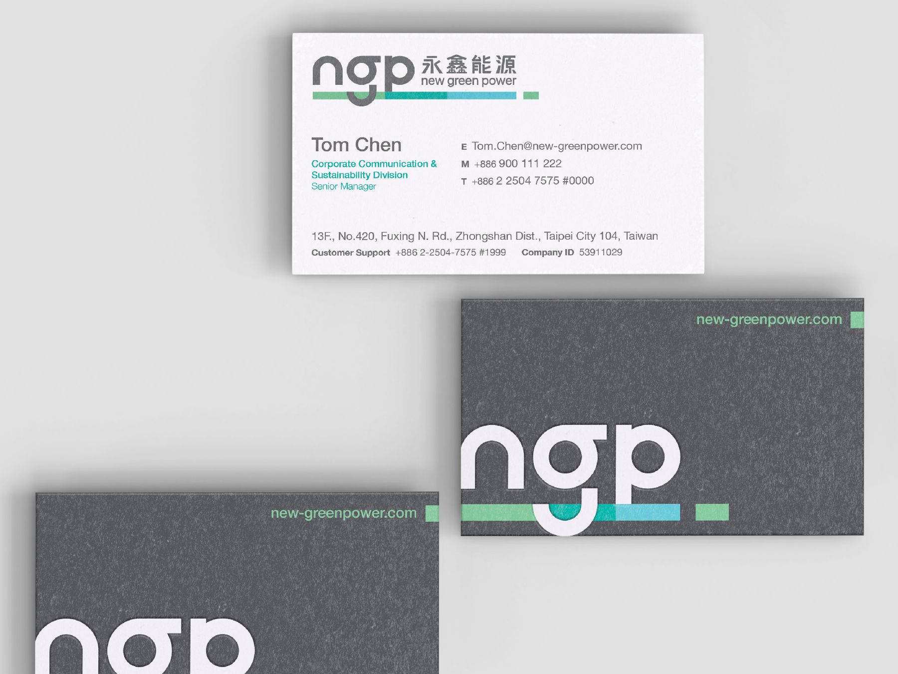
New Green Power stands as a trailblazer in Taiwan's solar industry, renowned for its comprehensive expertise spanning development, design, construction, and project management. Tasked with revolutionizing their brand, we embarked on crafting a visual identity that would encapsulate NGP's essence while propelling them into a new era.
Read more
KEYWORDS
⚑ Connectivity
⚑ Visionary
⚑ Adaptive
⚑ Mobility
⚑ Connectivity
⚑ Visionary
⚑ Adaptive
⚑ Mobility

KUI-HIUNN 貴香鹹酥雞
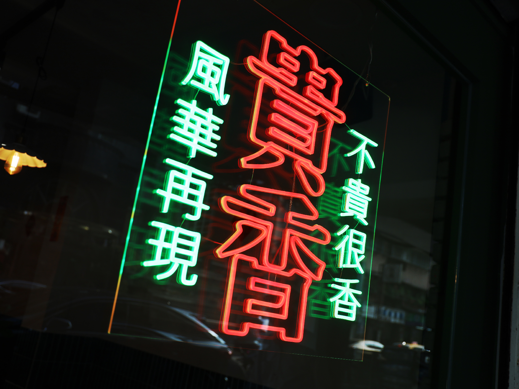
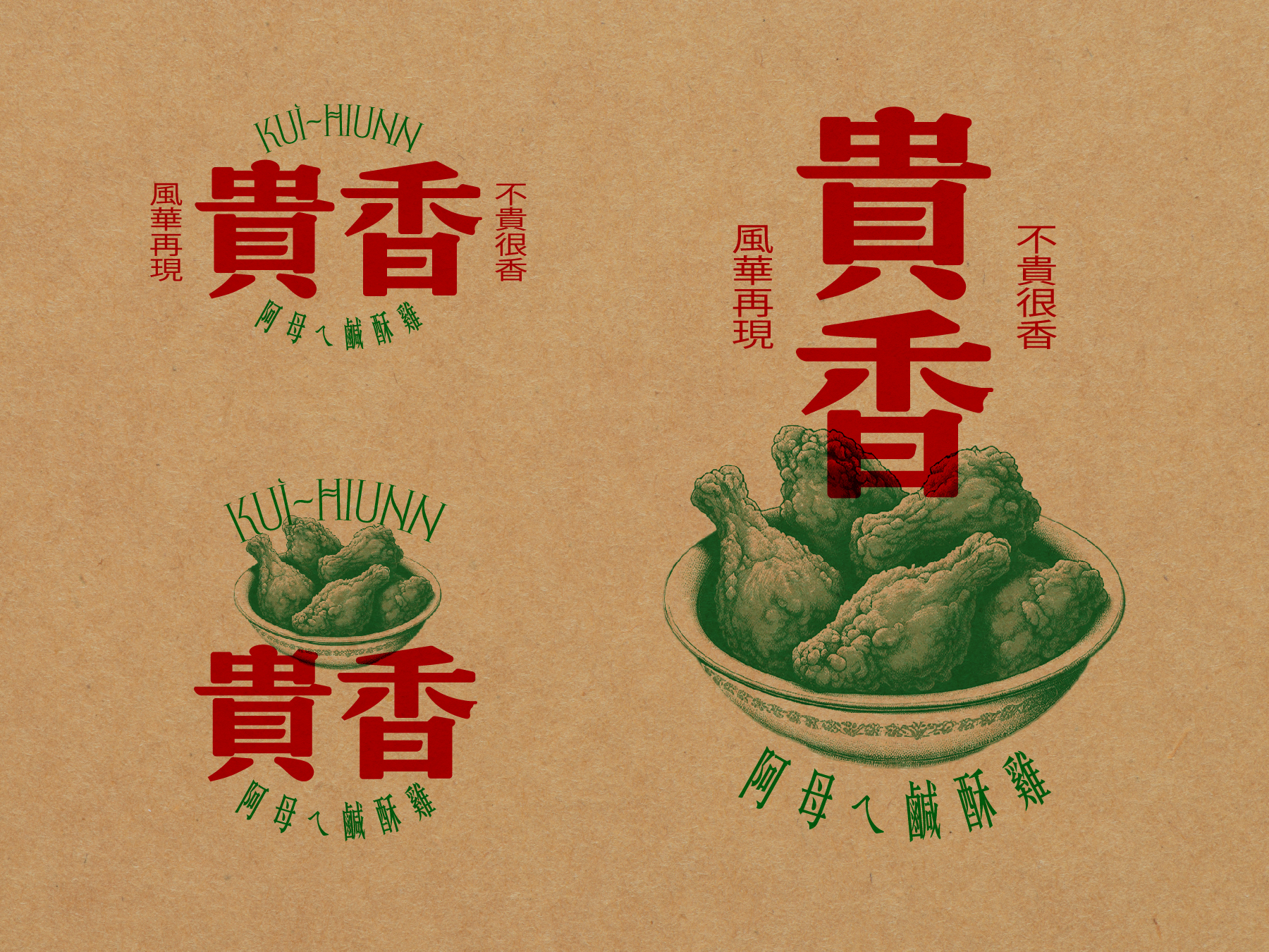
The visual identity design for KUI-HIUNN 貴香鹹酥雞 is deeply rooted in the rich flavors of Taiwanese street food culture. Inspired by the founder’s mother’s cherished recipe, the brand carries forward a taste of nostalgia, blending tradition with a bold and contemporary aesthetic.
Read more
KEYWORDS
⚑ Retro Aesthetic
⚑ Revival
⚑ TW Nostalgia
⚑ Street Vibe
⚑ Retro Aesthetic
⚑ Revival
⚑ TW Nostalgia
⚑ Street Vibe
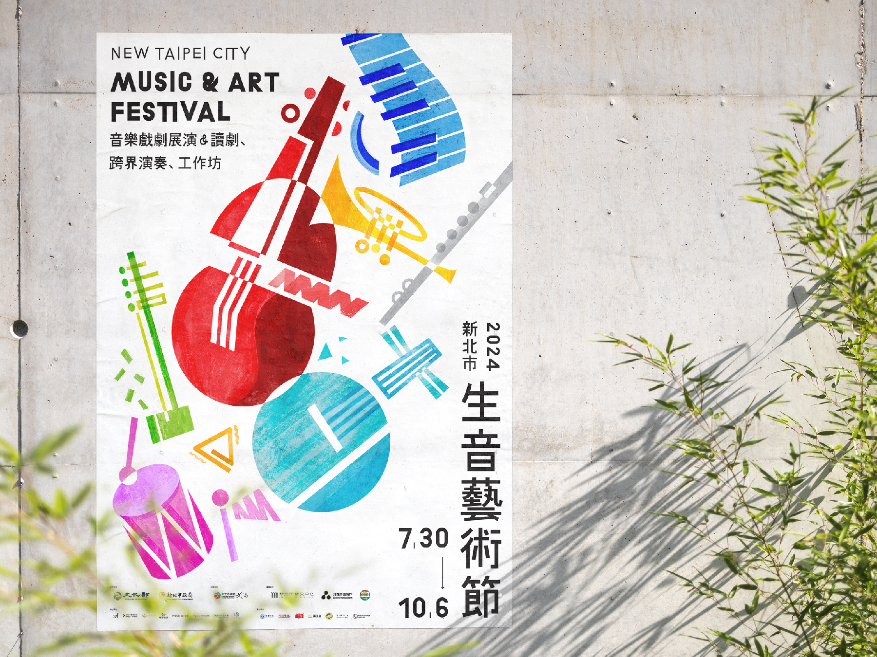
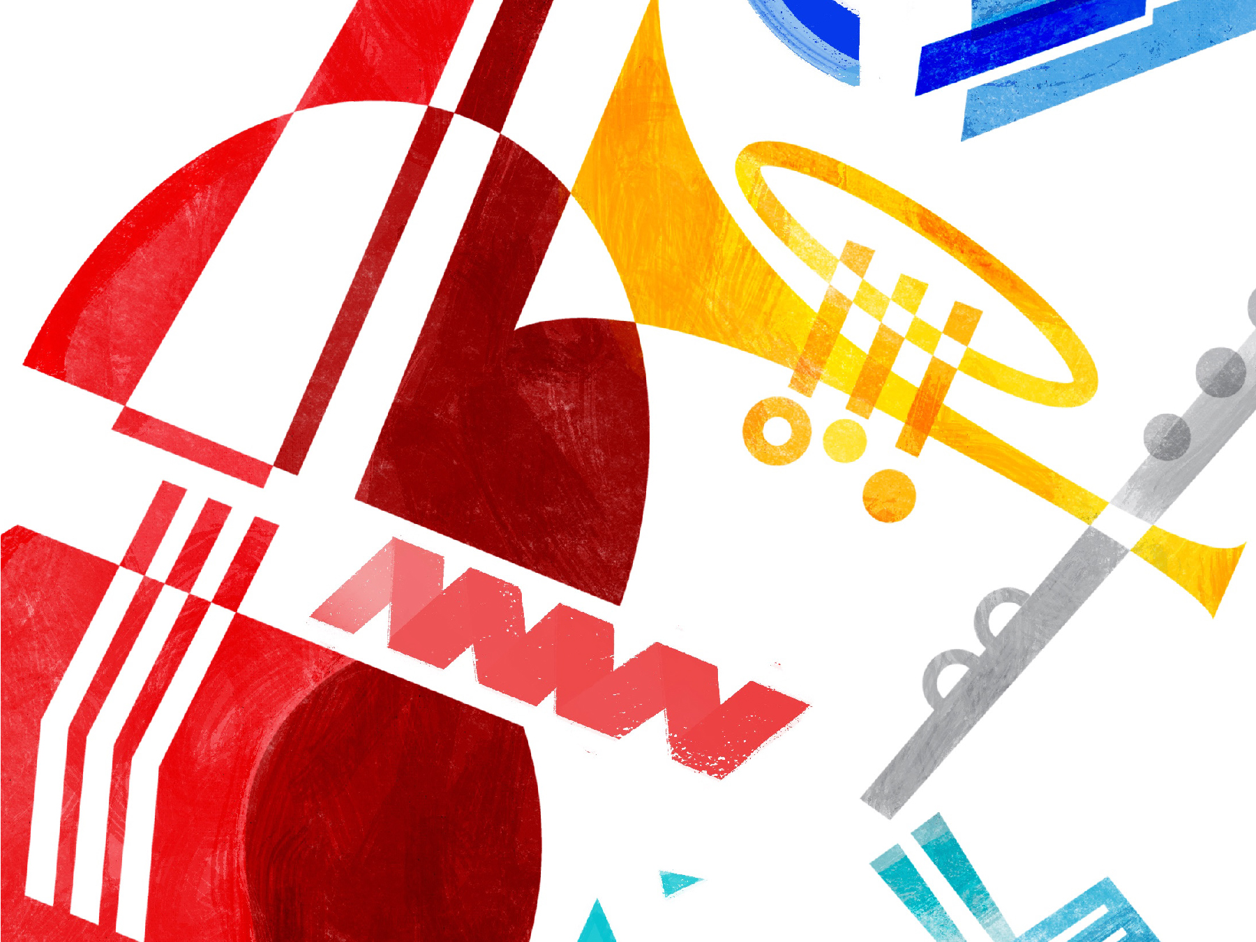
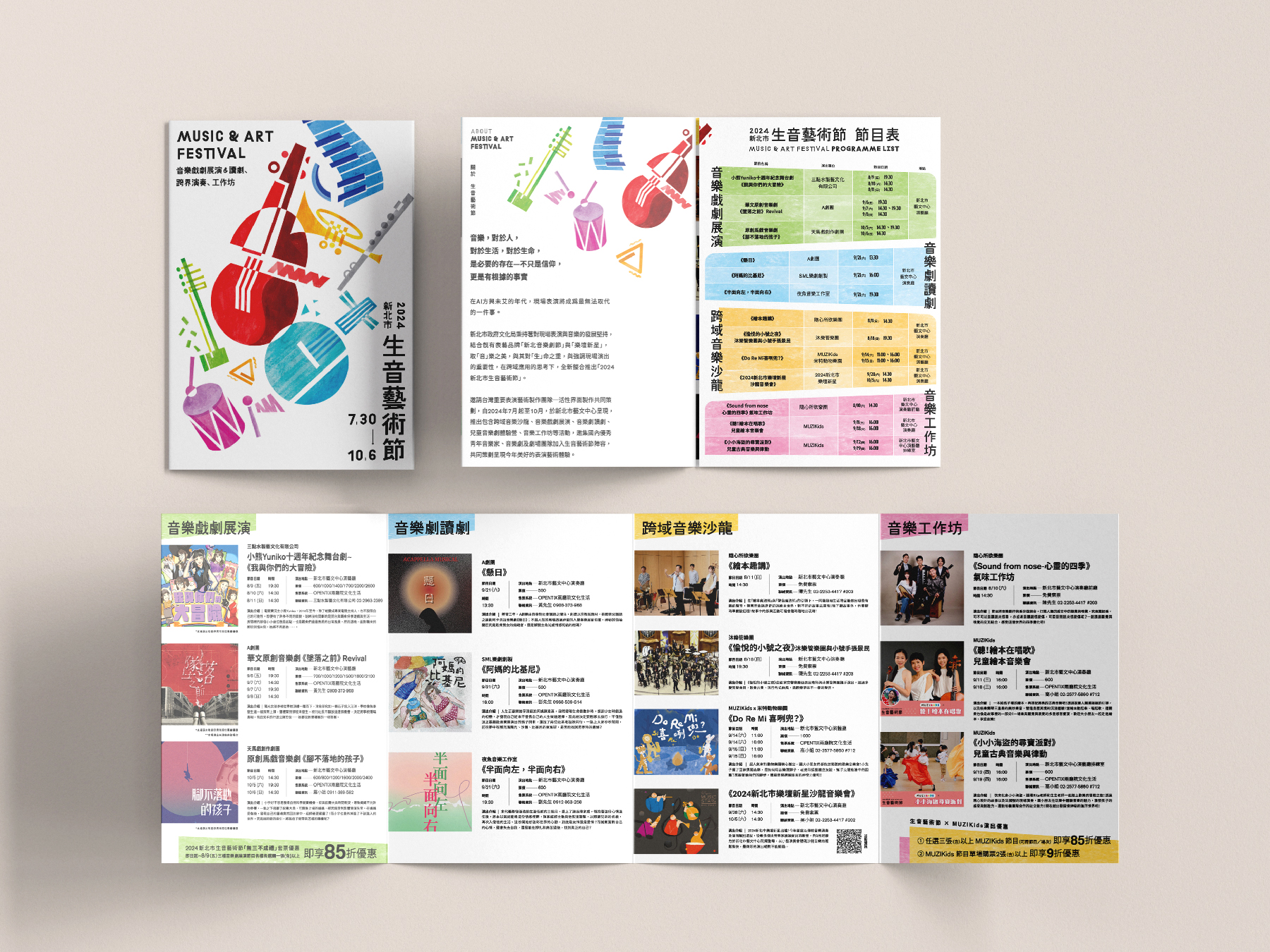
Music & Art Festival 2024 生音藝術節
The 2024 Music & Art Festival visual campaign embraces a vibrant and dynamic design approach, celebrating the festival's diversity, creativity, and energy. Showcasing interdisciplinary music salons, musical theatre performances, and children’s musical theatre workshops, the design captures the spirit of artistic collaboration and joyful expression.
Read more
KEYWORDS
⚑ Geometry
⚑ Playful
⚑ Sustainable
⚑ Dynamic
⚑ Geometry
⚑ Playful
⚑ Sustainable
⚑ Dynamic


Move To Zero 藝文永續行動
The visual identity for “MOVE TO ZERO” is rooted in the concept of transformation—moving from awareness to action toward sustainability in the arts and culture sector. Inspired by the core theme of “0,” the design reinterprets the number zero as a symbol of cyclical renewal and regenerative momentum.
Read more
KEYWORDS
⚑ Circulation
⚑ Symbolic
⚑ Rational
⚑ Transform
⚑ Circulation
⚑ Symbolic
⚑ Rational
⚑ Transform
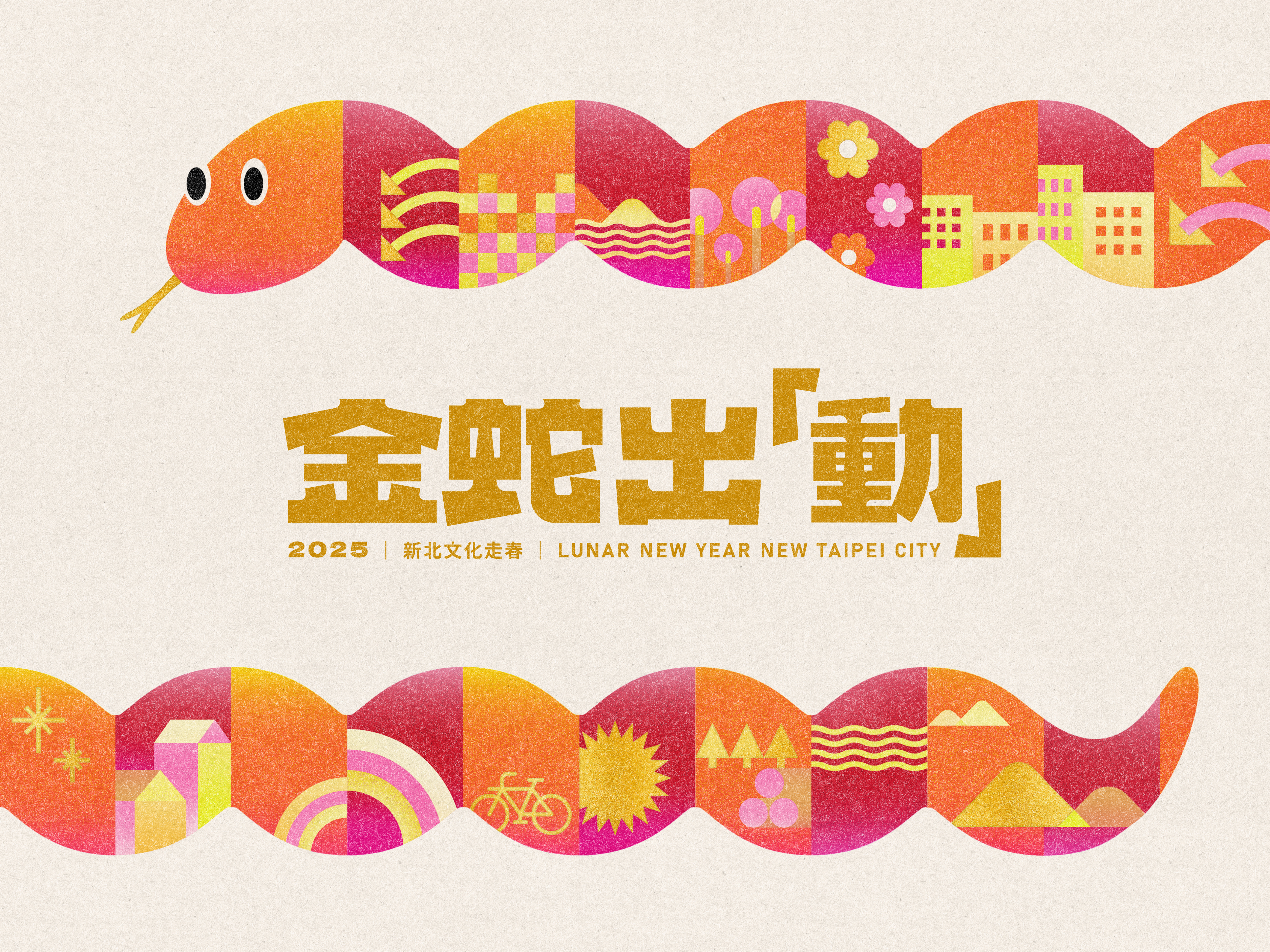
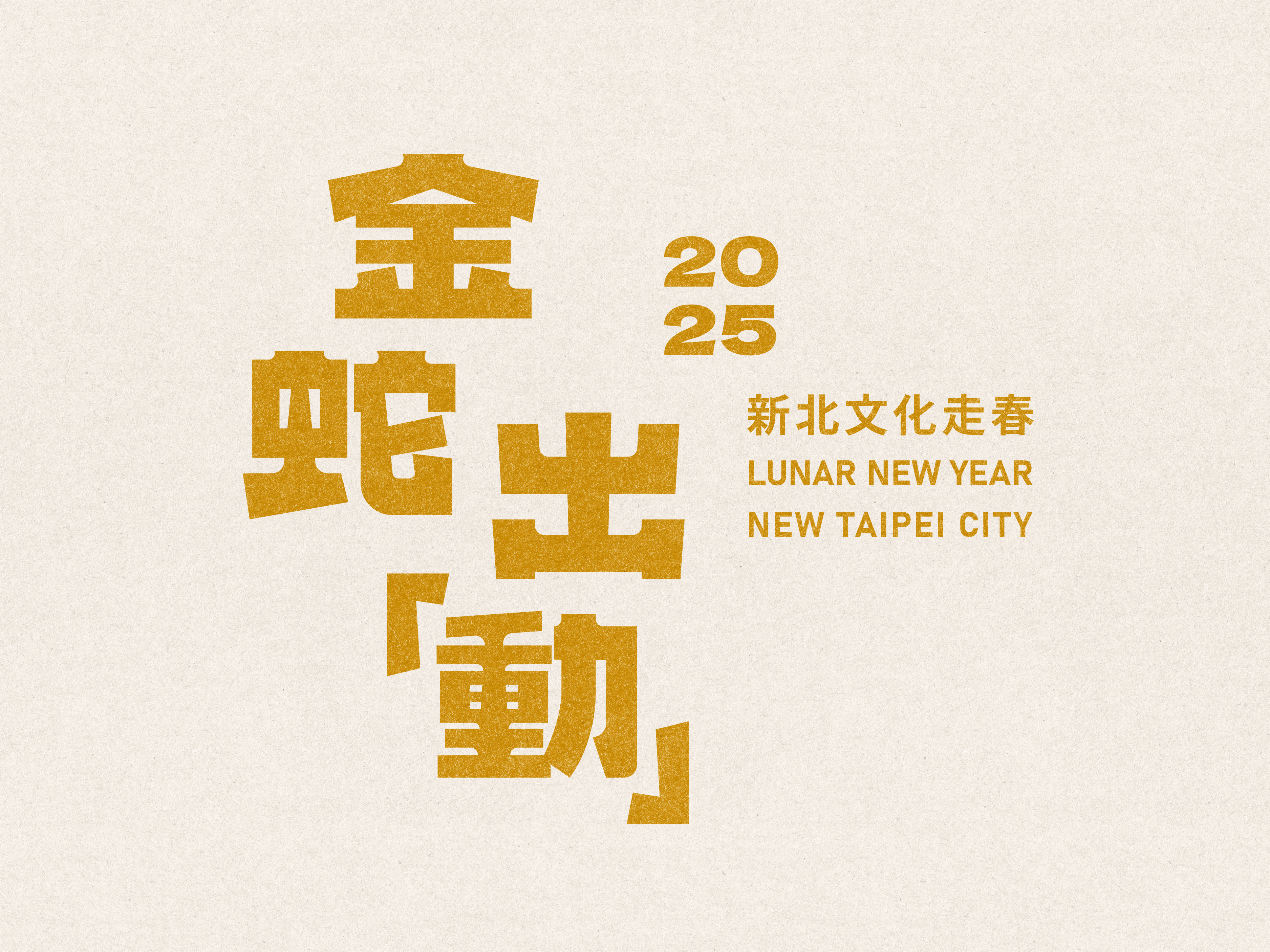
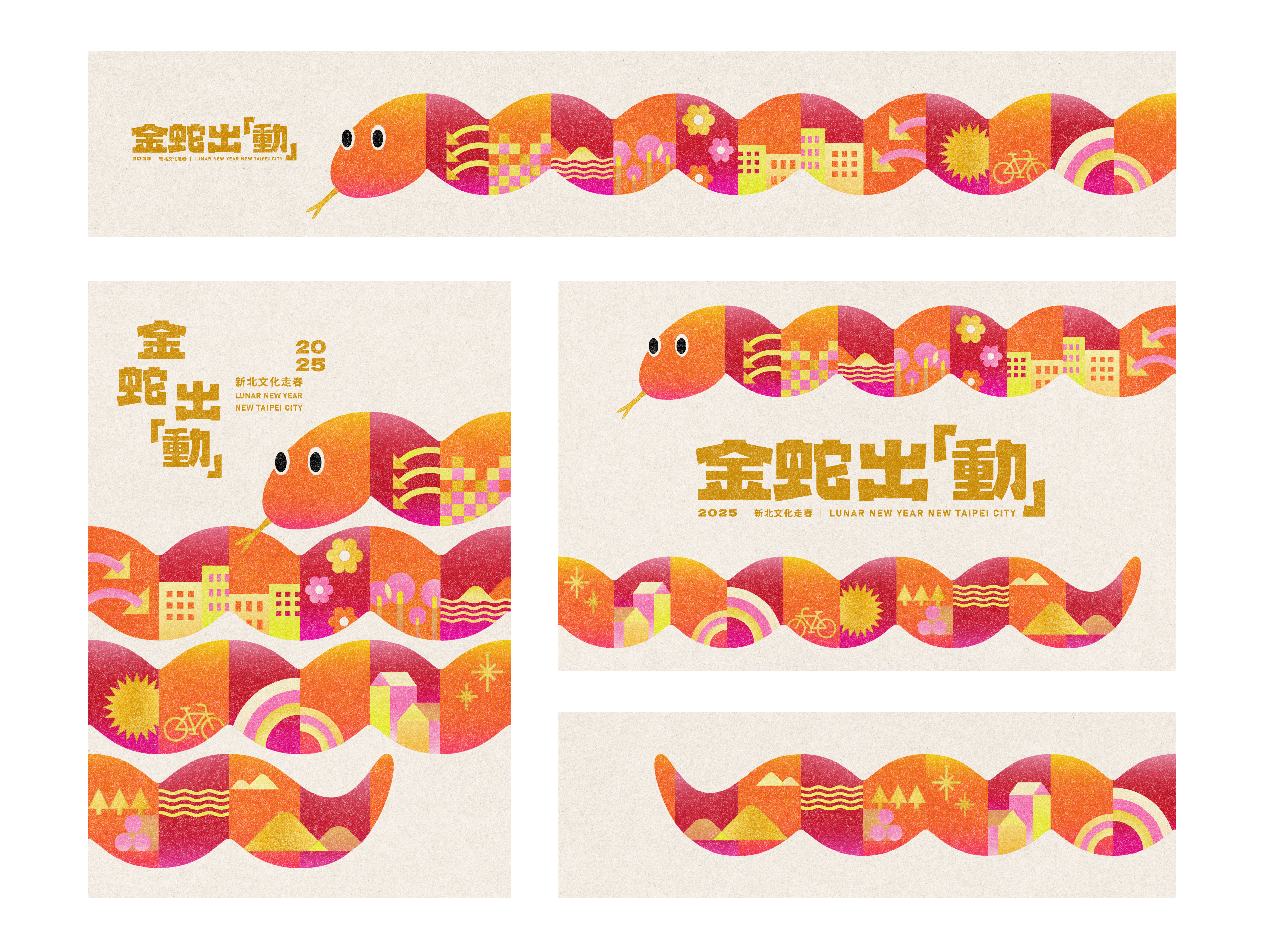
New Taipei City 2025 “Spring Culture Voyage” 新北市「金蛇出『動』文化走春」
The New Taipei City 2025 “Spring Culture Voyage” Key Visual Design embraces the spirit of the Year of the Snake with a bold yet festive approach. The key visual features a uniquely crafted snake, composed of design elements that represent the essence of New Taipei City.
Read more
KEYWORDS
⚑ Red & Gold
⚑ Diversity
⚑ Modular Design
⚑ Dynamic
⚑ Red & Gold
⚑ Diversity
⚑ Modular Design
⚑ Dynamic


Carrefour Foundation Annual Report 2023
We designed the publication around the theme of "Constant Dialogue," visually represented through various speech bubble designs - which connects the entire report, symbolizing the continuous communication and interaction between the company, its customers, and society.
Read more
KEYWORDS
⚑ Accessible
⚑ Dialogue
⚑ Visual Cohesion
⚑ Reader-Centered
⚑ Accessible
⚑ Dialogue
⚑ Visual Cohesion
⚑ Reader-Centered


Dynamic City Parkour 城市跑酷
Rooted in the New Taipei City Culture Foundation's vision of promoting cultural equality, this project aims to break down barriers between urban and rural areas by offering elementary school students across New Taipei City the chance to engage in a city parkour-themed painting activity.
Read more
KEYWORDS
⚑ Vibrant
⚑ Imaginative
⚑ Fun
⚑ Bold
⚑ Vibrant
⚑ Imaginative
⚑ Fun
⚑ Bold


Winson 2024 Contemporary Art Autumn Auction Catalogue 衛山2024秋季拍賣會圖錄
The Winsun Contemporary Art 2024 Autumn Auction Catalog is designed with a functional and minimalistic approach, ensuring that each art piece takes center stage with optimal clarity and visibility. Our goal is to create a refined visual experience that enhances appreciation for the artworks while maintaining a functional yet timeless aesthetic.
Read more
KEYWORDS
⚑ Clarity
⚑ Structured
⚑ Art-Centric
⚑ Clarity
⚑ Structured
⚑ Art-Centric

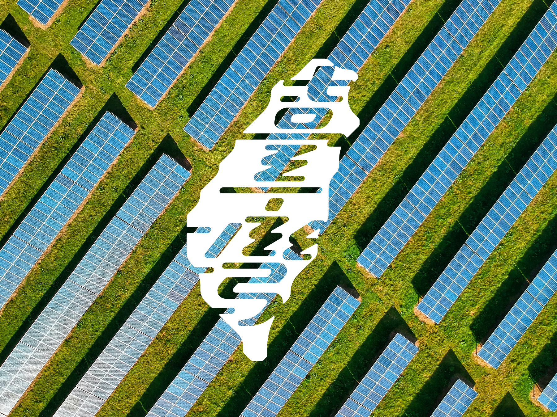
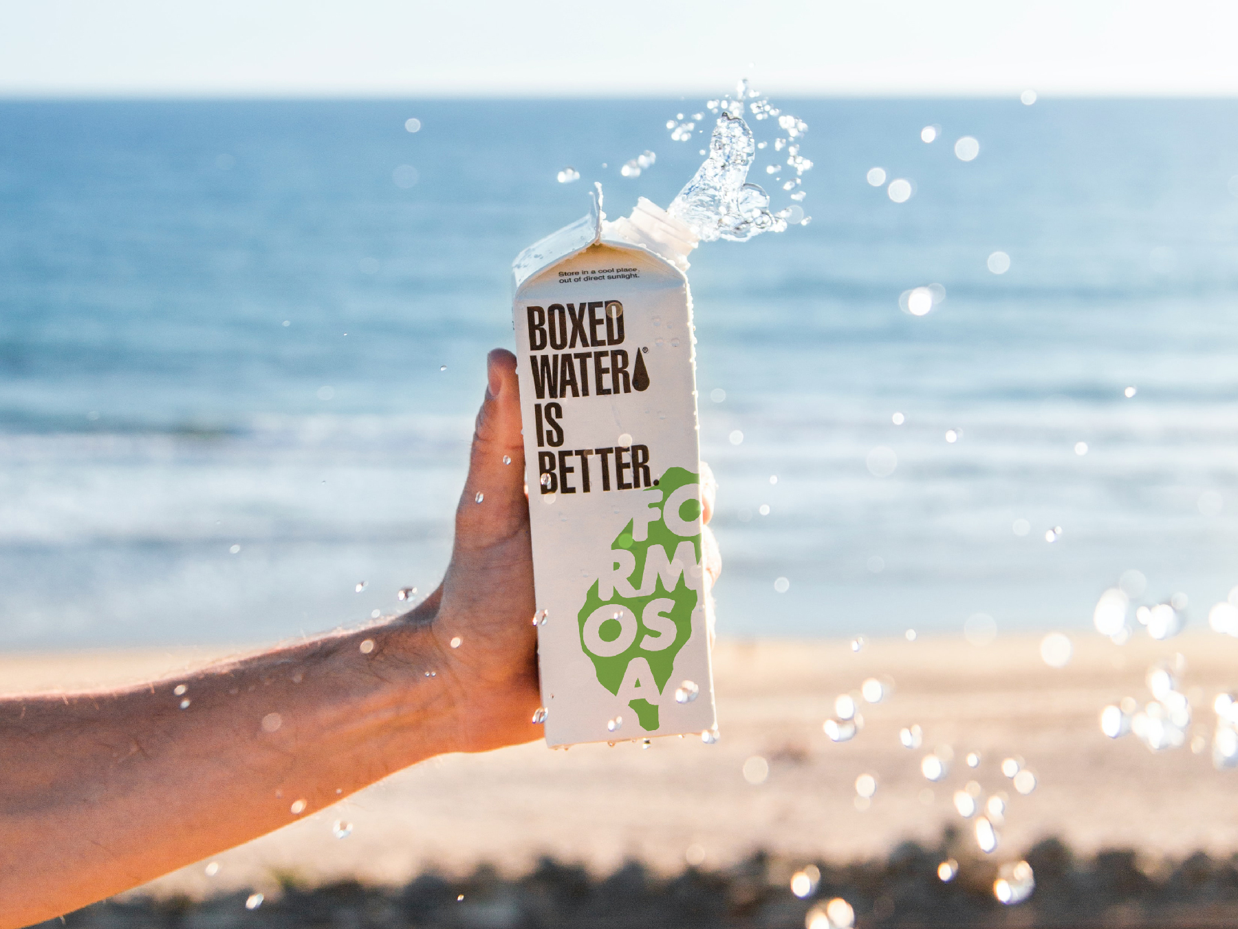
FORMOSA GREEN
FORMOSA GREEN is a Taiwanese company dedicated to producing farm products in a sustainable and environmentally friendly manner. With a focus on utilizing solar energy to power their farms, they are committed to reducing their carbon footprint and promoting renewable energy sources.
Read more
KEYWORDS
⚑ Taiwan
⚑ Fresh
⚑ Community
⚑ Pride
⚑ Taiwan
⚑ Fresh
⚑ Community
⚑ Pride

DRAGON HORN
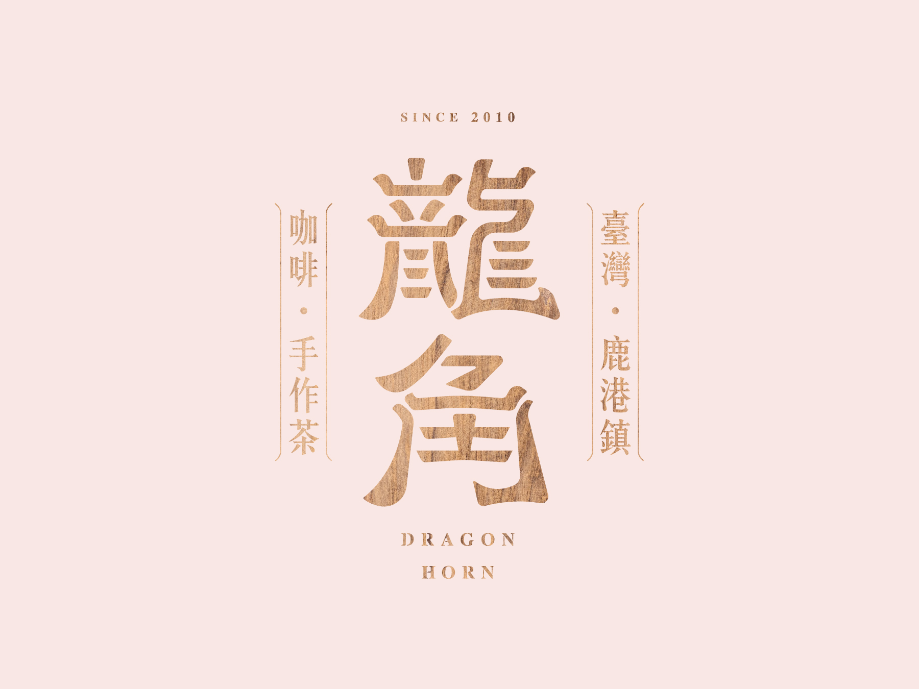
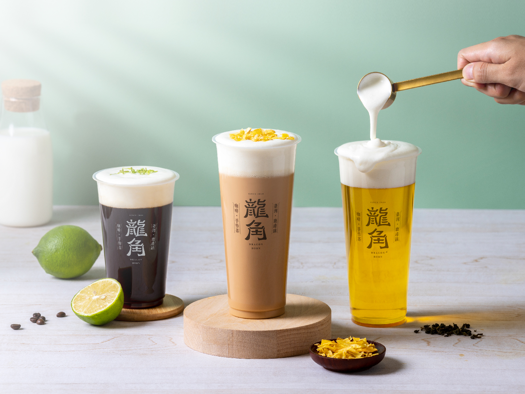
Drawing upon the bubble tea & coffee shop's origin in Lukang and the cultural significance of Chinese temples, we utilized wood sculpture as the primary design element to create a logo that is both unique and memorable.
Read more
KEYWORDS
⚑ Classic
⚑ Honest
⚑ Authentics
⚑ Acceptance
⚑ Classic
⚑ Honest
⚑ Authentics
⚑ Acceptance


EV OASIS
EV OASIS is an EV charging service provider with over 200 charging stations located throughout Taiwan. The main concept of the brand image is to create a futuristic design that seamlessly integrates with all car brands, regardless of their specific design elements.
Read more
KEYWORDS
⚑ Sonorous
⚑ Futuristic
⚑ Compatible
⚑ Routine
⚑ Sonorous
⚑ Futuristic
⚑ Compatible
⚑ Routine


FZ Cultural Salon 2022
FZ Cultural Salon: CITY DESIGN: SIX FACETS, hosted by the New Taipei City Cultural Foundation. The event focused on contemporary urban design, bringing together 18 forward-thinking designers and researchers to share their experiences in social design, circular design, local branding design, education design, environmental design, and festival design.
Read more
KEYWORDS
⚑ Blue print
⚑ Experimental
⚑ Dynamic
⚑ Engaging
⚑ Blue print
⚑ Experimental
⚑ Dynamic
⚑ Engaging

Year of the Tiger Campaign -
New Taipei City Government
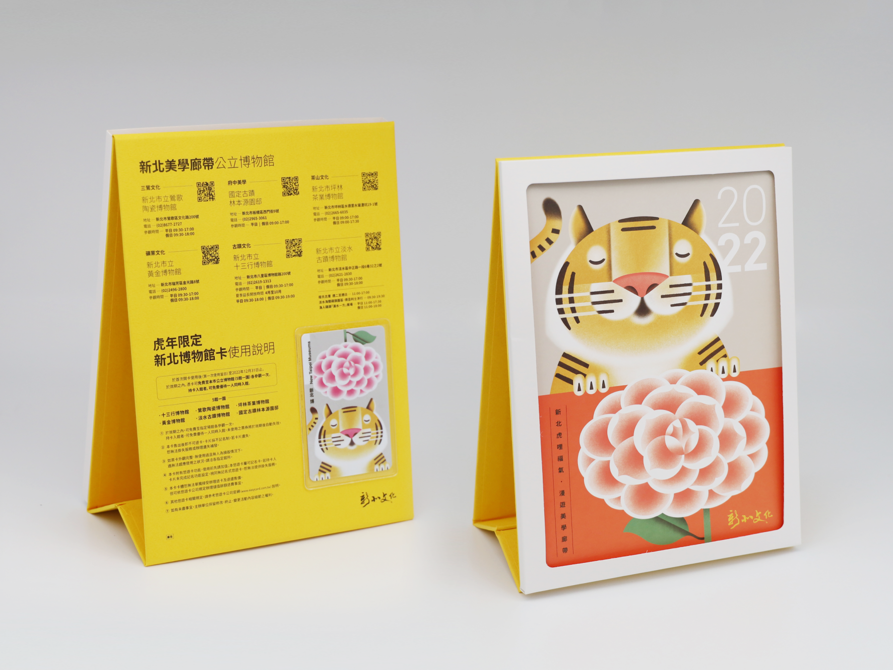
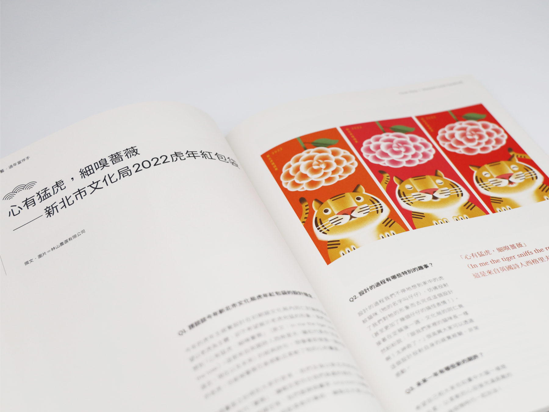
Our team was tasked with creating a campaign that celebrated the Chinese New Year (2022 Year of the Tiger) while highlighting the beauty and diversity of New Taipei City. Inspired by the famous line of poetry "In me the tiger sniffs the rose", we chose to depict a gentle and calm tiger sniffing a beautiful Camellia flower, which represents the city.
Read more
KEYWORDS
⚑ Festive
⚑ Poetic
⚑ Adorable
⚑ Whimsical
⚑ Festive
⚑ Poetic
⚑ Adorable
⚑ Whimsical


STRIKING THE GONG & LISTENING TO YOUR HEART:An Introduction to Gong Sound Healing. 敲響銅鑼 返聽自心 : 銅鑼音療入門
We sought to capture the essence of the moment when the gong is struck—a profound, resonant sound that echoes deeply within the hearts of those who hear it. The book, written by renowned gong sound healing master Fang Baihua, invites readers on a journey of spiritual awakening, healing, and self-discovery.
Read more
KEYWORDS
⚑ Zen Aesthetics
⚑ Balance
⚑ Mindfulness
⚑ Resonance
⚑ Zen Aesthetics
⚑ Balance
⚑ Mindfulness
⚑ Resonance



NEC Calendar Design 2019 / 2020
The calendar design for NEC, a leading tech company in Taiwan and Japan. The calendar is not just a mere schedule-keeping tool, but it also embodies the company's core values, and integrate into a creative product.
Read more
KEYWORDS
⚑ Corporate
⚑ Bold
⚑ Tech-focused
⚑ Functional
⚑ Corporate
⚑ Bold
⚑ Tech-focused
⚑ Functional

OFALO - Spread The Seeds of Beauty
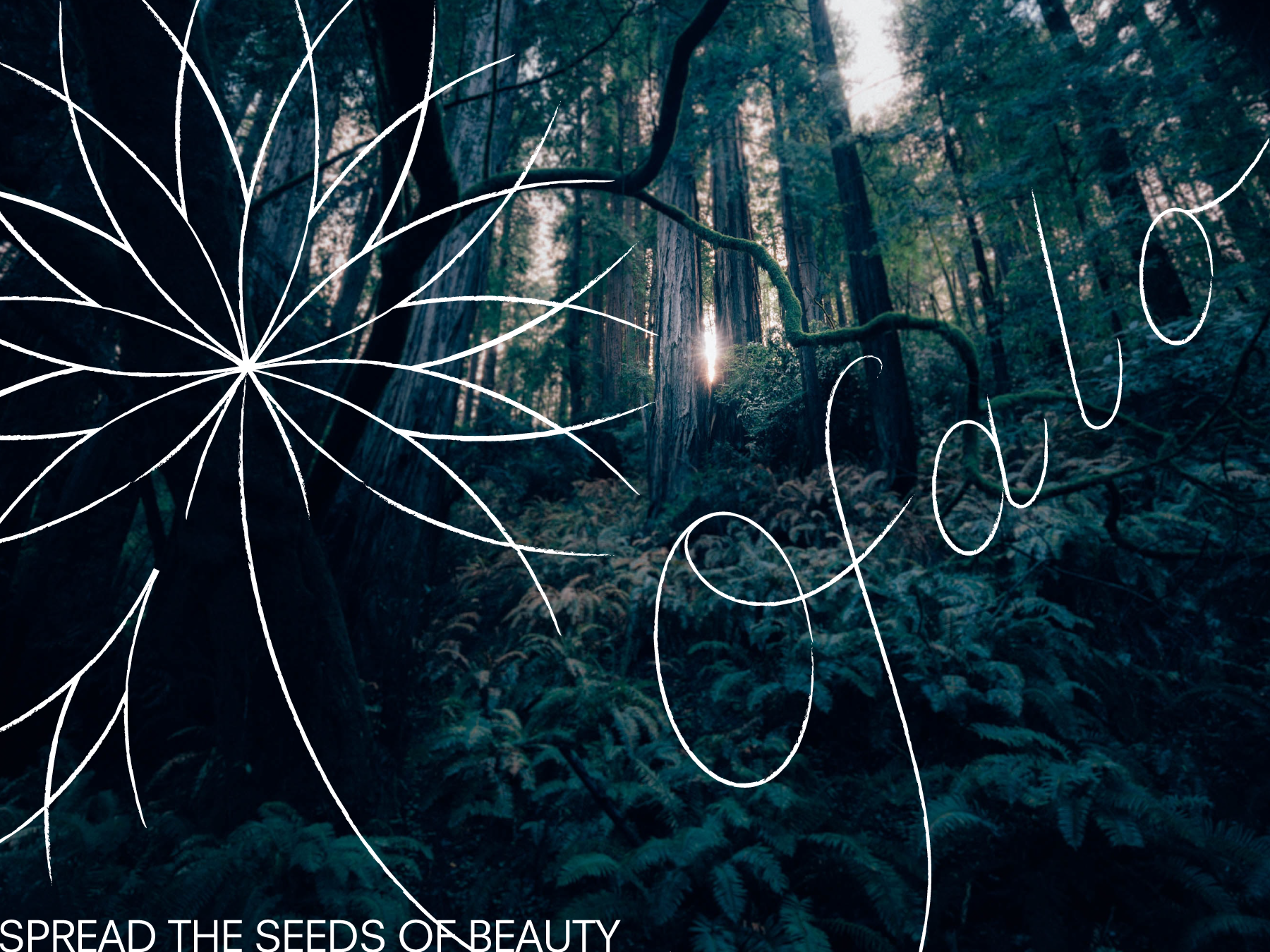
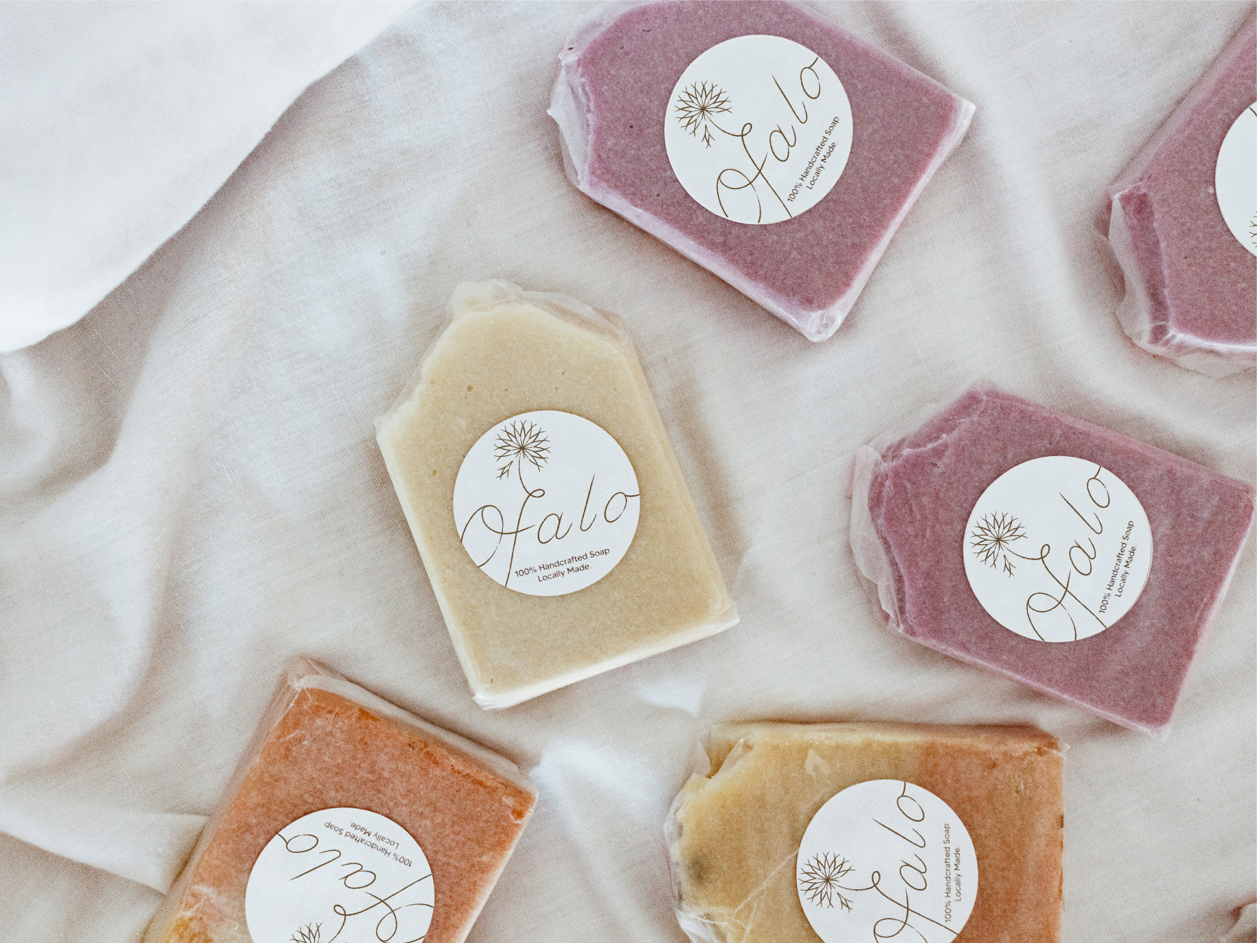
The visual identity designed for OFALO, a brand focused on using indigenous plants in their cosmetic products. The name OFALO, meaning "seeds in the flower", is a beautiful representation of the brand's values - spreading the seeds of beauty using traditional methods. The logo design, featuring a soft, hand-drawn dandelion, perfectly captures the essence of the brand.
Read more
KEYWORDS
⚑ Botanical
⚑ Fluid
⚑ Indigenous
⚑ Free-flowing
⚑ Botanical
⚑ Fluid
⚑ Indigenous
⚑ Free-flowing


Tea of HAKKA 客庄好茶
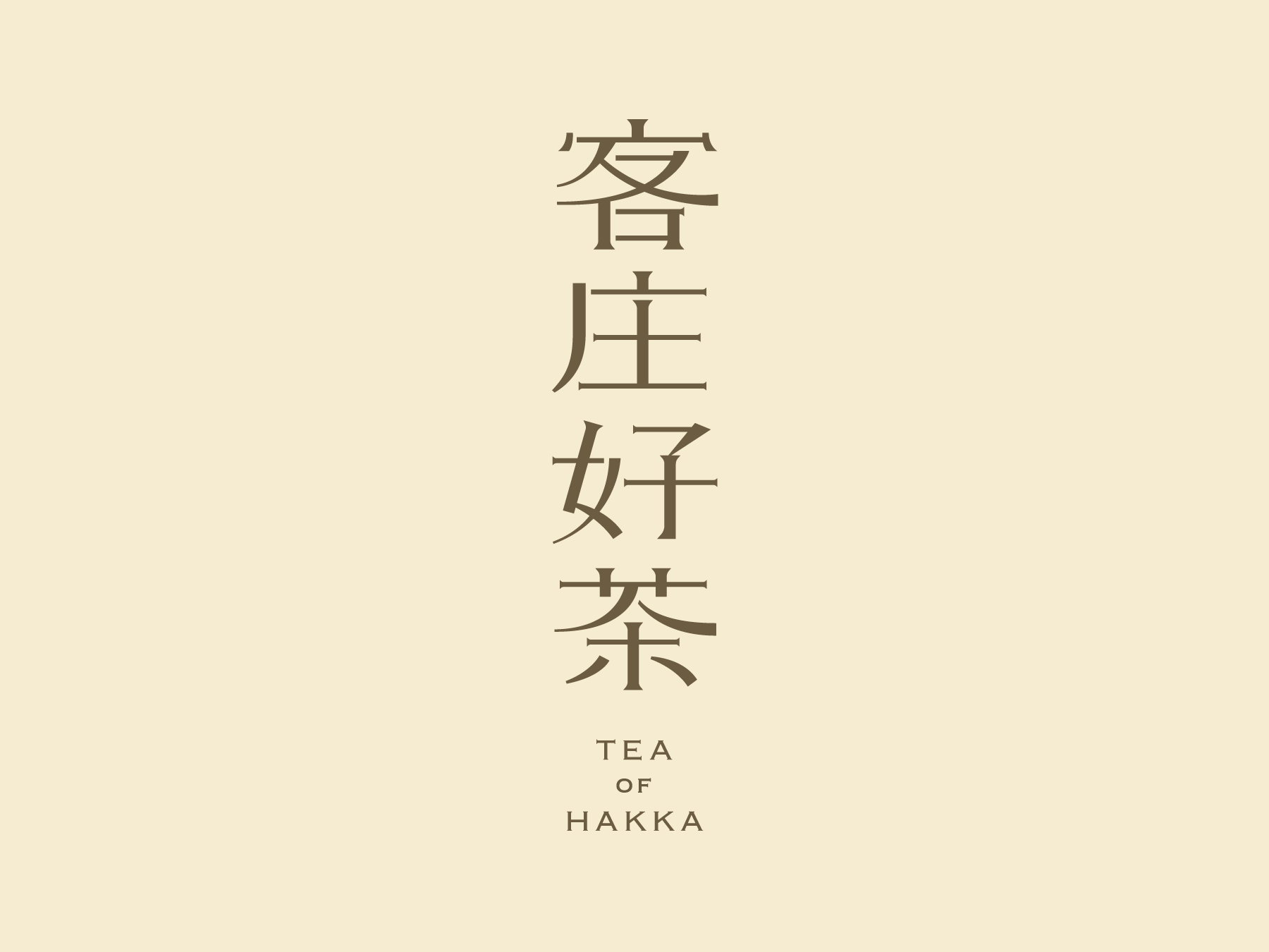
"TEA OF HAKKA" campaign aim to help revive the tea culture exclusively for the Hakka people in Taiwan. With a focus on supporting local Hakka tea farmers and promoting their products, this project goal was to bring awareness to the unique qualities and history of Hakka tea and its unique culture.
Read more
KEYWORDS
⚑ Rustic
⚑ Warm
⚑ Organic
⚑ Nostalgic
⚑ Rustic
⚑ Warm
⚑ Organic
⚑ Nostalgic
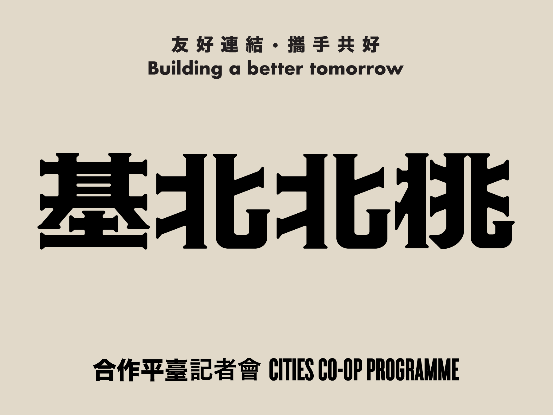
Cities Co-op Programme Press Conference
基北北桃城市合作平臺
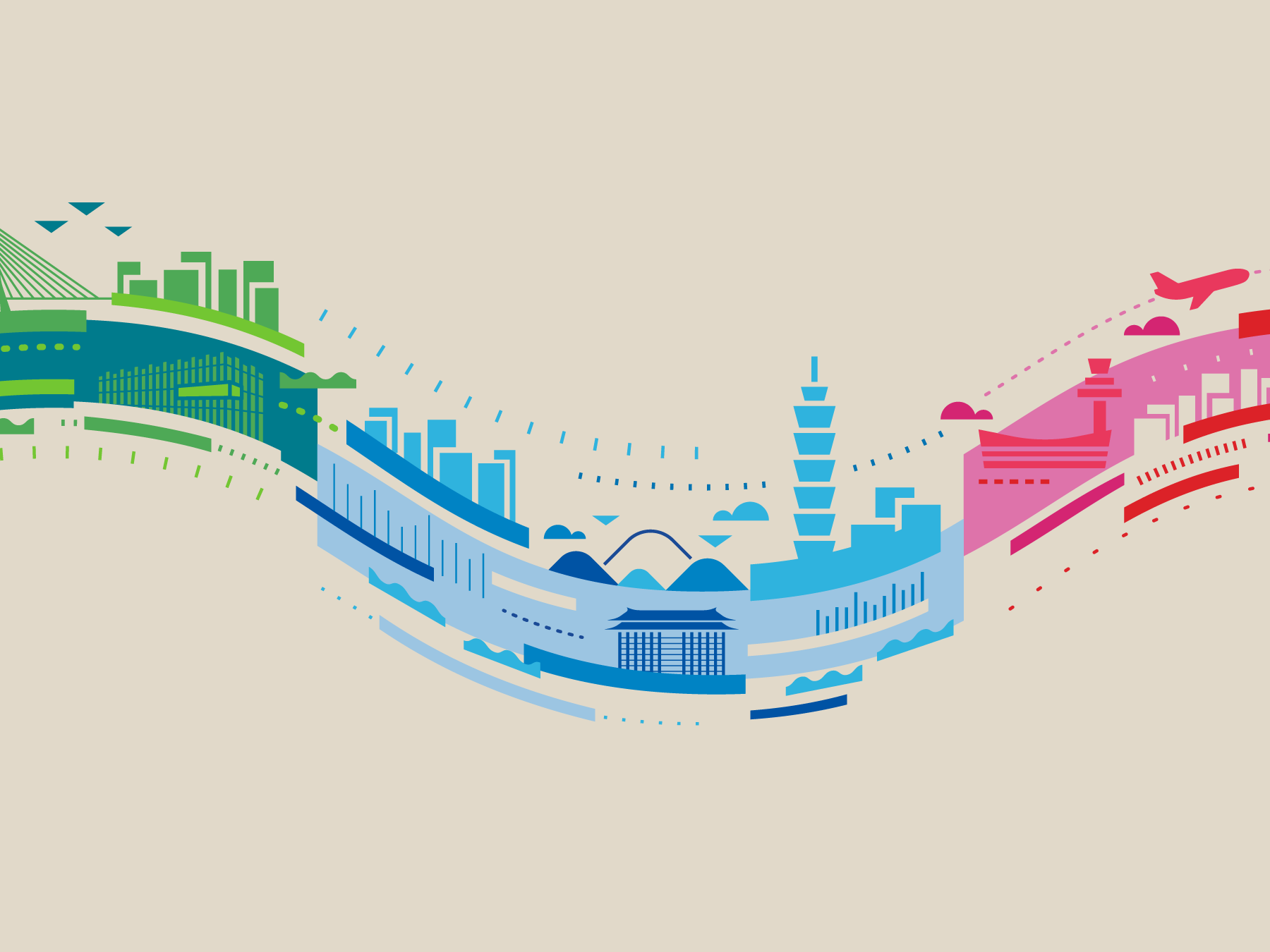
Commissioned by the New Taipei City Government - the key visual design for the press conferences of the Cities Co-op Programme. The programme aims to announce how Taipei, New Taipei City, Keelung, and Taoyuan are working together to create a better experience for their citizens.
Read more
KEYWORDS
⚑ United
⚑ Progress
⚑ Harmonious
⚑ Inclusive
⚑ United
⚑ Progress
⚑ Harmonious
⚑ Inclusive

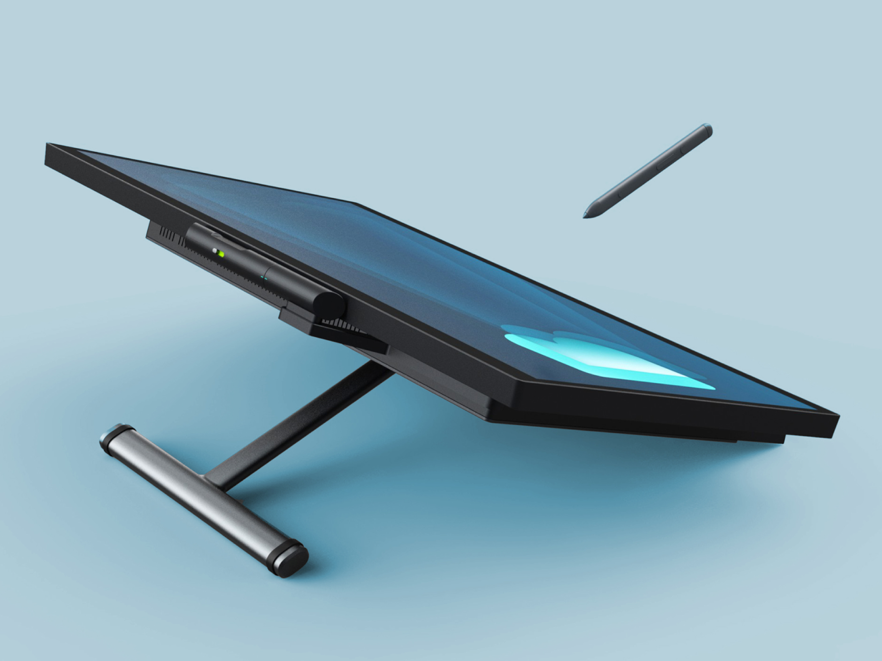

Bestboard
As the brand management team for BestBoard, our task was to create a cohesive visual identity that represented their All-In-One Collaboration product for the modern workplace. We were responsible for various aspects of the brand, including marketing materials, photography, web design, and product design.
Read more
KEYWORDS
⚑ Cohesive
⚑ Professional
⚑ Versatile
⚑ Efficient
⚑ Cohesive
⚑ Professional
⚑ Versatile
⚑ Efficient
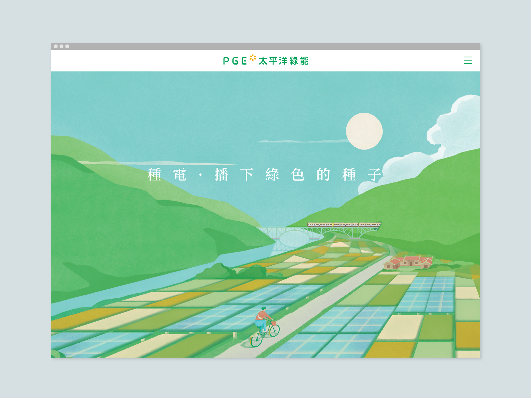
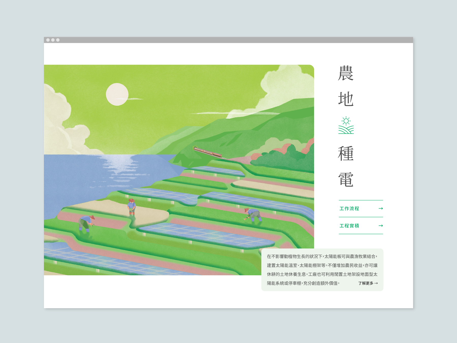
PGE Solar 太平洋綠能
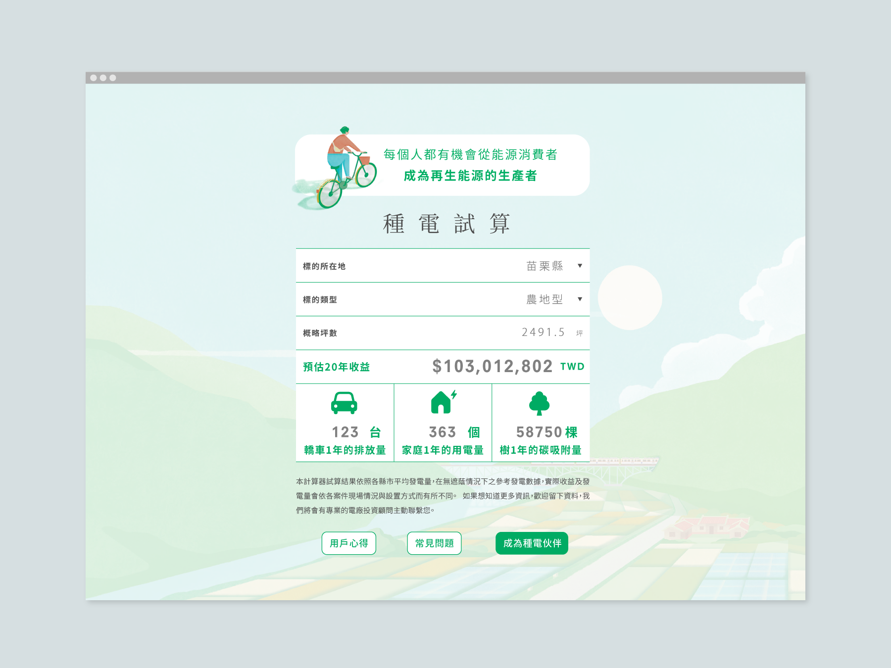
A web design project for PGE Solar 太平洋綠能, the website showcases the company's commitment to sustainable energy by using large-scale scenic illustrations to depict a beautiful landscape with incorporated energy structures.
Read more
KEYWORDS
⚑ Green energy
⚑ Nature-inspired
⚑ Sustainable
⚑ Green energy
⚑ Nature-inspired
⚑ Sustainable

Linshan Farmers Select 林山農選
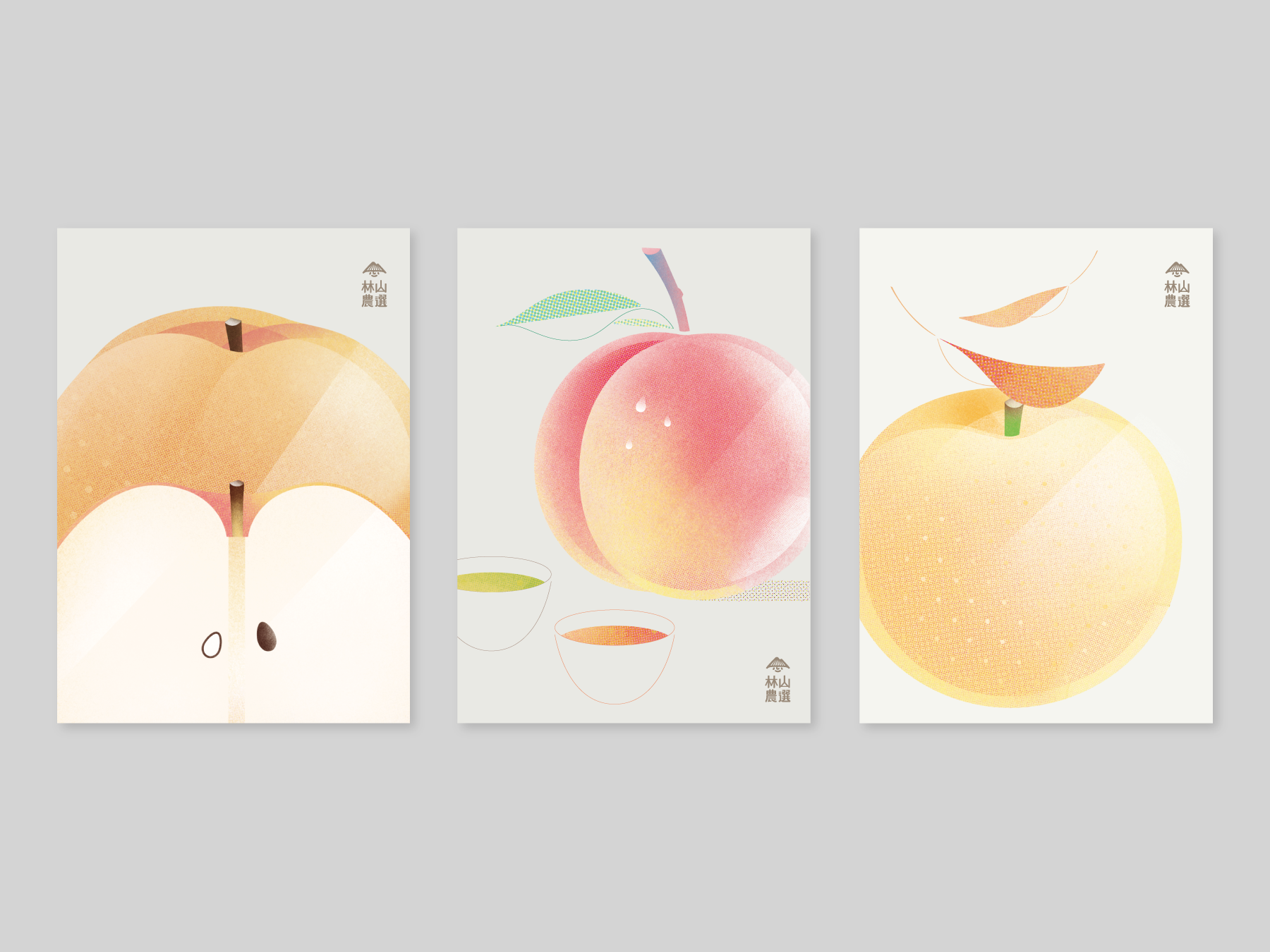
To share with you a project that is close to our company's heart - the creation of the entire visual identity, packaging, and marketing materials for Linshan Farmers Select. As a co-founder of this brand, We are proud to be part of a company that focuses on providing high mountain farm products in Taiwan, while caring for the farmers and creating a fair trade system for both the consumers and producers.
Read more
KEYWORDS
⚑ Sustainable
⚑ Fairtrade
⚑ Transparent
⚑ Honest
⚑ Sustainable
⚑ Fairtrade
⚑ Transparent
⚑ Honest


Accesssoft
As a software provider company that offers a wide range of software licenses for enterprise, Accesssoft needed a brand identity and website that reflected their innovative and modern approach. We were tasked with revamping the brand logo and website interface design, with the goal of introducing this long-established brand to a new generation of customers.
Read more
KEYWORDS
⚑ Sleek
⚑ Responsive
⚑ Functional
⚑ Sleek
⚑ Responsive
⚑ Functional
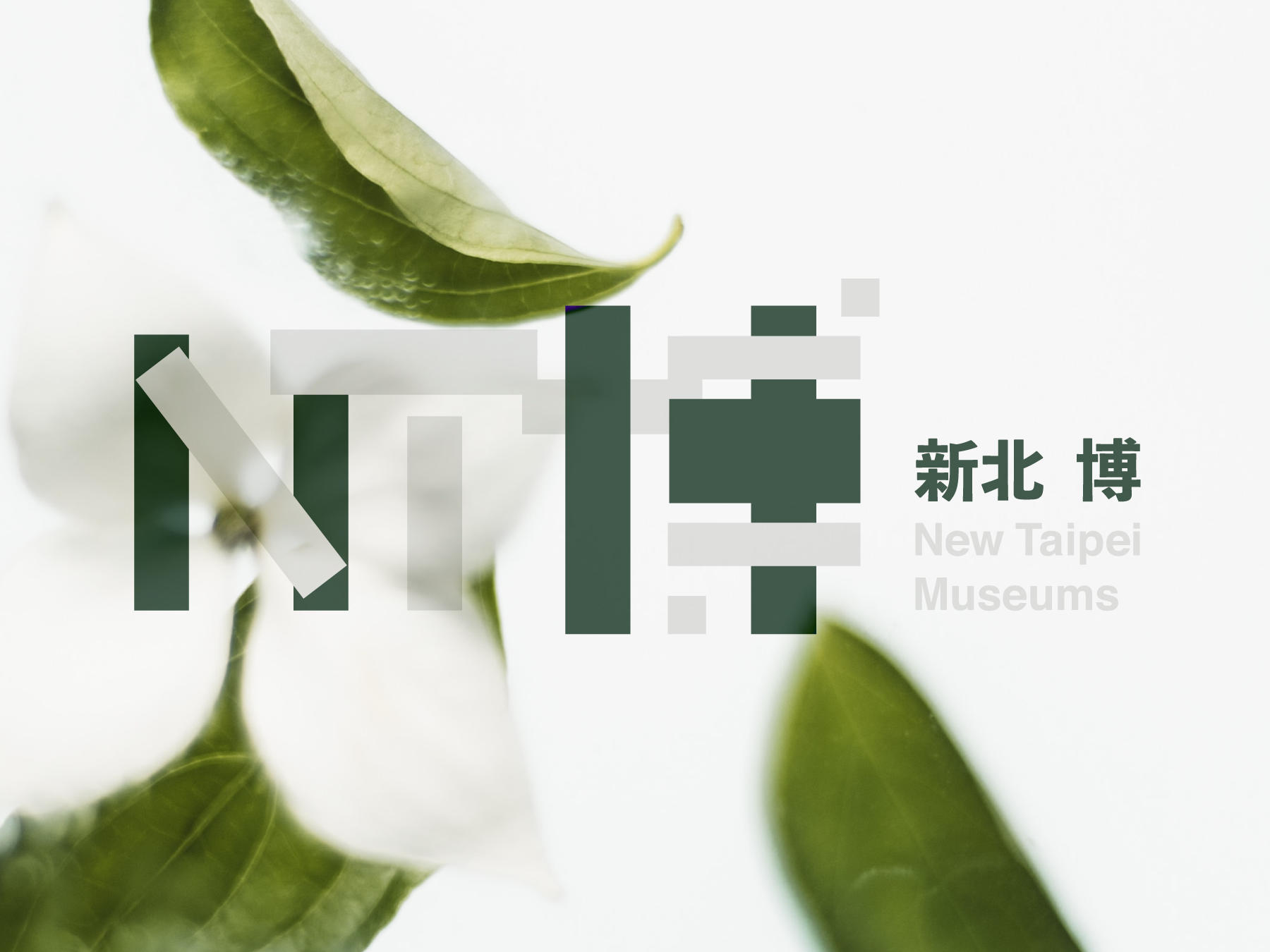

New Taipei City Museum 新北博
Invited by the New Taipei City Cultural Bureau, we were commissioned to design the logo for the "New Taipei City Museum" campaign. The campaign aimed to bring together six museums located in New Taipei City onto a single platform, allowing citizens to easily access information about each museum.
Read more
KEYWORDS
⚑ Constructivist
⚑ Multifaceted
⚑ Connected
⚑ Unified
⚑ Constructivist
⚑ Multifaceted
⚑ Connected
⚑ Unified
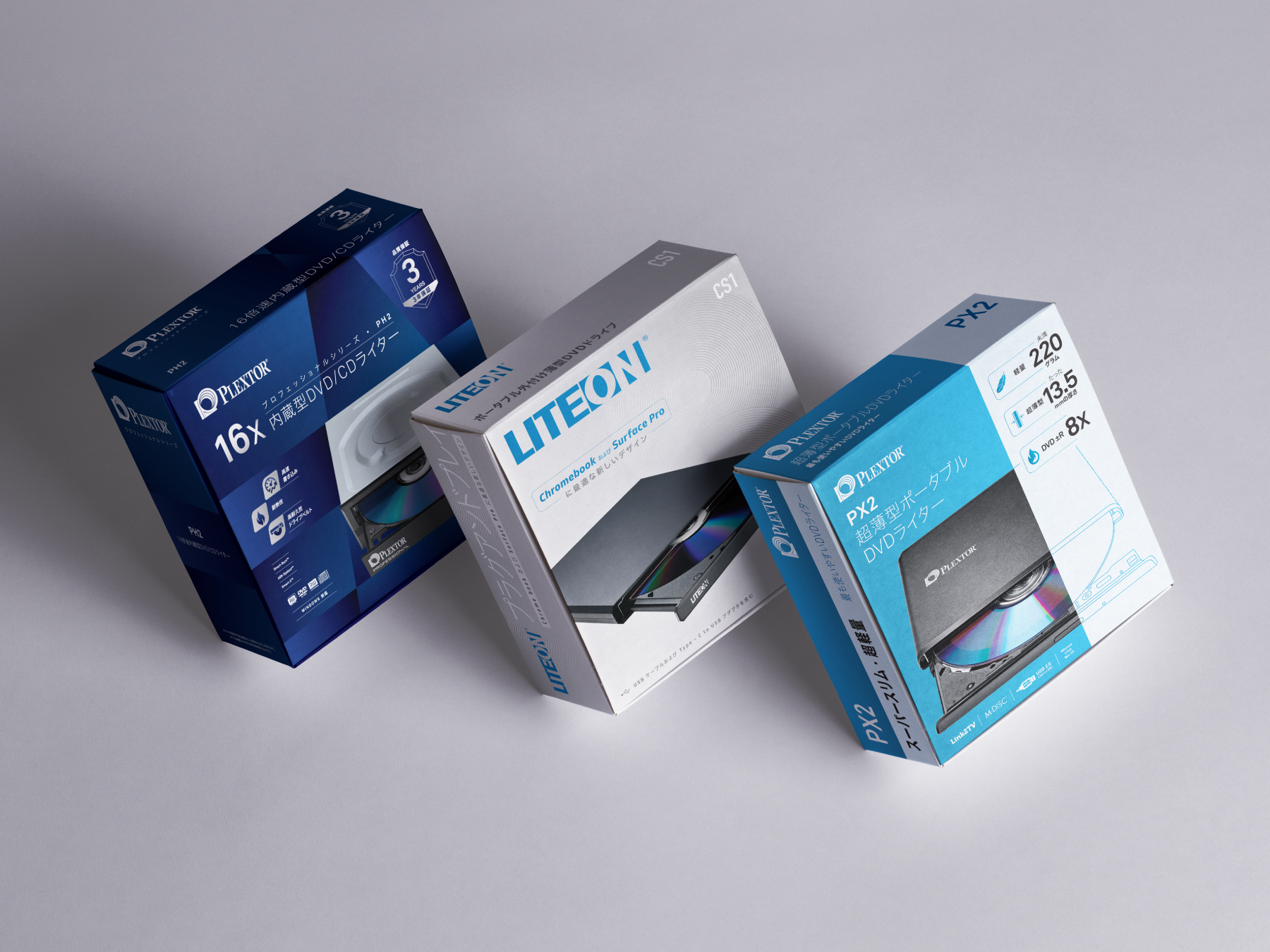

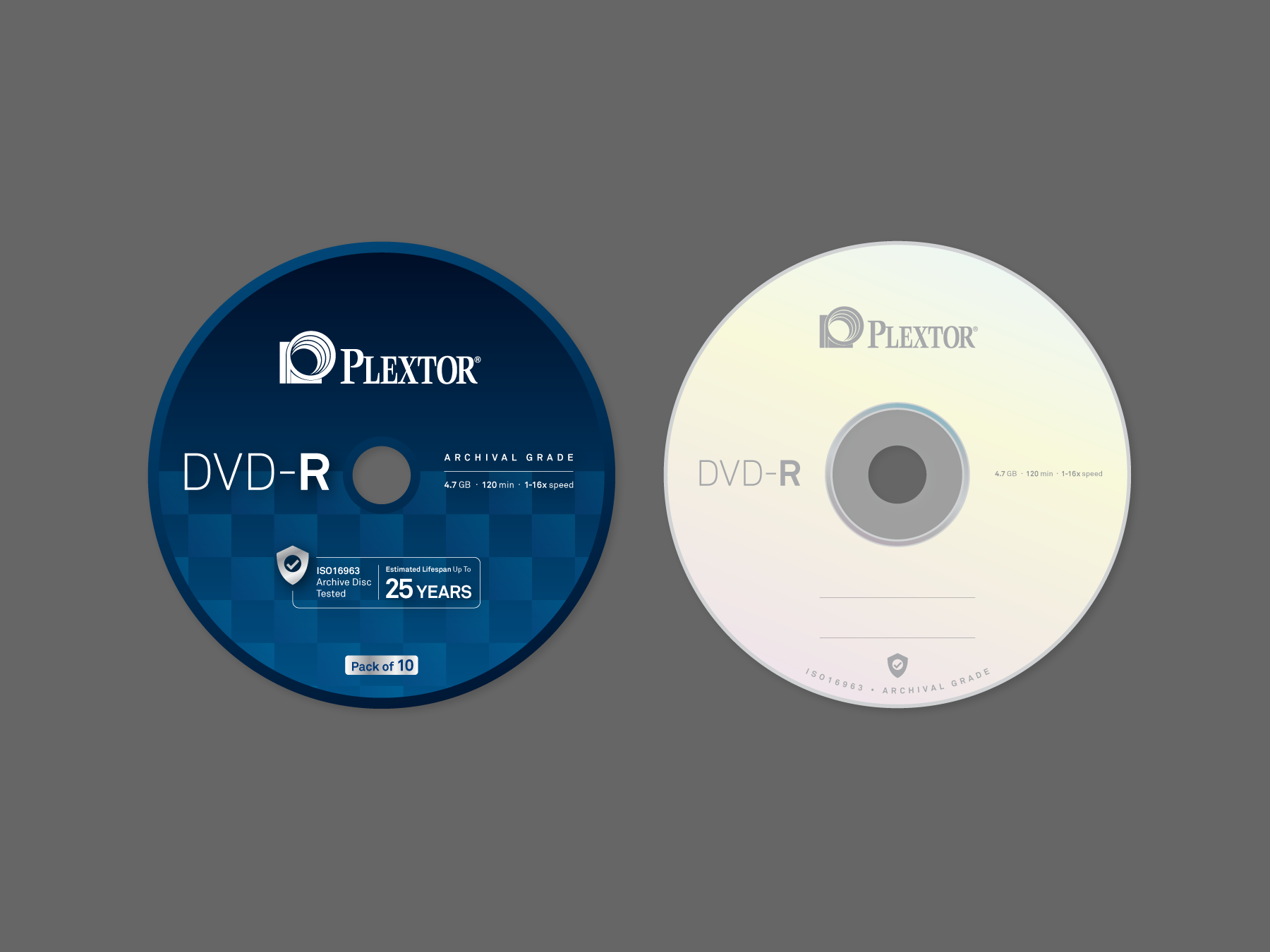
LITE-ON 光寶科技
We had the opportunity to work on the packaging design project for LITE-ON and exclusively for the Japanese market. The design approach was to keep it simple yet marketable. The packaging design reflects the product features and its capabilities.
Read more
KEYWORDS
⚑ Functional
⚑ Chic
⚑ All-rounded
⚑ Functional
⚑ Chic
⚑ All-rounded
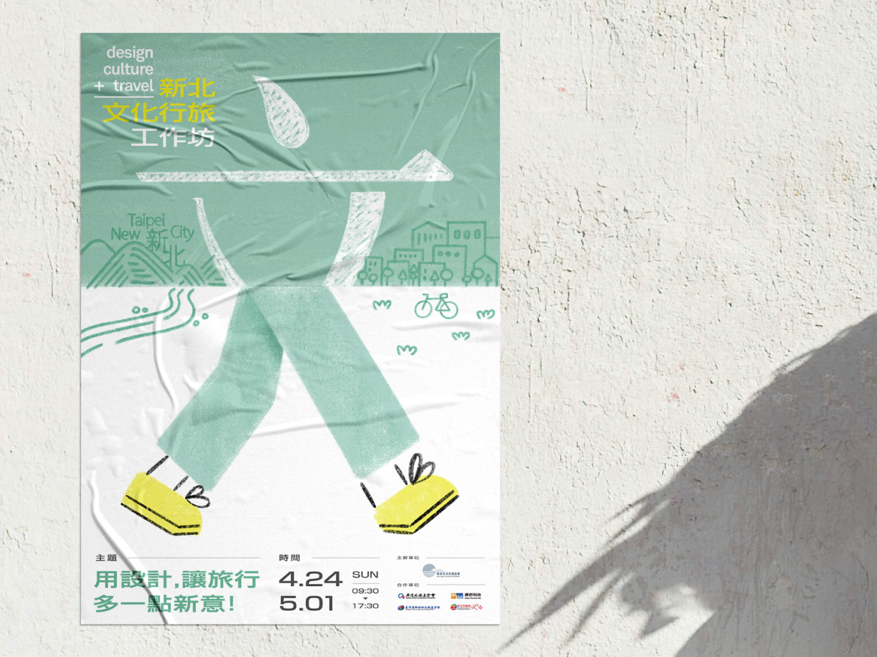
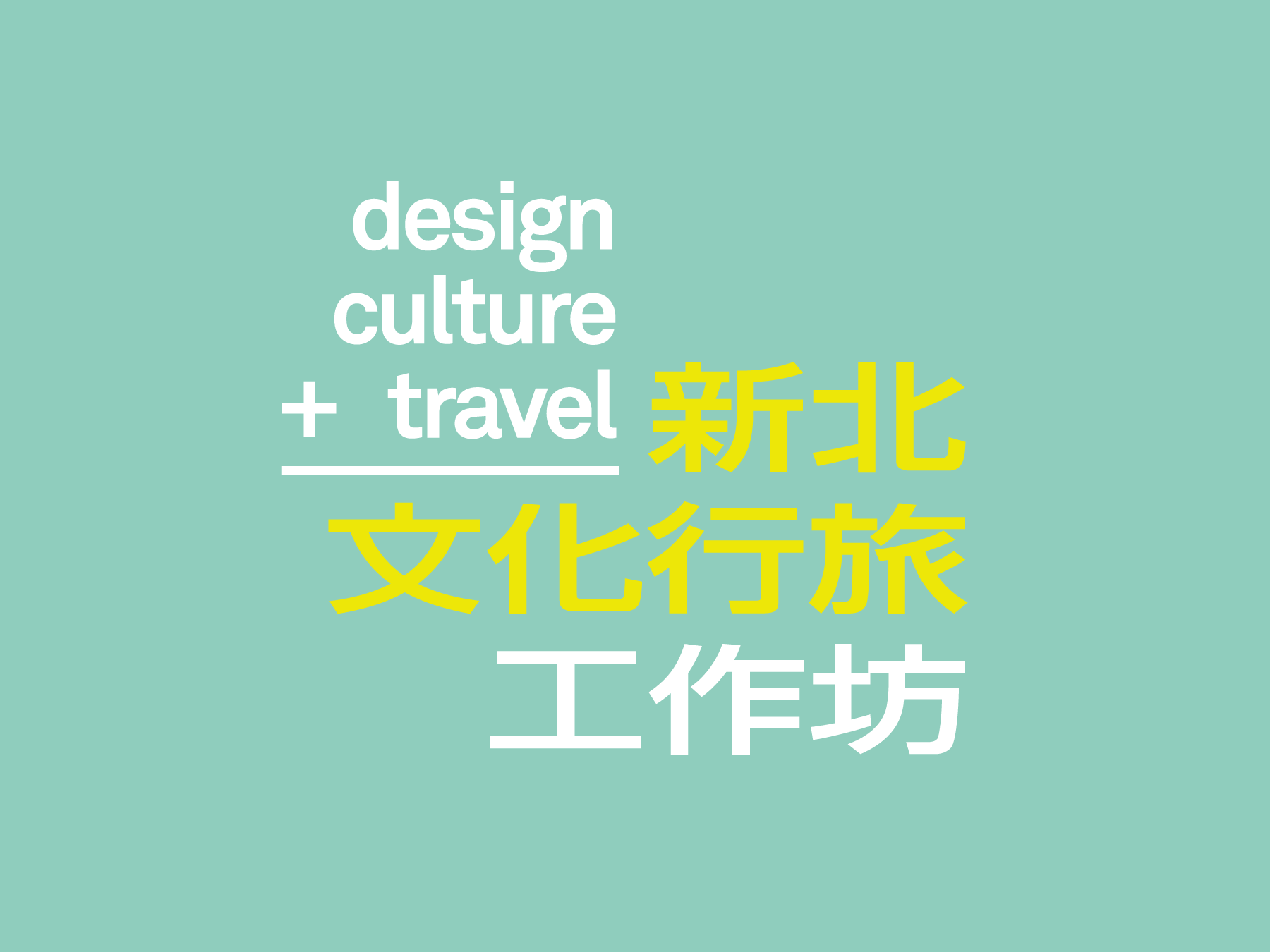
NTC Cultural Design Travel Workshop
新北文化行旅工作坊
We are invited to design the poster for the event "Design and Culture Travel in New Taipei City" for the New Taipei City Culture Foundation. The design reflects the project's theme of cultural exploration and travel, showcasing the diverse cultural experiences that New Taipei City has to offer.
Read more
KEYWORDS
⚑ Lively
⚑ Expressive
⚑ Whimsical
⚑ Joyful
⚑ Lively
⚑ Expressive
⚑ Whimsical
⚑ Joyful
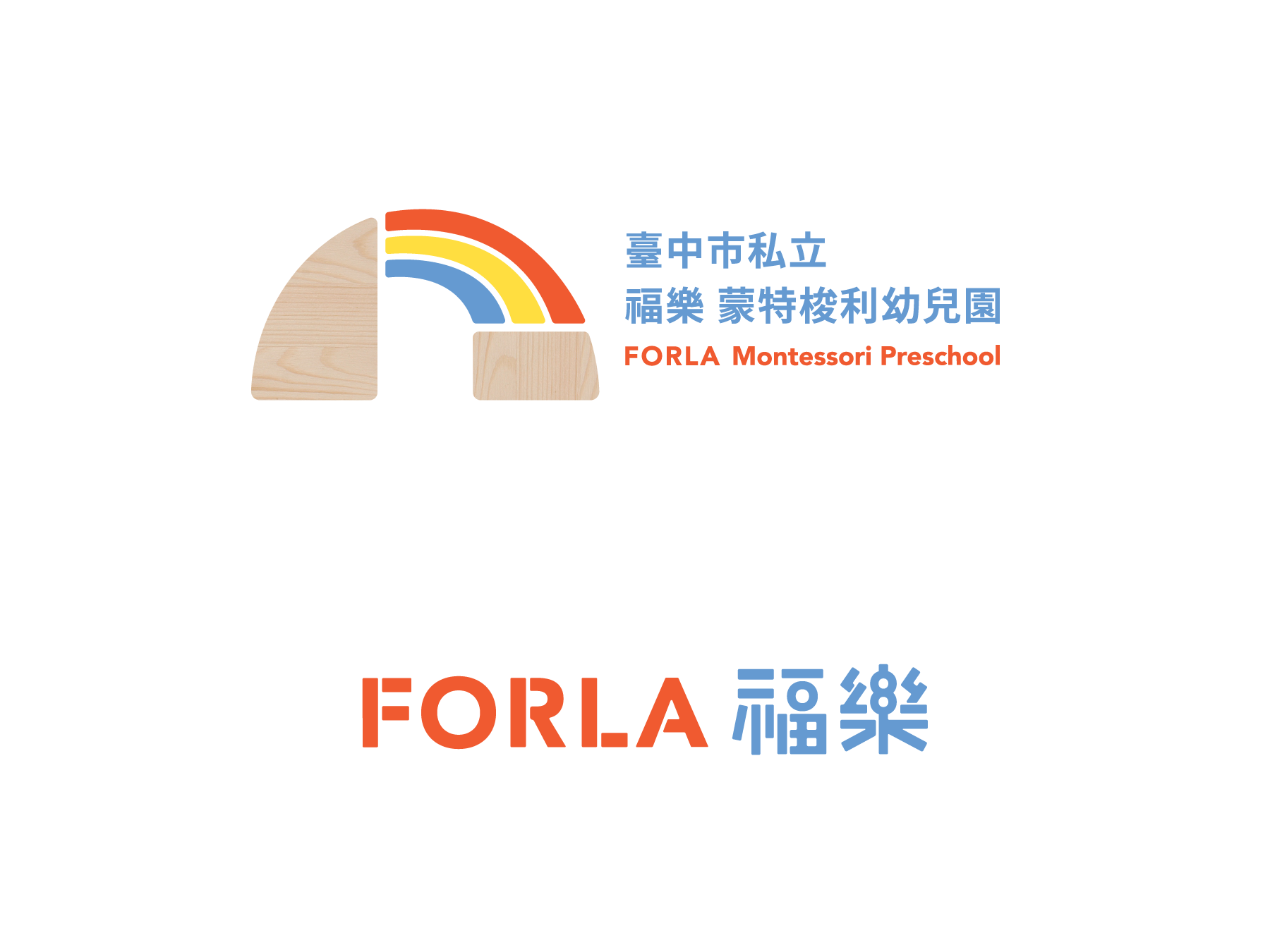


FORLA Montessori Kindergarten
We were tasked with designing a new visual identity for the FORLA Montessori Kindergarten, that celebrated the school's unique teaching method. Drawing inspiration from the Montessori philosophy of learning through play, we created a logo design that used building blocks to represent the foundational skills children learn in their early education.
Read more
KEYWORDS
⚑ Inspiring
⚑ Dynamic
⚑ Nurturing
⚑ Enriching
⚑ Inspiring
⚑ Dynamic
⚑ Nurturing
⚑ Enriching
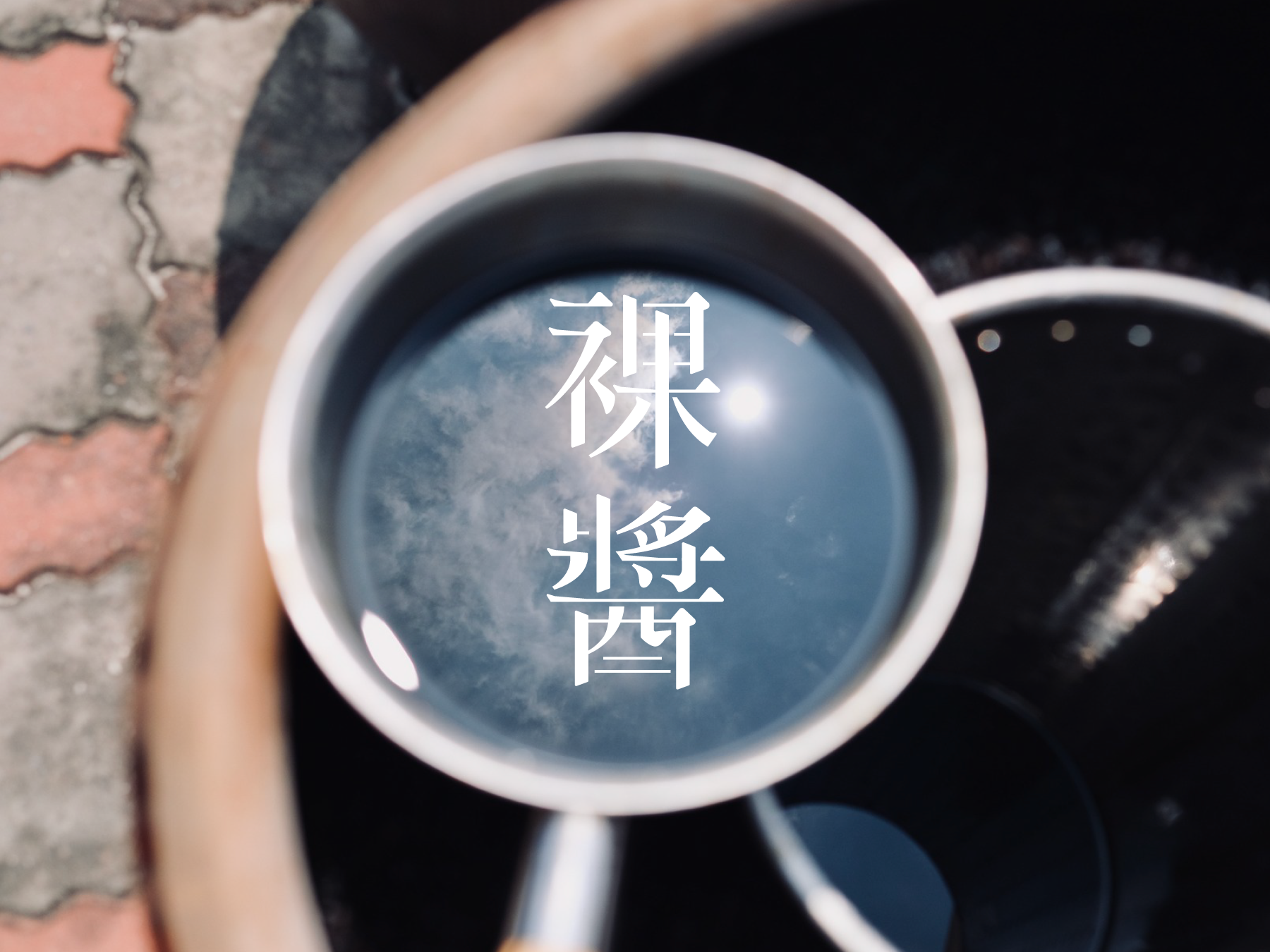


Naked Sauce 祼醬
The packaging design for "Naked Sauce" was commissioned by Yu-ding-xin Soy Sauce Factory (御鼎興純手工柴燒黑豆醬油) , a leading traditional soy sauce manufacturer in Yunlin, Taiwan. This premium soy sauce boasts several unique features, including a three-year aged dry pot oil, a nitrogen content of 2.35, and an annual production schedule.
Read more
KEYWORDS
⚑ Timeless
⚑ Handcrafted
⚑ Artisanal
⚑ Elegant
⚑ Timeless
⚑ Handcrafted
⚑ Artisanal
⚑ Elegant
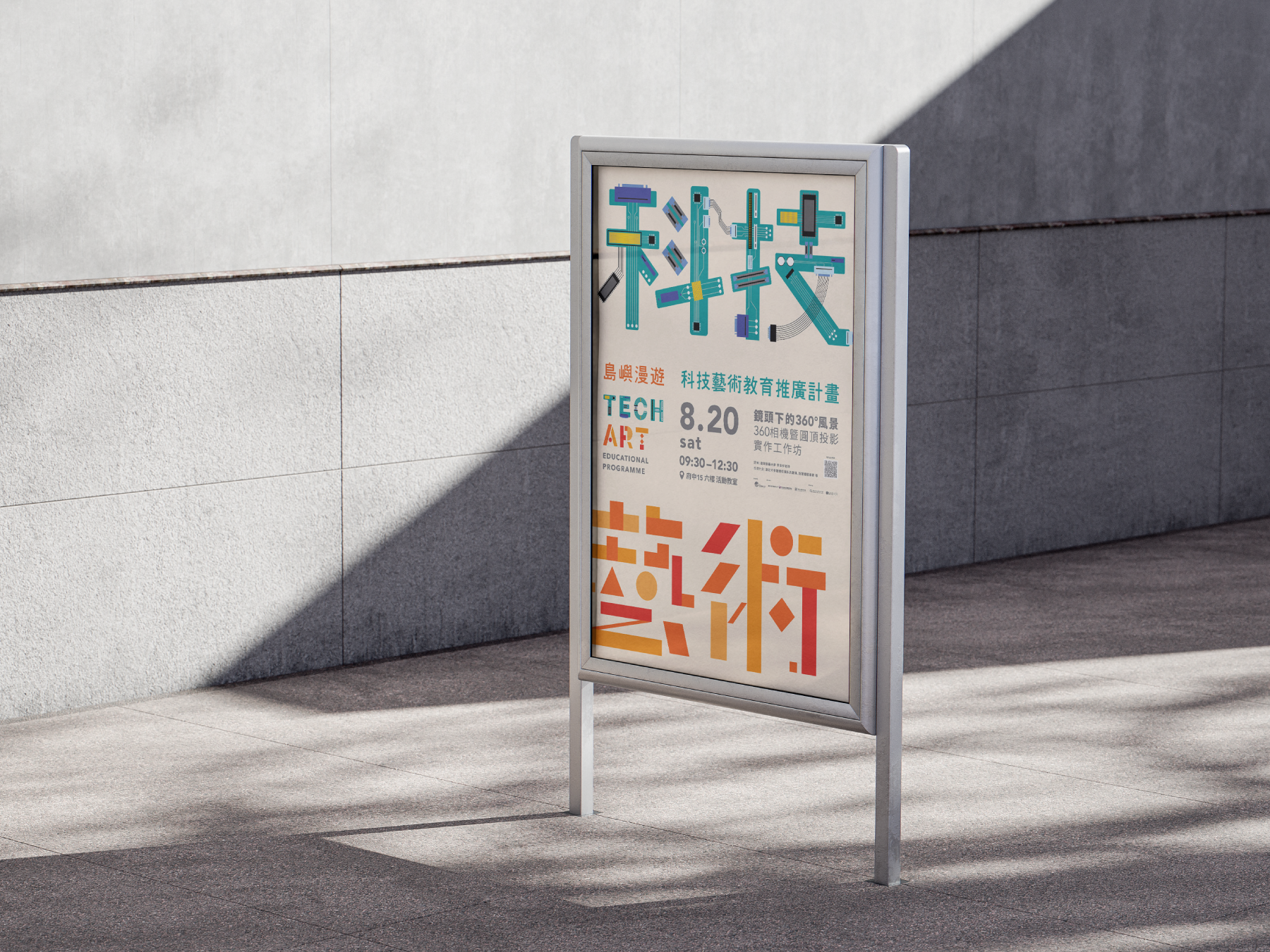


Technologies and Arts Educational Programme
The poster design for the event "Technologies and Arts Educational Programme". Invited by the New Taipei City Culture Foundation, we created a design that intuitively combines the words "Tech" and "Art" to create a typographical key visual.
Read more
KEYWORDS
⚑ Vibrant
⚑ Educational
⚑ Inspiring
⚑ Youthful
⚑ Vibrant
⚑ Educational
⚑ Inspiring
⚑ Youthful

The Source 所以生活
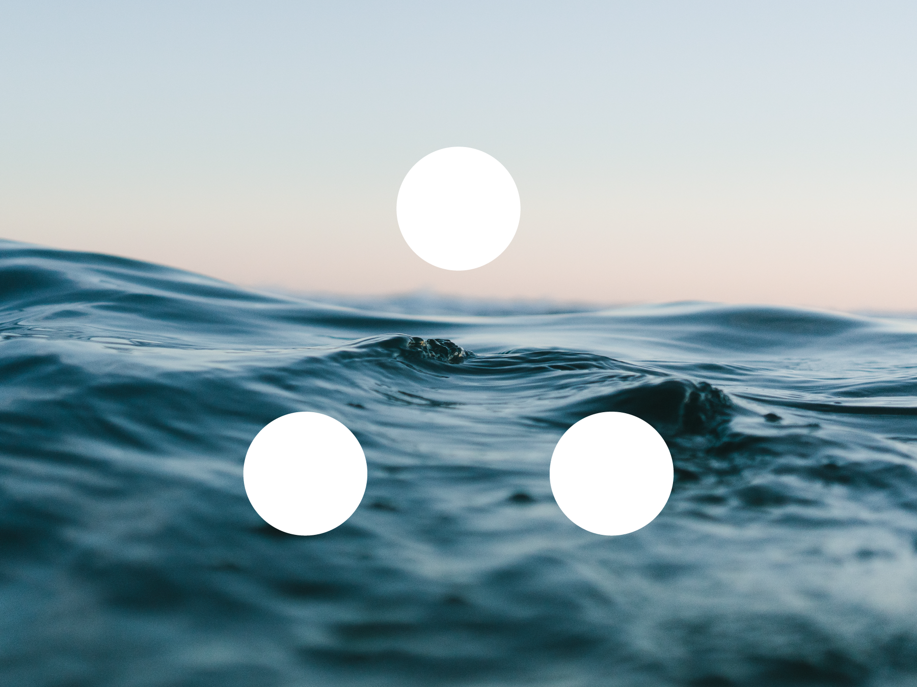
We were invited to manage the brand image for "所以生活 the source", a brand that focuses on household and body cleaning products derived from the ocean's materials and elements. The brand's environmental-friendly approach, promoting the use of fossil-free chemicals in their products, was the inspiration for the minimalistic design, which embodies a fresh and zen vibe.
Read more
KEYWORDS
⚑ Oceanic
⚑ Zen
⚑ Simple
⚑ Eco
⚑ Oceanic
⚑ Zen
⚑ Simple
⚑ Eco
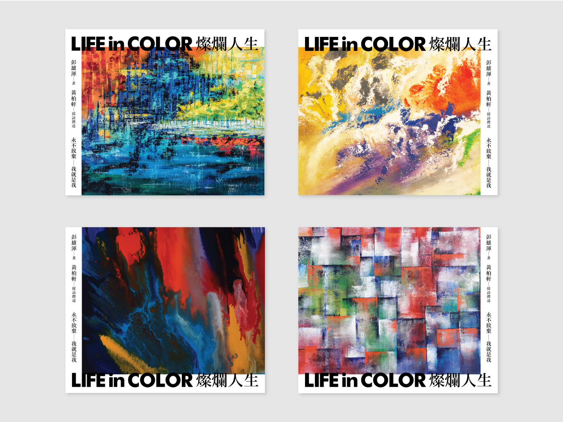
LIFE IN COLOUR by Stephen Peng
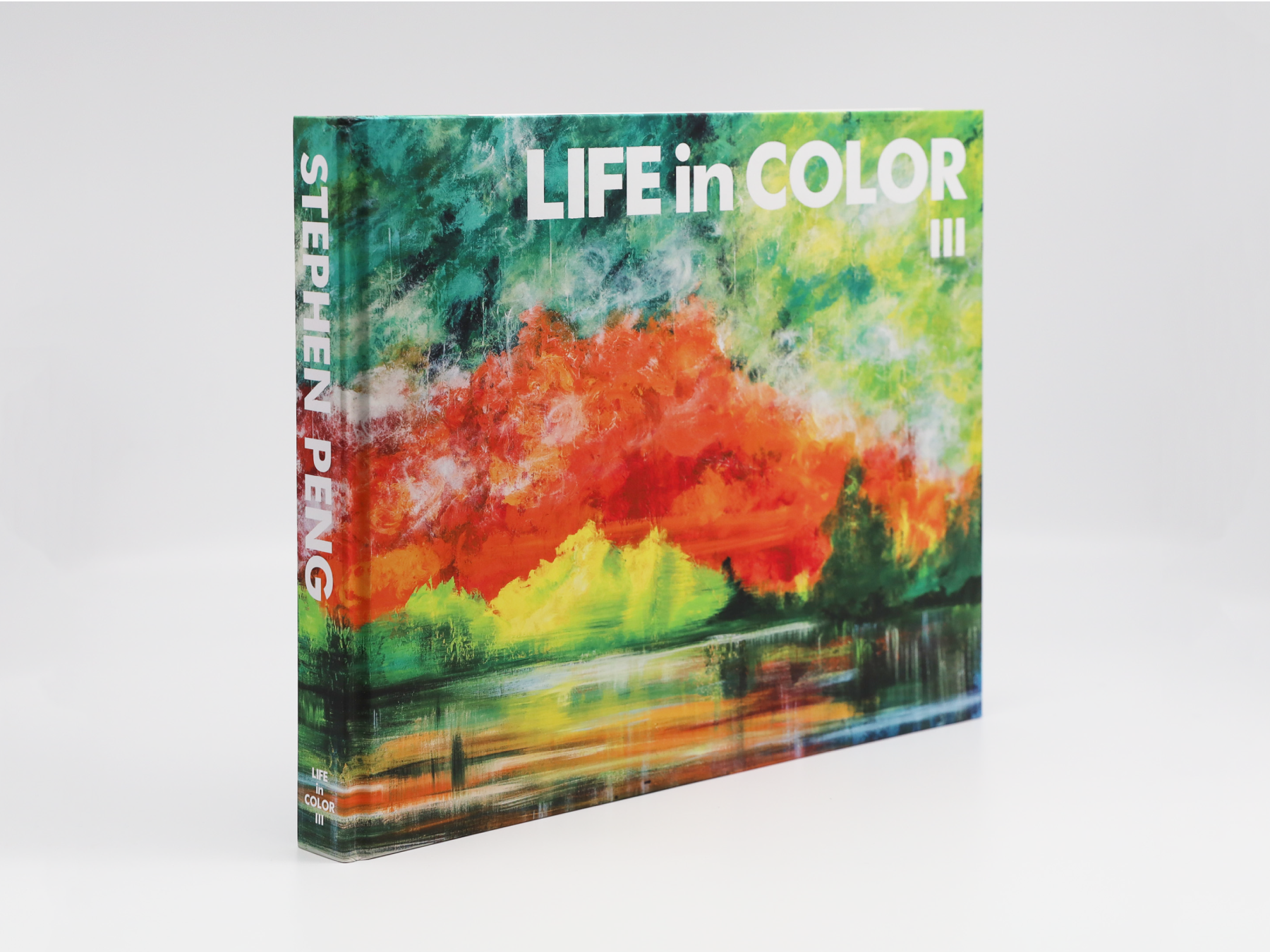
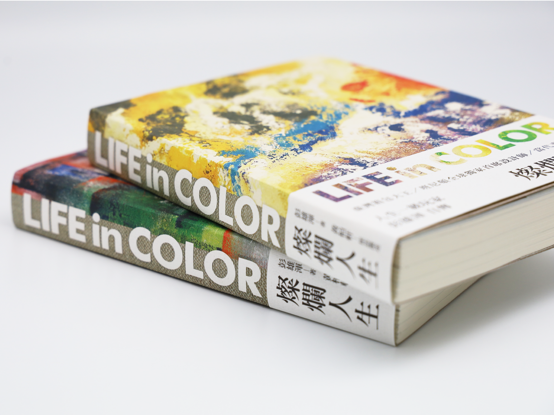
We were thrilled to take on the comission of designing the LIFE IN COLOUR art book series for Stephen Peng. With his mesmerizing abstract paintings as the centerpiece, we wanted to create a design that would complement the artwork and bring out its full beauty. Each book in the series showcases a different period of Peng's artistic journey.
Read more
KEYWORDS
⚑ Honoring
⚑ Respectful
⚑ Reverent
⚑ Honoring
⚑ Respectful
⚑ Reverent

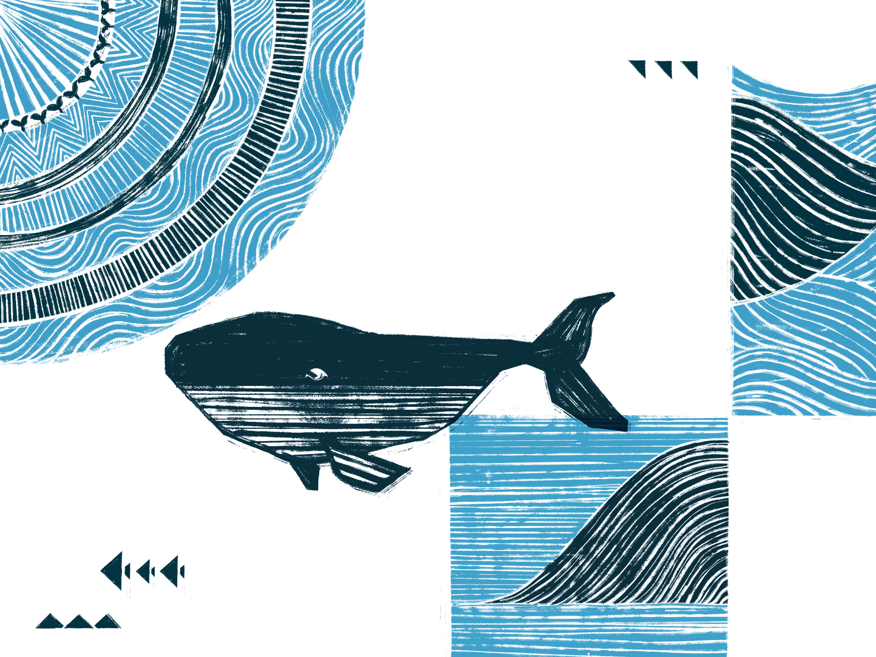
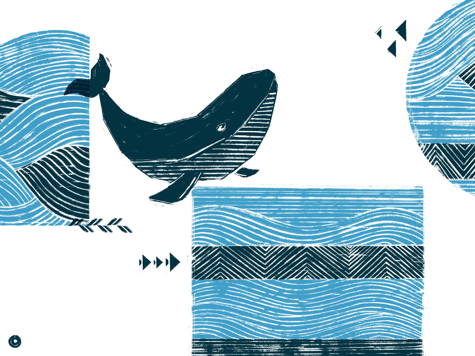
Wasangshow 花生騷 Cooltime Series
Wasangshow embodies a unique brand concept, where modern indigenous culture meets the world of fashion. For this project, I was tasked with creating a design that captured the essence of a cool summer vibe while staying true to the theme of the well-known story - "Whales & Ocean."
Read more
KEYWORDS
⚑ Oceanic
⚑ Summer
⚑ Cultural Fusion
⚑ Oceanic
⚑ Summer
⚑ Cultural Fusion
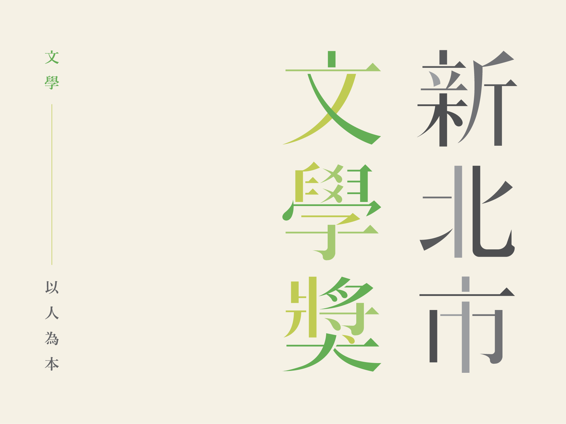
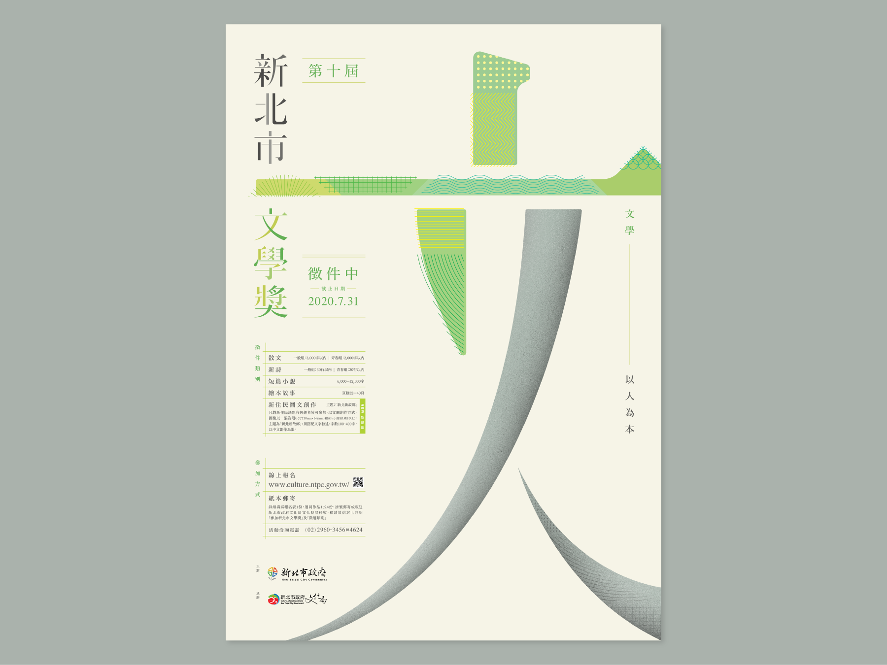
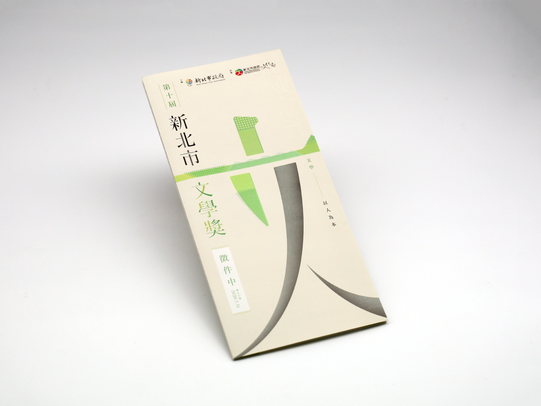
10th New Taipei City Literature Award
第十屆新北市文學獎
For the 10th New Taipei City Literature Award, we were invited by the New Taipei City Cultural Bureau to create a visual design that would showcase the importance of literature in the community. Our team came up with a unique concept using the Chinese character "文" as the key visual.
Read more
KEYWORDS
⚑ Literary
⚑ Soft
⚑ Grounded
⚑ Literary
⚑ Soft
⚑ Grounded

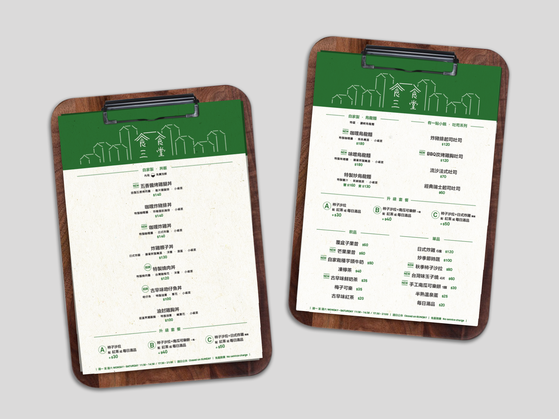
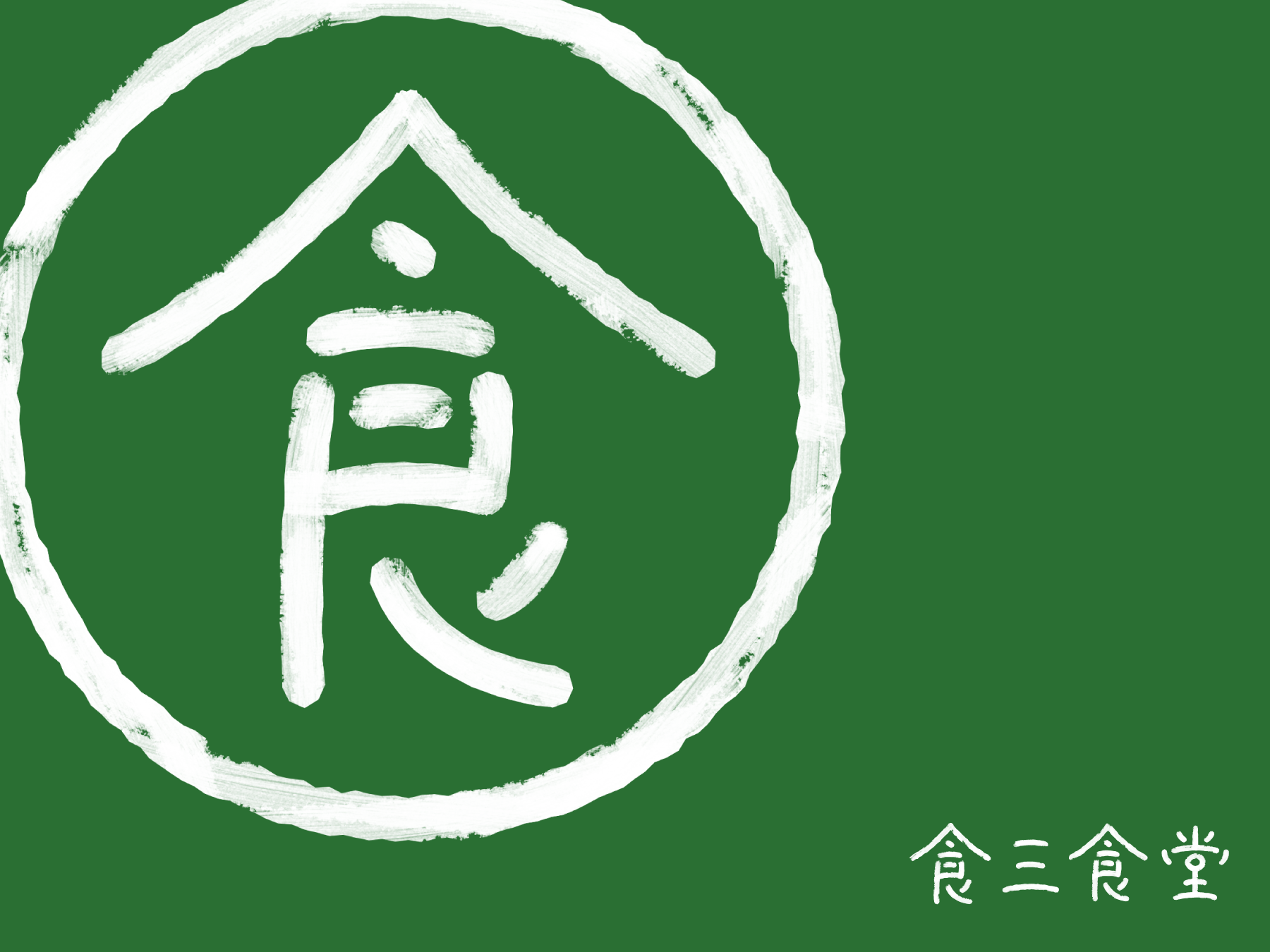
Food Three Bento
食三食堂
Introducing "Food Three Bento," a community restaurant located in the heart of Taipei that serves up delicious and healthy lunch boxes to local residents. The name "Food Three" embodies the concept of a balanced diet, tasty food, and innovative culinary ideas. As the designer behind the brand, our goal was to create a visual identity that connects the neighborhood with the restaurant itself.
Read more
KEYWORDS
⚑ Community
⚑ Inviting
⚑ Flavorful
⚑ Community
⚑ Inviting
⚑ Flavorful
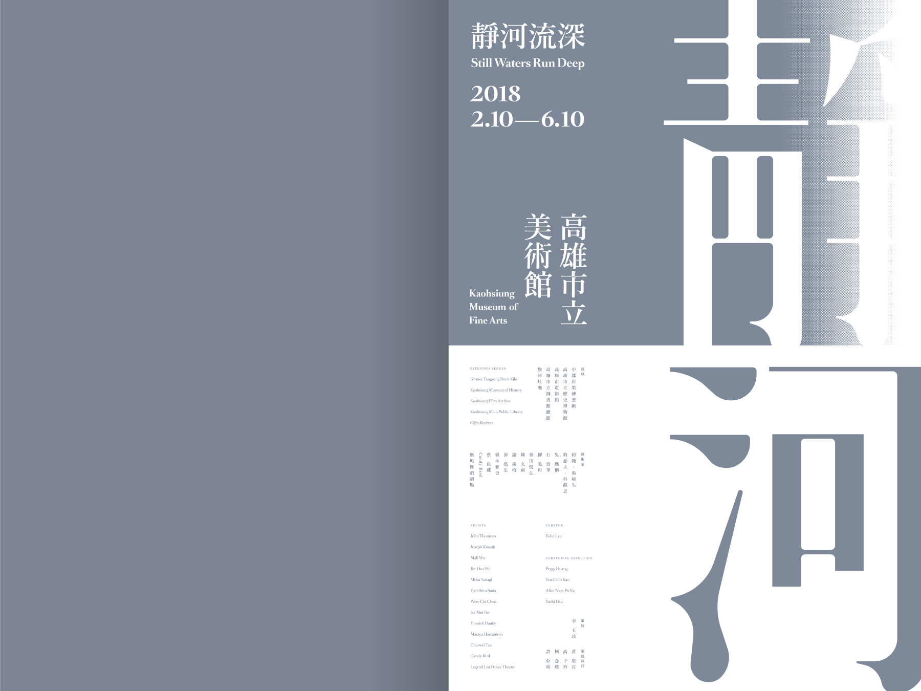
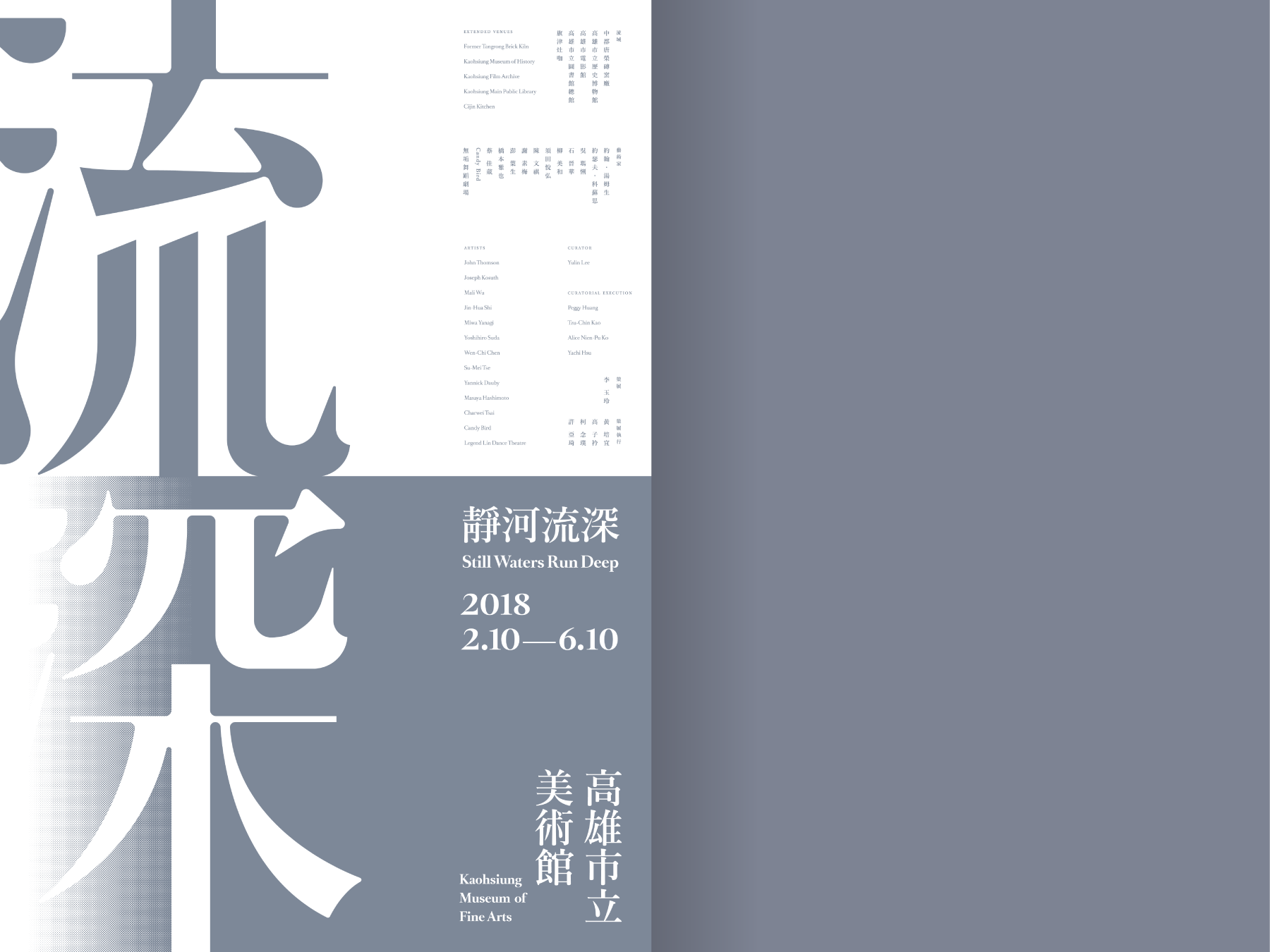

Still Water Runs Deep
靜河流深 art exhibition
We were invited to design the event branding for the "Still Water Runs Deep 靜河流深" art exhibition curated by the Kaohsiung Museum of Fine Arts. This exhibition marked an important debut show after the museum renovation and connected the whole city by running different sites along the Love River, a representing river in Kaohsiung.
Read more
KEYWORDS
⚑ Provoking
⚑ Reflective
⚑ Conceptual
⚑ Poetic
⚑ Provoking
⚑ Reflective
⚑ Conceptual
⚑ Poetic
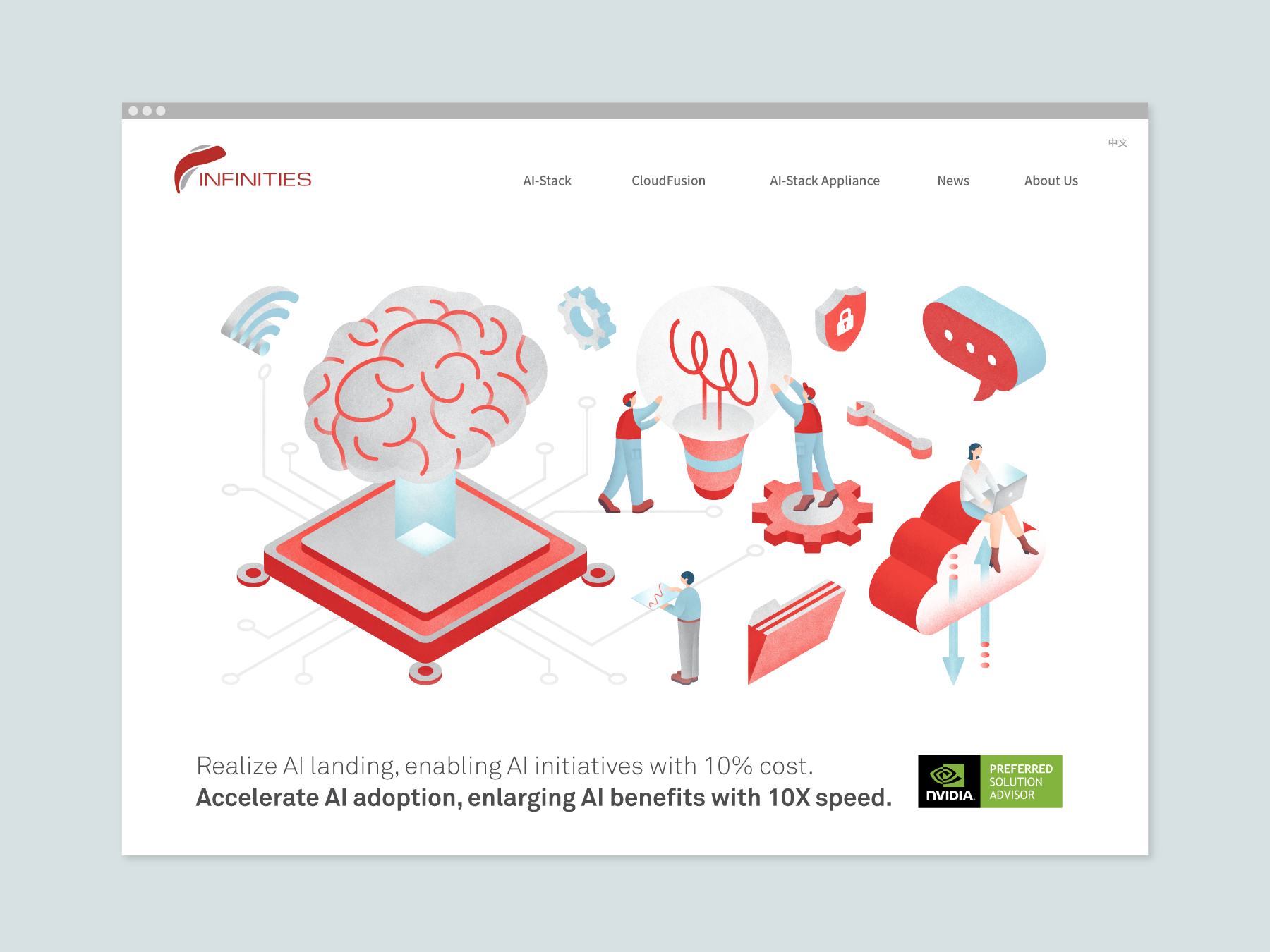
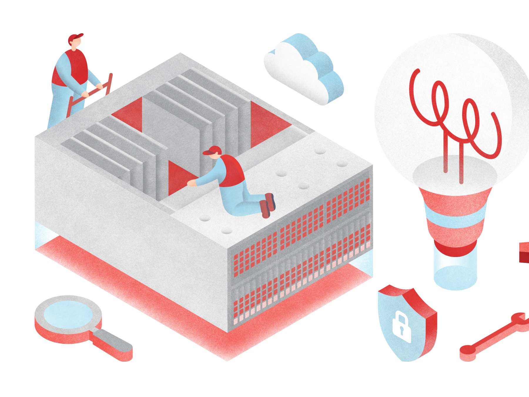

Infinitiessoft
We were invited to design the web and illustration for Infinitiessoft, an AI product company specializing in AI and cloud businesses. Our goal was to create visual materials that could clearly communicate the brand's message to customers. To achieve this, we designed a series of lively characters that inhabit a miniature AI world, which we used in all our illustrations.
Read more
KEYWORDS
⚑ Miniature
⚑ Tech-inspired
⚑ Simplification
⚑ Miniature
⚑ Tech-inspired
⚑ Simplification
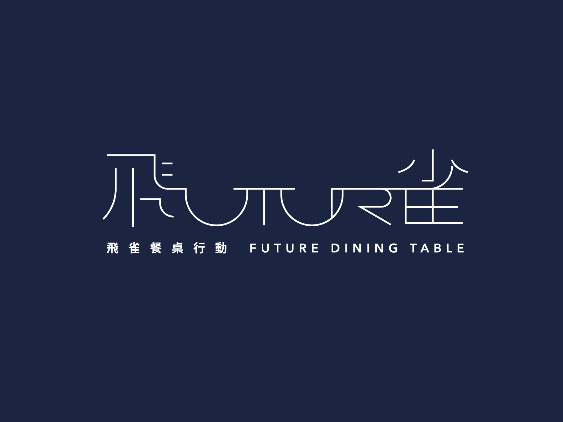
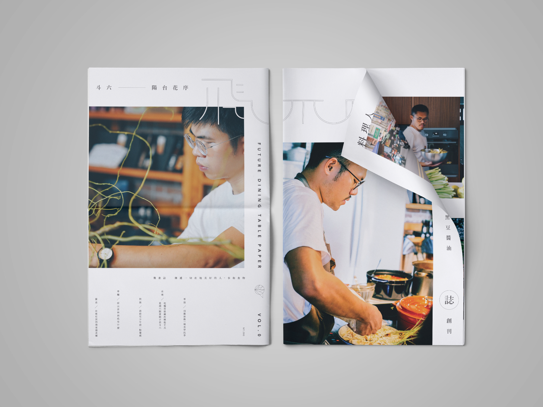
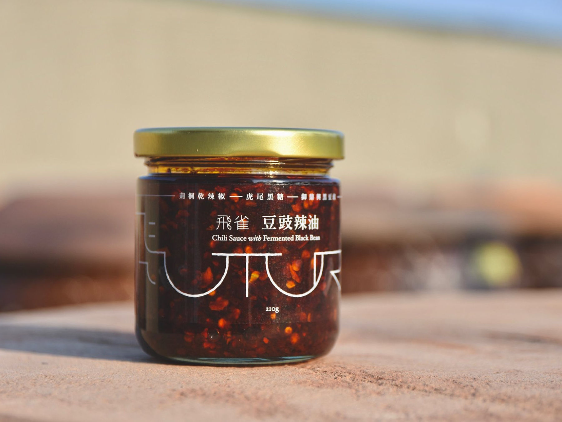
Future Dining Table Project
飛雀餐桌計劃
the Visual Identity Design for the Future Dining Table Project, a unique event that links the culture of food in Yunlin, Taiwan. This project curates events such as exhibitions, talks, dining experiences, and local tours.
Read more
KEYWORDS
⚑ Sustainable
⚑ Local
⚑ Community-driven
⚑ Rustic
⚑ Sustainable
⚑ Local
⚑ Community-driven
⚑ Rustic
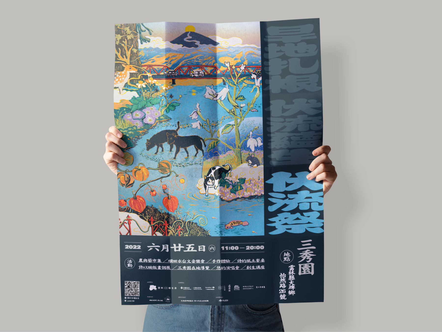
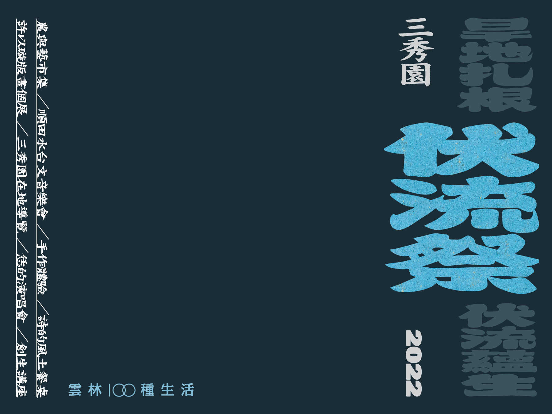
伏流祭 2022
We had the honor of working on the event branding design for "伏流祭", a celebration of the rich food and culture of Yunlin. The key visual, created by a local artist, captured the essence of the city's unique charm and character.
Read more
KEYWORDS
⚑ Festivity
⚑ Celebration
⚑ Cultural
⚑ Festivity
⚑ Celebration
⚑ Cultural
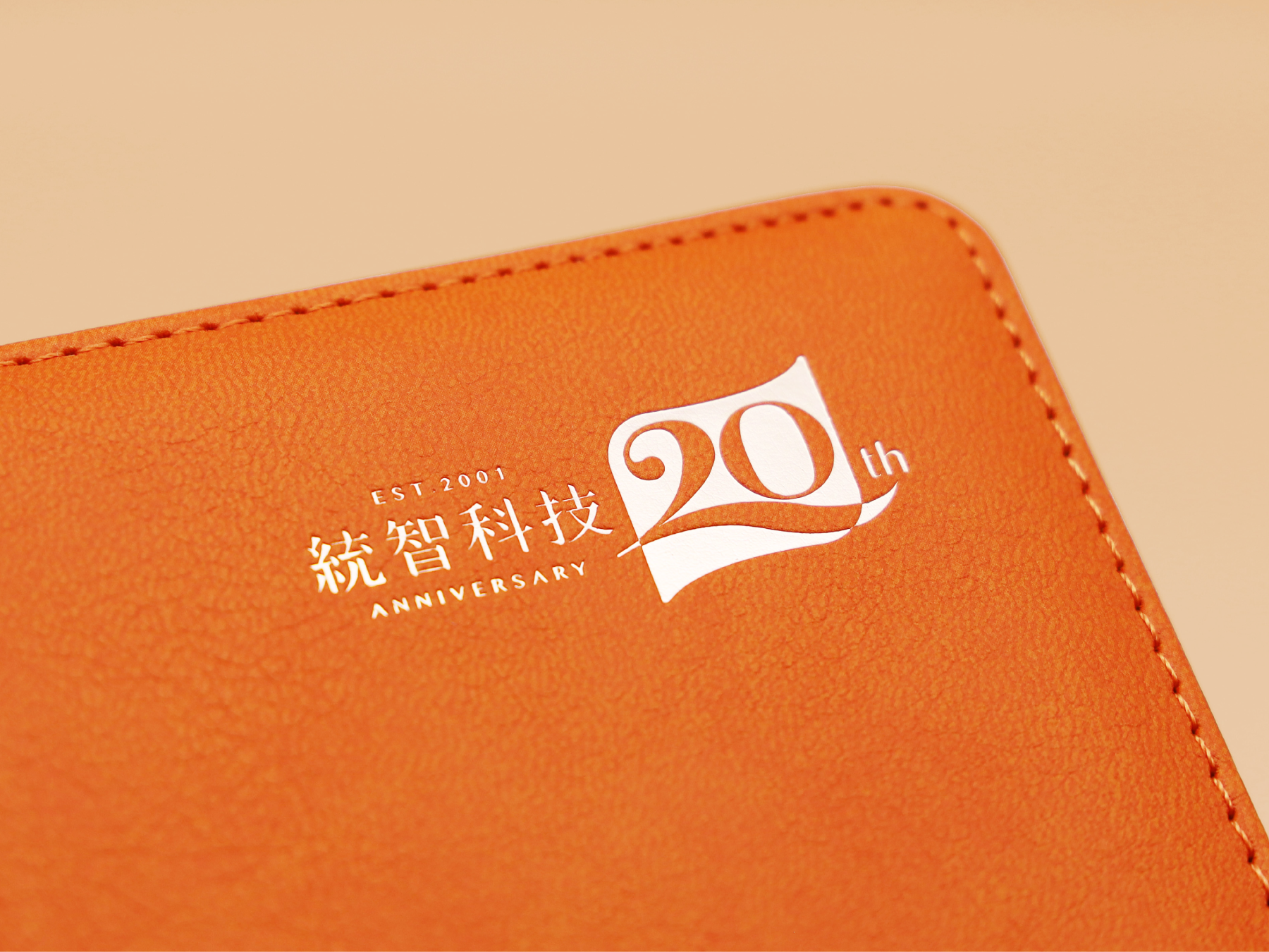


President Technology Corp. 20th Anniversary
We were invited by President Technology Corp. to design a campaign for celebrating their 20th anniversary, aiming to emphasize the brand's value and vision. Our team designed a commemorative diary as a complimentary gift for clients and staff, showcasing the company's heritage and values.
Read more
KEYWORDS
⚑ Appreciation
⚑ Legacy
⚑ Heritage
⚑ Appreciation
⚑ Legacy
⚑ Heritage

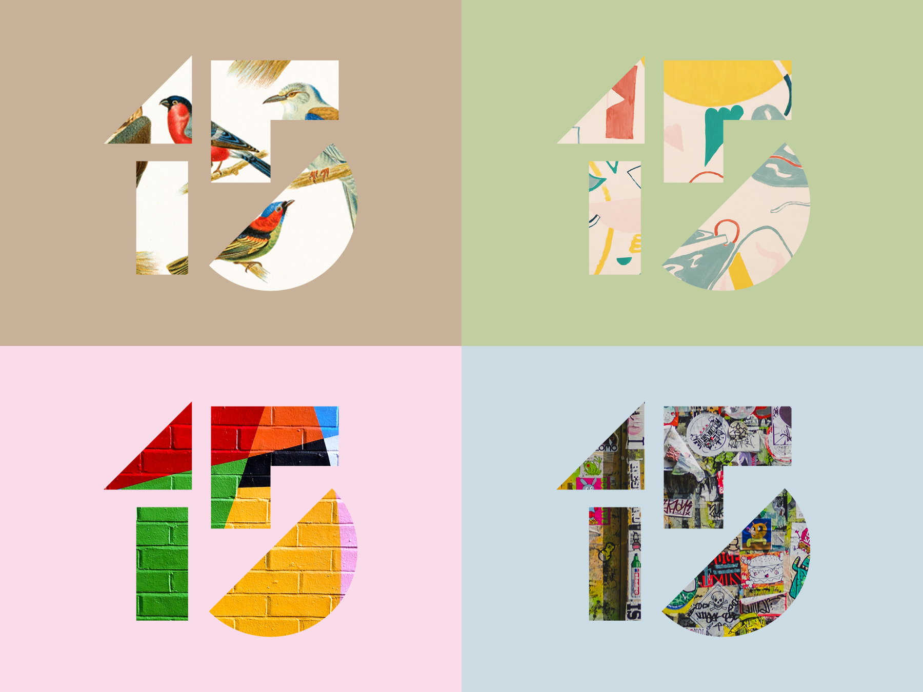

Fuzhong 15 Museum 府中15
Designing for a teen-oriented museum is no easy feat, but with the Fuzhong 15 project, we wanted to create a visual identity that was both fun and educational. Our aim was to appeal to young adults and make learning exciting through multimedia education topics.
Read more
KEYWORDS
⚑ Bold
⚑ Energetic
⚑ Youthful
⚑ Interactive
⚑ Bold
⚑ Energetic
⚑ Youthful
⚑ Interactive

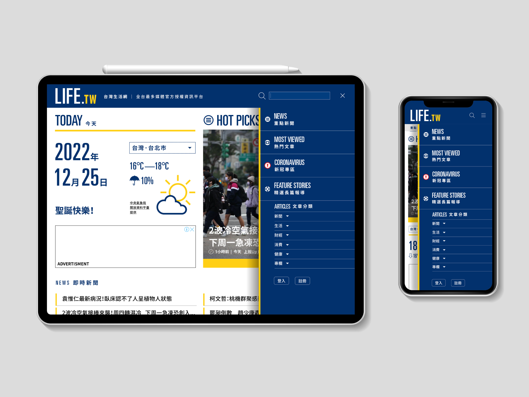
LIFE.TW
Life.tw is a widely popular news channel website that attracts millions of visitors each day. As a designer for this project, I was tasked with creating a new logo design and UI/UX for the website. The new logo design is a simple yet modern typographic treatment that uses the classic DIN typeface. The clean and minimal design of the logo conveys a sense of trust and credibility, which is important for a news platform.
Read more
KEYWORDS
⚑ Clarity
⚑ Neutrality
⚑ Informative
⚑ Clarity
⚑ Neutrality
⚑ Informative
Habby 樂兒租
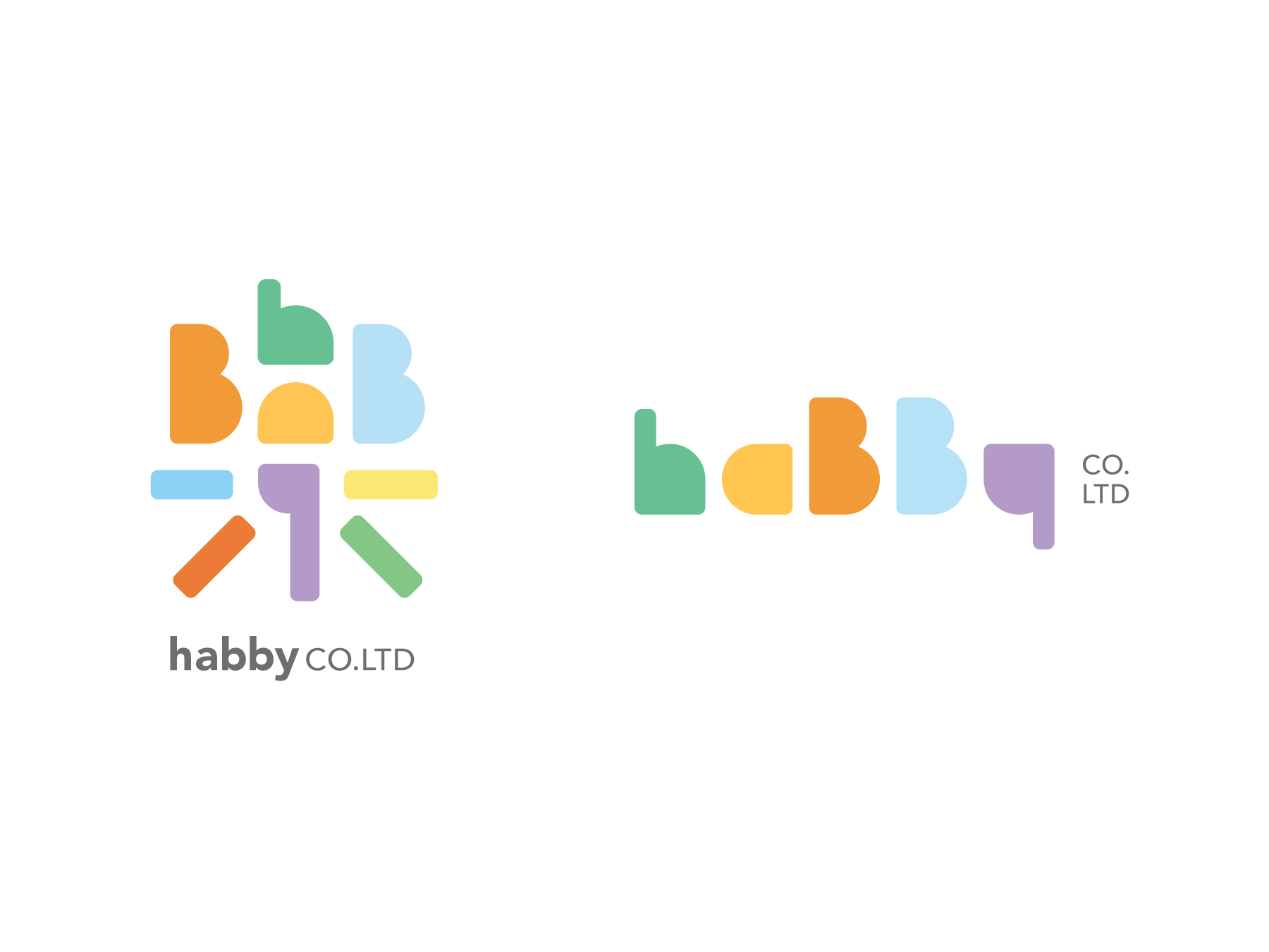
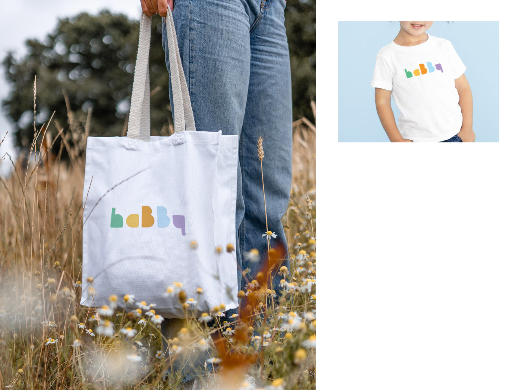
A visual identity design project for Habby, a Baby Equipment Rentals company that offers easy rental service for foreign visitors in Taiwan. The design concept takes inspiration from the company's name "Habby - a happy baby" and focuses on the idea of happiness.
Read more
KEYWORDS
⚑ Welcoming
⚑ Colorful
⚑ Child-like
⚑ Comforting
⚑ Welcoming
⚑ Colorful
⚑ Child-like
⚑ Comforting


Taste of the indigenous farmers’ table
原味食桌
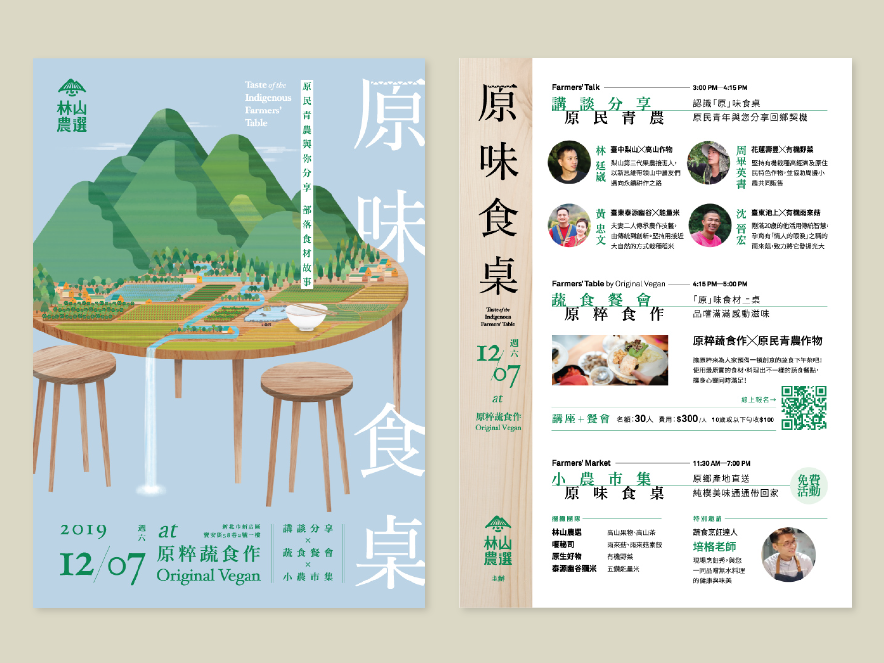
A farm-to-table event that celebrates the best of Taiwanese produce. Organized by Linshan Farmers Select, this event is a feast for the senses, featuring talks, a small market, and a unique dining experience that showcases the natural beauty of Taiwan.
Read more
KEYWORDS
⚑ Farm-to-table
⚑ Indigenous
⚑ Flavorful
⚑ Farm-to-table
⚑ Indigenous
⚑ Flavorful

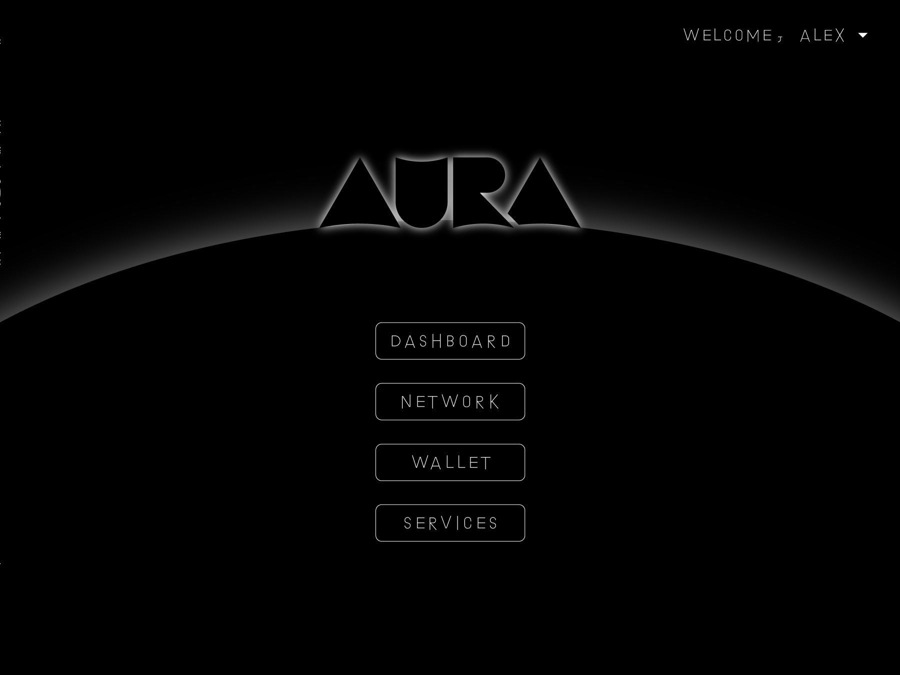

AURA Crypto-betting Platform
We are invited to design the UI/UX Design for the brand new platform for online cryto-betting & mining. The ground breaking idea of creating a game like experience for young investors of crypto-currency invenstment. We also designed the visual identity for the brand.
Read more
KEYWORDS
⚑ Gaming
⚑ Chic nerd
⚑ Mysterious
⚑ Puzzled
⚑ Gaming
⚑ Chic nerd
⚑ Mysterious
⚑ Puzzled

Hi there!
Hey, lovely people browsing through my portfolio! I hope you're enjoying your time here. Just wanted to give you a quick heads up - I'm sorry for the delay in uploading my recent work. Turns out, being a designer is a lot like being a circus performer - constantly juggling multiple projects at once! Stay tuned and keep smiling!
KEYWORDS
⚑ Overload
⚑ Brain Rent
⚑ A nap
⚑ or 5...
⚑ Overload
⚑ Brain Rent
⚑ A nap
⚑ or 5...
