New Taipei City Music & Art Festival 2024 生音藝術節
2024

𒊹︎︎︎ Event Visual Identity
𒊹︎︎︎ Integrated Design
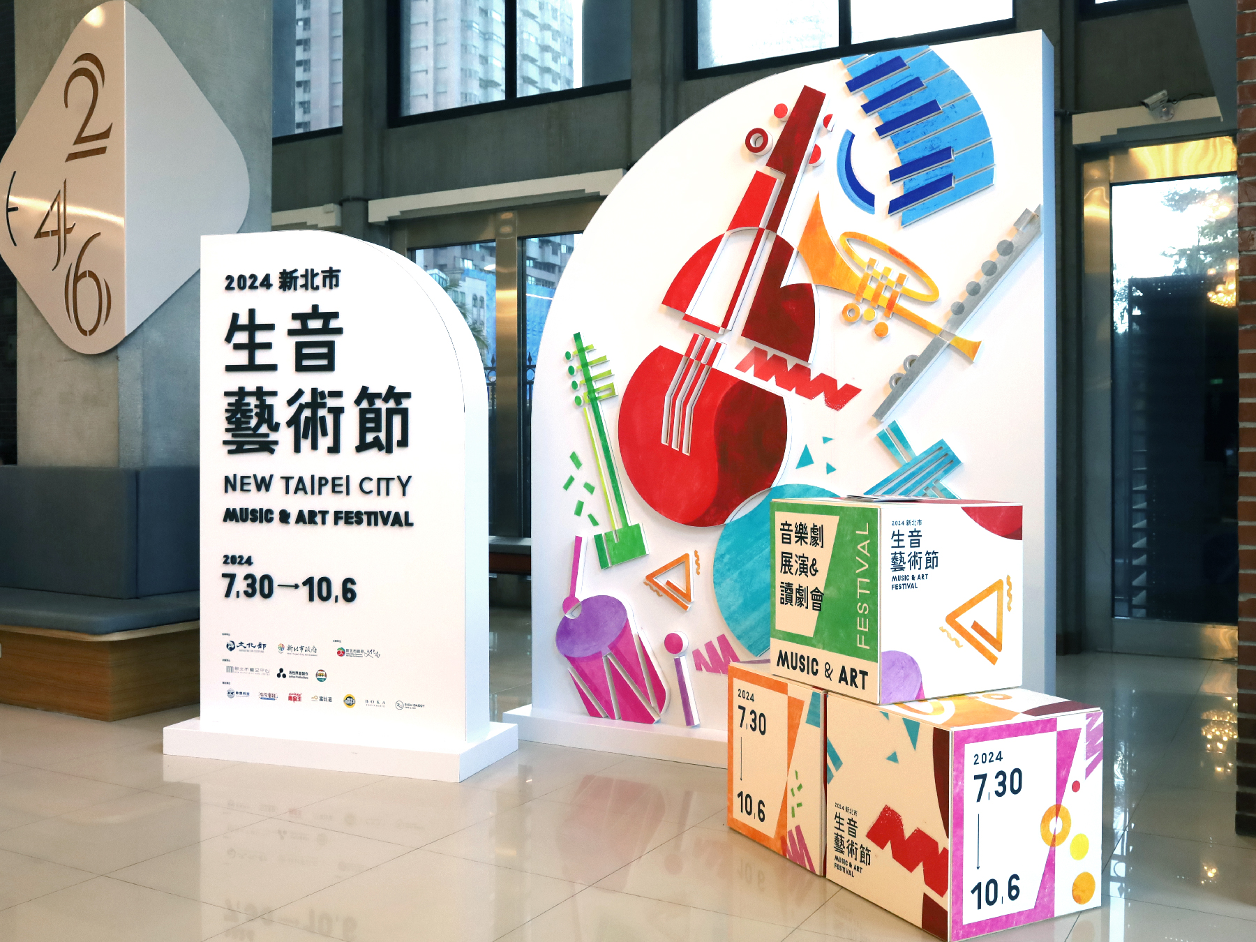
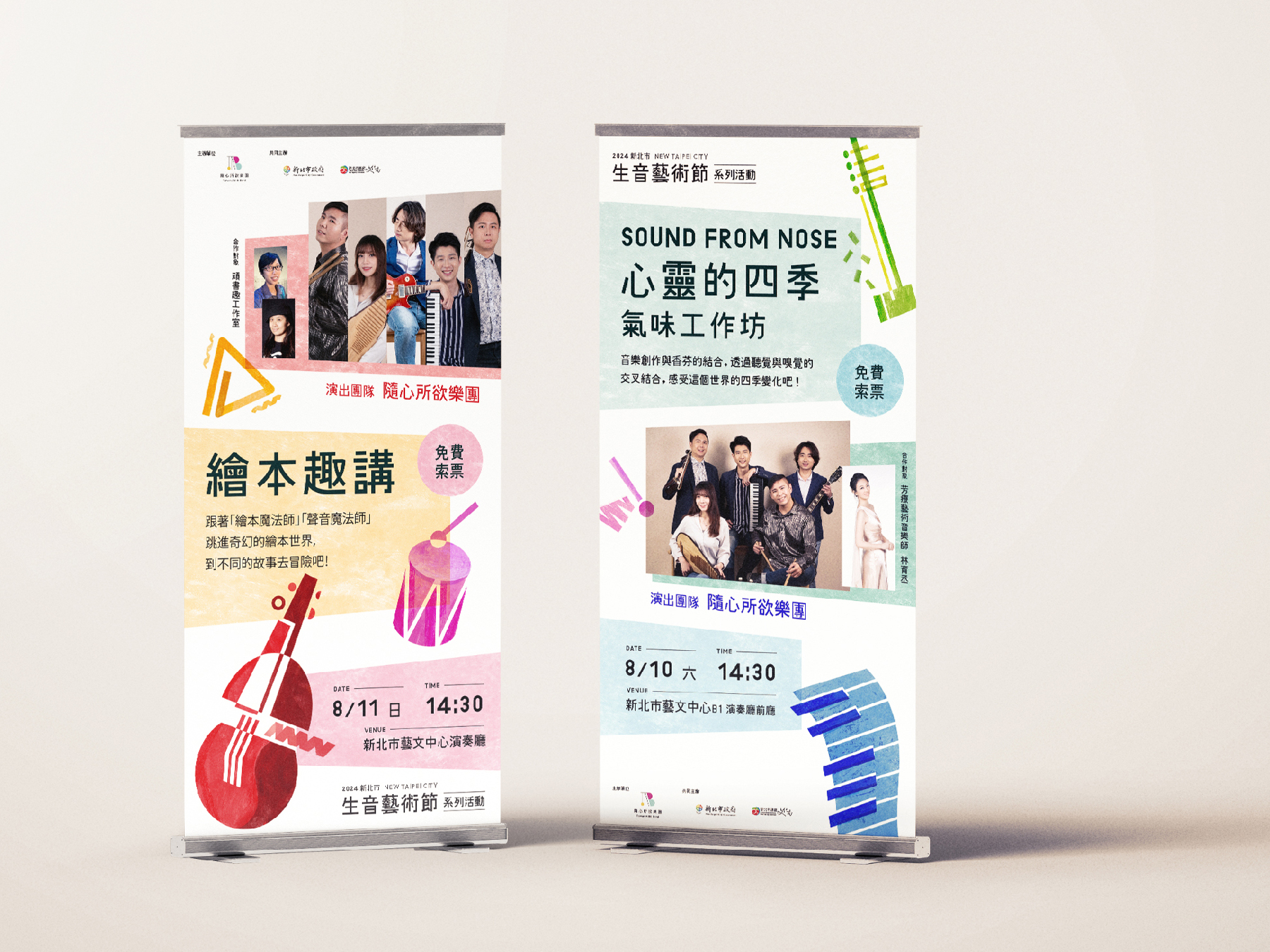
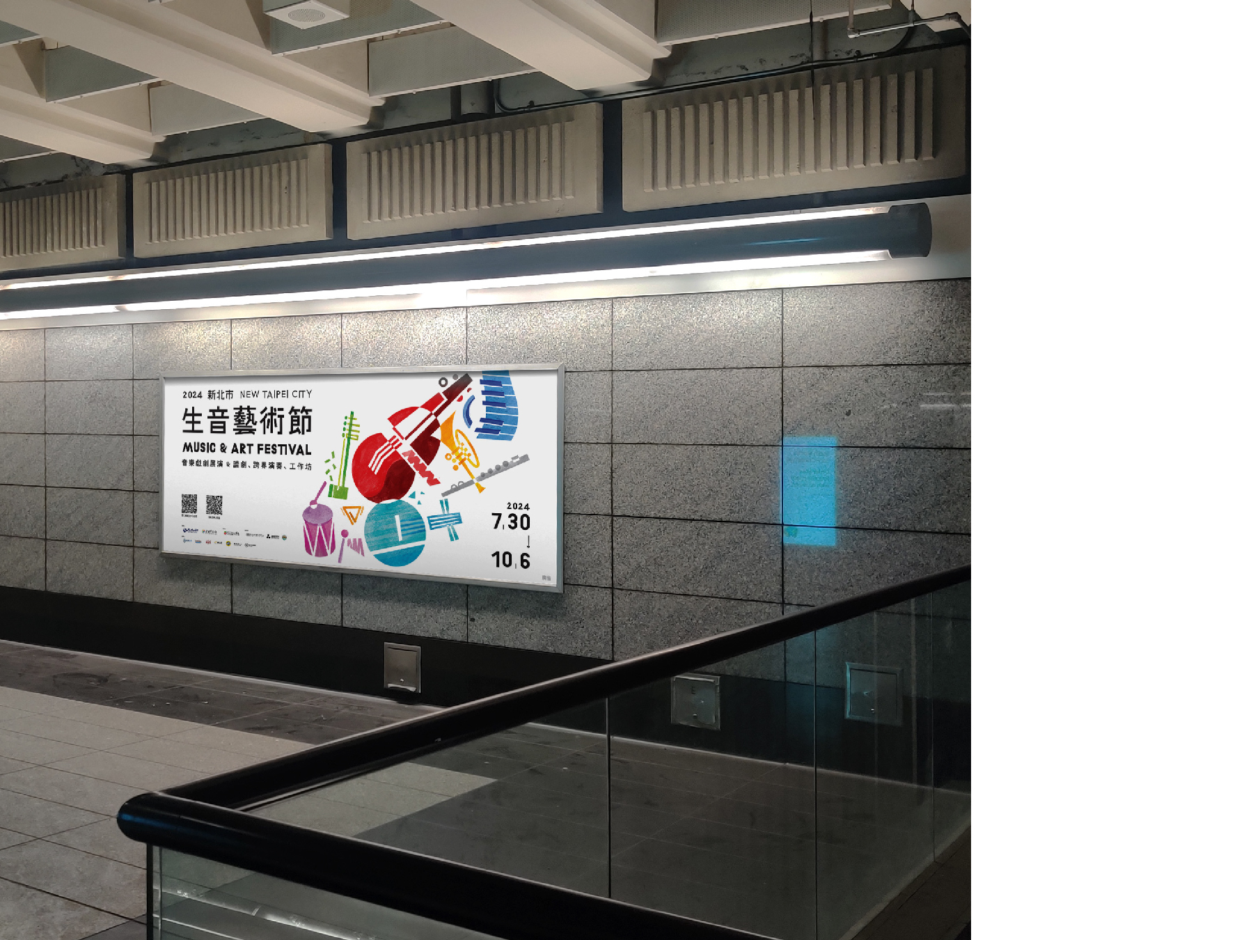
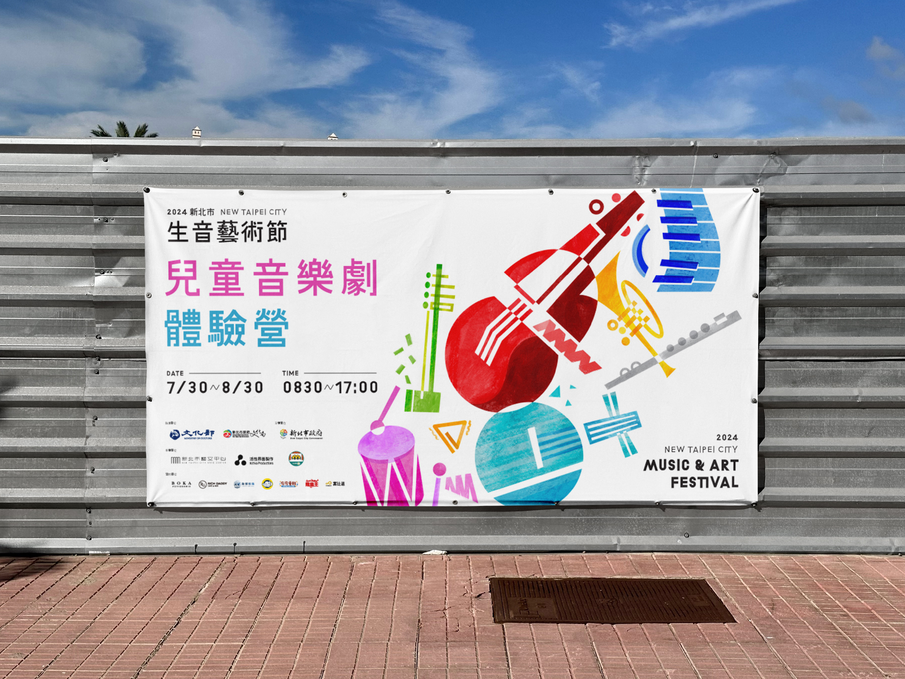
For the NTC 2024 Music & Art Festival visual campaign, we crafted a vibrant and dynamic visual identity that captures the festival’s spirit of creativity, diversity, and joy. Spanning from July to October, the festival integrates the well-established New Taipei Musical Festival and Rising Stars in Music, featuring cross-disciplinary music salons, theatrical performances, and children's musical theater workshops.
Our design concept revolves around geometric representations of musical instruments, symbolizing the harmony between different art forms. By incorporating bold colors and playful compositions, we aimed to reflect the festival’s energetic and inclusive atmosphere, inviting audiences of all ages to immerse themselves in a world where music and art come alive. The result is a visually engaging campaign that not only enhances the festival’s identity but also amplifies its mission to celebrate artistic expression and community engagement.
新北市 2024 生音藝術節 視覺設計以充滿活力與動感的視覺語言,展現藝術節的多元、創意與歡樂氛圍。今年藝術節自 7 月至 10 月舉行,結合 新北音樂劇節 與 樂壇新星 兩大品牌,活動內容涵蓋跨領域音樂沙龍、音樂戲劇展演、兒童音樂劇體驗營等,邀請國內優秀的青年音樂家與音樂劇團隊共同策劃,帶來豐富精彩的音樂藝術體驗。
我們的設計概念以 幾何化的樂器圖像 為核心,象徵不同藝術形式的交融與對話。透過 鮮明的色彩運用與活潑的構圖,營造出熱情洋溢且充滿感染力的視覺效果,吸引各年齡層的觀眾參與其中。整體視覺不僅塑造了藝術節獨特的品牌形象,更強化了活動「讓音樂與藝術融入生活、連結社群」的核心精神。
我們的設計概念以 幾何化的樂器圖像 為核心,象徵不同藝術形式的交融與對話。透過 鮮明的色彩運用與活潑的構圖,營造出熱情洋溢且充滿感染力的視覺效果,吸引各年齡層的觀眾參與其中。整體視覺不僅塑造了藝術節獨特的品牌形象,更強化了活動「讓音樂與藝術融入生活、連結社群」的核心精神。
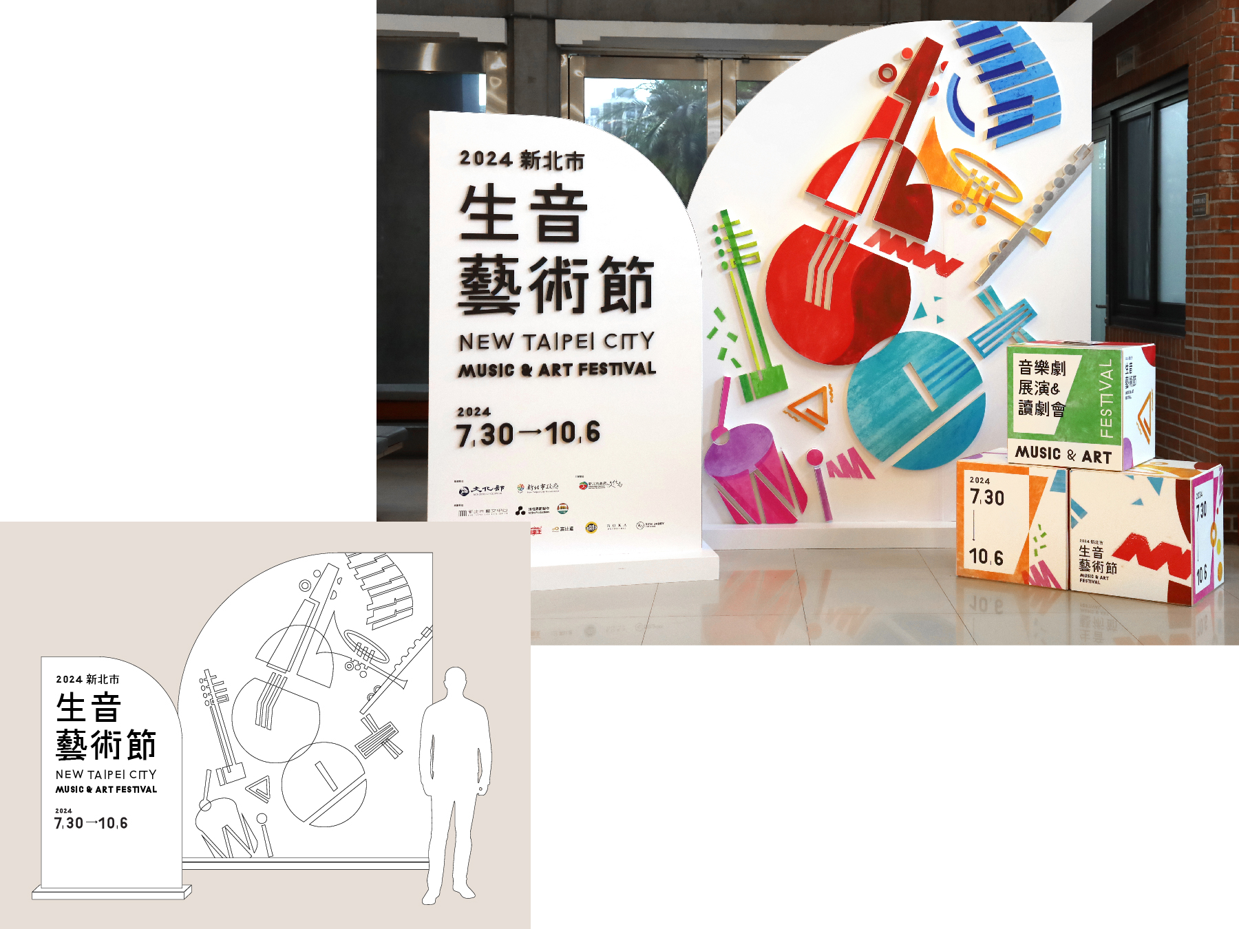
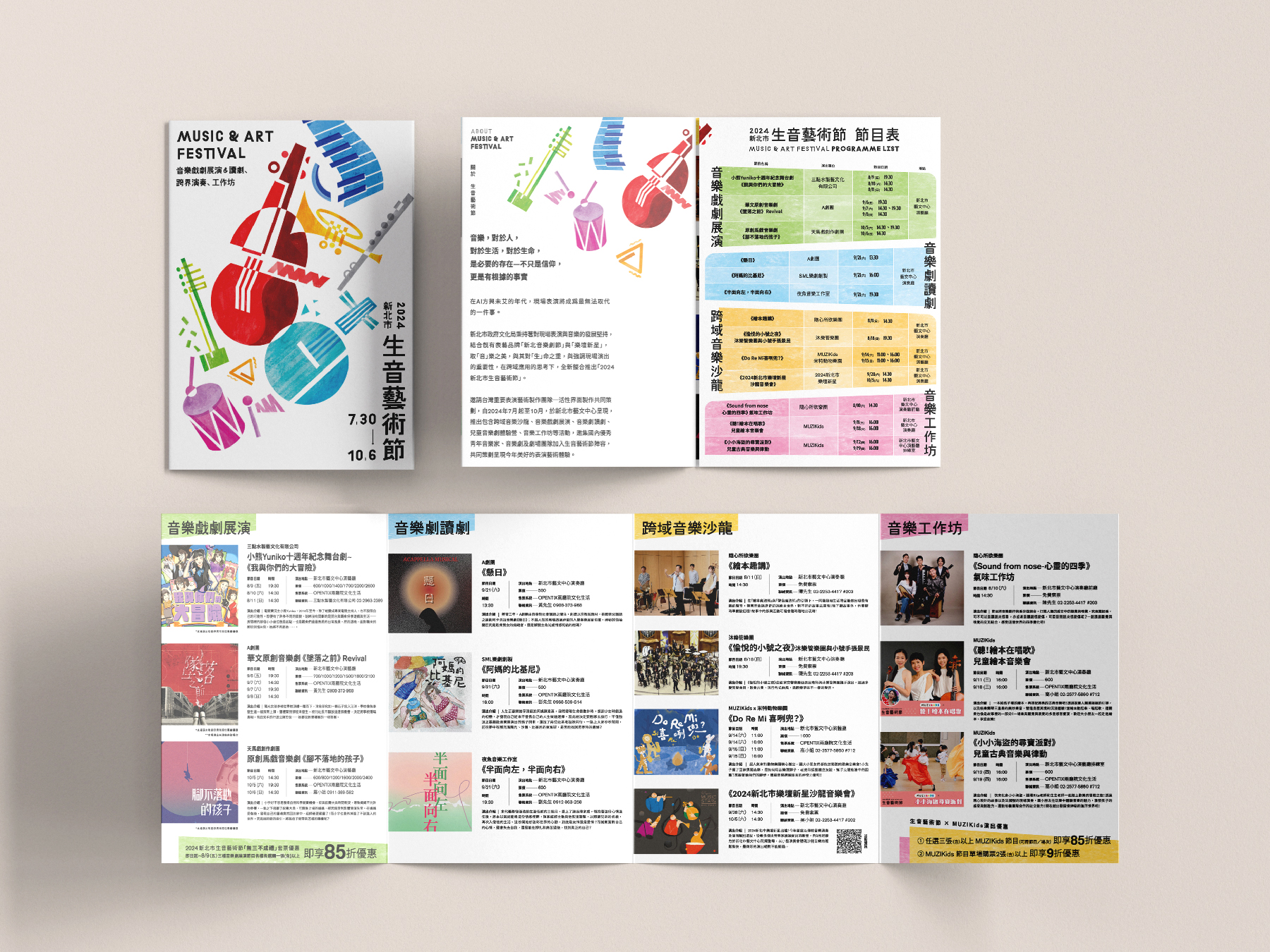
In addition, we prioritize sustainability in physical applications. All POP displays are made from eco-friendly D-Board, ensuring a visually striking yet environmentally responsible design. Instead of printing individual program leaflets for each performance, we have adopted a digital version, reducing paper waste while providing audiences with easy access to event information.
此外,我們在 實體應用 上也特別重視 環保永續 的理念。所有 POP 設計皆採用 環保材質 D-Board,確保設計兼具美觀與環境友善。節目手冊部分,則以 數位化 取代傳統紙本,減少印刷品的浪費,讓觀眾透過電子版本輕鬆獲取節目資訊。
此外,我們在 實體應用 上也特別重視 環保永續 的理念。所有 POP 設計皆採用 環保材質 D-Board,確保設計兼具美觀與環境友善。節目手冊部分,則以 數位化 取代傳統紙本,減少印刷品的浪費,讓觀眾透過電子版本輕鬆獲取節目資訊。
MOVE TO ZERO 藝文永續行動
2021

𒊹︎︎︎ Key Visual Design
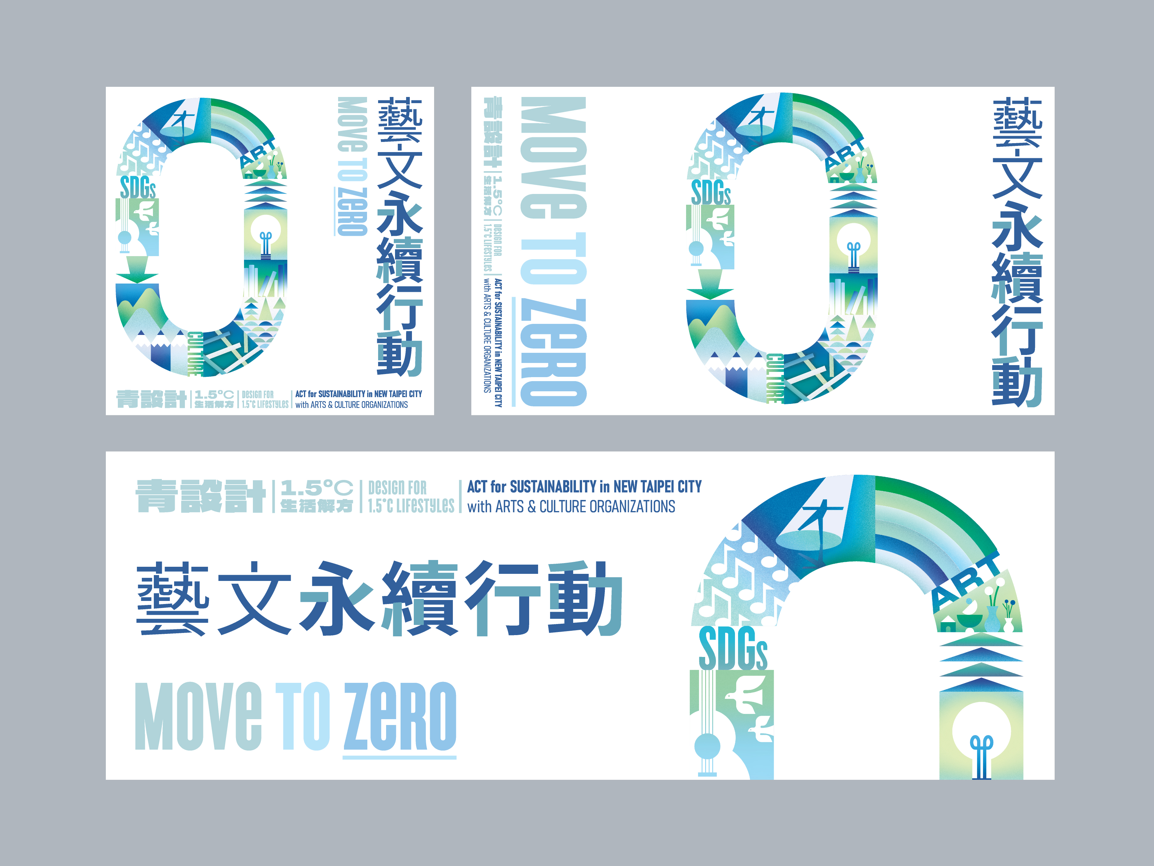
The visual identity for “MOVE TO ZERO 藝文永續行動” is rooted in the concept of transformation—moving from awareness to action toward sustainability in the arts and culture sector. Inspired by the core theme of “0,” the design reinterprets the number zero as a symbol of cyclical renewal and regenerative momentum. This circular motif not only reflects the idea of a continuous, evolving process but also echoes the vision of achieving net-zero emissions through unified action.
-
「MOVE TO ZERO 藝文永續行動」的主視覺設計以「轉化」為核心概念,象徵藝文界從意識到實踐、邁向永續的具體行動。設計靈感源自「0」這個符號,將其轉化為象徵循環與再生動能的圖騰,代表著不斷推進、持續演進的永續旅程,同時呼應淨零排放的願景。
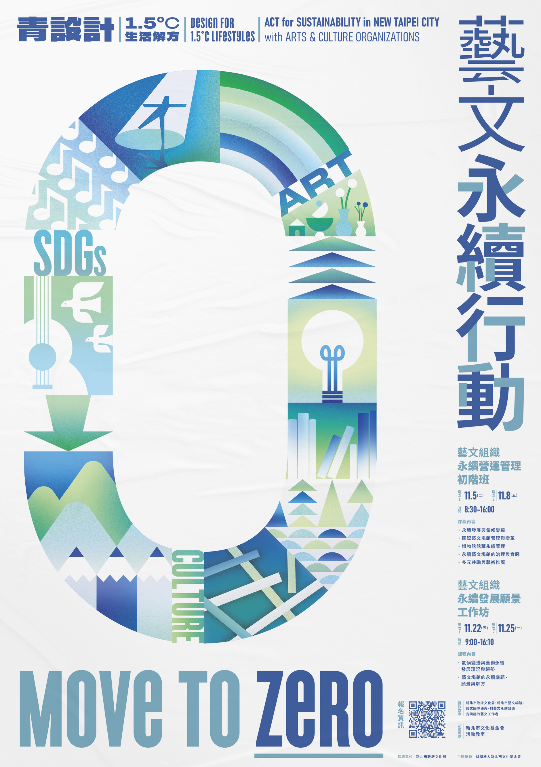
To reflect the essence of both environmental consciousness and artistic expression, the key visual integrates organic, directional shapes & arrows and subtle references to art and cultural forms within the cycle itself. Shades of green and blue are chosen as the primary palette, evoking the natural world and projecting a sense of calm, clarity, and future-forward thinking. These colors also reinforce the campaign’s message of ecological responsibility and collective harmony.
-
為了融合環境意識與藝術文化的視覺語彙,設計以指向箭頭構成圓形結構,並在其中融入與藝文相關的意象,象徵創意與文化在永續進程中的核心角色。整體配色以綠色與藍色為主軸,傳遞自然、生態與清新的感受,直接呼應行動的理念。


This design serves not just as a visual anchor for the event but also as a communicative tool—helping participants quickly grasp the campaign’s vision of fusing sustainable practices with art and culture. Through simplicity and symbolism, “MOVE TO ZERO” positions itself as both a call to action and a hopeful gesture toward a greener, more resilient creative landscape.
-
協助參與者迅速理解活動訴求與永續目標。透過簡潔而充滿意義的符號設計,「MOVE TO ZERO」成為一項集結藝文力量、邁向永續未來的行動倡議。
Winsun 2024 Contemporary Art Autumn Auction Catalog 衛山 2024 秋季拍賣會圖錄
2024

𒊹︎︎︎ Catalogue Design
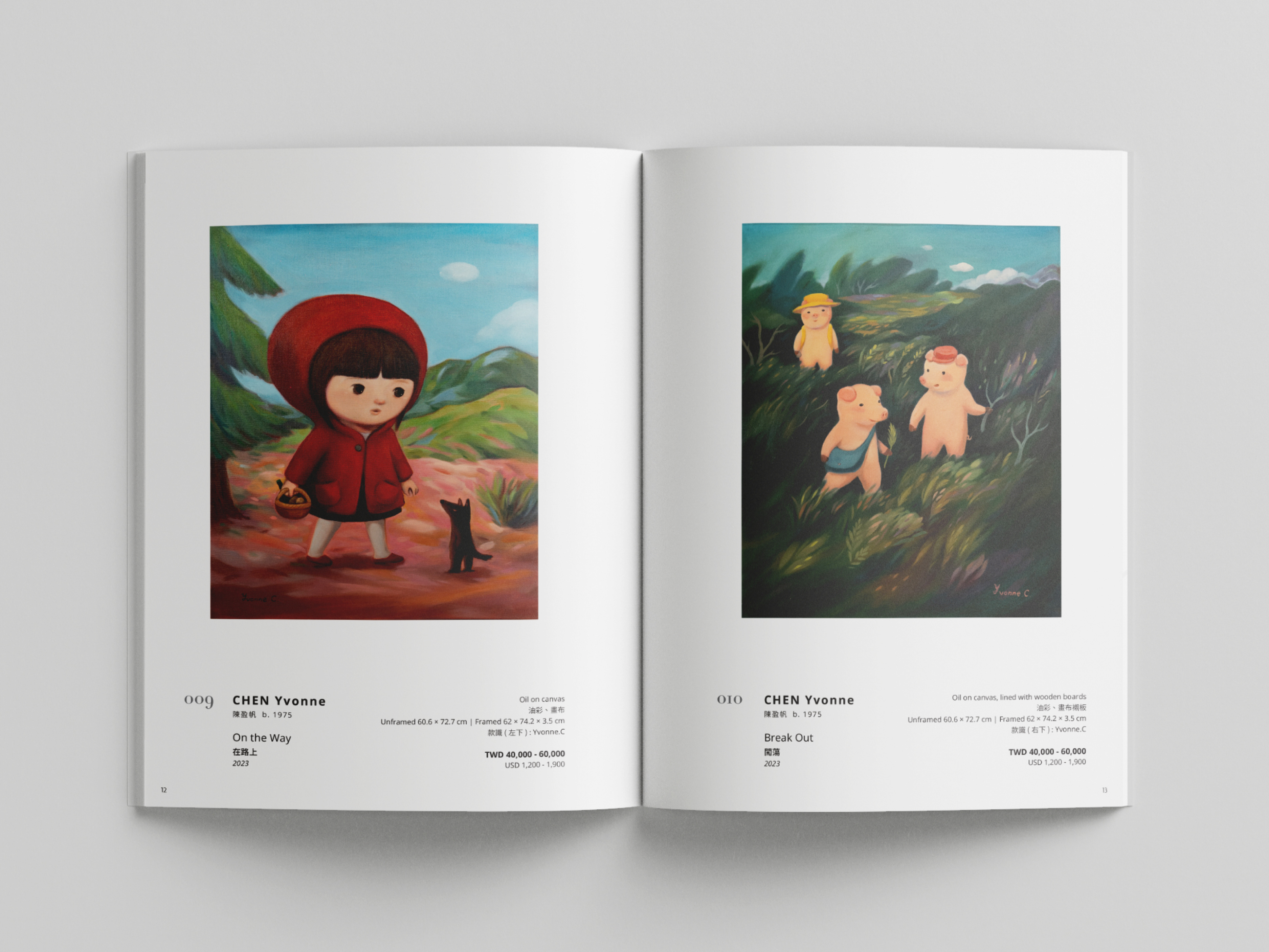
The Winsun 2024 Contemporary Art Autumn Auction Catalog is designed with a neat and minimalistic approach, ensuring that each art piece takes center stage with optimal clarity and visibility. Our goal is to create a refined visual experience that enhances appreciation for the artworks while maintaining a sophisticated and timeless aesthetic.
衛山 2024 秋季拍賣會圖錄 設計主要考量其功能性,確保每件藝術作品都能以最佳的視覺方式展現其獨特魅力,用簡約的畫面呈現精緻且具有永恆美感的視覺體驗,讓藏家能夠更加專注於藝術本身。
衛山 2024 秋季拍賣會圖錄 設計主要考量其功能性,確保每件藝術作品都能以最佳的視覺方式展現其獨特魅力,用簡約的畫面呈現精緻且具有永恆美感的視覺體驗,讓藏家能夠更加專注於藝術本身。


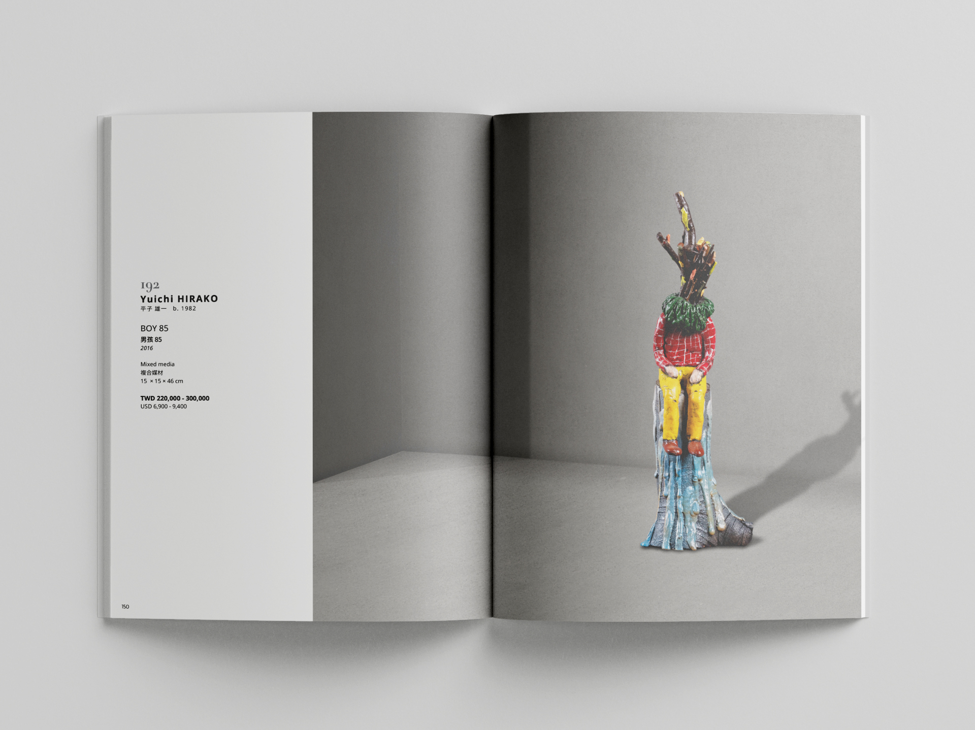
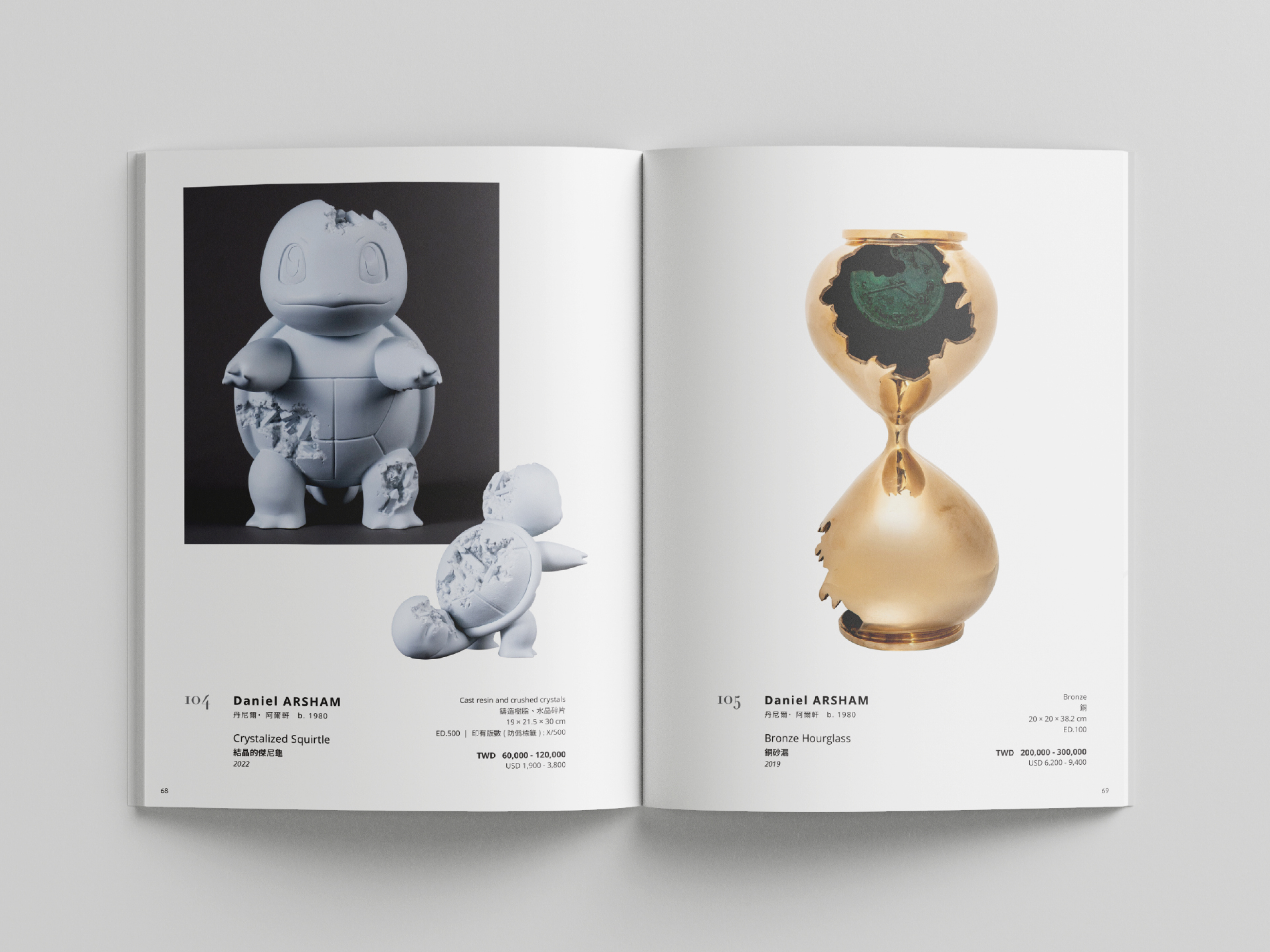
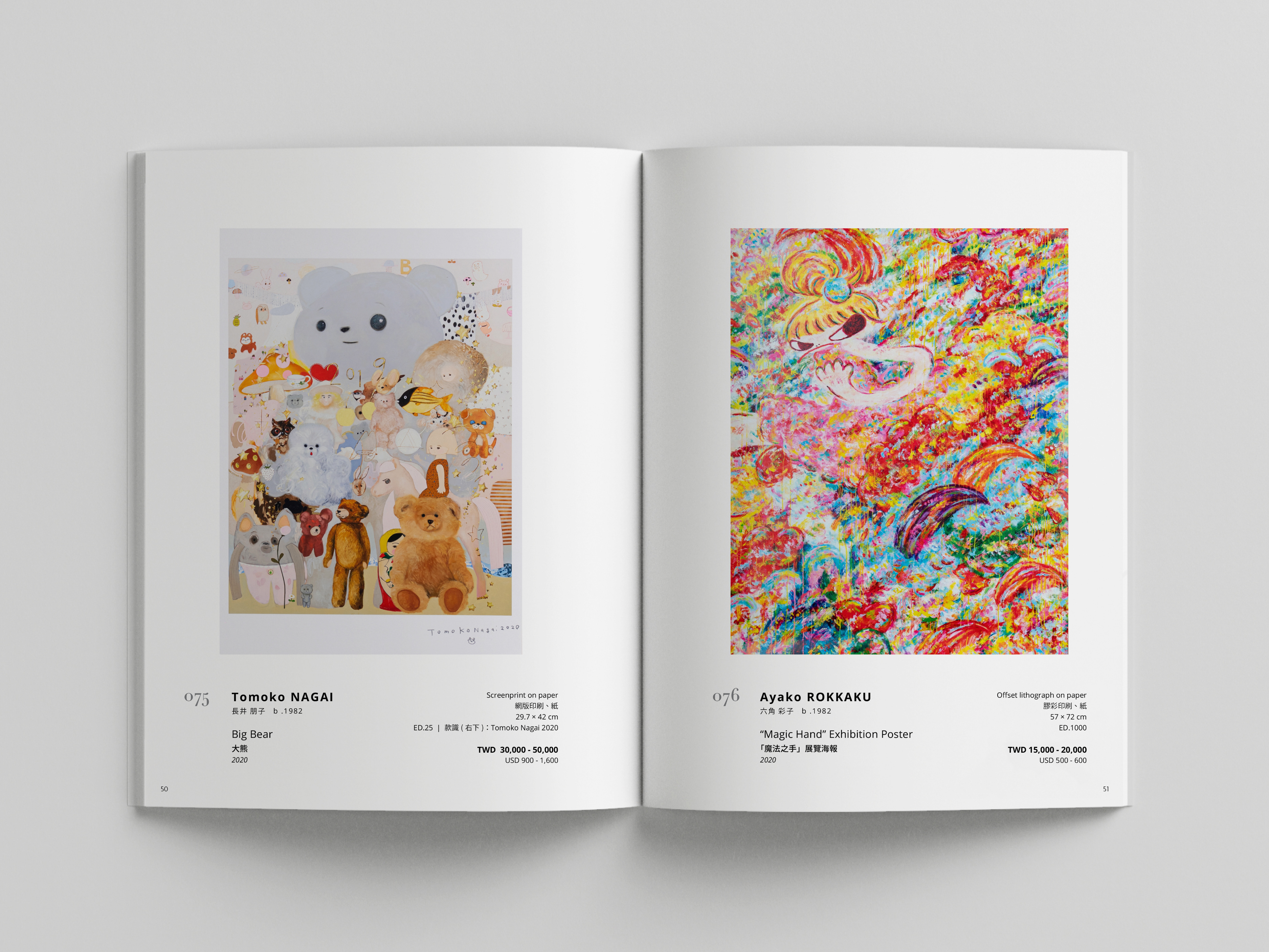


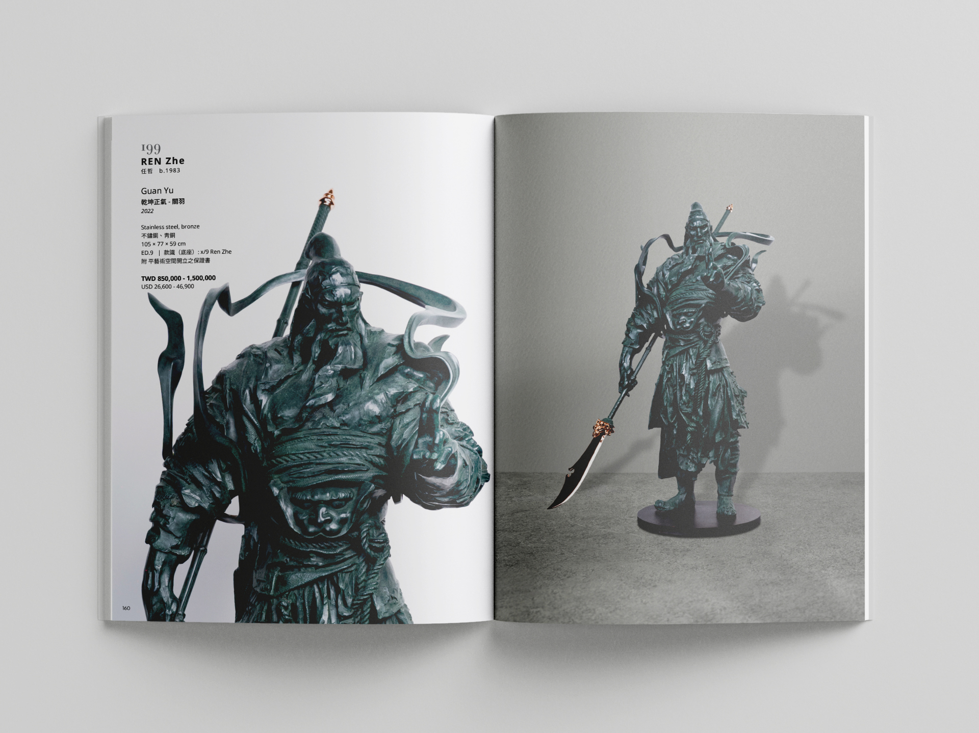
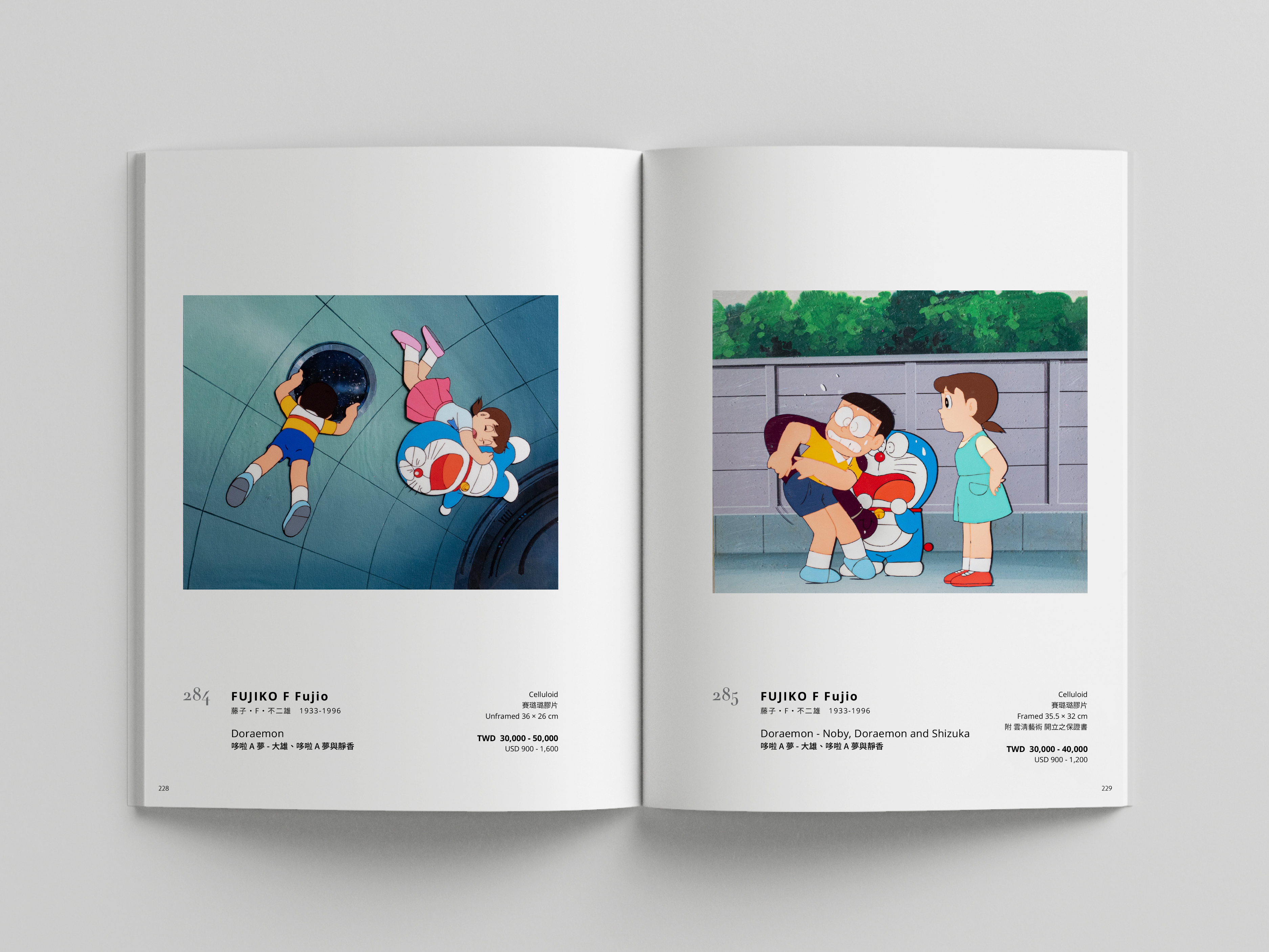

The layout prioritizes legibility and accessibility, presenting detailed auction information in a structured and elegant manner, making it easy for buyers of all ages to engage with the content. A balance of white space, carefully selected typography, and a clean yet multi-functional grid system allows for a seamless reading experience while complementing the contemporary nature of the artworks.
圖錄的版面設計強調清晰易讀與資訊可及性,透過精確的排版與細緻的資訊編排,使不同年齡層的買家都能輕鬆閱讀並掌握拍賣細節。我們運用留白、精挑細選的字體與簡潔多功能的網格系統,確保資訊呈現既專業又易於閱讀,同時也與當代藝術的美學語言相呼應。
-
View the full catalogue
線上圖錄
圖錄的版面設計強調清晰易讀與資訊可及性,透過精確的排版與細緻的資訊編排,使不同年齡層的買家都能輕鬆閱讀並掌握拍賣細節。我們運用留白、精挑細選的字體與簡潔多功能的網格系統,確保資訊呈現既專業又易於閱讀,同時也與當代藝術的美學語言相呼應。
-
View the full catalogue
線上圖錄
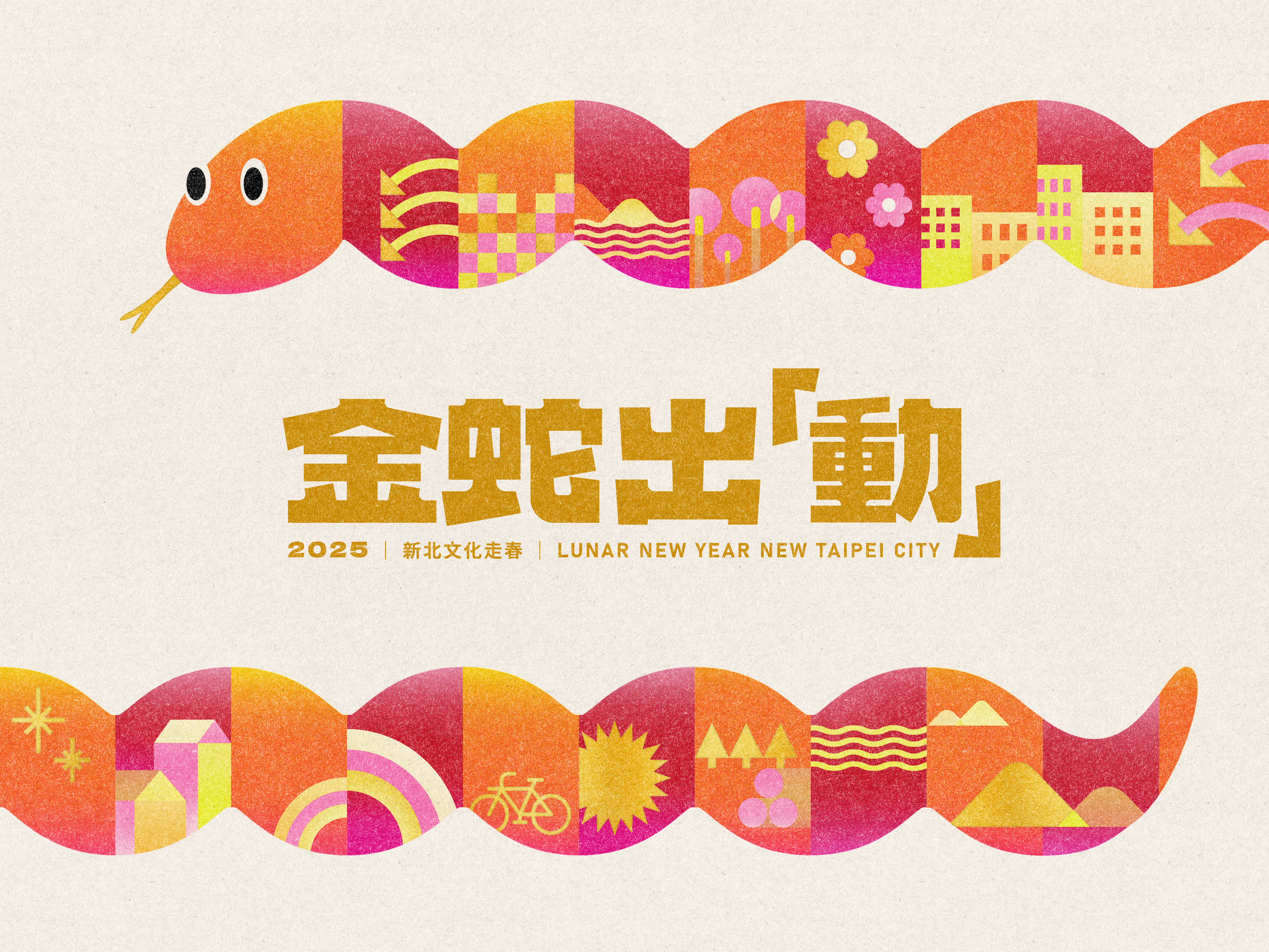
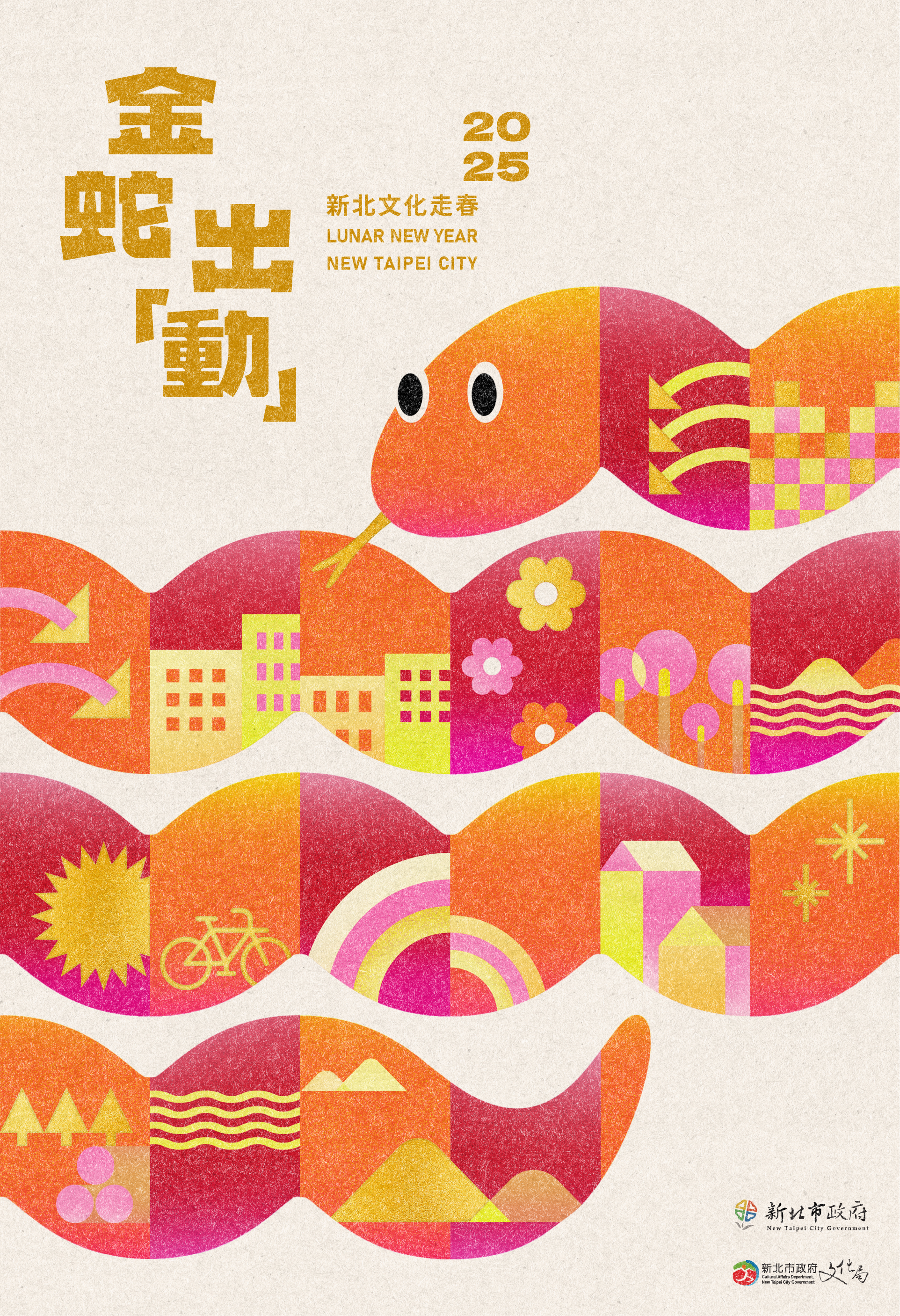
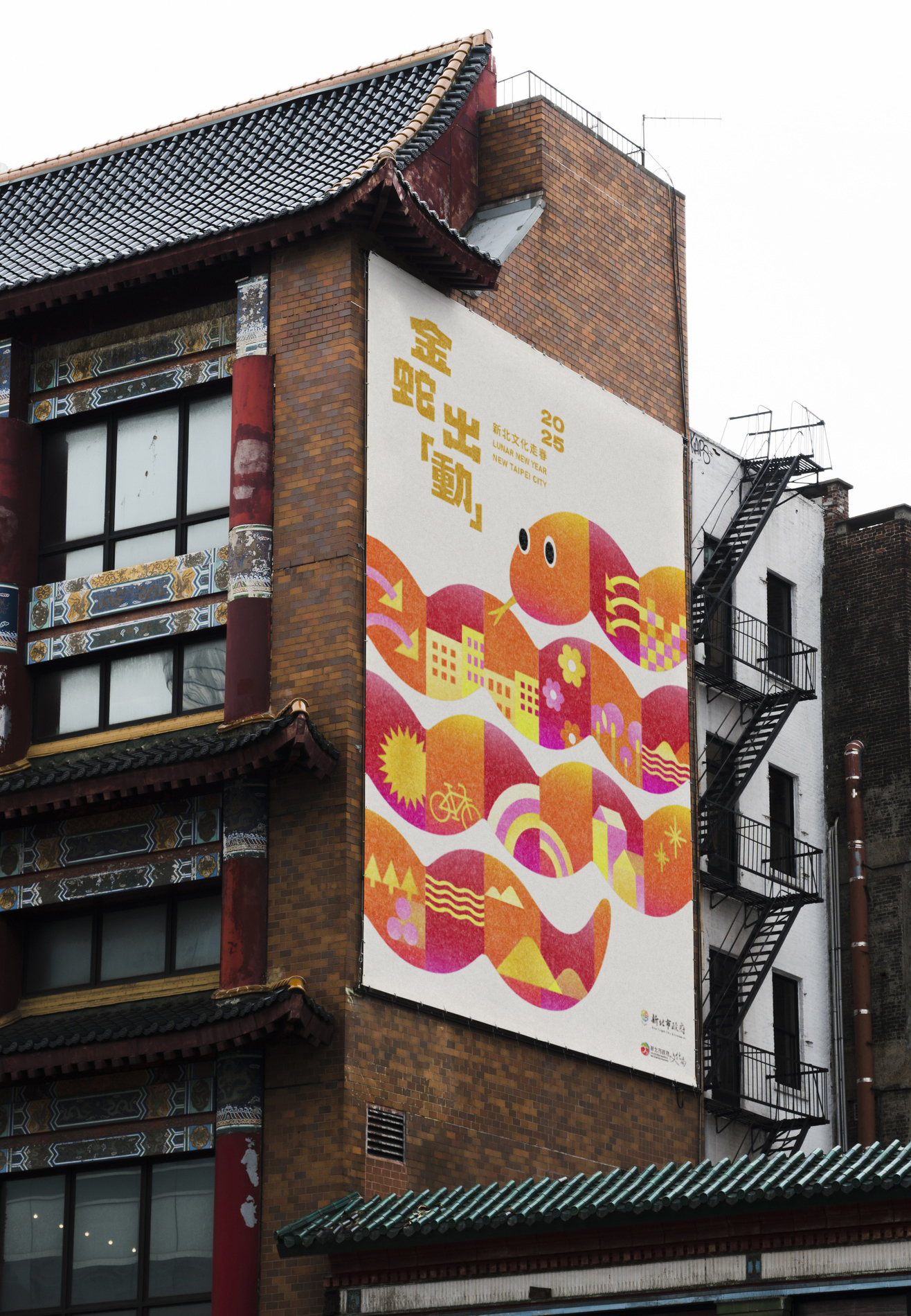
New Taipei City 2025 “Spring Culture Voyage” Key Visual Design
新北市「金蛇出『動』文化走春」主視覺設計
2025
𒊹︎︎︎ Key Visual Design
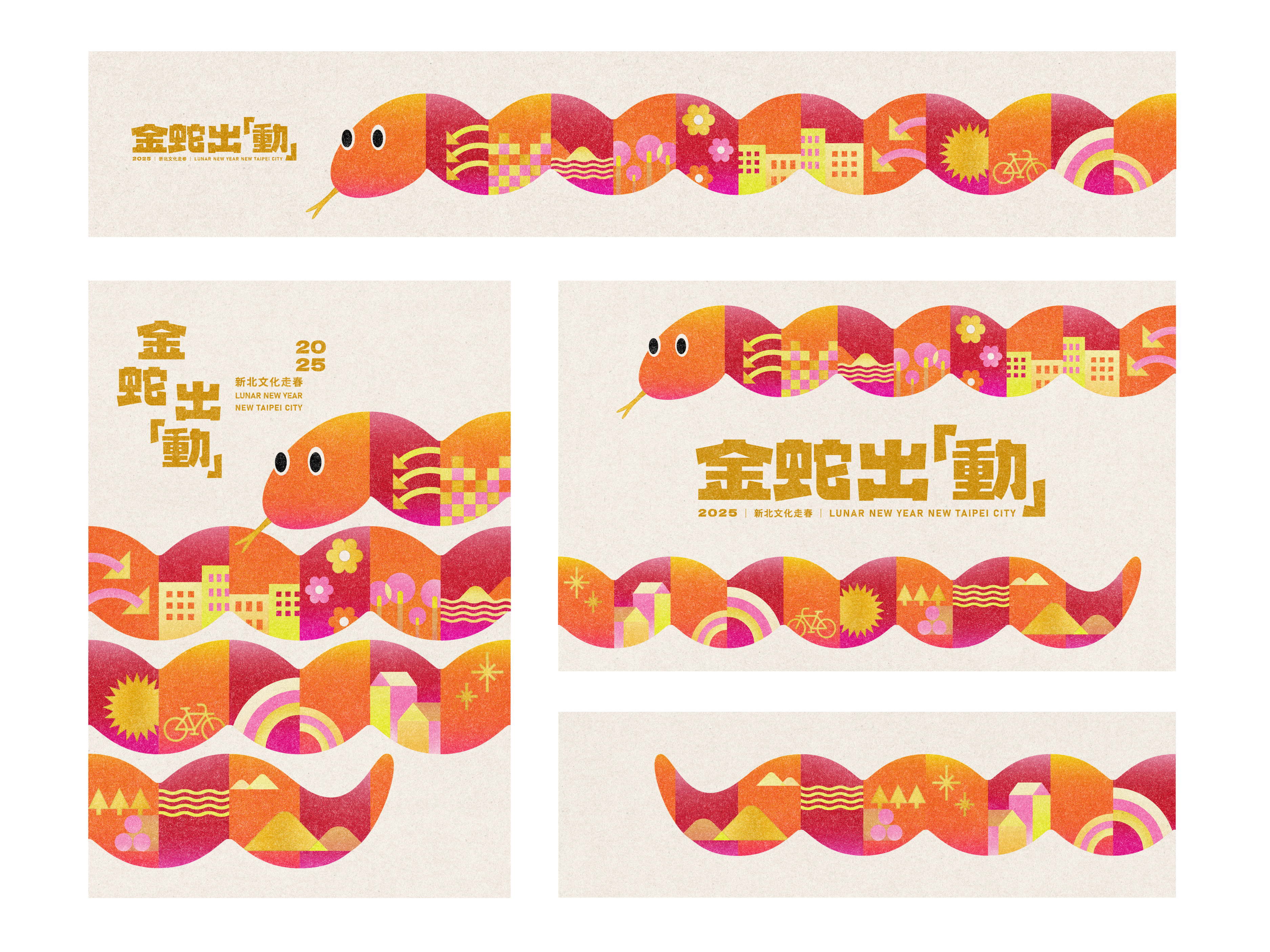
The New Taipei City 2025 “Spring Culture Voyage” Key Visual Design embraces the spirit of the Year of the Snake with a bold yet festive approach. The key visual features a uniquely crafted snake, composed of design elements that represent the essence of New Taipei City. By utilizing the elongated form of the snake, we evoke the dynamic cityscape, weaving through landmarks, museums, and gardens—symbolizing the cultural journey encouraged by the campaign.
新北市 2025「文化走春」主視覺設計 以喜慶的方式呈現蛇年精神。主視覺以模組式設計打造一條象徵新北市城市精髓的蛇,其蜿蜒延展的形態呼應城市的動態天際線,巧妙地穿梭於城市與園林之間,象徵本次活動所鼓勵的文化探索旅程。
新北市 2025「文化走春」主視覺設計 以喜慶的方式呈現蛇年精神。主視覺以模組式設計打造一條象徵新北市城市精髓的蛇,其蜿蜒延展的形態呼應城市的動態天際線,巧妙地穿梭於城市與園林之間,象徵本次活動所鼓勵的文化探索旅程。
This visual campaign celebrates the Lunar New Year, inviting citizens to explore and experience the rich heritage of New Taipei City. Traditionally, snakes may not be perceived as friendly creatures, but our design challenge was to transform this imagery into something warm, welcoming, and full of festive cheer. Through a combination of flowing forms and vibrant colors, the snake is reimagined as an elegant and approachable symbol of the New Year.
活動以農曆新年為核心,邀請市民深入體驗新北市豐富的文化底蘊。蛇通常給人冷峻或不親切的印象,而我們的設計挑戰在於如何將這個形象轉化為溫暖、友善,且充滿節慶氛圍的象徵。我們透過流暢造型、鮮明色彩與可愛的卡通形象,使這條「金蛇」能說出新北故事,也帶來可親與喜慶的節日氛圍。
活動以農曆新年為核心,邀請市民深入體驗新北市豐富的文化底蘊。蛇通常給人冷峻或不親切的印象,而我們的設計挑戰在於如何將這個形象轉化為溫暖、友善,且充滿節慶氛圍的象徵。我們透過流暢造型、鮮明色彩與可愛的卡通形象,使這條「金蛇」能說出新北故事,也帶來可親與喜慶的節日氛圍。
𒊹︎︎︎ Logotype Design

𒊹︎︎︎ Poster Design
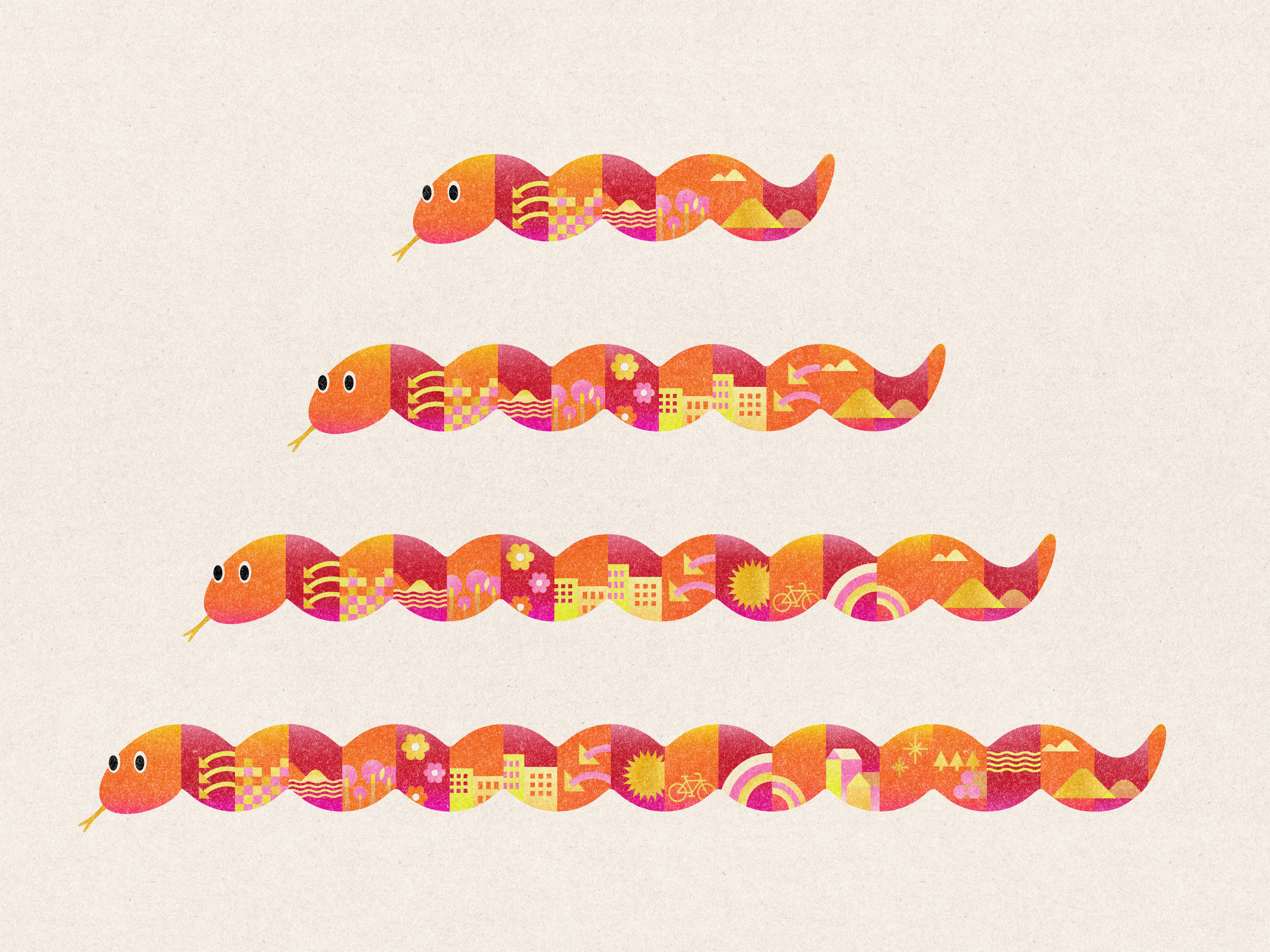
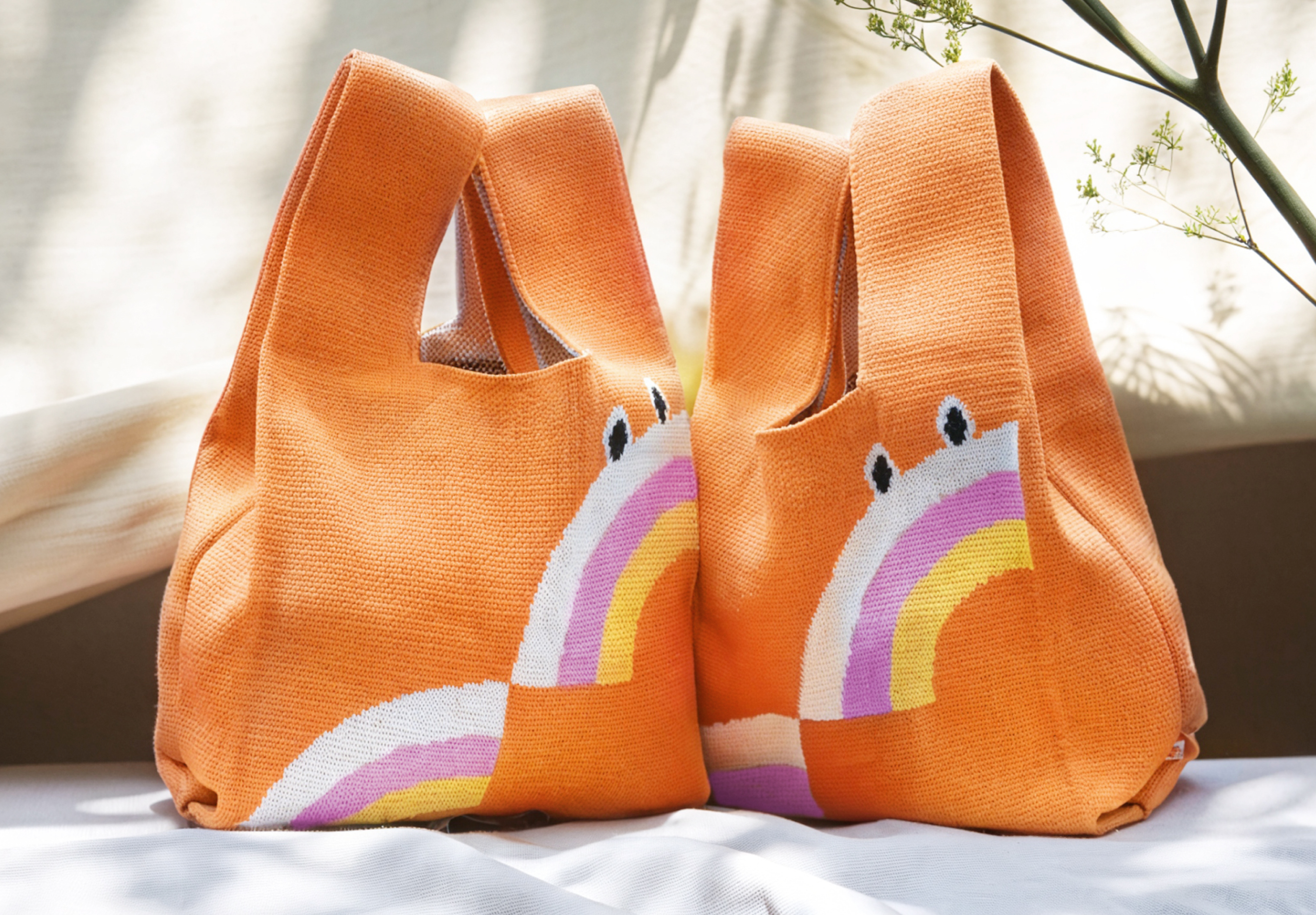
Beyond being a key visual wrapped around the city during the Lunar New Year, the design extends to a range of souvenirs, transforming everyday objects into collectible mementos of the festival. Among the many souvenirs, the most popular design is the shopping bag.
This bag features the Year of the Snake key visual, enhanced with rainbow elements to bring a sense of vibrancy and festive charm. The colorful rainbow symbolizes New Taipei City's cultural diversity and inclusivity, reflecting the city's rich artistic, humanistic, and social vitality. The snake is presented in a stacked, two-layered rainbow form, representing the auspicious meaning of "rising to the next level in the new year." This design not only adds depth and visual richness but also conveys a message of hope, growth, and celebration for the festive season.
這組主視覺以廣告形式在年節期間出現在城市的不同角落,更擴展至多樣化的紀念品設計,讓節慶氛圍更具體呈現於日常生活之中。 在眾多紀念品中,最受歡迎的是織布手提包包!
這款購物袋以主視覺為核心,融入彩虹元素,為整體設計增添活力與吉祥氛圍。 彩虹的繽紛色彩象徵著新北市的文化多樣性與融合性,展現這座城市豐富的藝術、人文與社會活力。蛇的形態以兩層彩虹堆疊的方式呈現,象徵著「新年步步高升」的美好寓意,不僅帶來視覺上的豐富層次感,也傳遞出充滿希望與成長的節慶祝福。
Dynamic City Parkour 城市跑酷
2024

𒊹︎︎︎ Logo type Design
𒊹︎︎︎ Promotional Material Design
In collaboration with the New Taipei City Culture Foundation, We had the opportunity to work on the logo type design for "城市跑酷 Dynamic City Parkour." Rooted in the Foundation's vision of promoting cultural equality, this project aims to break down barriers between urban and rural areas by offering elementary school students across New Taipei City the chance to engage in a city parkour-themed painting activity.
The logo type design captures the essence of this dynamic concept, with bold and lively typography that reflects the adventurous spirit of parkour. Drawing inspiration from the vibrant illustrations by local illustrator, Train 火車, the design incorporates jumps and parkour movements through characters, creating a sense of excitement and movement.
在與新北市文化基金會的合作中,我們有機會為「城市跑酷 Dynamic City Parkour」設計標誌字型。在基金會與主創作、動畫製作者黑碼藝識共同合作的專案中,根植於促進文化平權的願景, 他們期待透過繪畫打破城鄉圍籬,藉由動畫線稿接力創作,共同完成圓頂動畫作品。
標誌字型設計捕捉了這個動態概念的本質,採用了大膽而生動的字體,反映了跑酷的冒險精神。配合插畫家火車 (Train) 的生動筆觸,通過字型的跳躍和動態,營造歡樂動感的氛圍。


Through this project, children are invited to unleash their imagination and explore the colorful cityscape of New Taipei City, transcending boundaries and embarking on an exhilarating urban adventure.
通過這個項目,孩子們被邀請釋放想像力,探索新北市豐富多彩的城市景觀,超越界限,展開一場都市冒險。
計畫總籌 | New Taipei City Culture Foundation 財團法人新北市文化基金會
主創作 動畫製作 | Hey mechanic! 黑碼藝識
插畫設計 | 火車 Train
計畫網站設計|多盒心科技
標準字設計 | 厸彡 Linshan
通過這個項目,孩子們被邀請釋放想像力,探索新北市豐富多彩的城市景觀,超越界限,展開一場都市冒險。
計畫總籌 | New Taipei City Culture Foundation 財團法人新北市文化基金會
主創作 動畫製作 | Hey mechanic! 黑碼藝識
插畫設計 | 火車 Train
計畫網站設計|多盒心科技
標準字設計 | 厸彡 Linshan
2024 © Linshan design & consultancy co ltd
厸彡行銷顧問有限公司