New Taipei City Music & Art Festival 2024 生音藝術節
2024

𒊹︎︎︎ Event Visual Identity
𒊹︎︎︎ Integrated Design
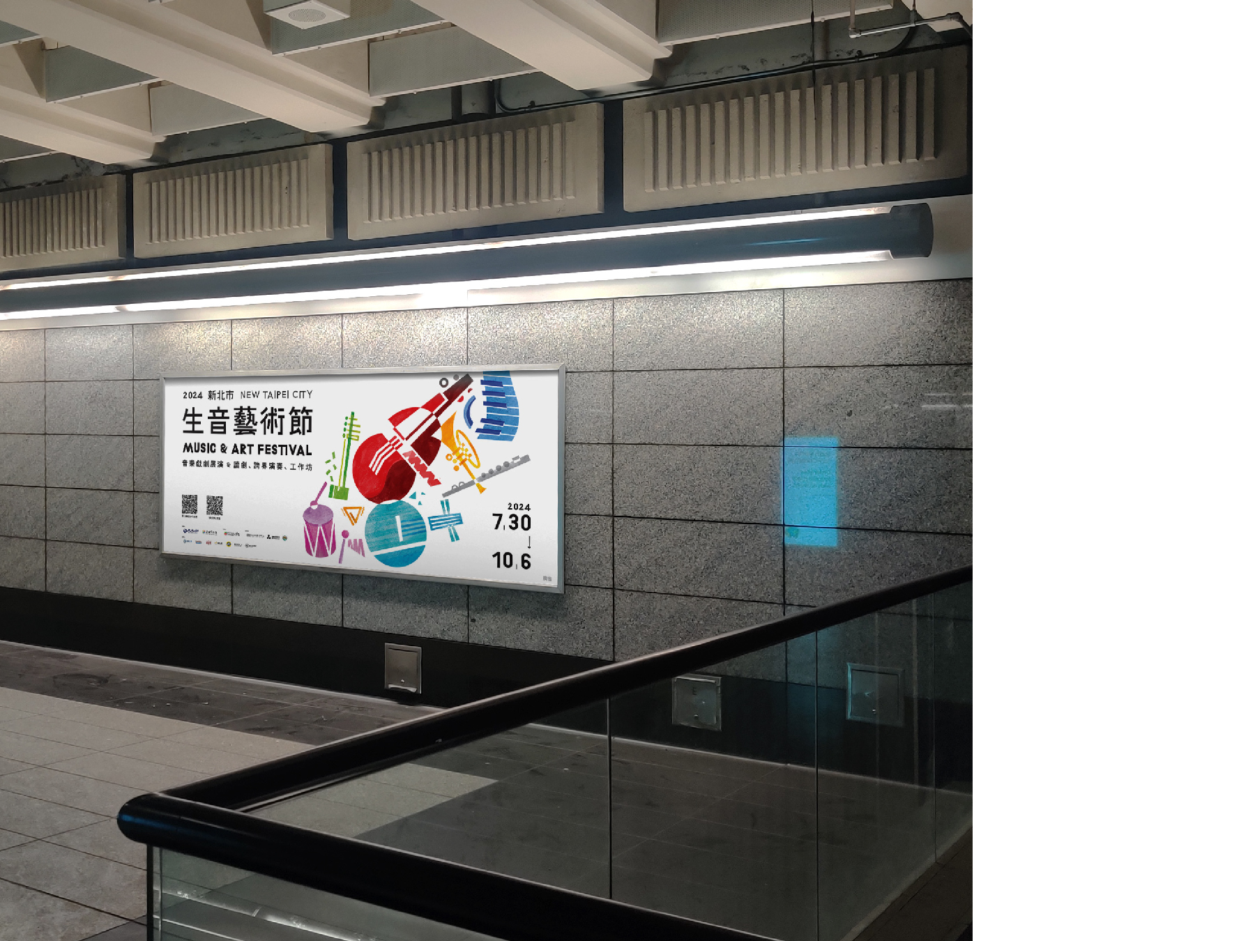
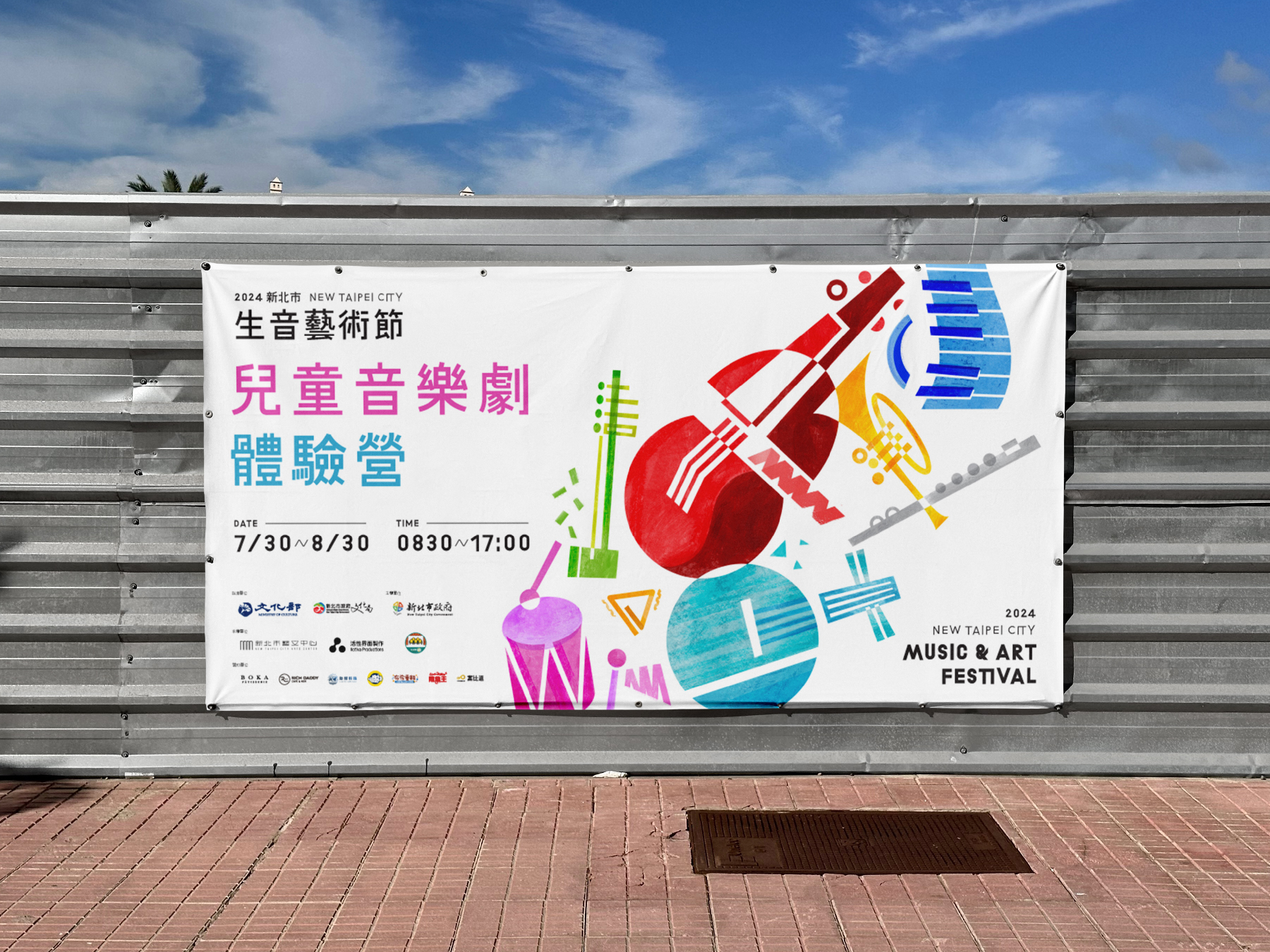
For the NTC 2024 Music & Art Festival visual campaign, we crafted a vibrant and dynamic visual identity that captures the festival’s spirit of creativity, diversity, and joy. Spanning from July to October, the festival integrates the well-established New Taipei Musical Festival and Rising Stars in Music, featuring cross-disciplinary music salons, theatrical performances, and children's musical theater workshops.
Our design concept revolves around geometric representations of musical instruments, symbolizing the harmony between different art forms. By incorporating bold colors and playful compositions, we aimed to reflect the festival’s energetic and inclusive atmosphere, inviting audiences of all ages to immerse themselves in a world where music and art come alive. The result is a visually engaging campaign that not only enhances the festival’s identity but also amplifies its mission to celebrate artistic expression and community engagement.
新北市 2024 生音藝術節 視覺設計以充滿活力與動感的視覺語言,展現藝術節的多元、創意與歡樂氛圍。今年藝術節自 7 月至 10 月舉行,結合 新北音樂劇節 與 樂壇新星 兩大品牌,活動內容涵蓋跨領域音樂沙龍、音樂戲劇展演、兒童音樂劇體驗營等,邀請國內優秀的青年音樂家與音樂劇團隊共同策劃,帶來豐富精彩的音樂藝術體驗。
我們的設計概念以 幾何化的樂器圖像 為核心,象徵不同藝術形式的交融與對話。透過 鮮明的色彩運用與活潑的構圖,營造出熱情洋溢且充滿感染力的視覺效果,吸引各年齡層的觀眾參與其中。整體視覺不僅塑造了藝術節獨特的品牌形象,更強化了活動「讓音樂與藝術融入生活、連結社群」的核心精神。
我們的設計概念以 幾何化的樂器圖像 為核心,象徵不同藝術形式的交融與對話。透過 鮮明的色彩運用與活潑的構圖,營造出熱情洋溢且充滿感染力的視覺效果,吸引各年齡層的觀眾參與其中。整體視覺不僅塑造了藝術節獨特的品牌形象,更強化了活動「讓音樂與藝術融入生活、連結社群」的核心精神。
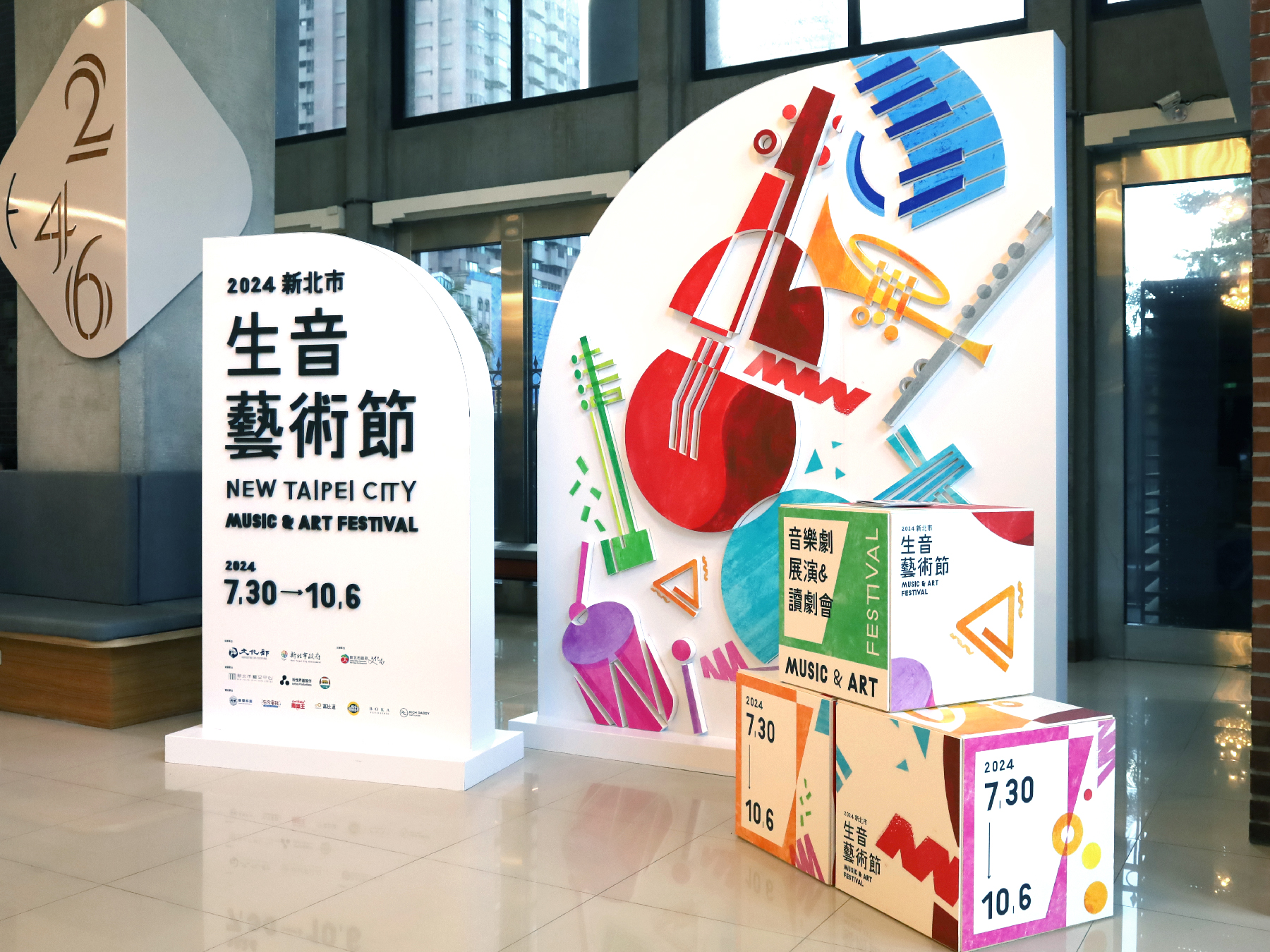
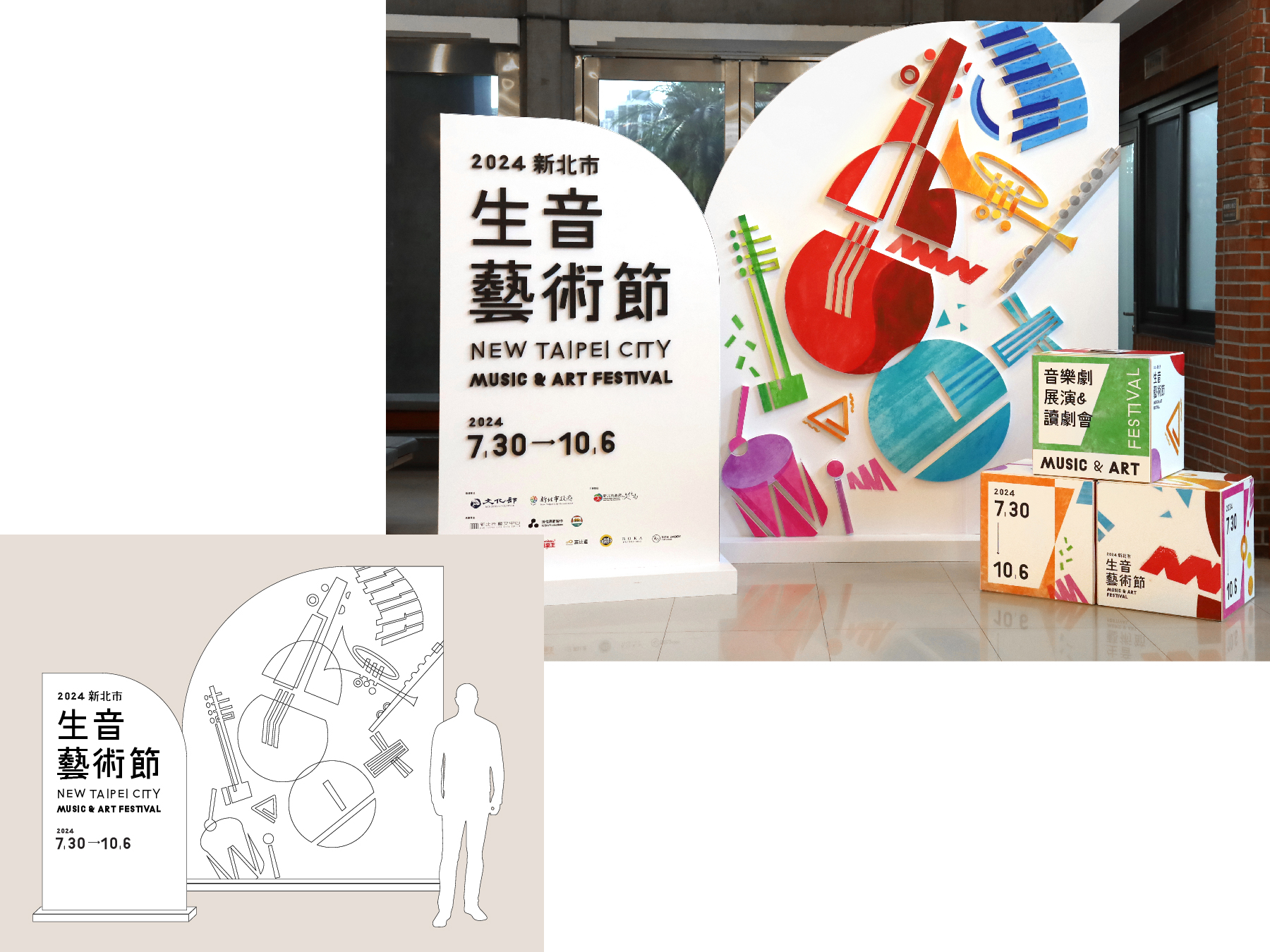
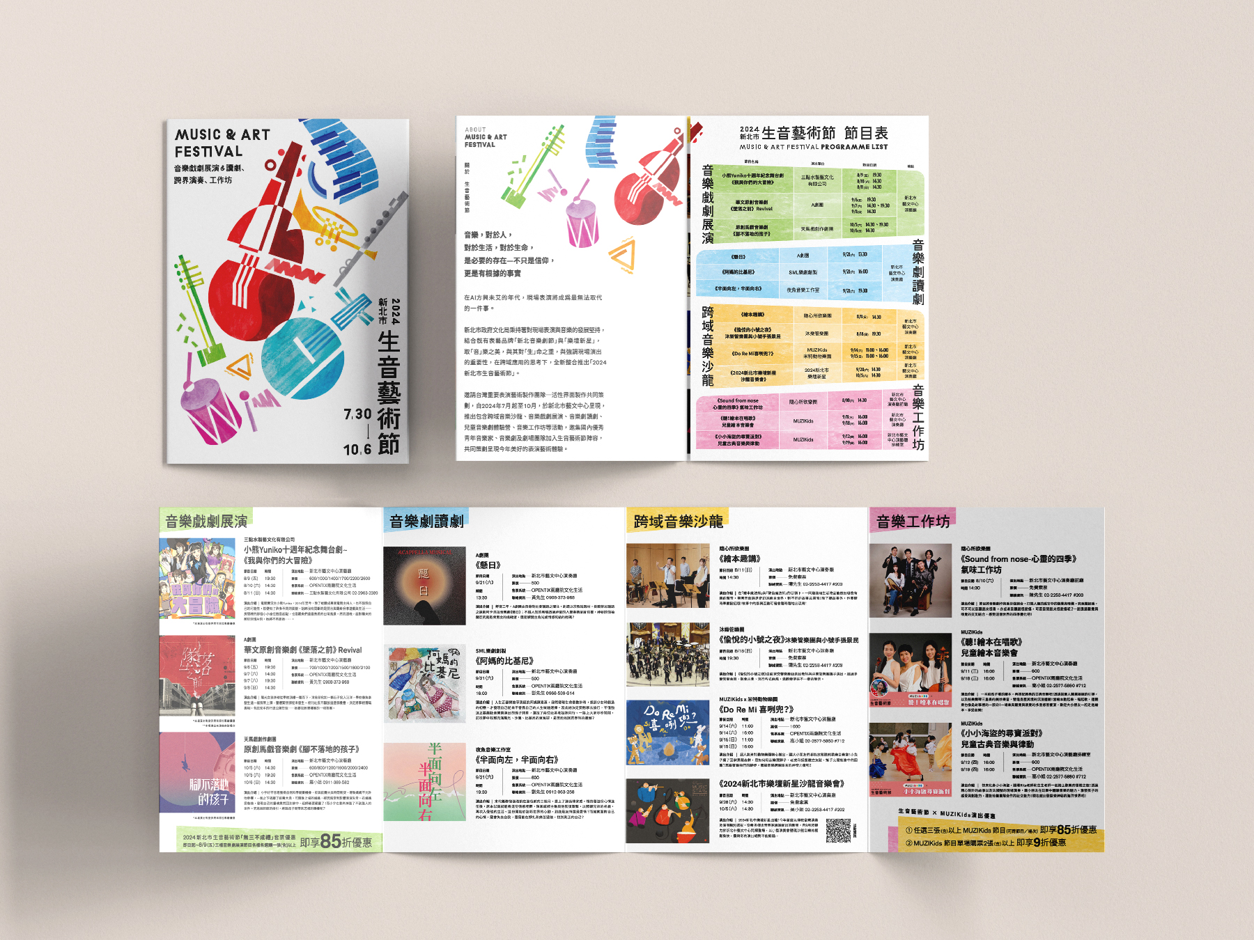
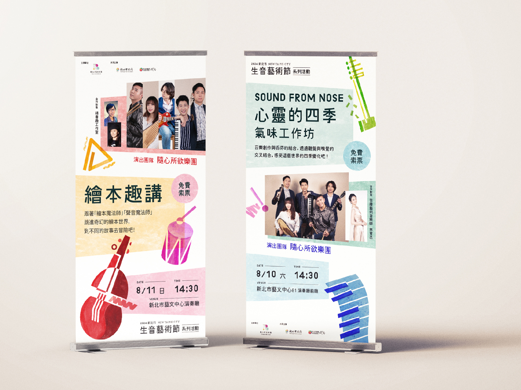
In addition, we prioritize sustainability in physical applications. All POP displays are made from eco-friendly D-Board, ensuring a visually striking yet environmentally responsible design. Instead of printing individual program leaflets for each performance, we have adopted a digital version, reducing paper waste while providing audiences with easy access to event information.
此外,我們在 實體應用 上也特別重視 環保永續 的理念。所有 POP 設計皆採用 環保材質 D-Board,確保設計兼具美觀與環境友善。節目手冊部分,則以 數位化 取代傳統紙本,減少印刷品的浪費,讓觀眾透過電子版本輕鬆獲取節目資訊。
此外,我們在 實體應用 上也特別重視 環保永續 的理念。所有 POP 設計皆採用 環保材質 D-Board,確保設計兼具美觀與環境友善。節目手冊部分,則以 數位化 取代傳統紙本,減少印刷品的浪費,讓觀眾透過電子版本輕鬆獲取節目資訊。
2024 © Linshan design & consultancy co ltd
厸彡行銷顧問有限公司