KUI-HIUNN 貴香鹹酥雞
2025
𒊹︎︎︎ Branding
𒊹︎︎︎ Shop Design
The visual identity design for KUI-HIUNN 貴香鹹酥雞 is deeply rooted in the rich flavors of Taiwanese street food culture. Inspired by the founder’s mother’s cherished recipe, the brand carries forward a taste of nostalgia, blending tradition with a bold and contemporary aesthetic.
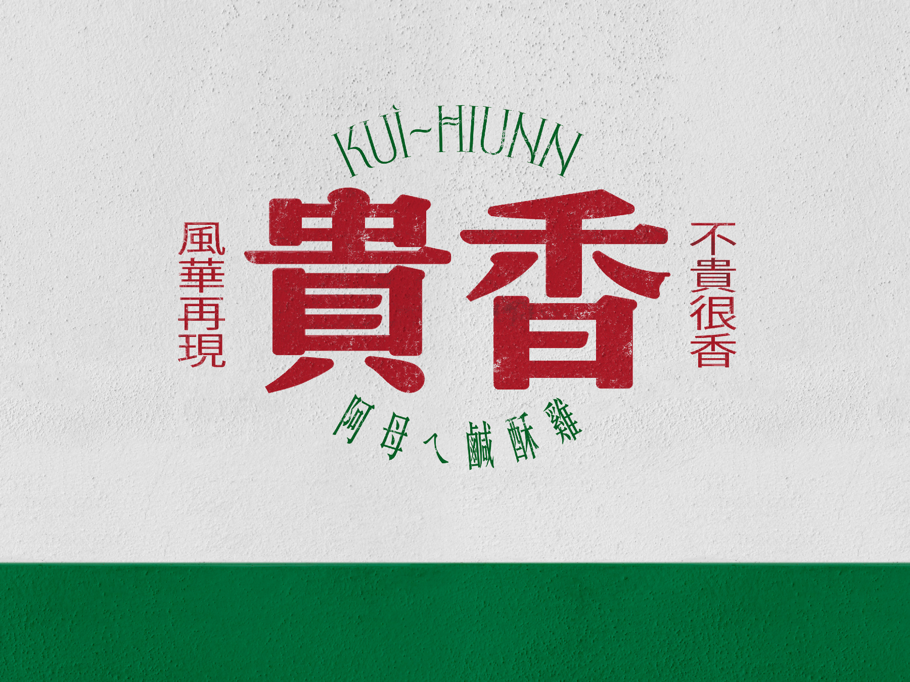
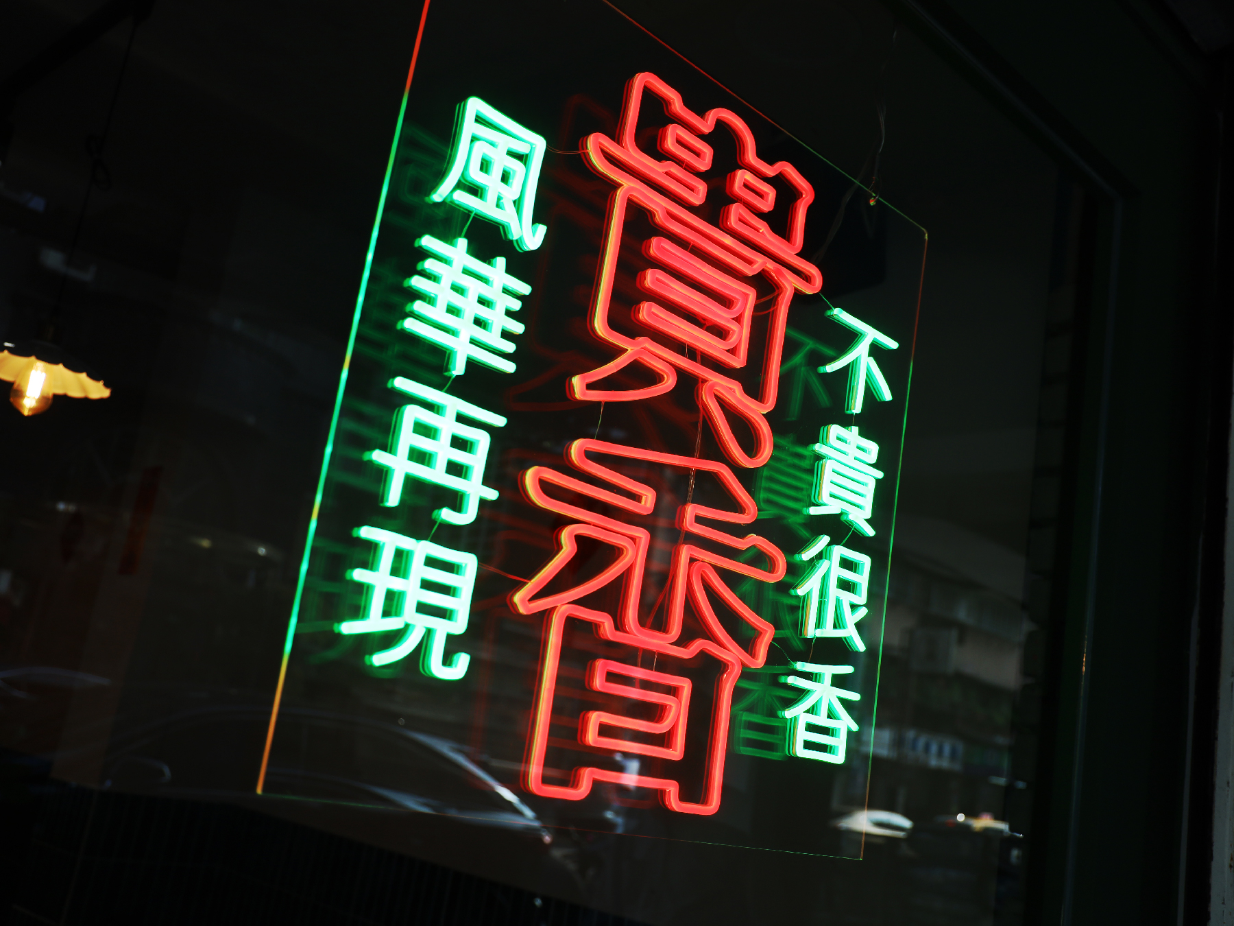
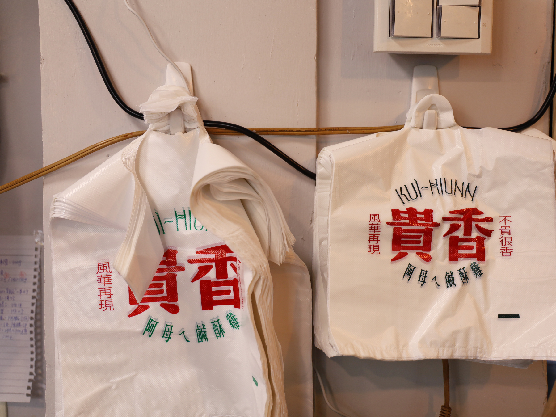
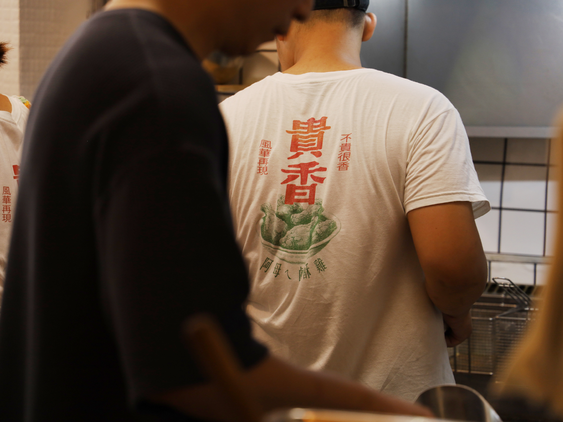
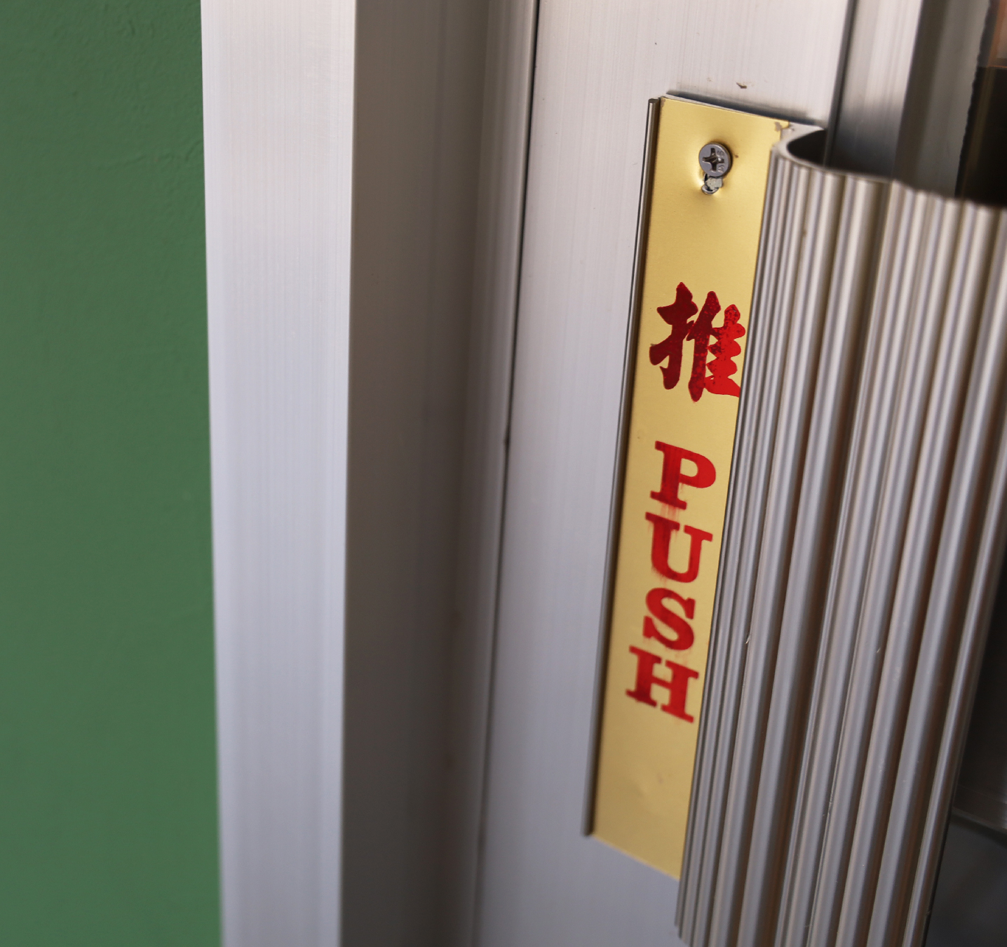
At the heart of the design is the phrase “滿滿的台式風味 Packed with Authentic Taiwanese Flavors”, emphasizing the authentic Taiwanese essence that defines the brand. The visual identity features a striking contrast of bold green and red, creating a dynamic and eye-catching appeal that reflects both the vibrancy of night market culture and the energy of local food stalls.
貴香鹹酥雞 KUI-HIUNN 的視覺識別設計深植於台灣街頭小吃文化的濃厚風味之中。品牌靈感來自創辦人阿母傳承的記憶好味道,將這份懷舊情感延續,並透過大膽且現代的設計語言,為傳統注入嶄新的活力。
設計核心以 「滿滿的台式風味」 為主軸,強調品牌的道地台灣精神。視覺識別選用 鮮明的綠色與紅色,透過強烈對比營造出吸睛且富有動感的視覺效果,不僅呼應台灣夜市文化的熱鬧氛圍,更展現街邊小吃攤的活力。
設計核心以 「滿滿的台式風味」 為主軸,強調品牌的道地台灣精神。視覺識別選用 鮮明的綠色與紅色,透過強烈對比營造出吸睛且富有動感的視覺效果,不僅呼應台灣夜市文化的熱鬧氛圍,更展現街邊小吃攤的活力。
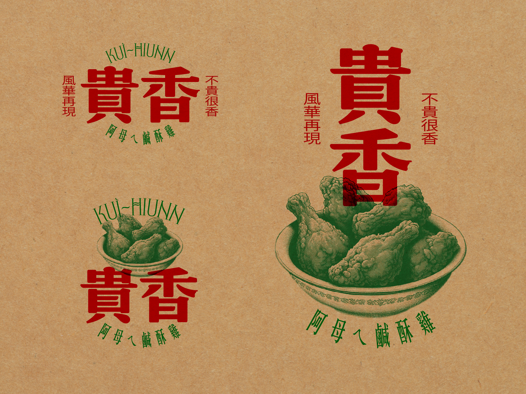
To further reinforce the brand’s character, we crafted the tagline “不貴很香 風華再現 Affordable Yet Flavorful, A Taste Revived”, placed alongside the logo. This phrase not only captures the brand’s affordability and deliciousness but also evokes a sense of revival—bringing back the golden era of Taiwanese flavors in a fresh, stylish way.
為進一步突顯品牌個性,我們精心打造了標語 「不貴很香 風華再現」,巧妙地放置於標誌側邊,傳達品牌平價美味的特色,同時喚起台灣經典風味的再現,讓傳統美食在時尚潮流中綻放新生。
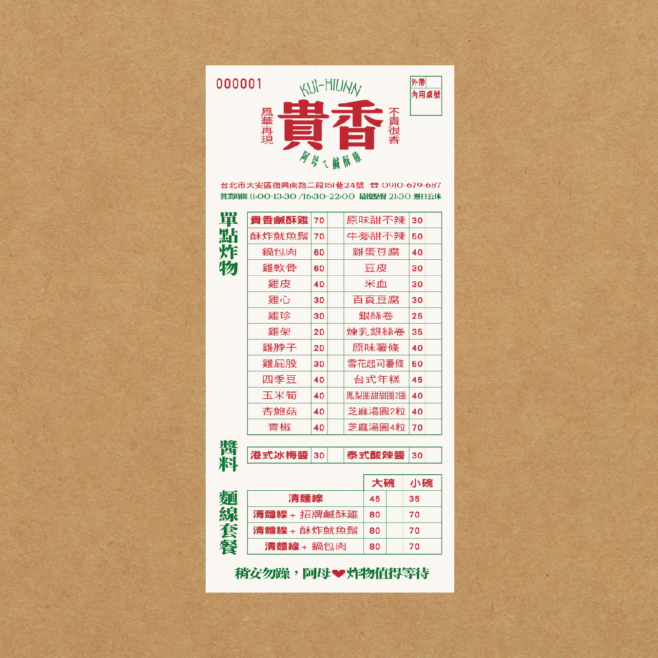
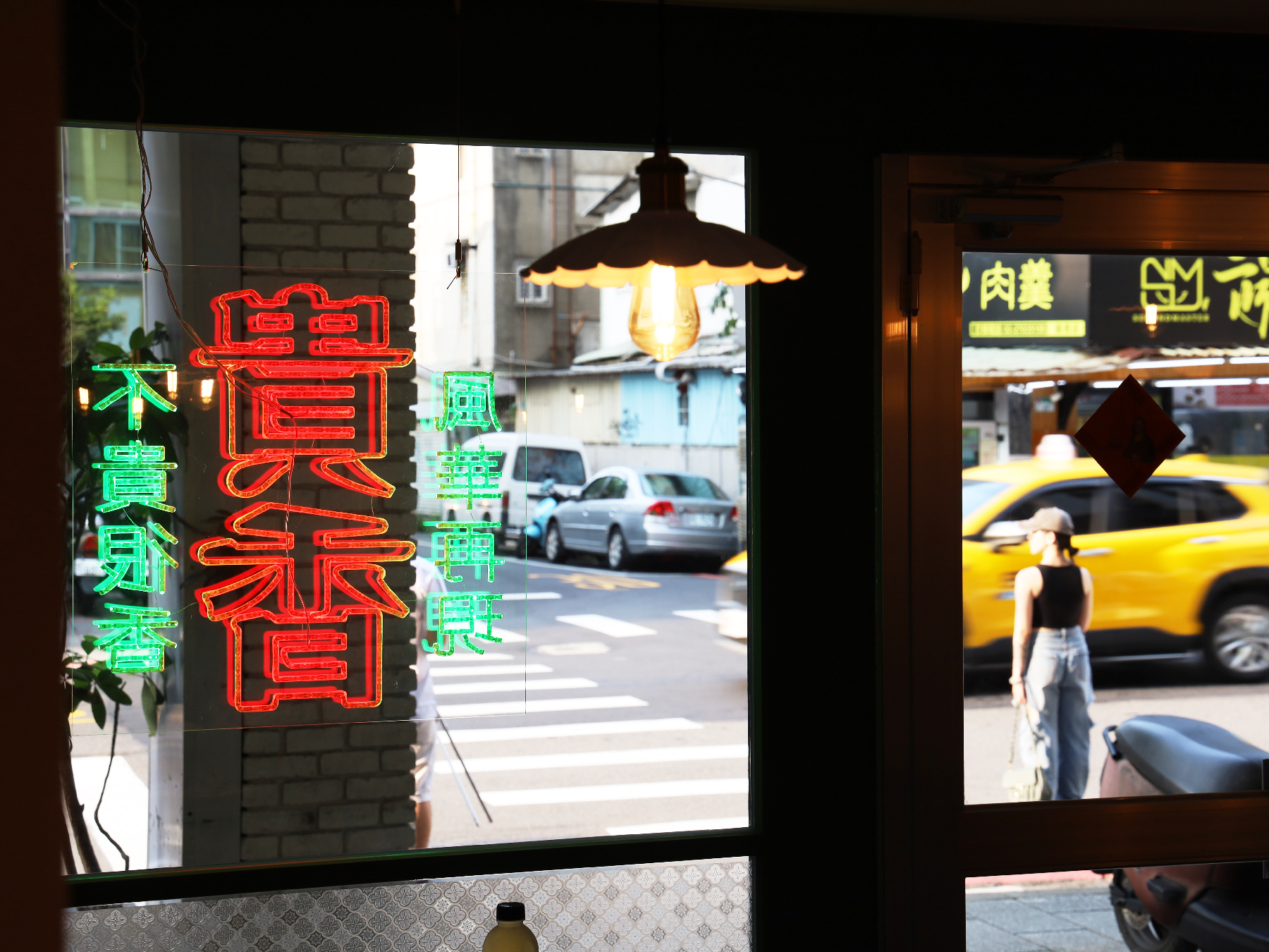
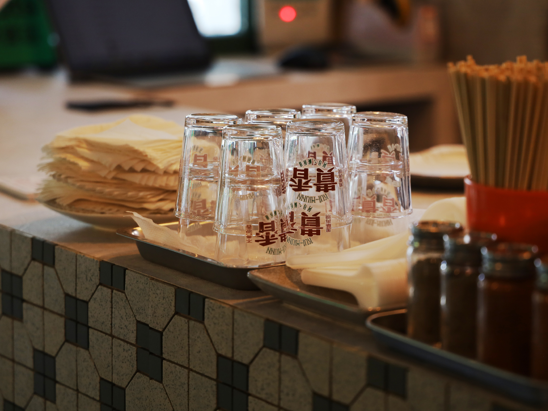
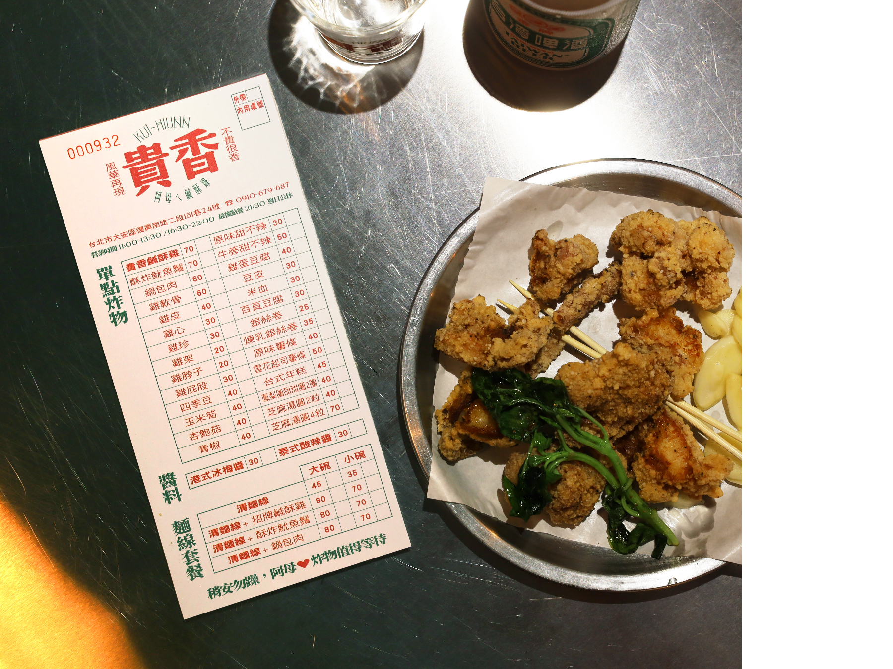
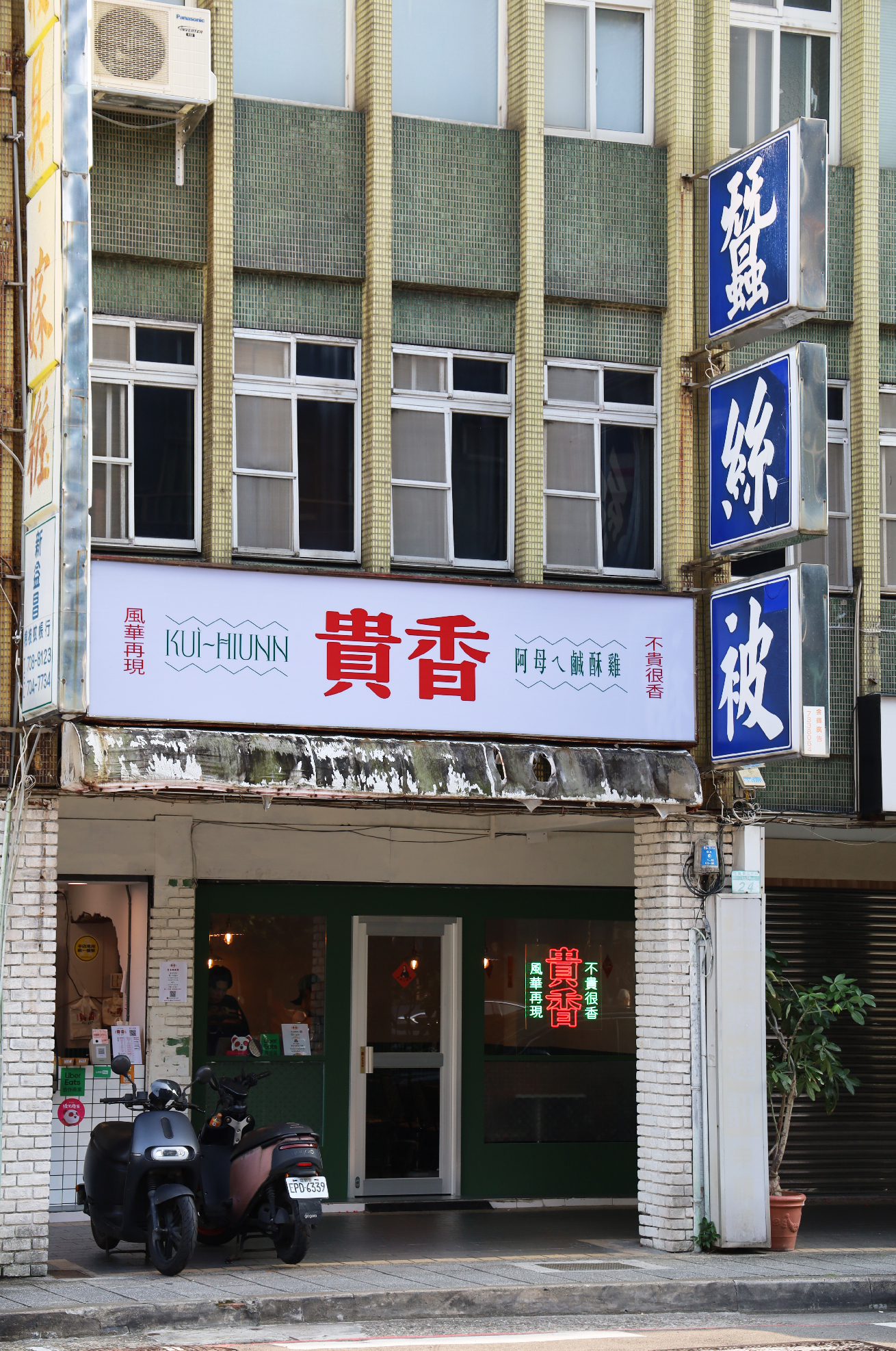
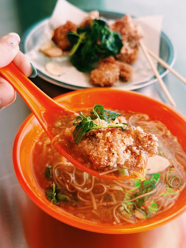
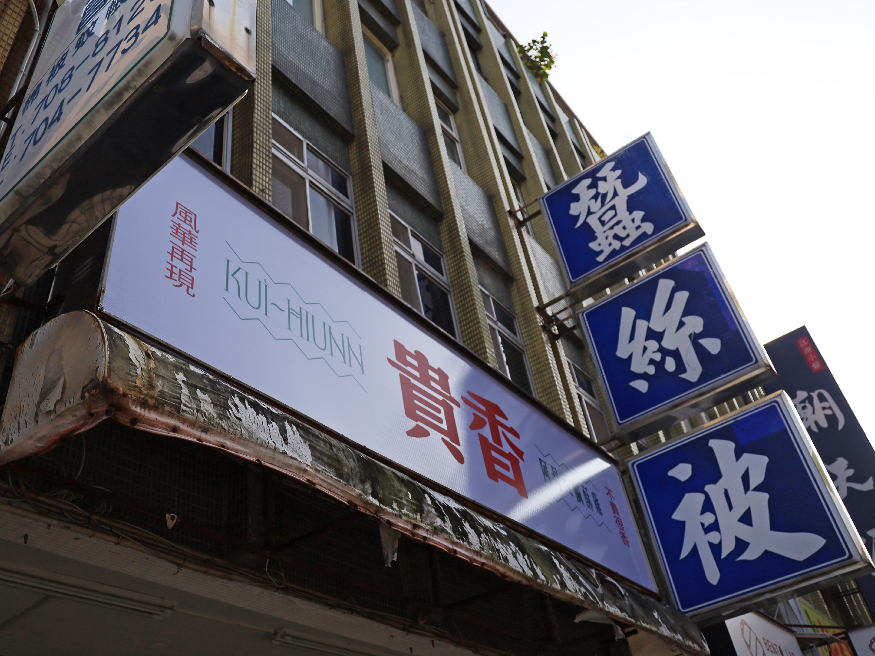
Beyond the logo and color scheme, the entire restaurant environment, from its interior design to tableware selection, is a homage to 1980s Taiwan. Elements such as retro tile patterns, vintage-style menus, and nostalgic lighting recreate the warmth and charm of classic local eateries, immersing customers in a dining experience that is both old-school and fashionable.
Through this visual identity, KUI-HIUNN 貴香鹹酥雞 successfully bridges the past and present, offering not just a meal but a multisensory journey through time, flavor, and culture.
除了標誌與色彩設計,品牌的 店內空間與餐具選擇 亦精心打造,向 1980 年代台灣 的懷舊氛圍致敬。復古磁磚紋樣、懷舊風格菜單,以及充滿復古情懷的燈飾,皆營造出溫馨親切的用餐體驗,讓顧客仿若走進舊時台灣街頭的經典小吃店,在復古與潮流交織的氛圍中,感受獨特的味覺與視覺享受。
透過這套視覺識別設計,貴香鹹酥雞 KUI-HIUNN 成功地串聯過去與現在,為顧客帶來的不僅是一頓美味的餐點,更是一場穿越時空的風味與文化之旅。
2024 © Linshan design & consultancy co ltd
厸彡行銷顧問有限公司