new green power 永鑫能源
2024

𒊹︎︎︎ Re-Branding
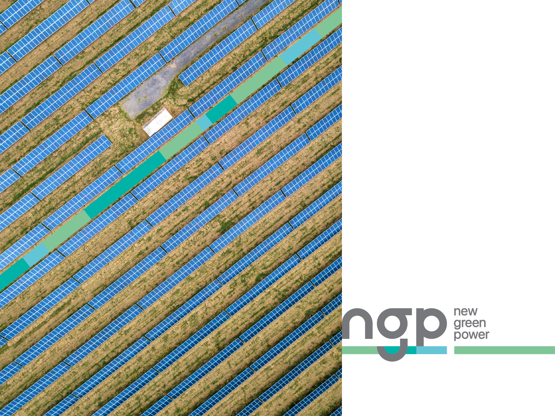
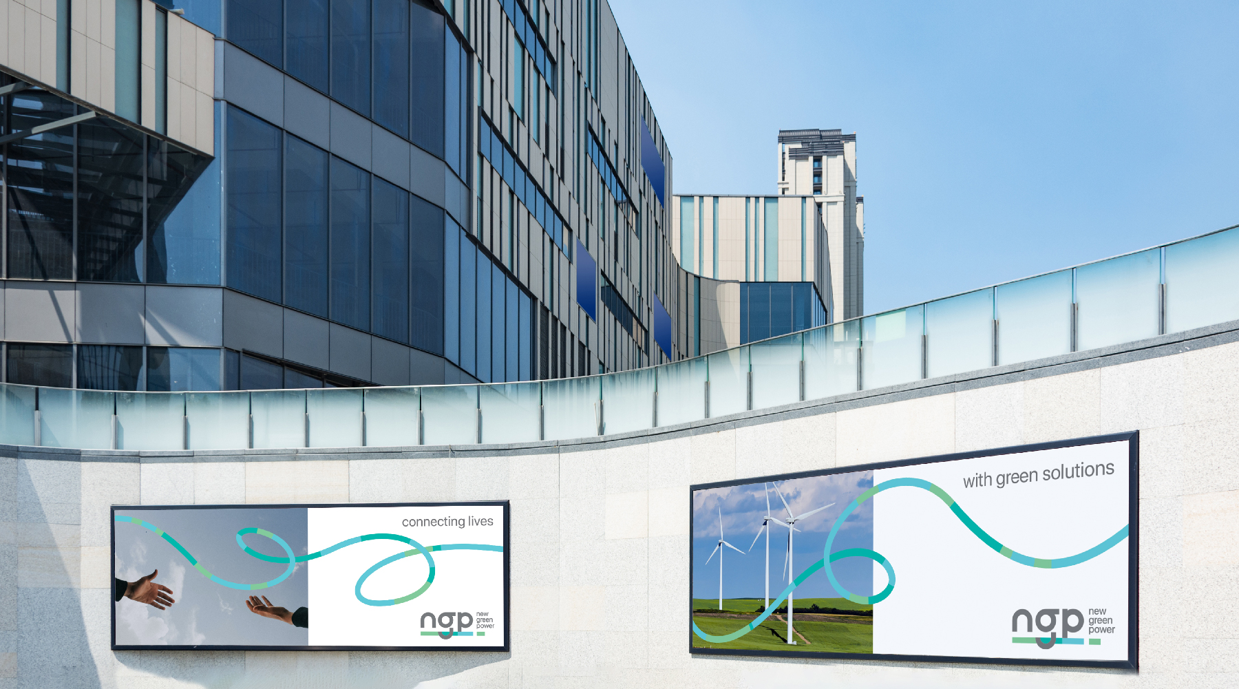
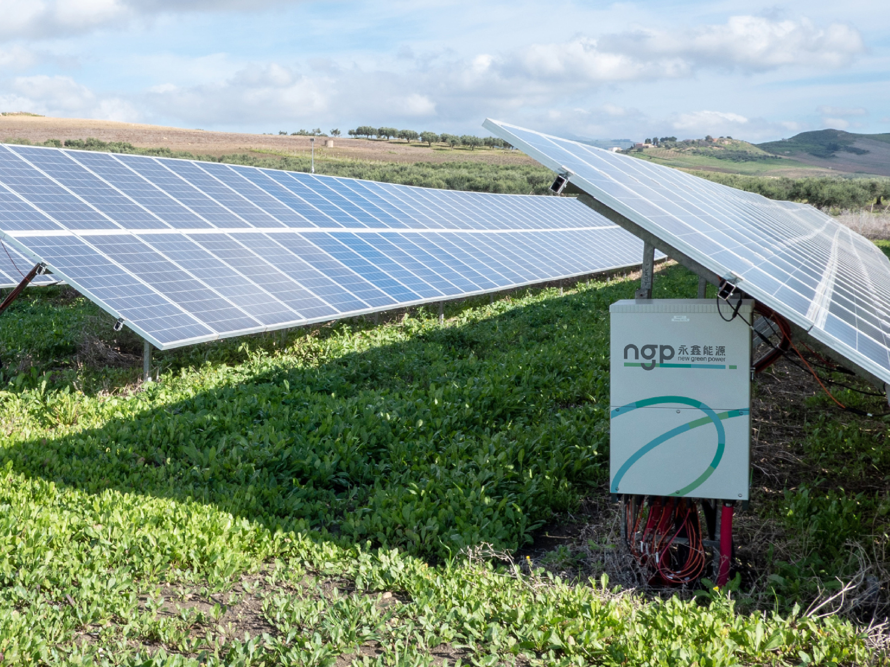
In the realm of sustainable energy, NGP (New Green Power) stands as a trailblazer in Taiwan's solar industry, renowned for its comprehensive expertise spanning development, design, construction, and project management. Tasked with revolutionizing their brand, we embarked on crafting a visual identity that would encapsulate NGP's essence while propelling them into a new era.
The brand revamp concept centered on instilling a sense of adaptability, sustainability, vision, and connectivity. Emphasizing perpetual movement, the design conveys NGP's commitment to progress and innovation. An open platform ethos was integral, fostering collaboration, shared values, community bonds, and an overarching aura of positivity.
在可持續能源領域,NGP(New Green Power)是台灣太陽能行業的開拓者,以其在開發、設計、施工和項目管理方面的全面專業知識而聞名。我們的任務是為他們打造一個全新的品牌形象,以體現NGP的本質,同時將其帶入一個新時代。
品牌改造的概念圍繞在注入適應性、可持續性、遠見和連接感。強調永恆運動,設計傳達了NGP對進步和創新的承諾。開放的平台理念至關重要,促進合作、共享價值觀、社區聯繫以及積極樂觀的氛圍。
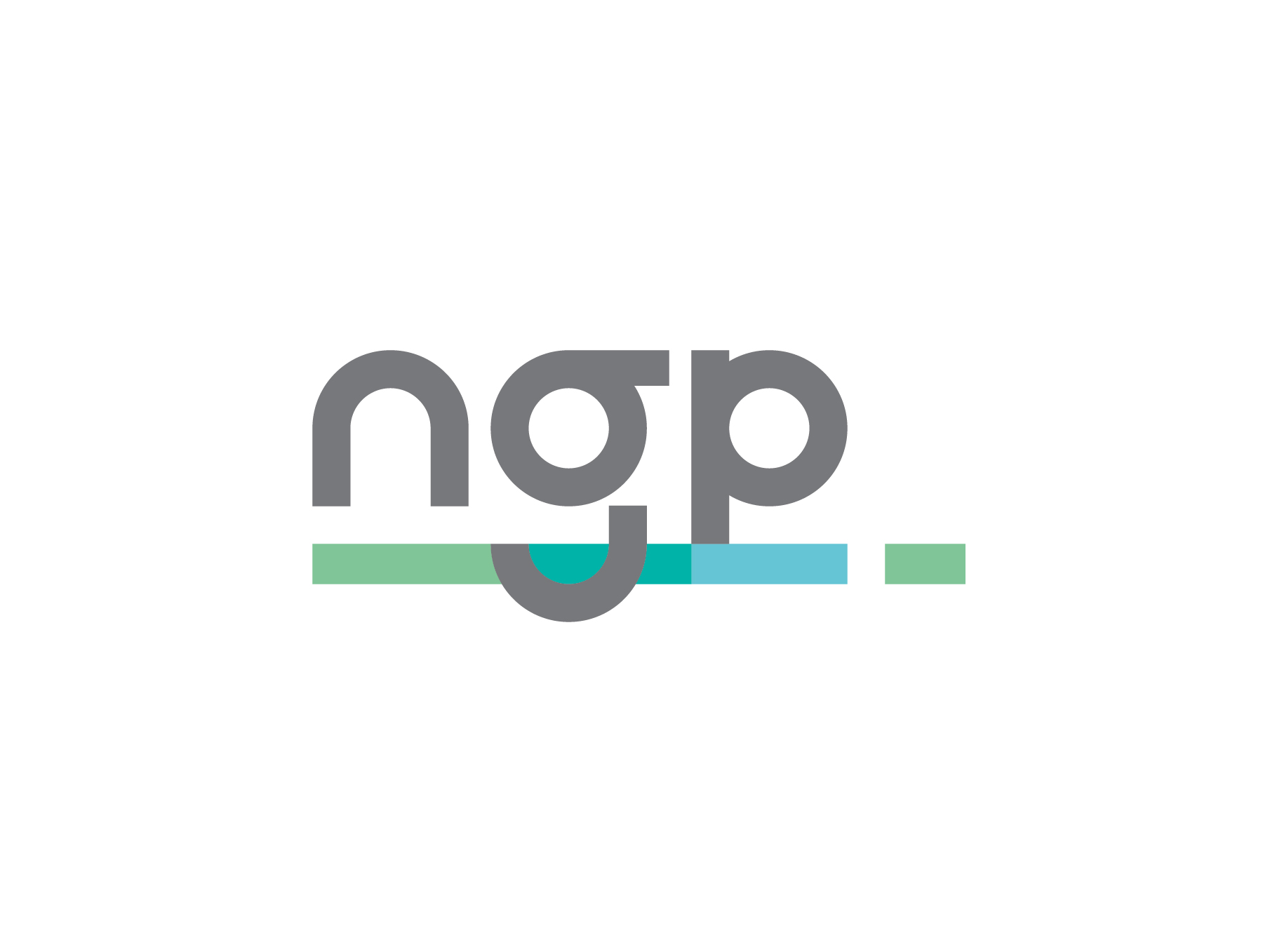
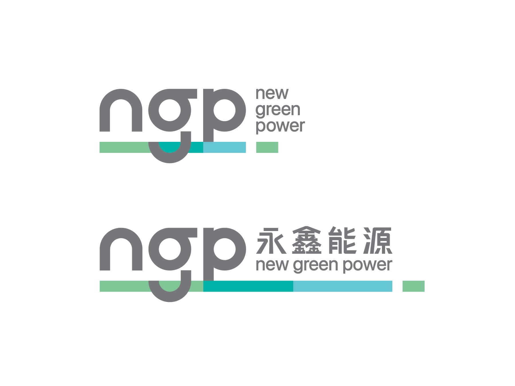

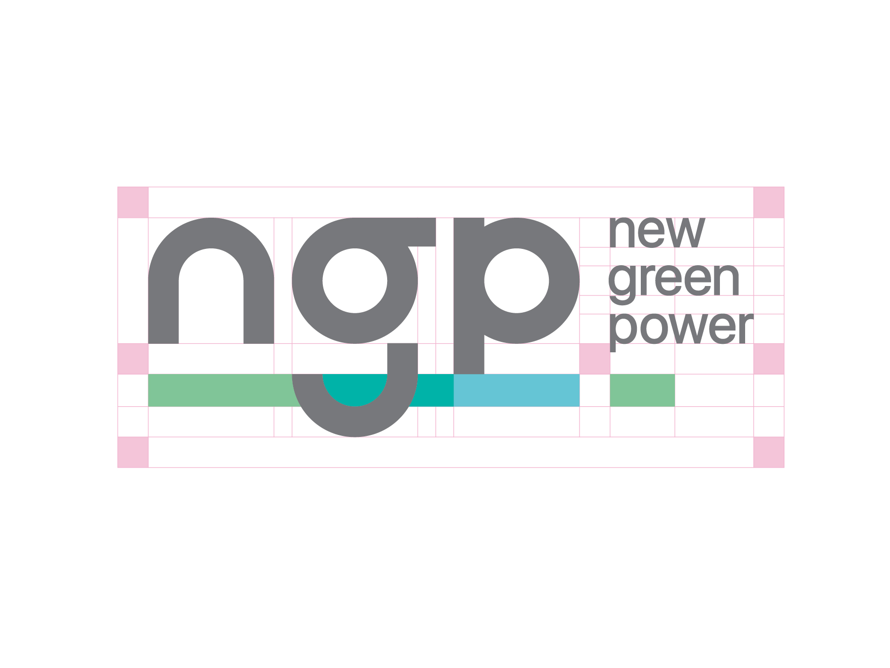
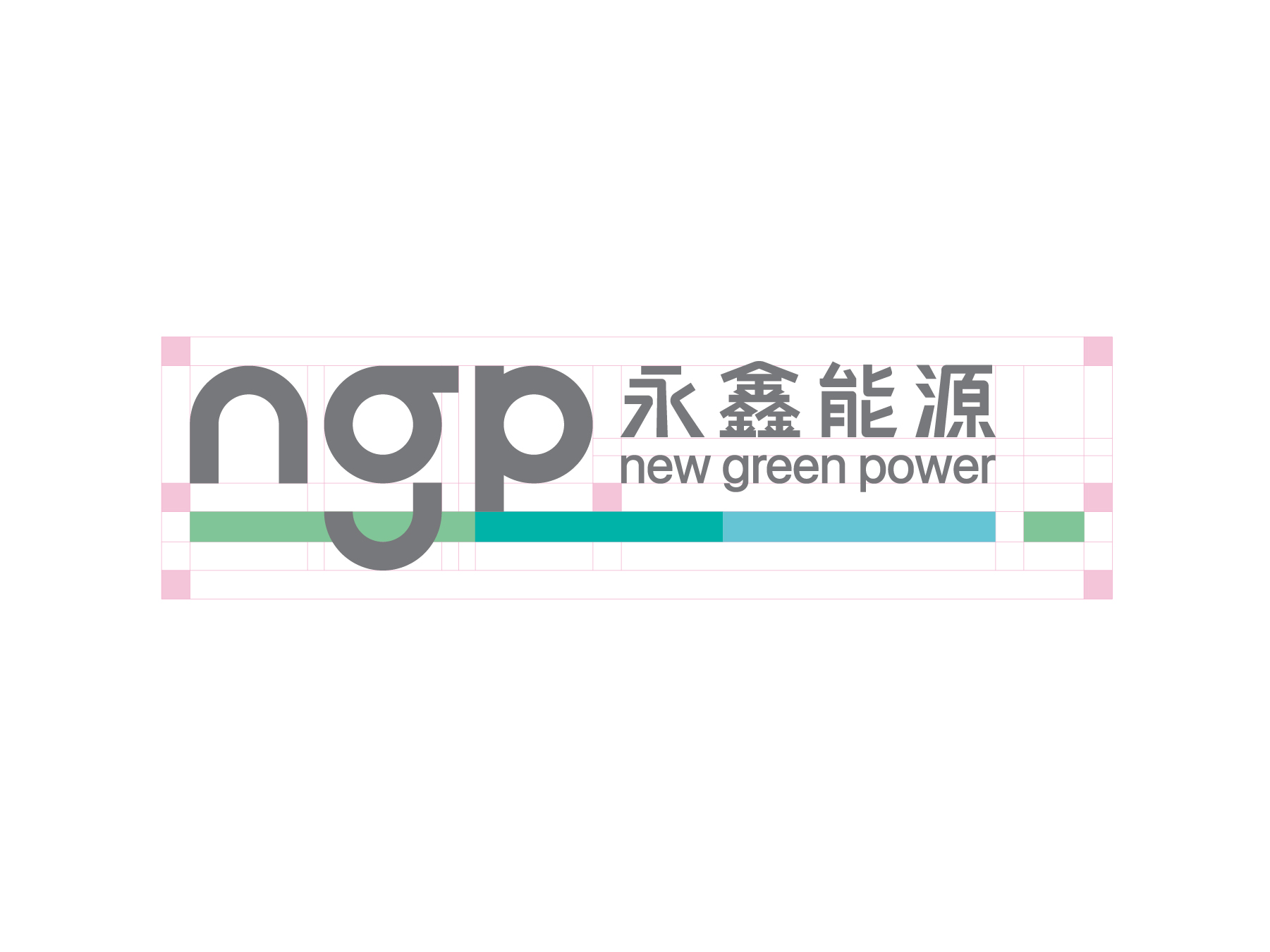
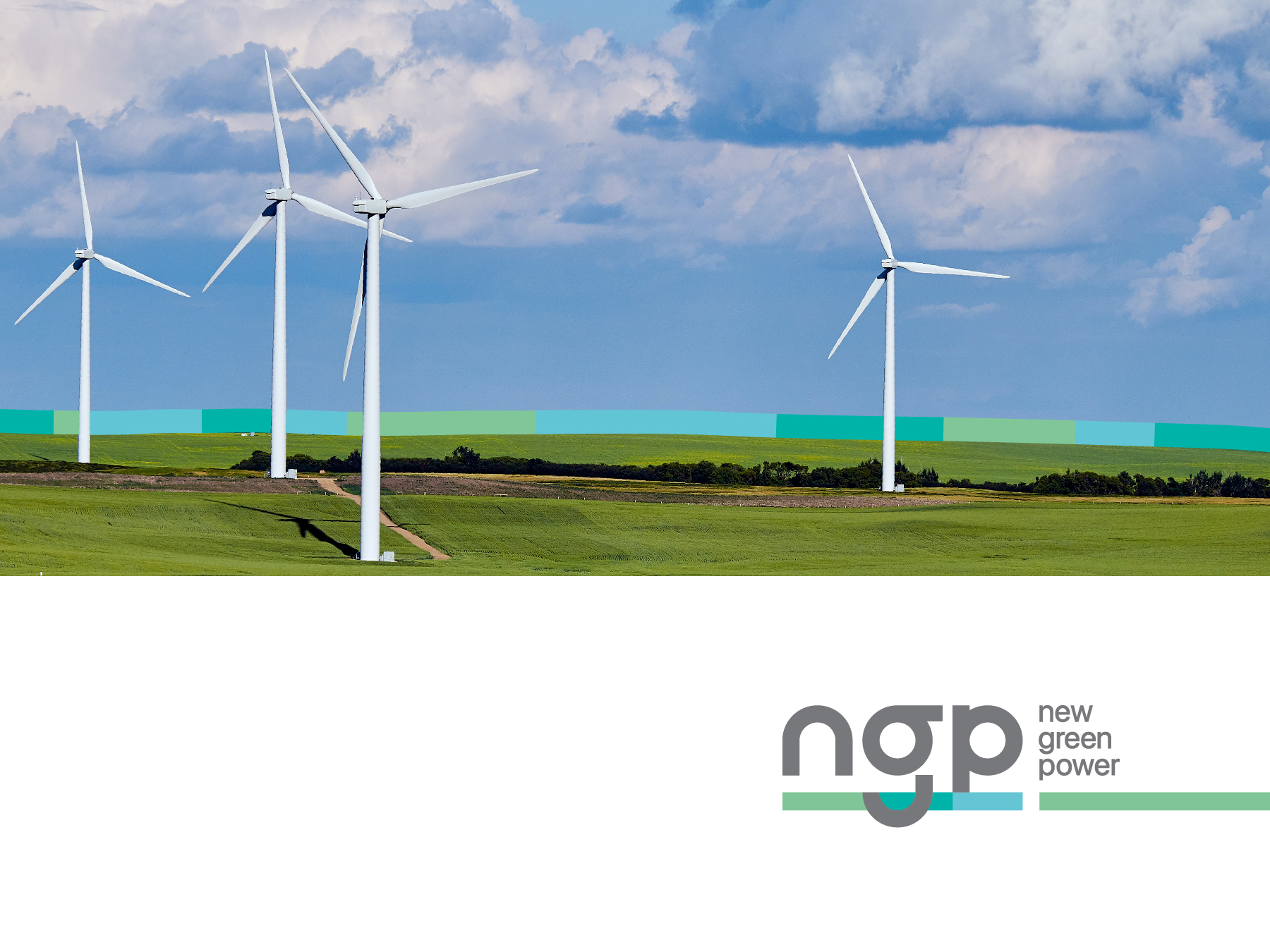

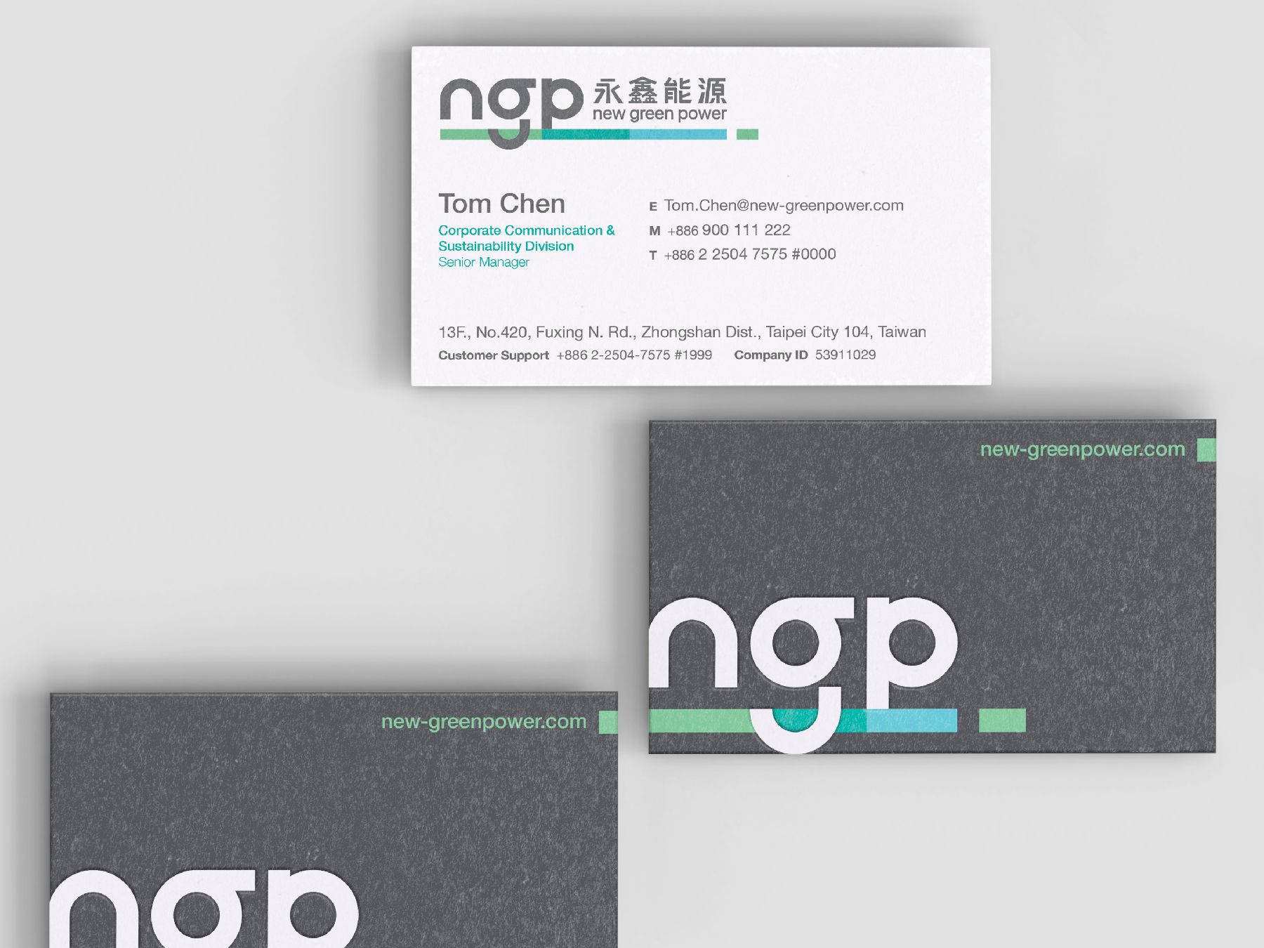
A pivotal aspect of the redesign was the transition from the verbose "永鑫能源 New Green Power" to the succinct "NGP," symbolizing a streamlined and modern approach to communication. Redefining the brand's essence as "connecting lives with green solutions" underscored NGP's forward-thinking mindset and commitment to making a meaningful impact on society.
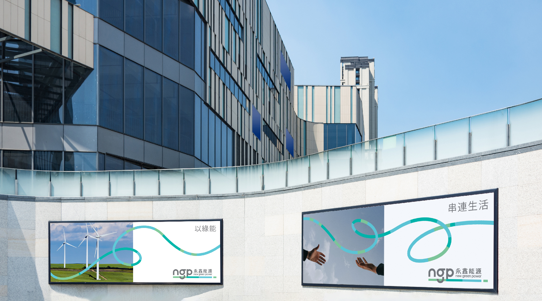
在設計中,我們強調了NGP不斷前進的精神,同時重新詮釋了品牌名稱,從“永鑫能源”到簡潔的“NGP”,以突顯現代感和精簡性。重新定義品牌的價值和本質,我們將NGP定位為“以綠能 串連生活”,強調了他們的未來思維和對社會的積極影響。
在設計中,我們強調了NGP不斷前進的精神,同時重新詮釋了品牌名稱,從“永鑫能源”到簡潔的“NGP”,以突顯現代感和精簡性。重新定義品牌的價值和本質,我們將NGP定位為“以綠能 串連生活”,強調了他們的未來思維和對社會的積極影響。
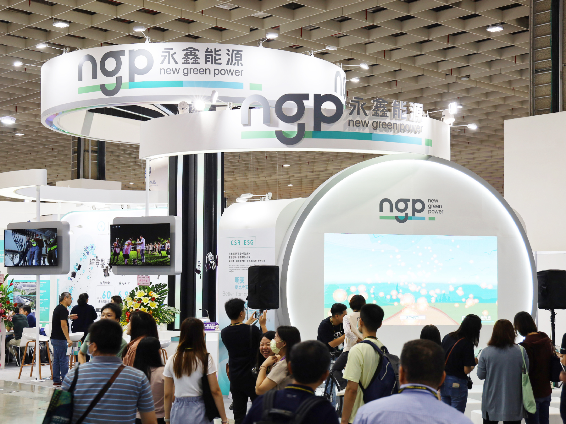

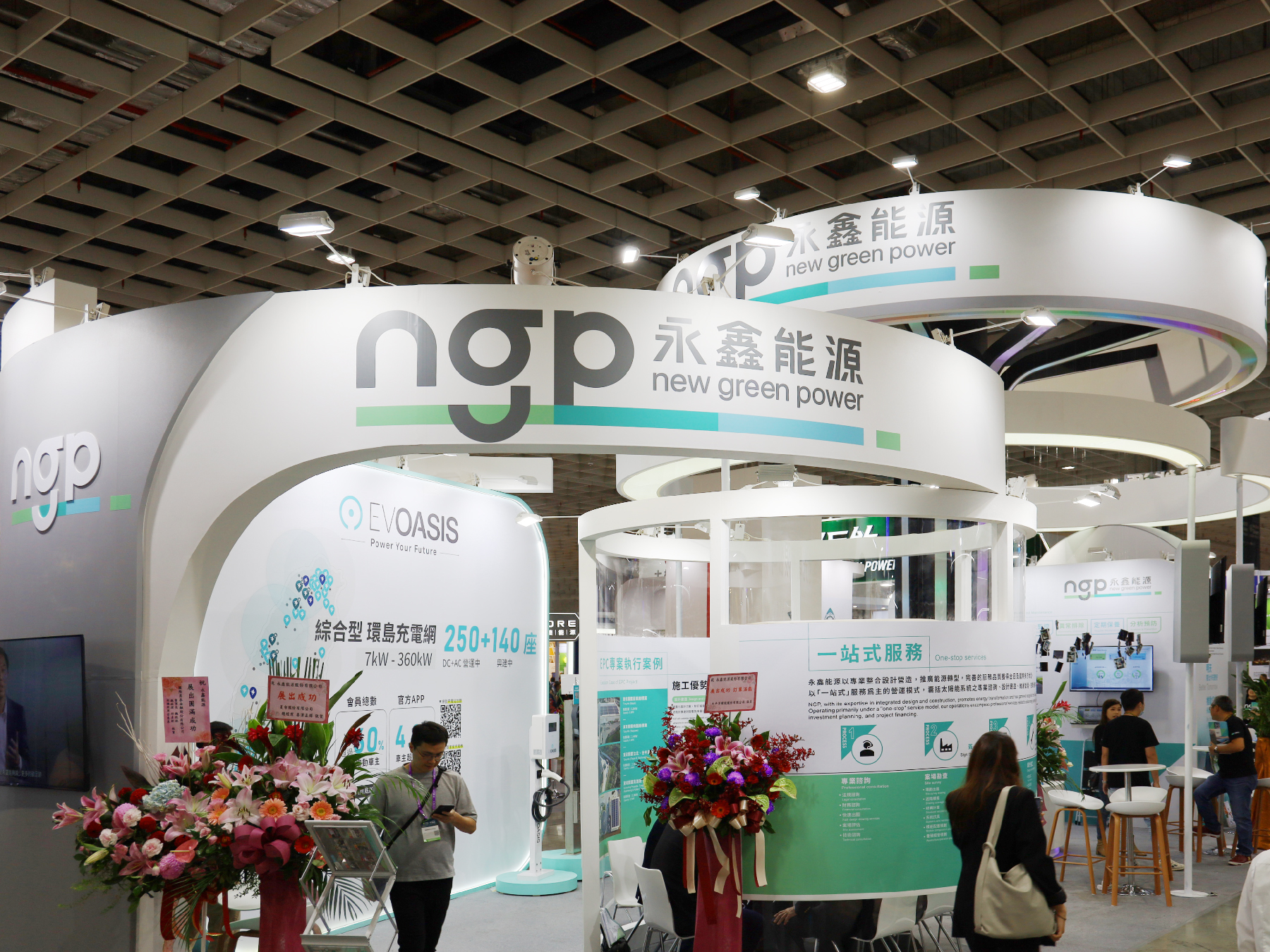
New Logo first appearance during the “Energy Taiwan exhibition”
國際台灣智慧能源週展覽 - 全新商標首次露出

︎︎︎Concept designs
The result? A forward-thinking design that not only ushered in a fresh image for NGP but also extended their brand value, positioning them as a beacon of innovation and sustainability in the renewable energy landscape.
最終,我們成功地為NGP打造了一個全新且具前瞻性的品牌形象,不僅展現了企業的創新精神,更進一步擴展了他們的品牌價值,使他們成為可持續發展領域中的領航者。
最終,我們成功地為NGP打造了一個全新且具前瞻性的品牌形象,不僅展現了企業的創新精神,更進一步擴展了他們的品牌價值,使他們成為可持續發展領域中的領航者。
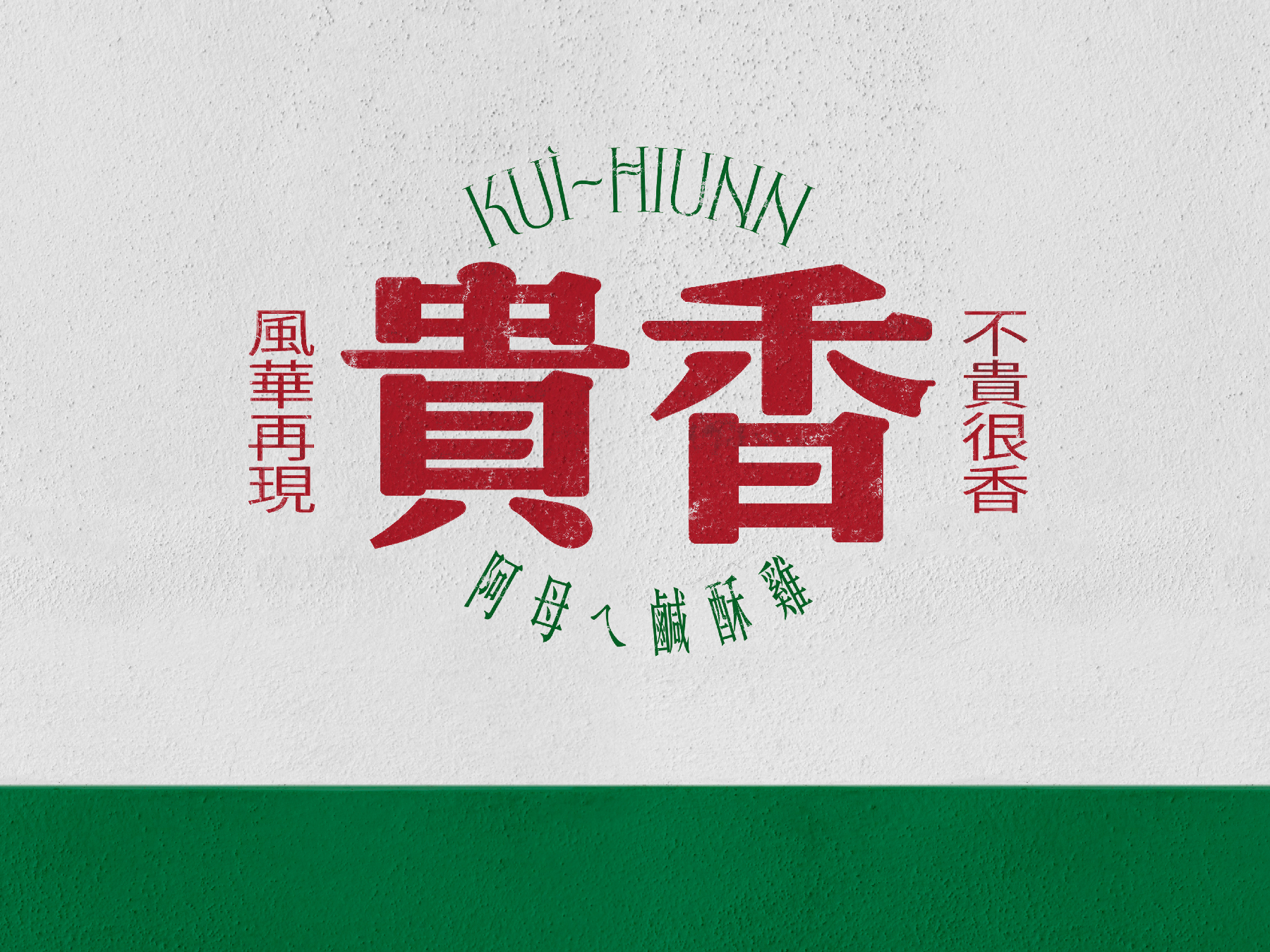
KUI-HIUNN 貴香鹹酥雞
2025
𒊹︎︎︎ Branding
𒊹︎︎︎ Shop Design
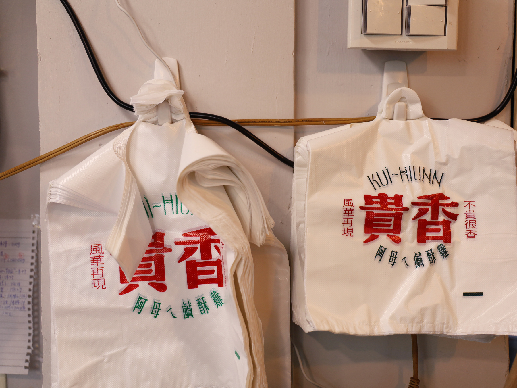
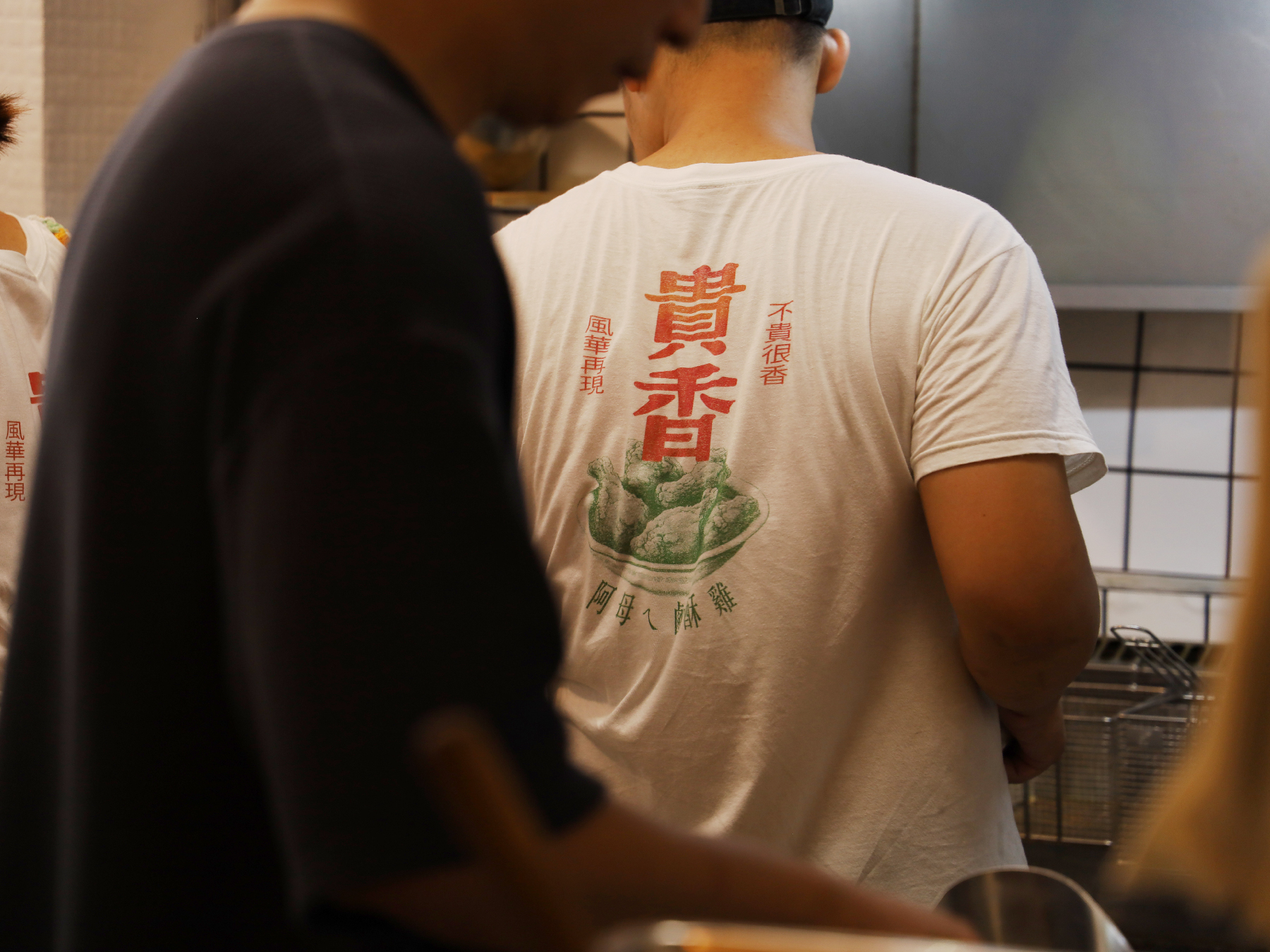
The visual identity design for KUI-HIUNN 貴香鹹酥雞 is deeply rooted in the rich flavors of Taiwanese street food culture. Inspired by the founder’s mother’s cherished recipe, the brand carries forward a taste of nostalgia, blending tradition with a bold and contemporary aesthetic.
At the heart of the design is the phrase “滿滿的台式風味 Packed with Authentic Taiwanese Flavors”, emphasizing the authentic Taiwanese essence that defines the brand. The visual identity features a striking contrast of bold green and red, creating a dynamic and eye-catching appeal that reflects both the vibrancy of night market culture and the energy of local food stalls.
貴香鹹酥雞 KUI-HIUNN 的視覺識別設計深植於台灣街頭小吃文化的濃厚風味之中。品牌靈感來自創辦人阿母傳承的記憶好味道,將這份懷舊情感延續,並透過大膽且現代的設計語言,為傳統注入嶄新的活力。
設計核心以 「滿滿的台式風味」 為主軸,強調品牌的道地台灣精神。視覺識別選用 鮮明的綠色與紅色,透過強烈對比營造出吸睛且富有動感的視覺效果,不僅呼應台灣夜市文化的熱鬧氛圍,更展現街邊小吃攤的活力。
設計核心以 「滿滿的台式風味」 為主軸,強調品牌的道地台灣精神。視覺識別選用 鮮明的綠色與紅色,透過強烈對比營造出吸睛且富有動感的視覺效果,不僅呼應台灣夜市文化的熱鬧氛圍,更展現街邊小吃攤的活力。
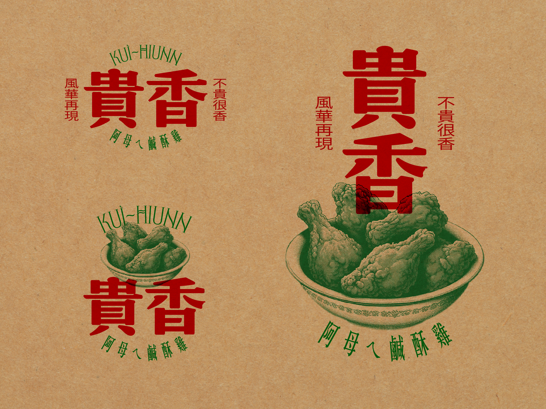
To further reinforce the brand’s character, we crafted the tagline “不貴很香 風華再現 Affordable Yet Flavorful, A Taste Revived”, placed alongside the logo. This phrase not only captures the brand’s affordability and deliciousness but also evokes a sense of revival—bringing back the golden era of Taiwanese flavors in a fresh, stylish way.
為進一步突顯品牌個性,我們精心打造了標語 「不貴很香 風華再現」,巧妙地放置於標誌側邊,傳達品牌平價美味的特色,同時喚起台灣經典風味的再現,讓傳統美食在時尚潮流中綻放新生。
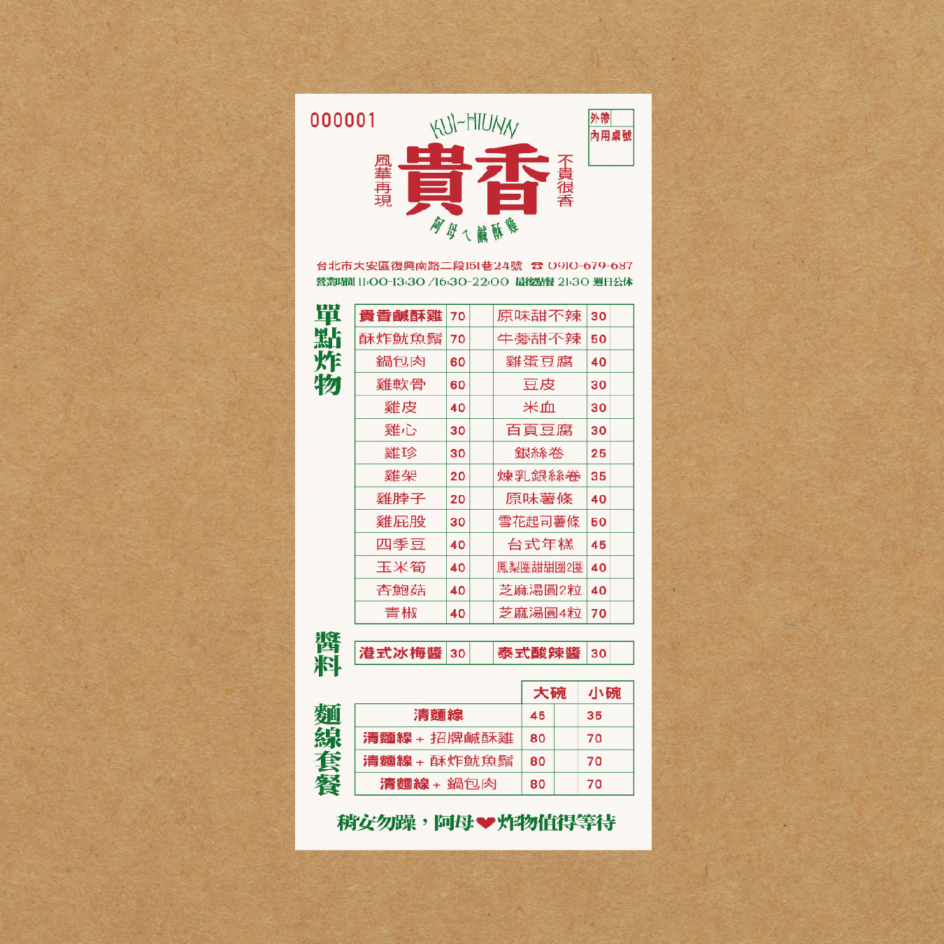
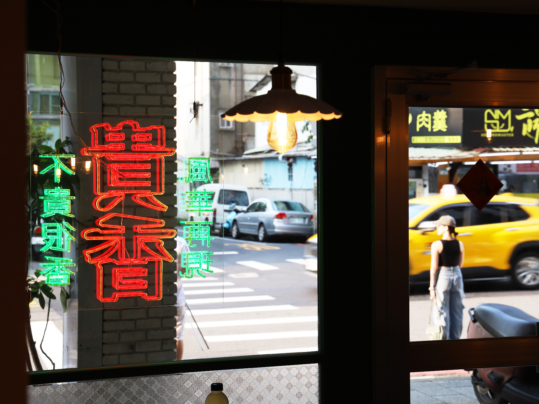
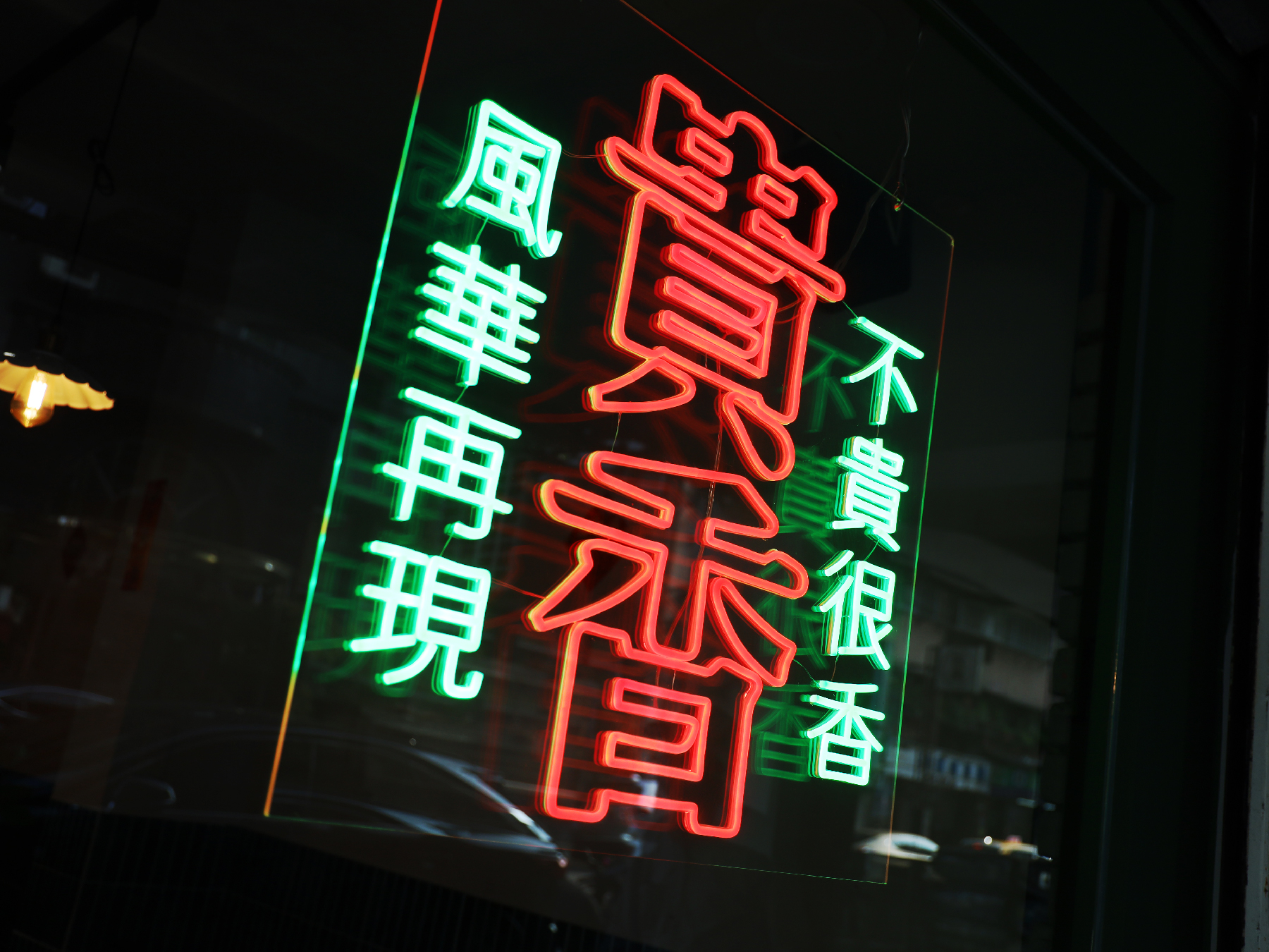
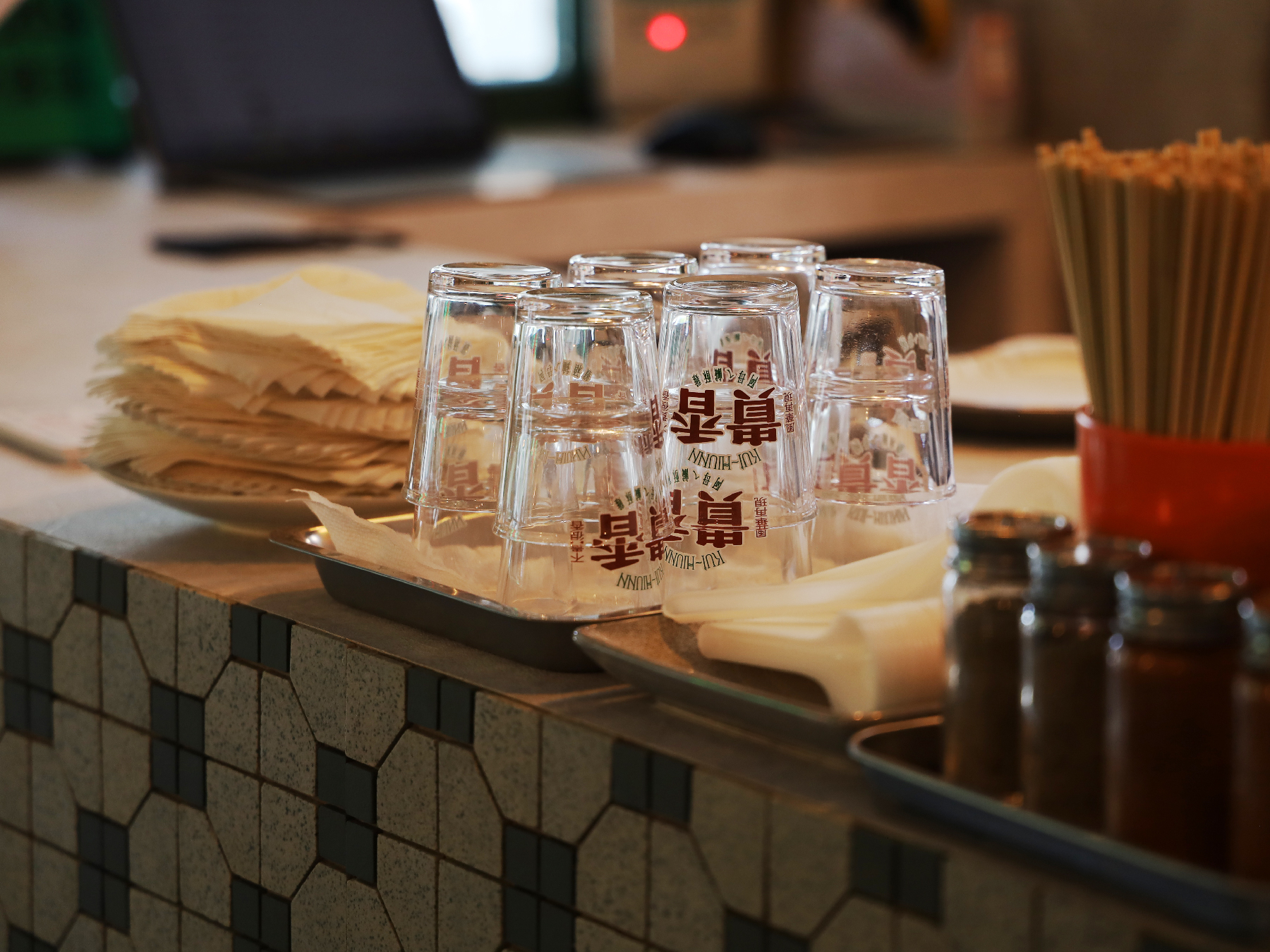
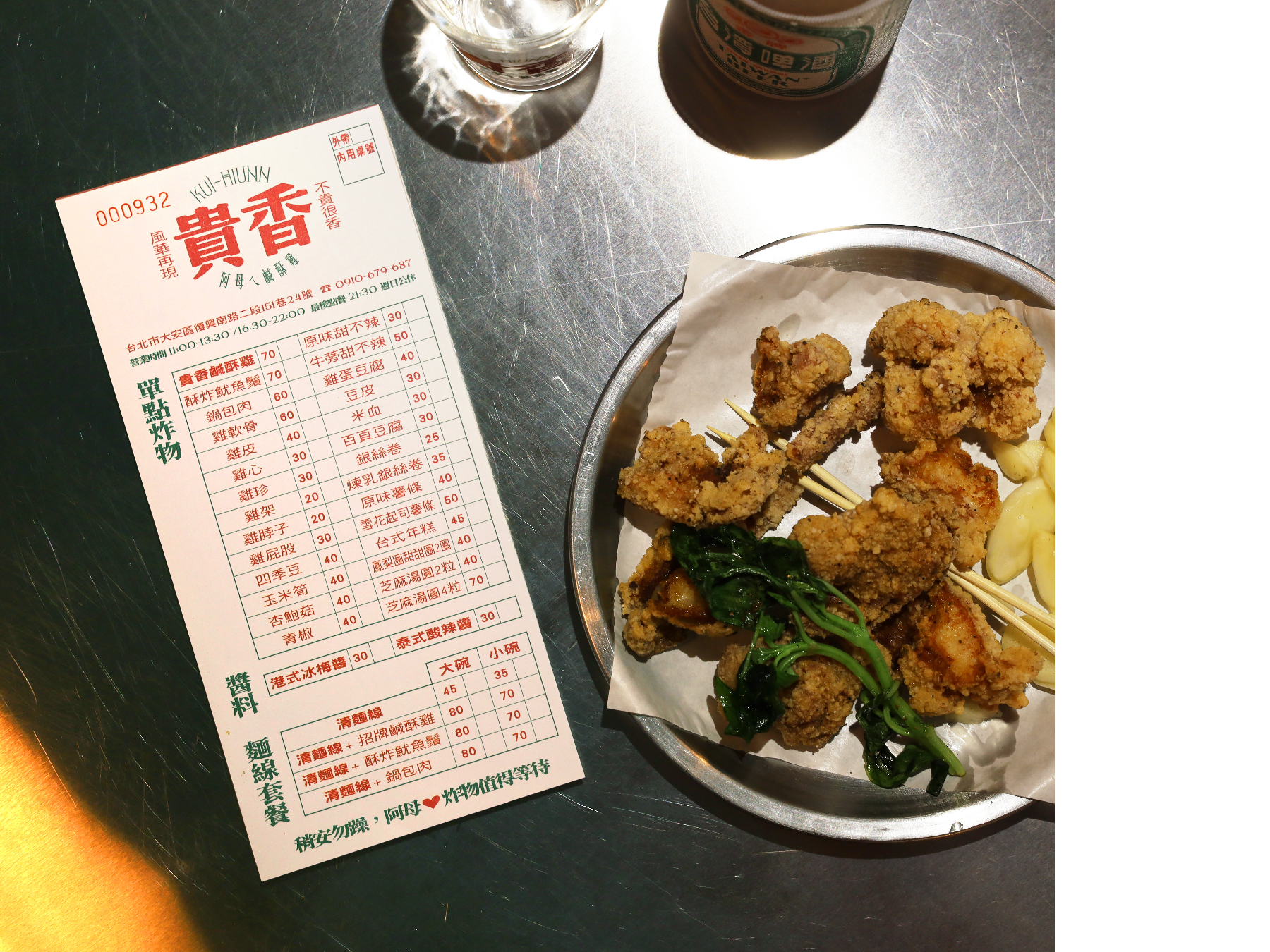
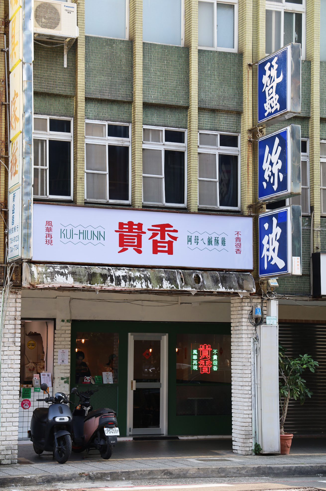
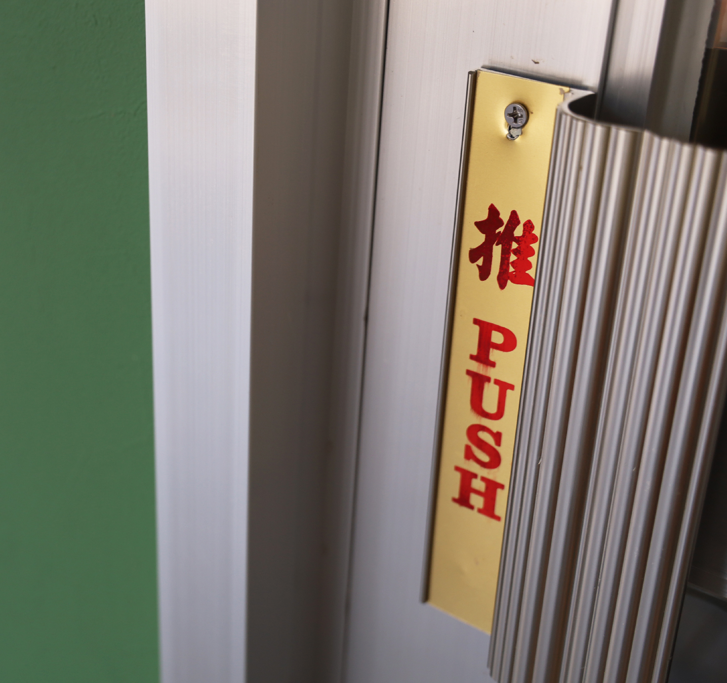
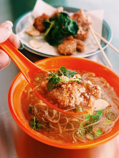
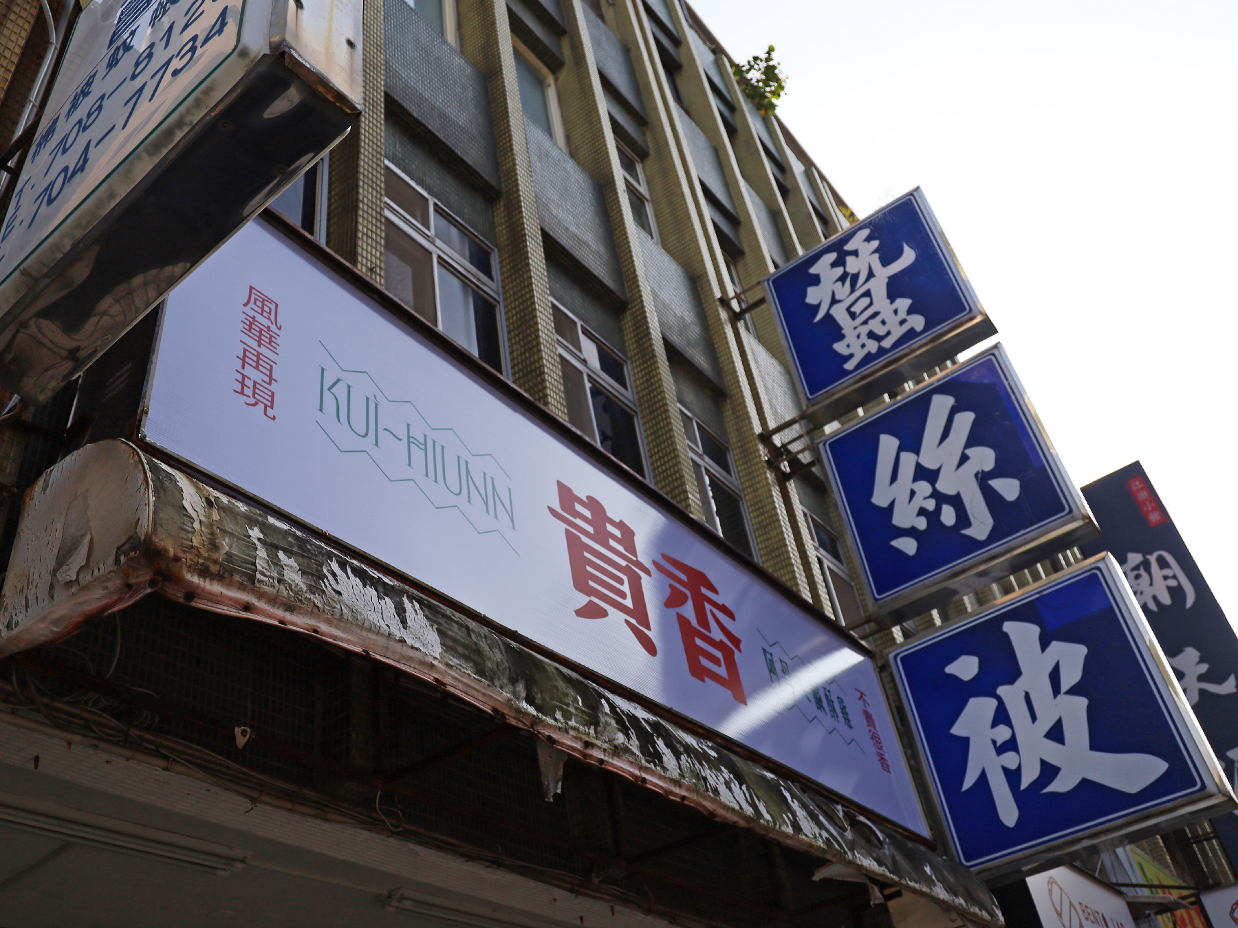
Beyond the logo and color scheme, the entire restaurant environment, from its interior design to tableware selection, is a homage to 1980s Taiwan. Elements such as retro tile patterns, vintage-style menus, and nostalgic lighting recreate the warmth and charm of classic local eateries, immersing customers in a dining experience that is both old-school and fashionable.
Through this visual identity, KUI-HIUNN 貴香鹹酥雞 successfully bridges the past and present, offering not just a meal but a multisensory journey through time, flavor, and culture.
除了標誌與色彩設計,品牌的 店內空間與餐具選擇 亦精心打造,向 1980 年代台灣 的懷舊氛圍致敬。復古磁磚紋樣、懷舊風格菜單,以及充滿復古情懷的燈飾,皆營造出溫馨親切的用餐體驗,讓顧客仿若走進舊時台灣街頭的經典小吃店,在復古與潮流交織的氛圍中,感受獨特的味覺與視覺享受。
透過這套視覺識別設計,貴香鹹酥雞 KUI-HIUNN 成功地串聯過去與現在,為顧客帶來的不僅是一頓美味的餐點,更是一場穿越時空的風味與文化之旅。
Carrefour Foundation Annual Report 2023 家樂福文教基金會 2023 年報
2024

𒊹︎︎︎ Editorial Concept & Design
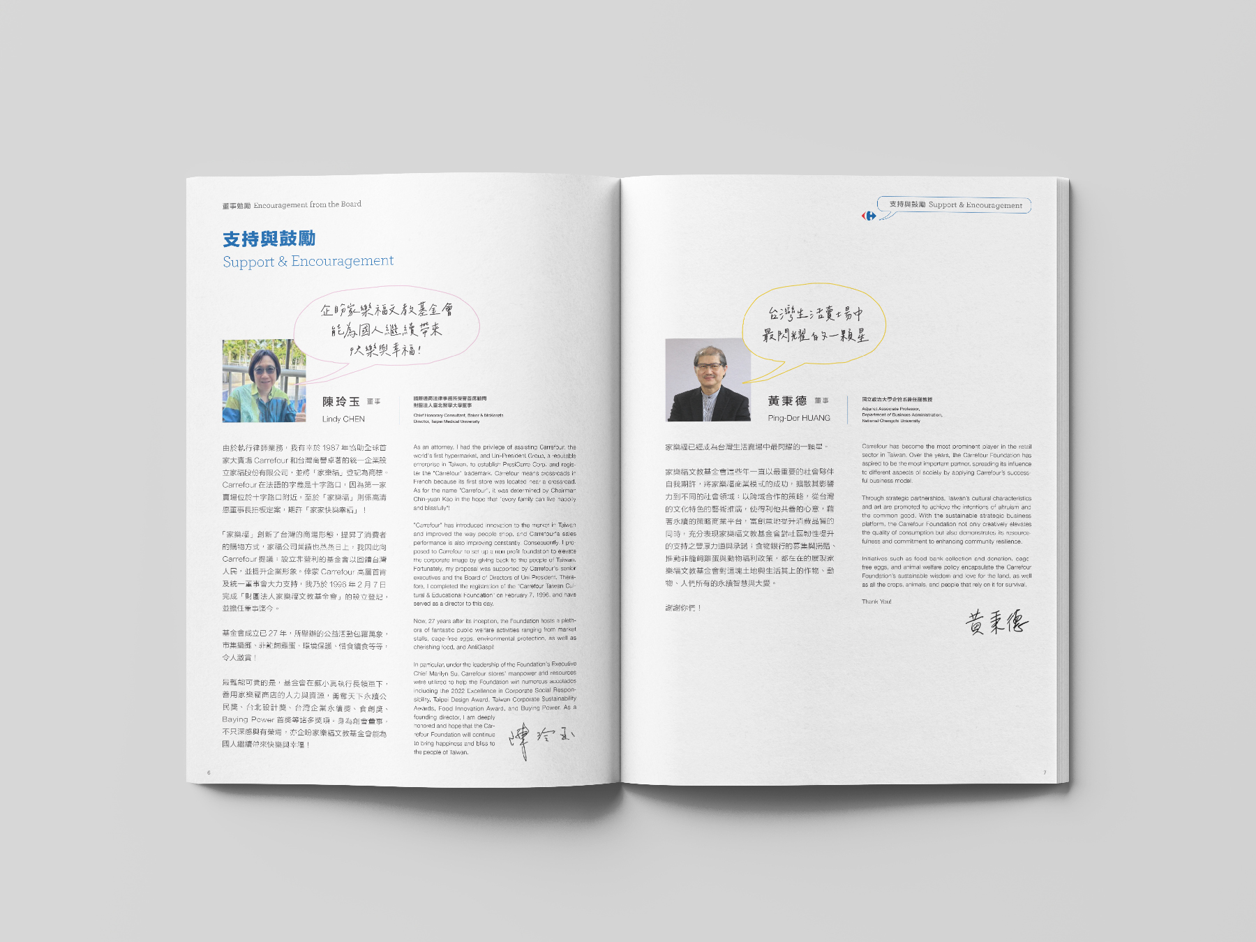
For the Carrefour Foundation Annual Report 2023 (Taiwan), we designed the publication around the theme of "Dialogue," visually represented through various speech bubble designs. These speech bubbles connect the entire report, symbolizing the continuous communication and interaction between the company, its customers, and society.
在 台灣家樂福基金會2023年報設計中,我們以「對話」為主題,透過各式各樣的對話框設計貫穿整本報告,象徵公司、顧客與社會之間不斷的溝通與互動。


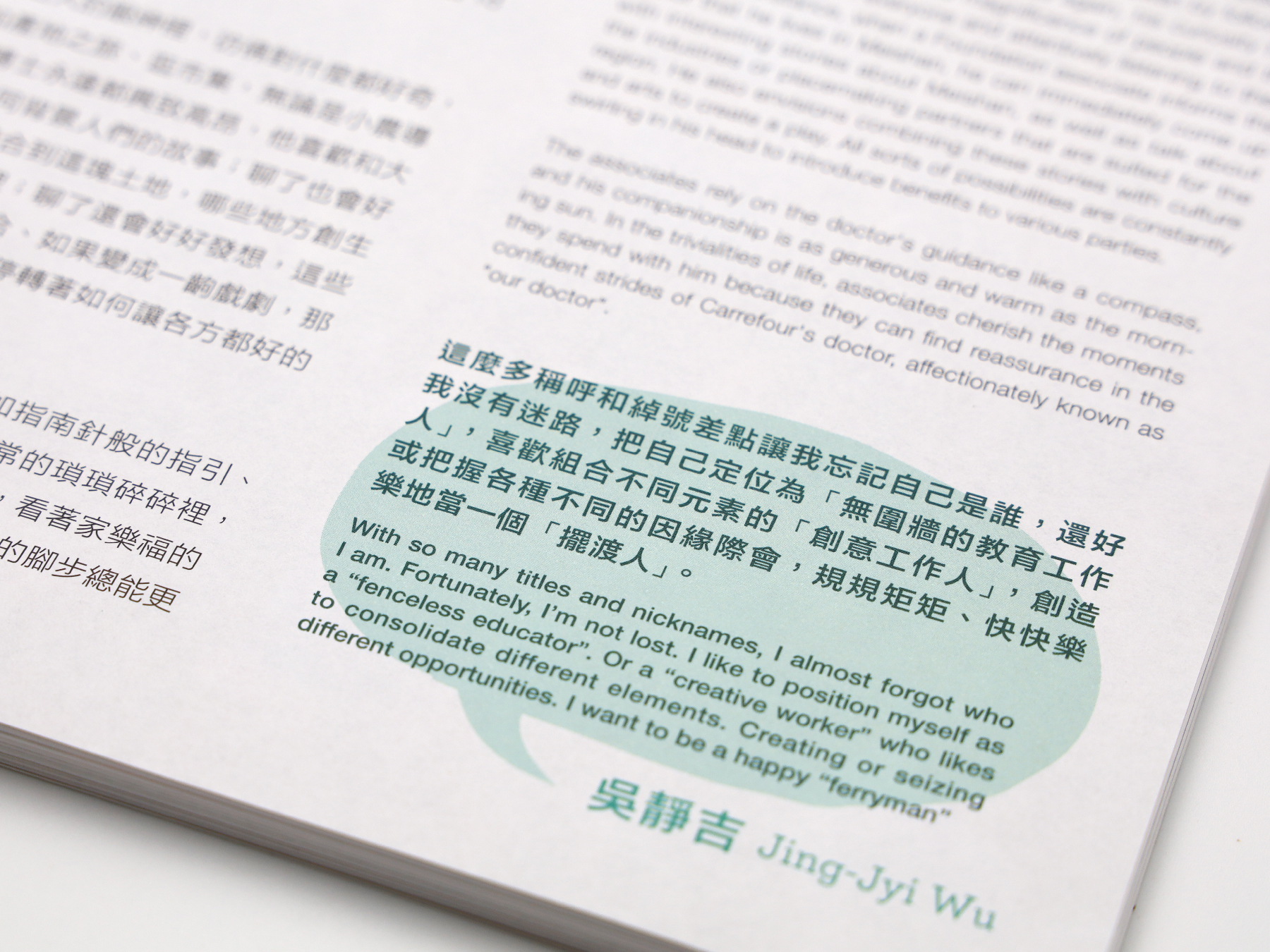


The report is divided into eight main chapters, each highlighting a different aspect of the foundation’s contributions to the community, from environmental initiatives to social responsibility programs. The use of speech bubbles reinforces the idea of ongoing dialogue and collaboration, making the content not only informative but also engaging. This creative approach celebrates the Carrefour Foundation’s efforts while showcasing its commitment to fostering meaningful connections and positive societal impact.
報告共分為八個章節,每個章節都著重於基金會在不同領域中的社會貢獻,涵蓋從文化藝術到社會責任等多方面的倡議與行動。對話框的設計強調了這種持續的溝通與合作,不僅讓內容更具資訊性,同時也增添了互動感。這種創意設計不僅展現了家樂福基金會的努力,也突顯了它對促進有意義的連結與社會正向影響的承諾。
報告共分為八個章節,每個章節都著重於基金會在不同領域中的社會貢獻,涵蓋從文化藝術到社會責任等多方面的倡議與行動。對話框的設計強調了這種持續的溝通與合作,不僅讓內容更具資訊性,同時也增添了互動感。這種創意設計不僅展現了家樂福基金會的努力,也突顯了它對促進有意義的連結與社會正向影響的承諾。


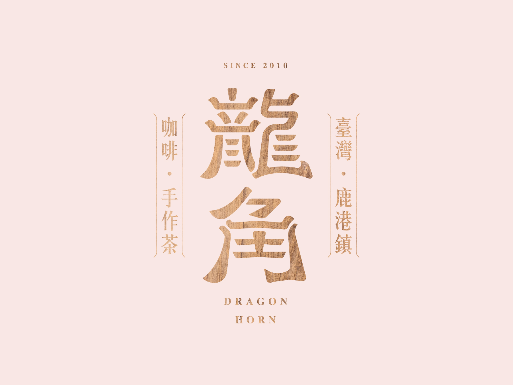
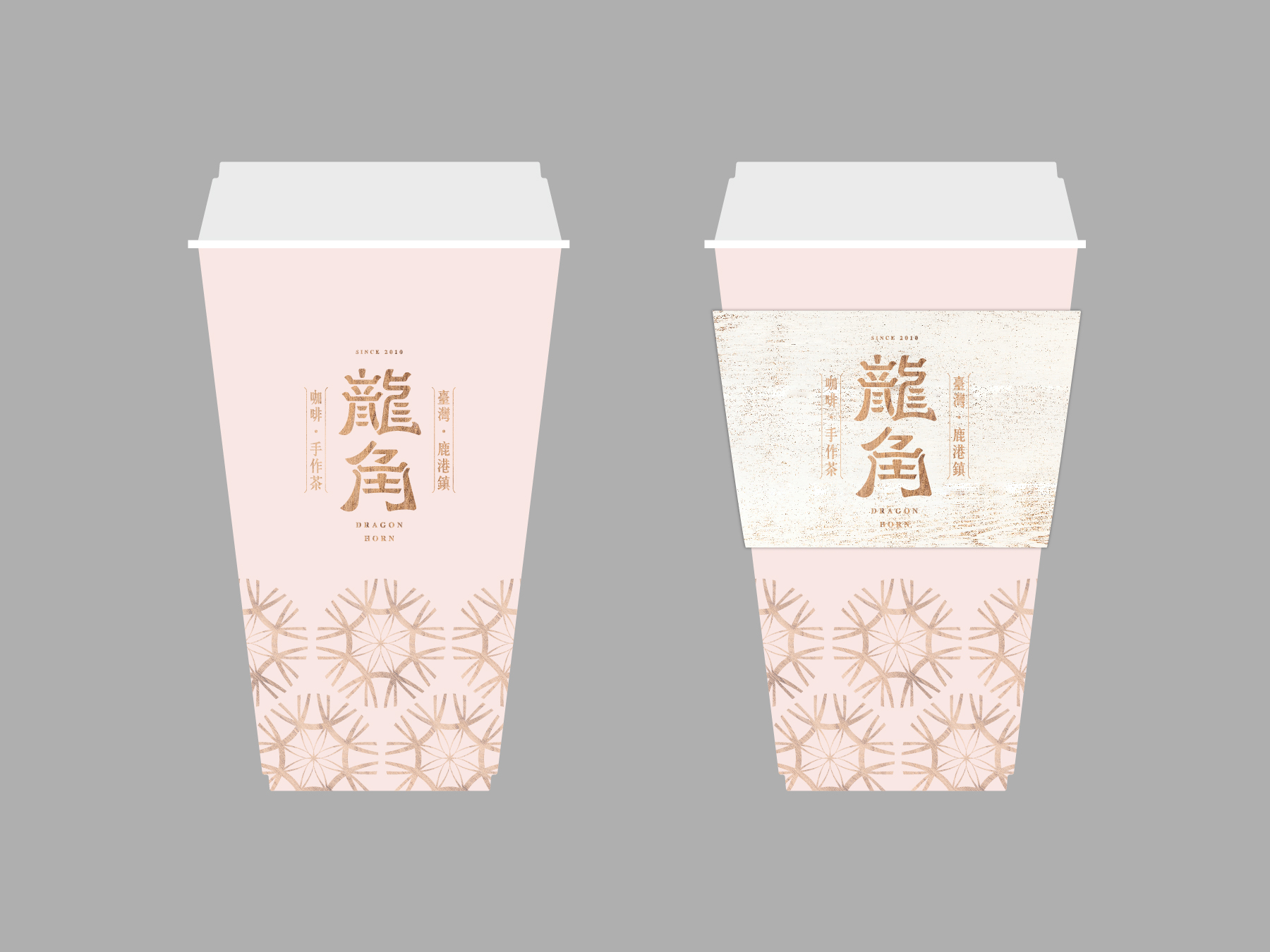
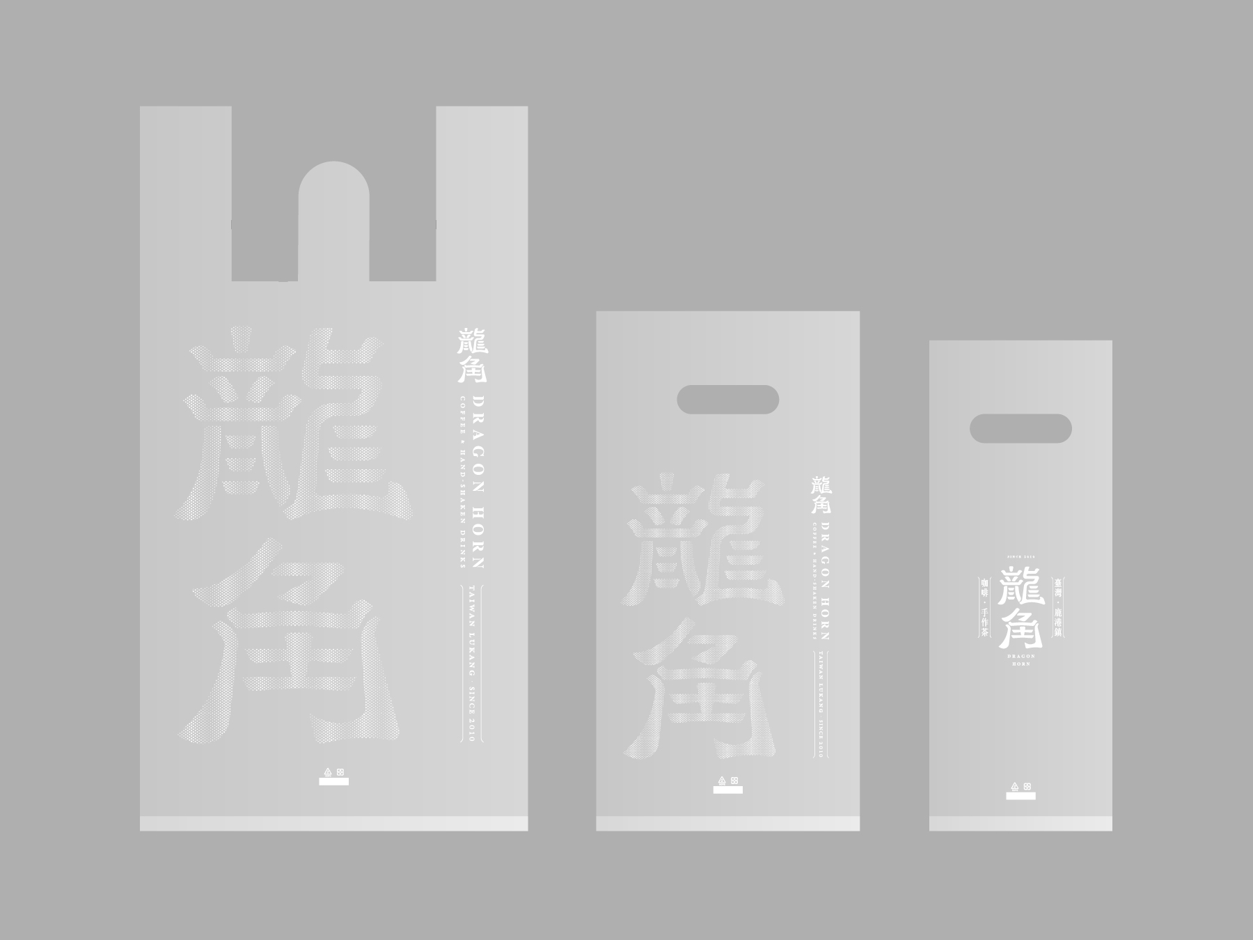
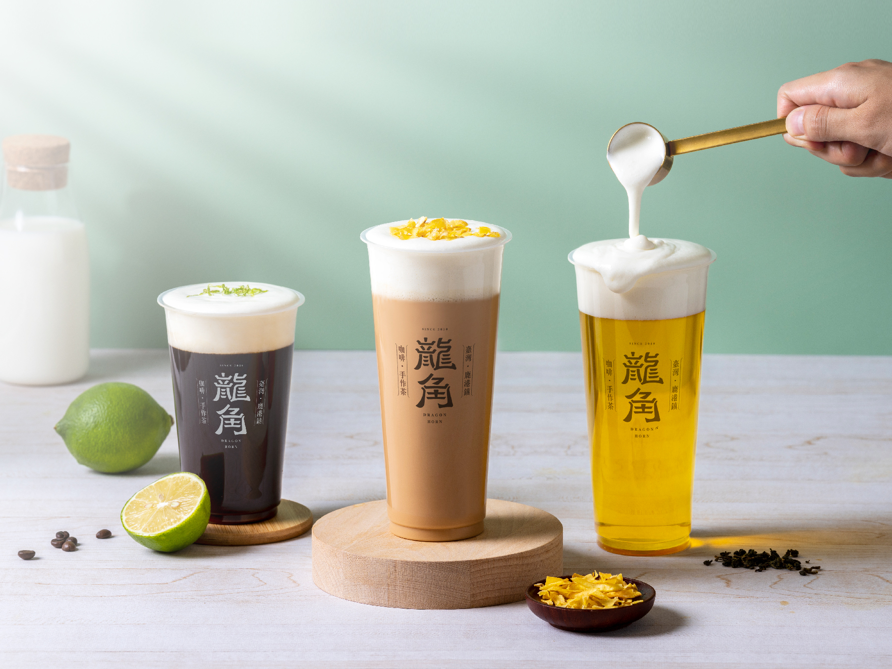
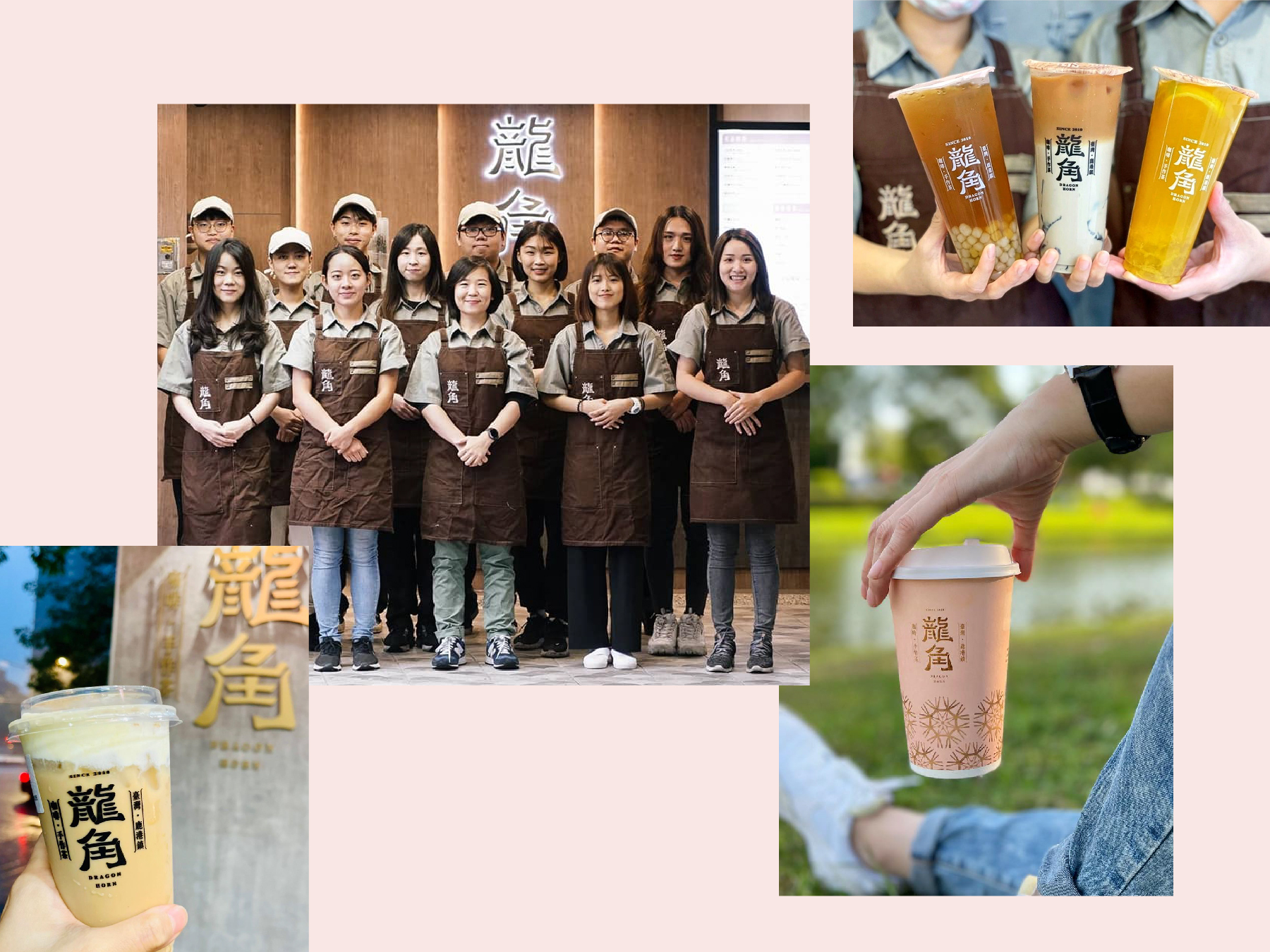
DRAGON HORN
2021
𒊹︎︎︎ Visual Identity
𒊹︎︎︎ Retail
Drawing upon the shop's origin in Lukang and the cultural significance of Chinese temples, we utilized wood sculpture as the primary design element to create a logo that is both unique and memorable. The warm, earthy tones of the woodwork are complemented by the bold, modern typography, creating a balance between tradition and innovation. The end result is a visually striking logo that captures the essence of this beloved bubble tea shop and its roots in Taiwanese culture.
借鑒了店鋪源於鹿港的起源和中國寺廟的文化意義,我們運用木雕作為主要的設計元素,創造出一個獨特而難忘的商標。木工作品的溫暖、自然的色調與大膽、現代的字體相輔相成,實現了傳統和創新之間的平衡。最終呈現的是一個視覺上引人注目的商標,捕捉了這家受人喜愛的珍珠奶茶店的本質和其在台灣文化中的根源。
CONCEPT →


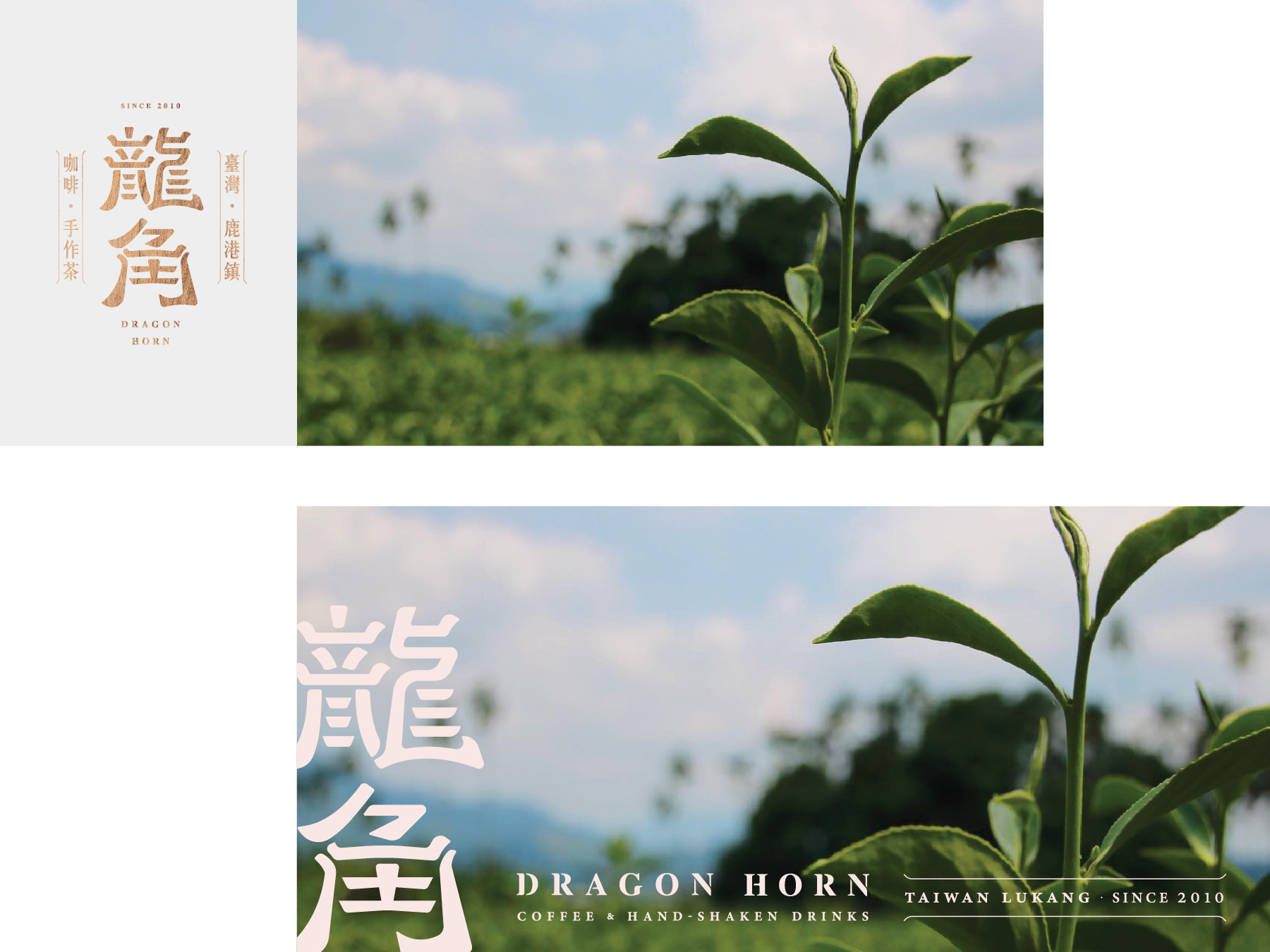

We were also responsible for designing all the marketing materials, including the cups, menu, shop front interior, and other visual elements that create a cohesive brand experience for the customers. Our goal was to create a welcoming atmosphere that incorporates the traditional elements of Lukang and Chinese culture, while also conveying a modern and trendy vibe that appeals to the younger generation.
我們負責設計所有的市場營銷材料,包括杯子、菜單、店鋪內部裝潢和其他視覺元素,為顧客創造出一個統一的品牌體驗。我們的目標是創造一個融入鹿港和中國文化傳統元素的友好氛圍,同時傳達出時尚現代的氛圍,吸引年輕一代的喜愛。
我們負責設計所有的市場營銷材料,包括杯子、菜單、店鋪內部裝潢和其他視覺元素,為顧客創造出一個統一的品牌體驗。我們的目標是創造一個融入鹿港和中國文化傳統元素的友好氛圍,同時傳達出時尚現代的氛圍,吸引年輕一代的喜愛。


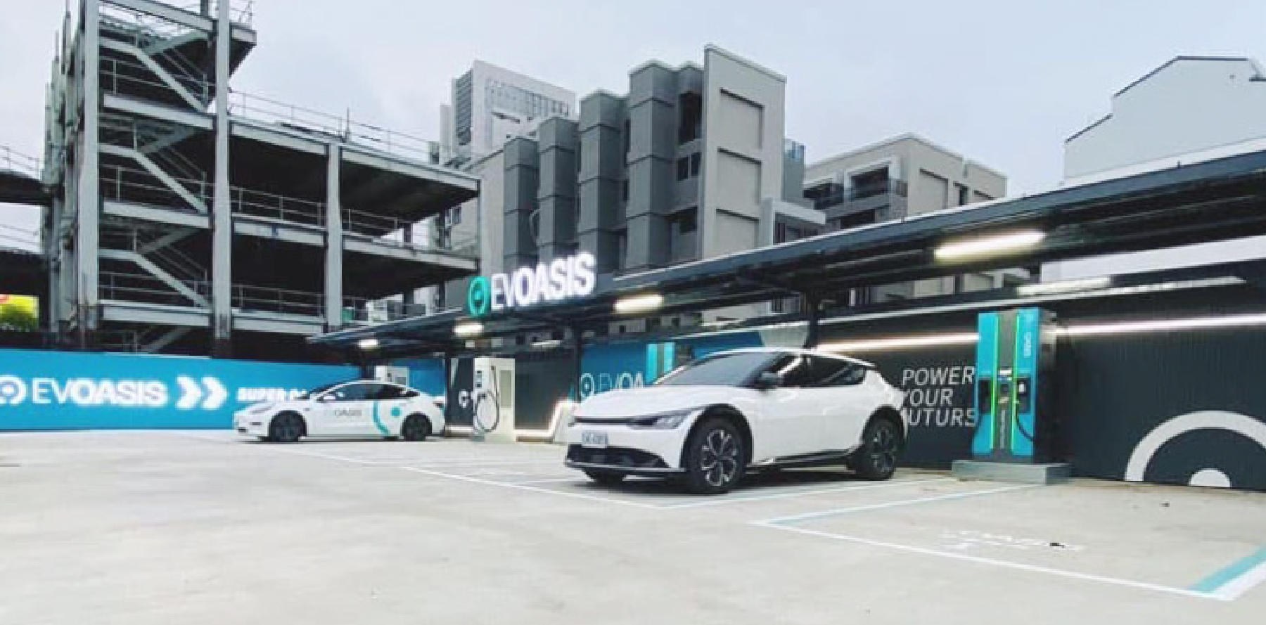
EV OASIS
2021


𒊹︎︎︎ Visual Identity
𒊹︎︎︎ Integrated Design
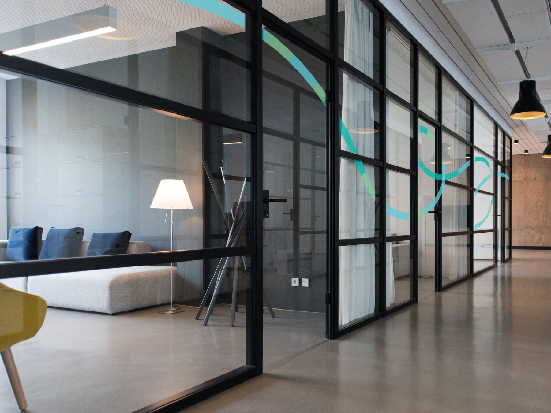
EV OASIS is an EV charging service provider with over 200 charging stations located throughout Taiwan. The main concept of the brand image is to create a futuristic design that seamlessly integrates with all car brands, regardless of their specific design elements.
The logo features a minimalist design with a sleek, simple font and an electric lake-blue-green color that represents the futuristic and eco-friendly nature of the brand. The circular shape of the logo symbolizes the charging slot as well as the infinite possibilities of EV technology and clean energy - to calls out the goal of the brand - provides an oasis of electricity for EV drivers.
The visual identity of EV OASIS adopts clean lines and modern minimalistic elements, creating a friendly and simplistic design across various user interfaces. This effectively highlights the brand's commitment to providing convenient, user-friendly, and sustainable electric vehicle charging solutions.
With its branding and marketing resources, as well as its charging pole and station designs, EV OASIS has become a trendsetter in the electric vehicle industry, making it one of the most well-known and beloved charging service providers in Taiwan.
EV OASIS 是一家在台灣設有超過200個充電站的電動車充電服務提供者。我們為品牌定義富未來感的形象, 標誌採用極簡設計,搭配流暢簡單的字體和湖藍綠色,代表品牌的未來主義和環保特性。標誌的圓形形狀象徵充電插槽以及電動車技術和清潔能源的無限可能性,突顯了品牌的目標 - 為電動車司機提供電力的綠洲。
EV OASIS 的視覺識別採用乾淨的線條和現代極簡主義元素,在各個使用者介面皆打造一個親和簡約的設計,有效凸顯品牌致力於提供便捷、友善易用,且可持續的電動車充電解決方案。
品牌和營銷資源以及充電樁和站內設計都在電動車界帶起風潮,使得 EV OASIS 成為台灣最知名和受人喜愛的充電服務提供商之一。

︎︎︎photos are provided by clients


︎︎︎site locations photos are provided by clients
2024 © Linshan design & consultancy co ltd
厸彡行銷顧問有限公司