new green power 永鑫能源
2024

𒊹︎︎︎ Re-Branding
In the realm of sustainable energy, NGP (New Green Power) stands as a trailblazer in Taiwan's solar industry, renowned for its comprehensive expertise spanning development, design, construction, and project management. Tasked with revolutionizing their brand, we embarked on crafting a visual identity that would encapsulate NGP's essence while propelling them into a new era.
The brand revamp concept centered on instilling a sense of adaptability, sustainability, vision, and connectivity. Emphasizing perpetual movement, the design conveys NGP's commitment to progress and innovation. An open platform ethos was integral, fostering collaboration, shared values, community bonds, and an overarching aura of positivity.
在可持續能源領域,NGP(New Green Power)是台灣太陽能行業的開拓者,以其在開發、設計、施工和項目管理方面的全面專業知識而聞名。我們的任務是為他們打造一個全新的品牌形象,以體現NGP的本質,同時將其帶入一個新時代。
品牌改造的概念圍繞在注入適應性、可持續性、遠見和連接感。強調永恆運動,設計傳達了NGP對進步和創新的承諾。開放的平台理念至關重要,促進合作、共享價值觀、社區聯繫以及積極樂觀的氛圍。
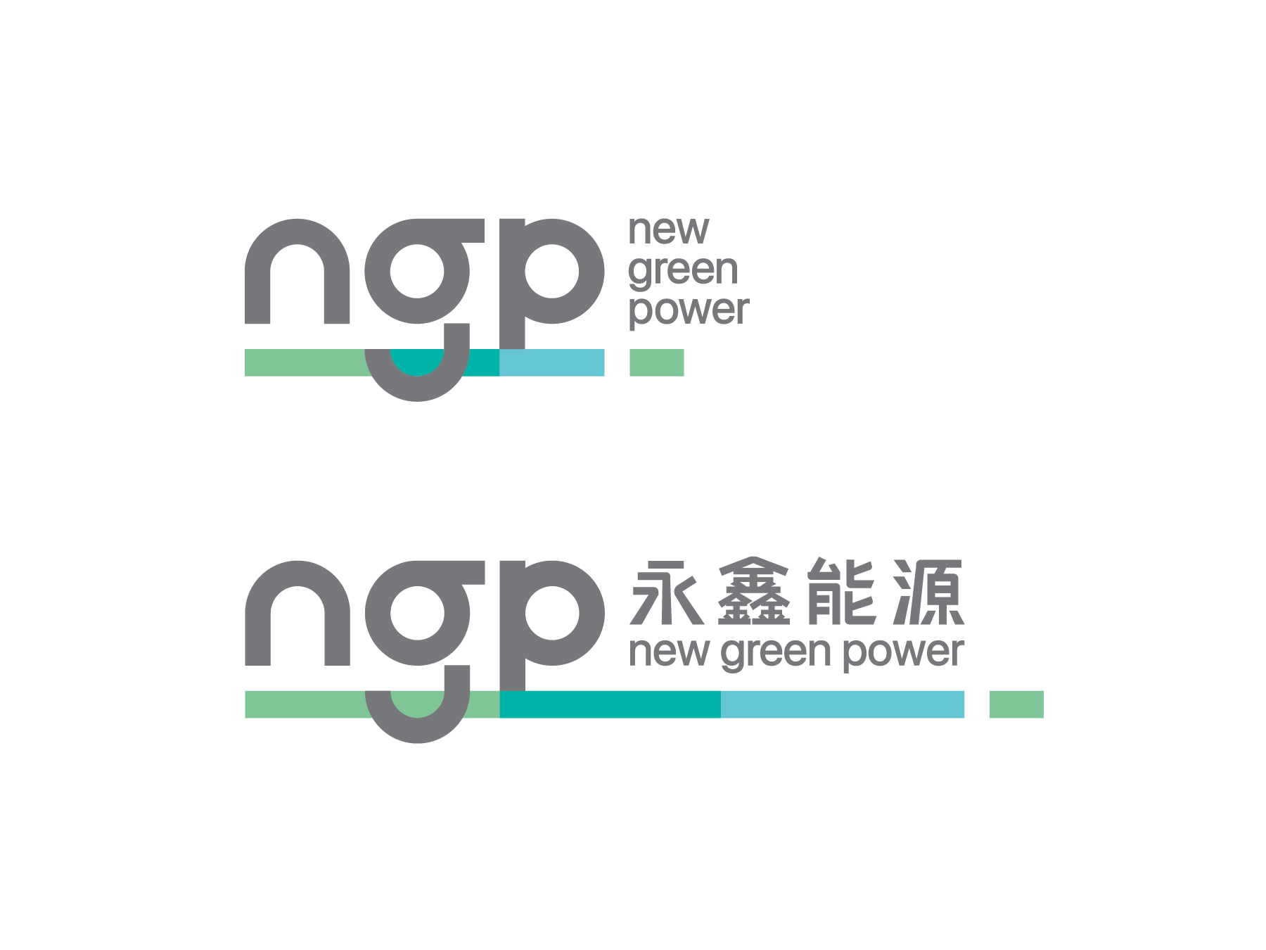

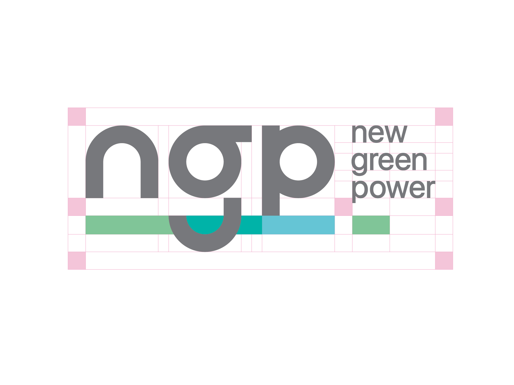
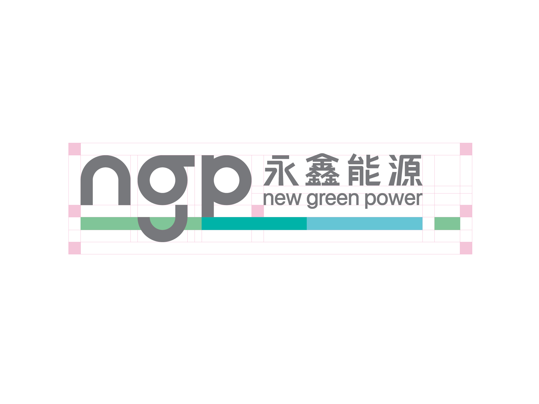

A pivotal aspect of the redesign was the transition from the verbose "永鑫能源 New Green Power" to the succinct "NGP," symbolizing a streamlined and modern approach to communication. Redefining the brand's essence as "connecting lives with green solutions" underscored NGP's forward-thinking mindset and commitment to making a meaningful impact on society.
在設計中,我們強調了NGP不斷前進的精神,同時重新詮釋了品牌名稱,從“永鑫能源”到簡潔的“NGP”,以突顯現代感和精簡性。重新定義品牌的價值和本質,我們將NGP定位為“以綠能 串連生活”,強調了他們的未來思維和對社會的積極影響。
在設計中,我們強調了NGP不斷前進的精神,同時重新詮釋了品牌名稱,從“永鑫能源”到簡潔的“NGP”,以突顯現代感和精簡性。重新定義品牌的價值和本質,我們將NGP定位為“以綠能 串連生活”,強調了他們的未來思維和對社會的積極影響。
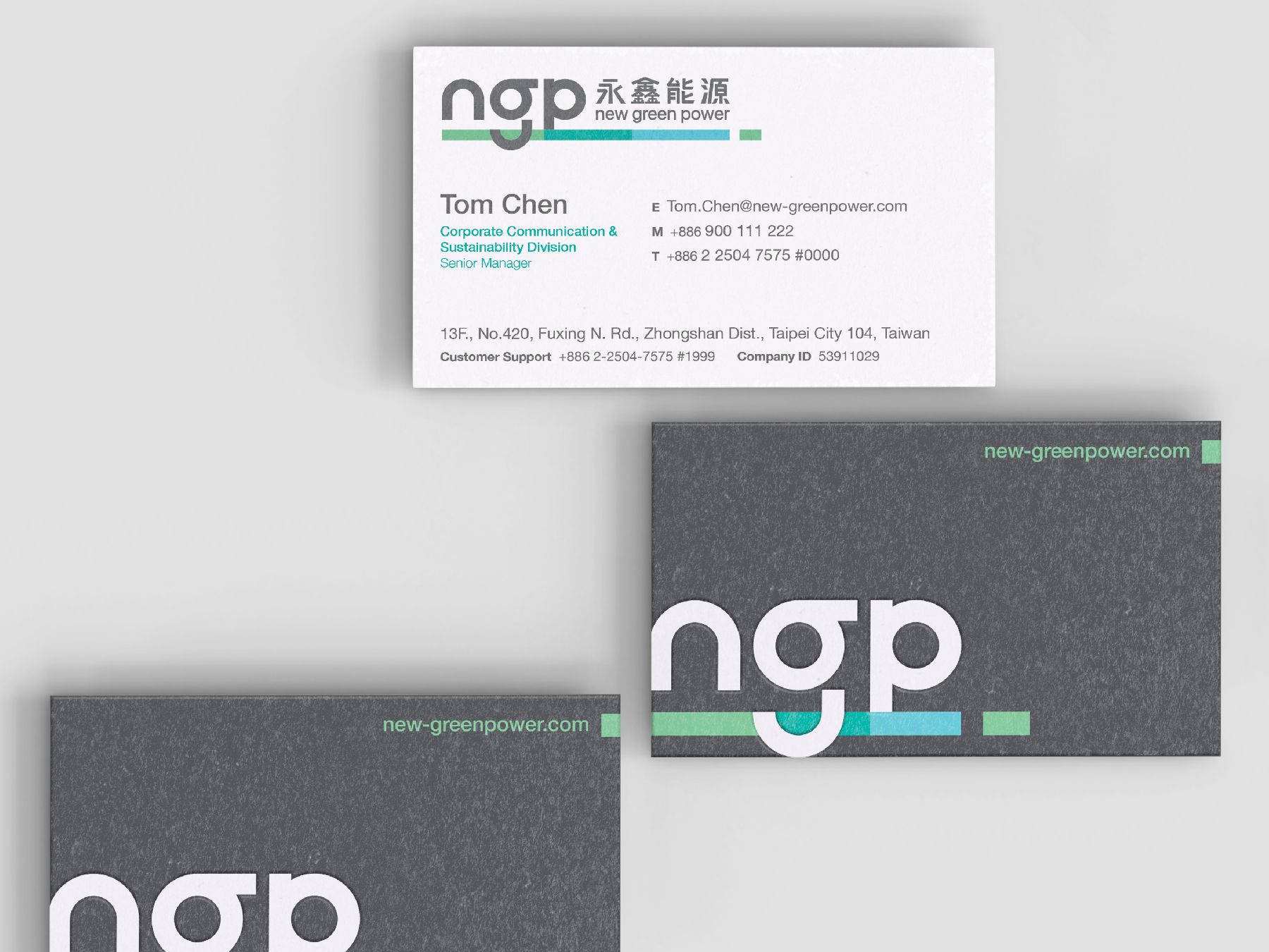
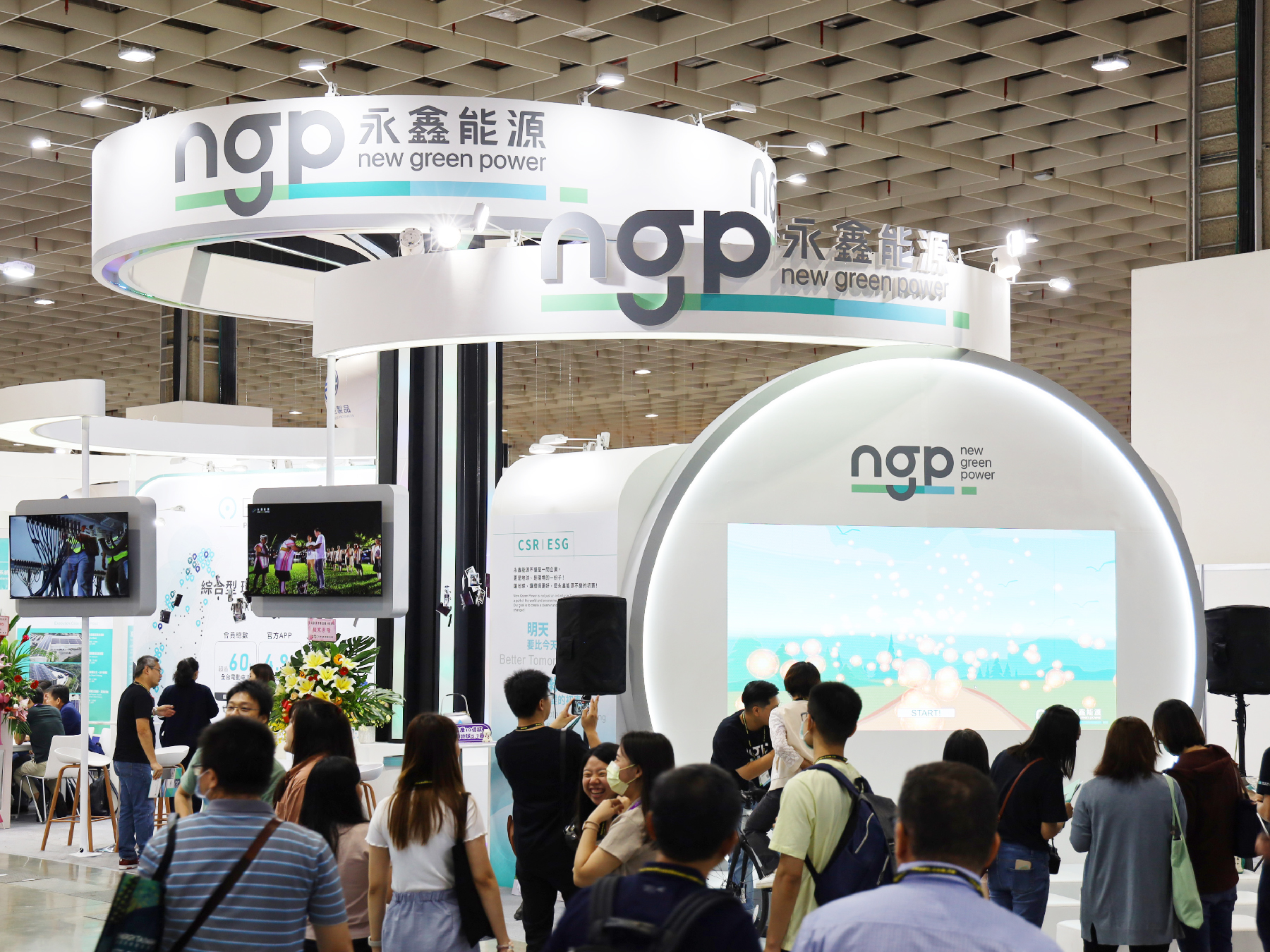

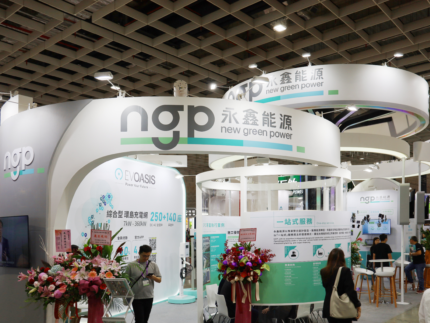
New Logo first appearance during the “Energy Taiwan exhibition”
國際台灣智慧能源週展覽 - 全新商標首次露出
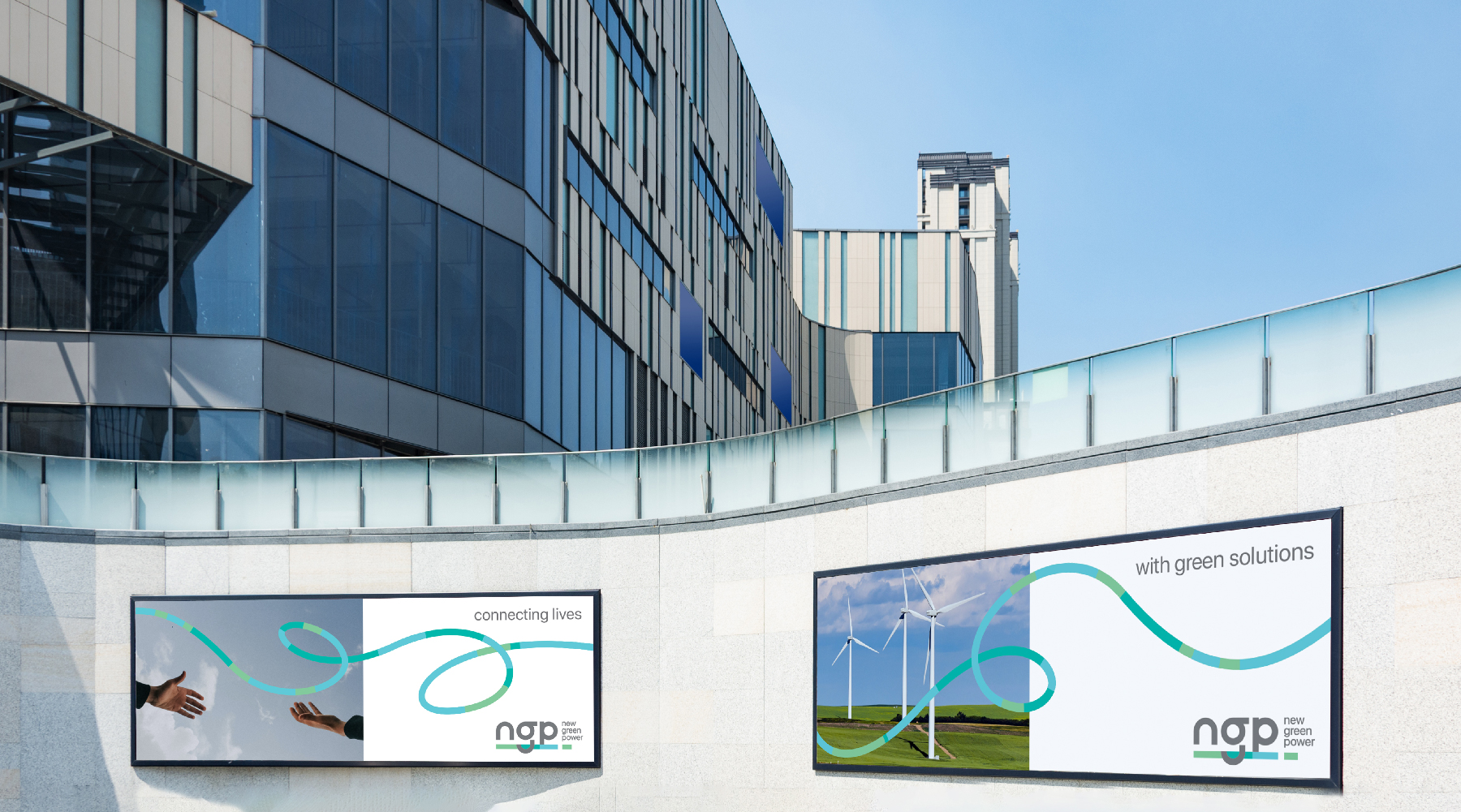
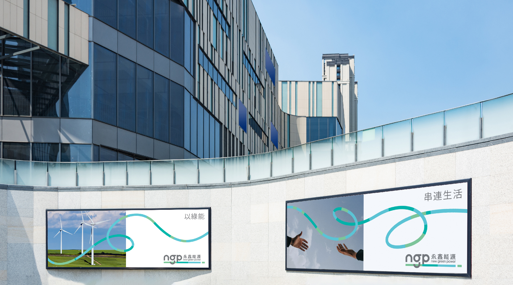
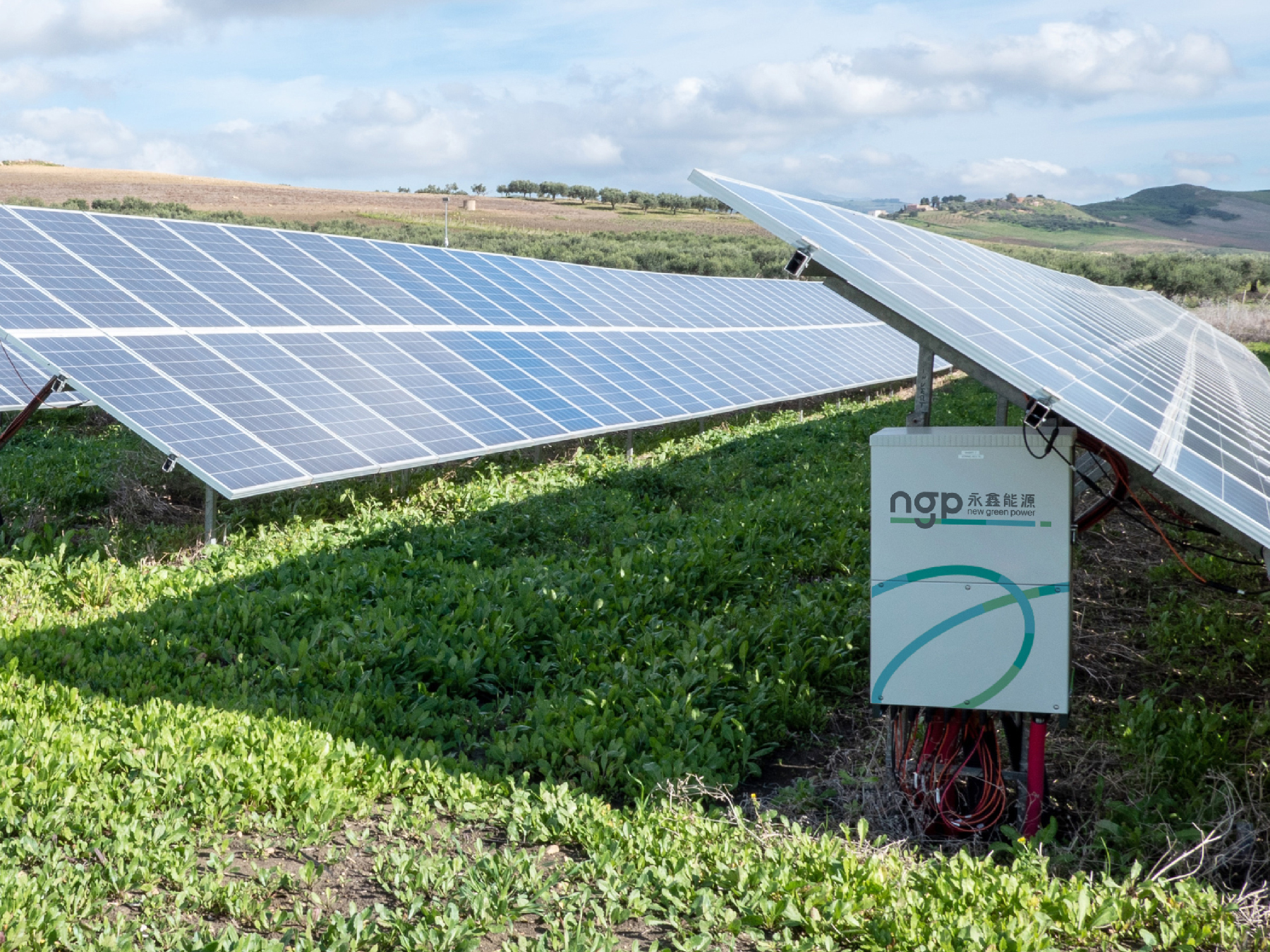
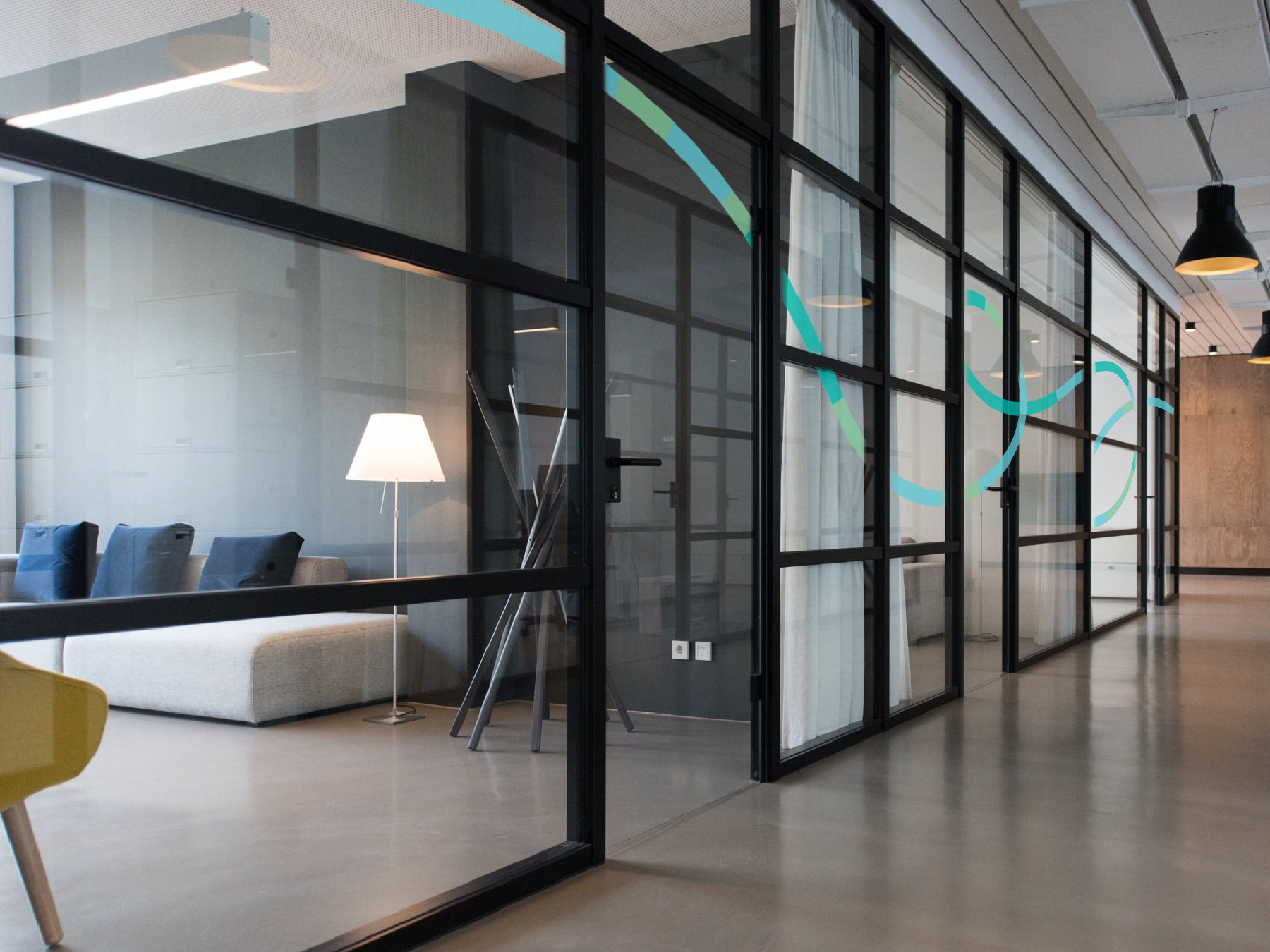

︎︎︎Concept designs
The result? A forward-thinking design that not only ushered in a fresh image for NGP but also extended their brand value, positioning them as a beacon of innovation and sustainability in the renewable energy landscape.
最終,我們成功地為NGP打造了一個全新且具前瞻性的品牌形象,不僅展現了企業的創新精神,更進一步擴展了他們的品牌價值,使他們成為可持續發展領域中的領航者。
最終,我們成功地為NGP打造了一個全新且具前瞻性的品牌形象,不僅展現了企業的創新精神,更進一步擴展了他們的品牌價值,使他們成為可持續發展領域中的領航者。
KUI-HIUNN 貴香鹹酥雞
2025
𒊹︎︎︎ Branding
𒊹︎︎︎ Shop Design
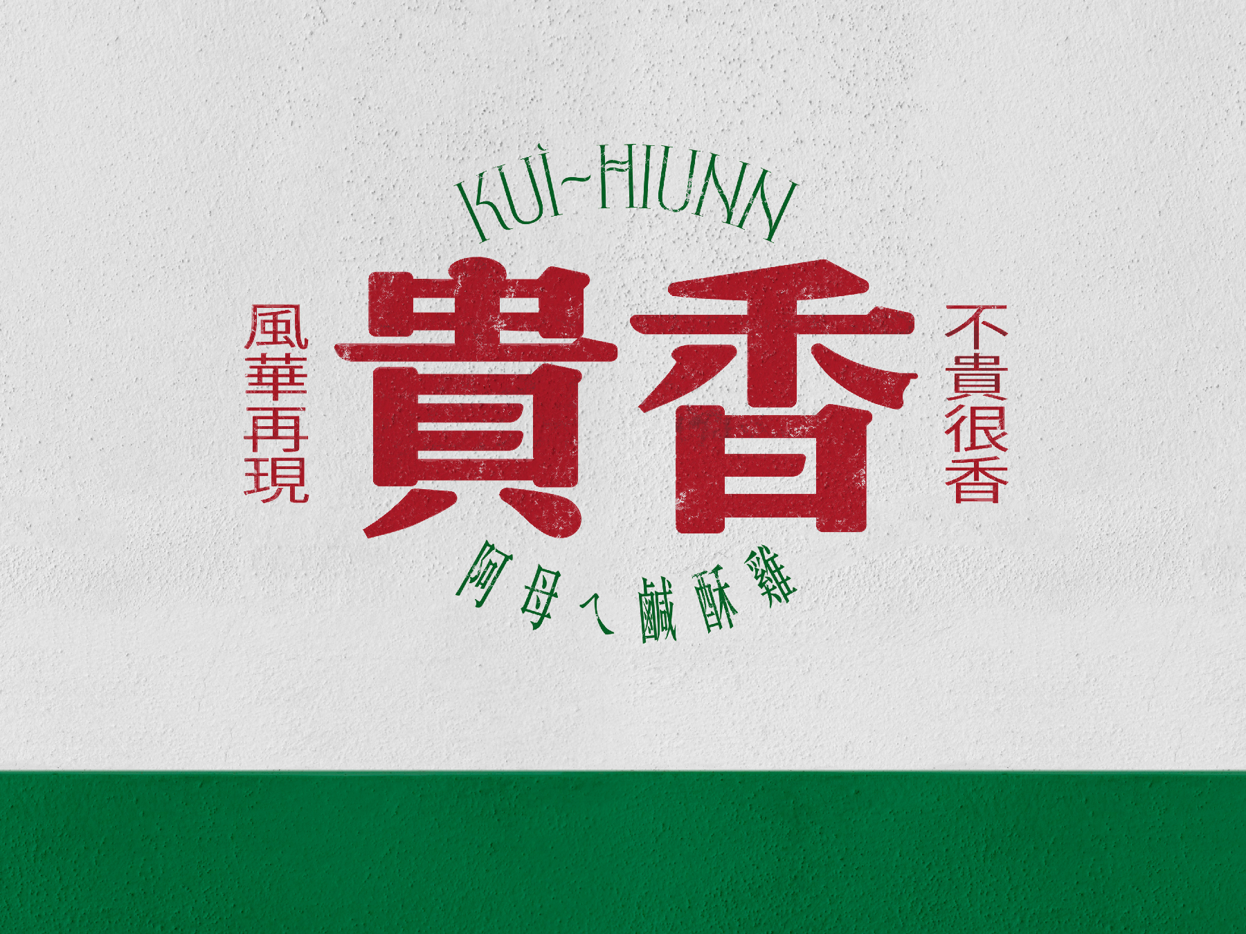
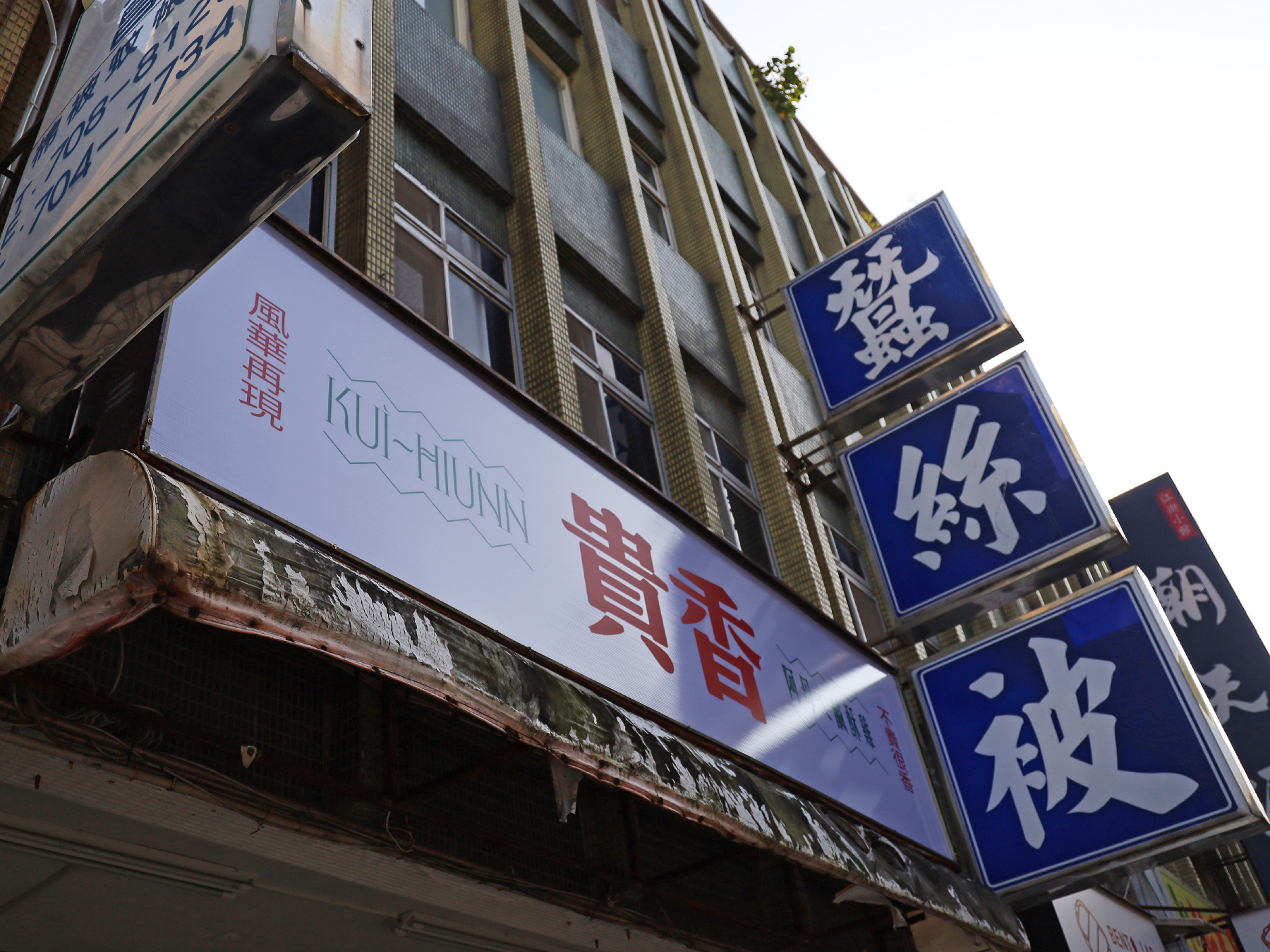
The visual identity design for KUI-HIUNN 貴香鹹酥雞 is deeply rooted in the rich flavors of Taiwanese street food culture. Inspired by the founder’s mother’s cherished recipe, the brand carries forward a taste of nostalgia, blending tradition with a bold and contemporary aesthetic.
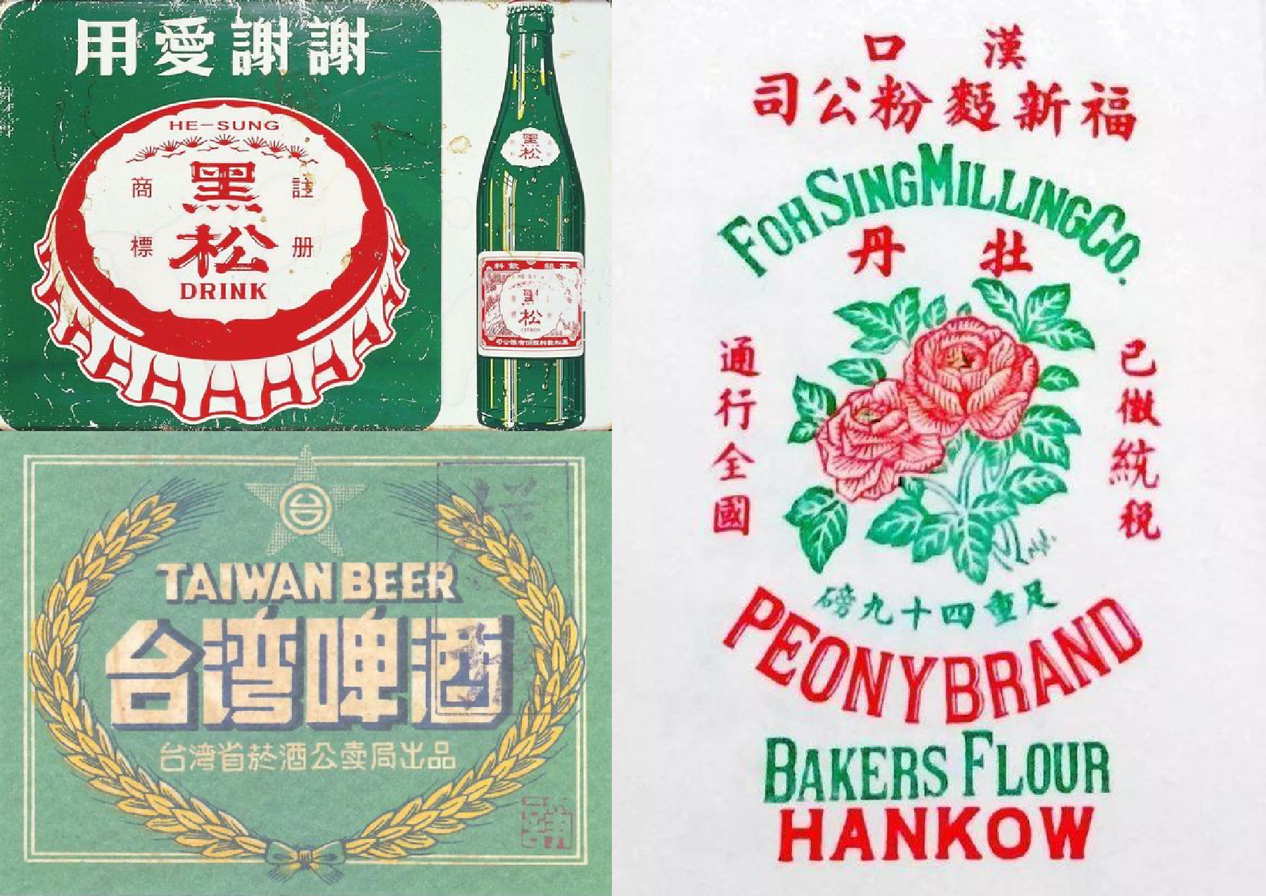
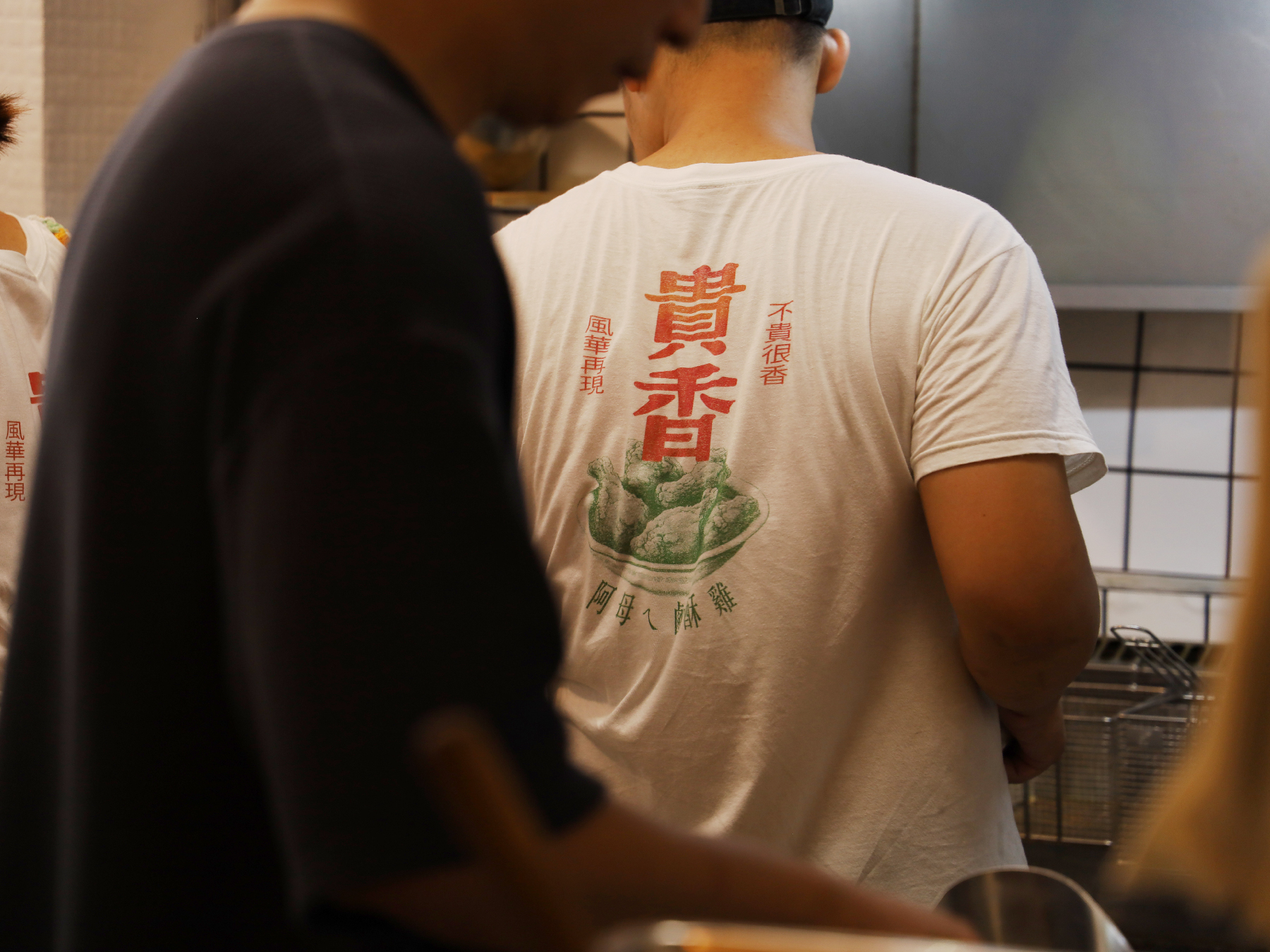
At the heart of the design is the phrase “滿滿的台式風味 Packed with Authentic Taiwanese Flavors”, emphasizing the authentic Taiwanese essence that defines the brand. The visual identity features a striking contrast of bold green and red, creating a dynamic and eye-catching appeal that reflects both the vibrancy of night market culture and the energy of local food stalls.
貴香鹹酥雞 KUI-HIUNN 的視覺識別設計深植於台灣街頭小吃文化的濃厚風味之中。品牌靈感來自創辦人阿母傳承的記憶好味道,將這份懷舊情感延續,並透過大膽且現代的設計語言,為傳統注入嶄新的活力。
設計核心以 「滿滿的台式風味」 為主軸,強調品牌的道地台灣精神。視覺識別選用 鮮明的綠色與紅色,透過強烈對比營造出吸睛且富有動感的視覺效果,不僅呼應台灣夜市文化的熱鬧氛圍,更展現街邊小吃攤的活力。
設計核心以 「滿滿的台式風味」 為主軸,強調品牌的道地台灣精神。視覺識別選用 鮮明的綠色與紅色,透過強烈對比營造出吸睛且富有動感的視覺效果,不僅呼應台灣夜市文化的熱鬧氛圍,更展現街邊小吃攤的活力。
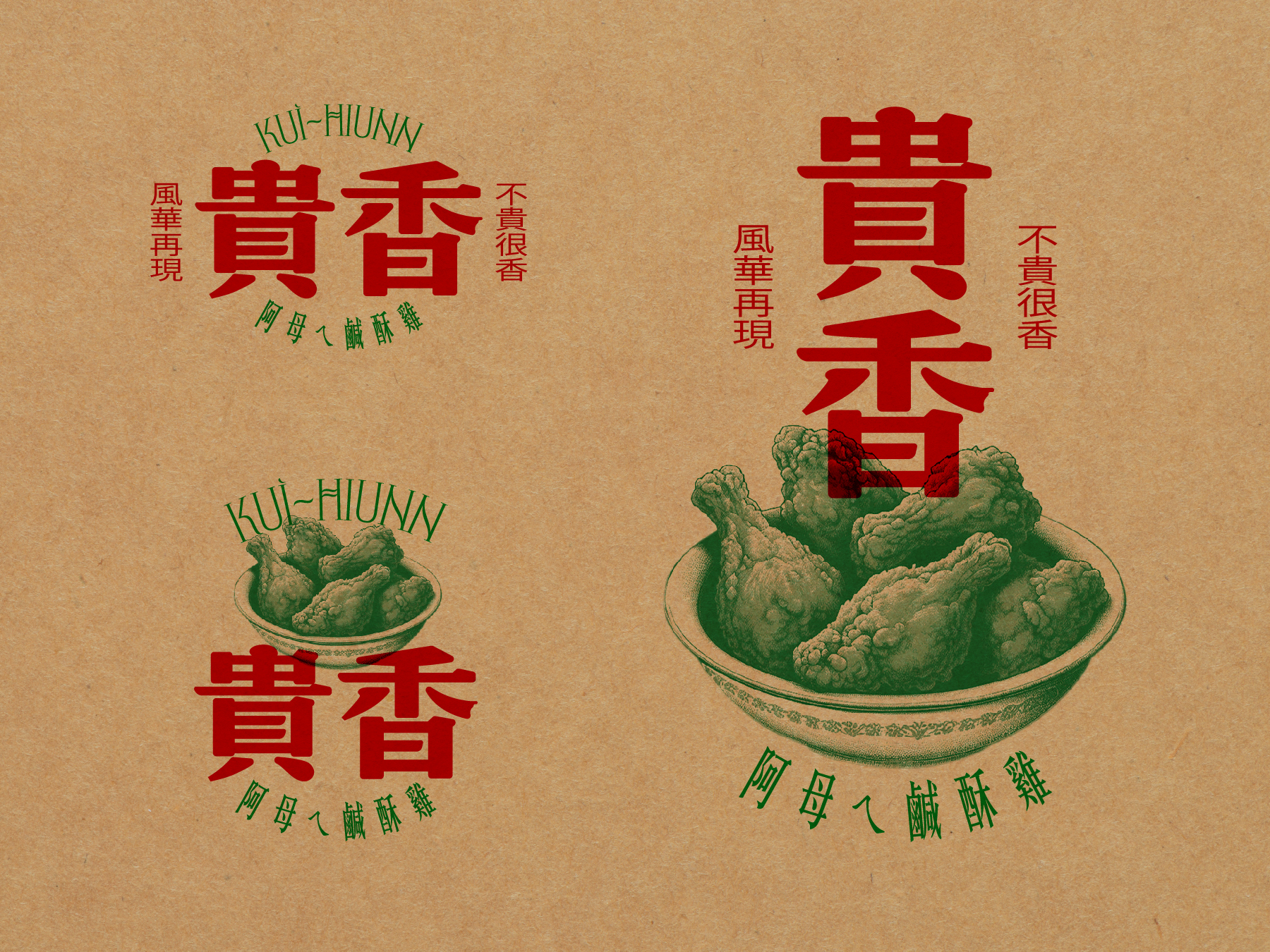
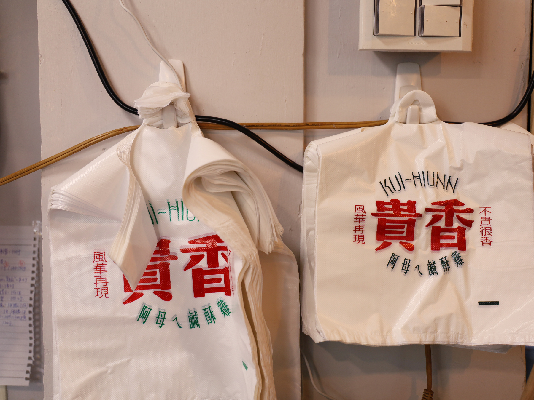
To further reinforce the brand’s character, we crafted the tagline “不貴很香 風華再現 Affordable Yet Flavorful, A Taste Revived”, placed alongside the logo. This phrase not only captures the brand’s affordability and deliciousness but also evokes a sense of revival—bringing back the golden era of Taiwanese flavors in a fresh, stylish way.
為進一步突顯品牌個性,我們精心打造了標語 「不貴很香 風華再現」,巧妙地放置於標誌側邊,傳達品牌平價美味的特色,同時喚起台灣經典風味的再現,讓傳統美食在時尚潮流中綻放新生。
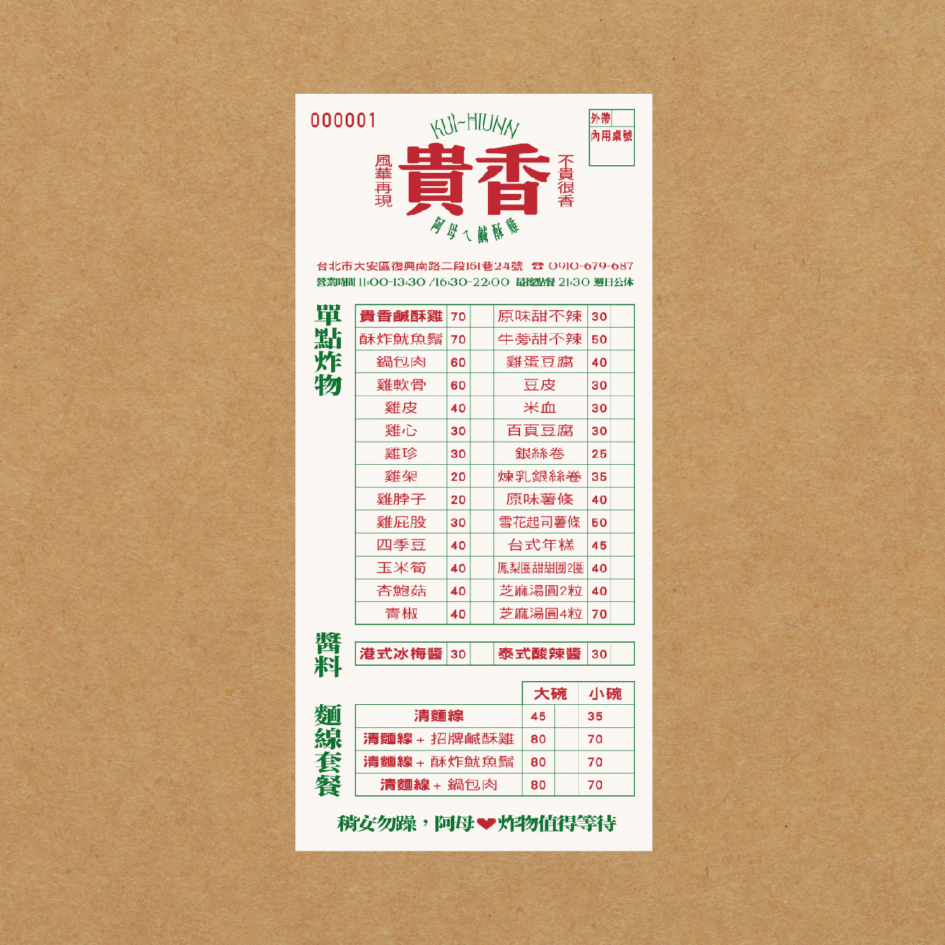
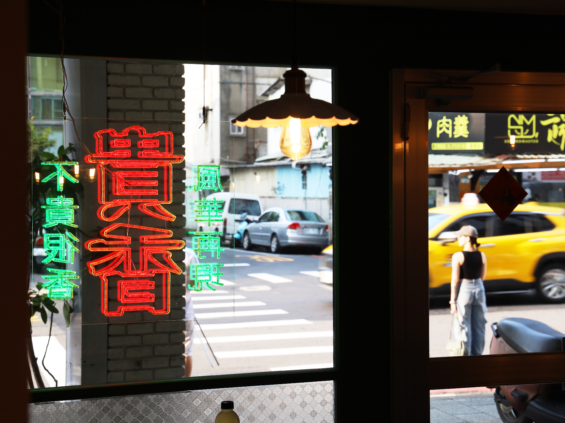
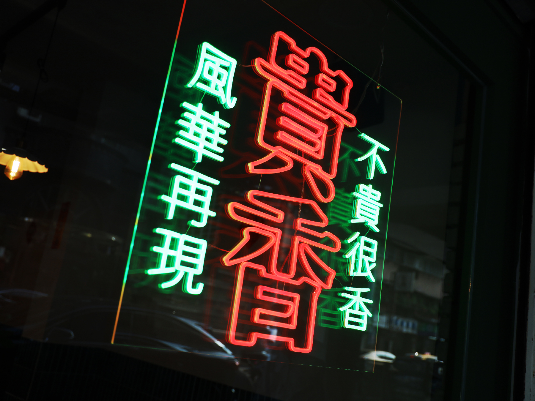
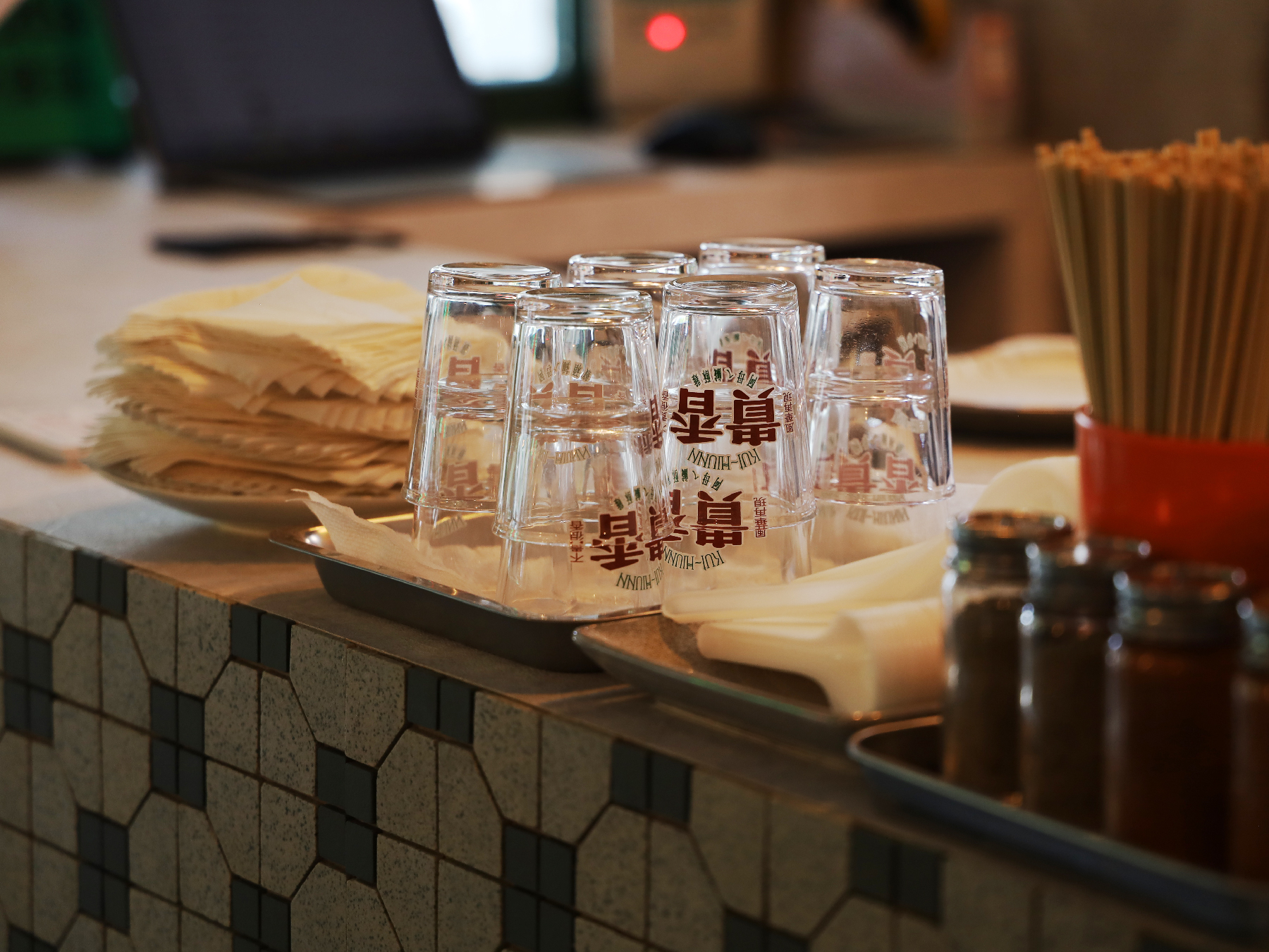
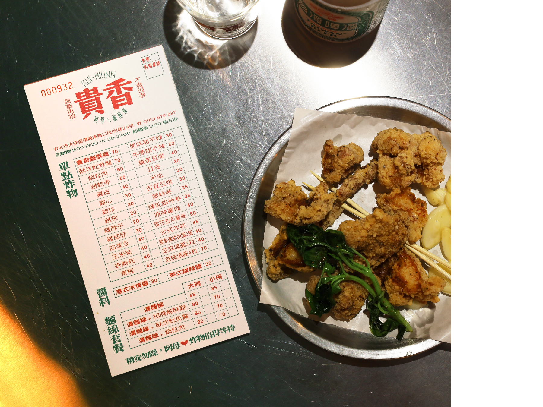
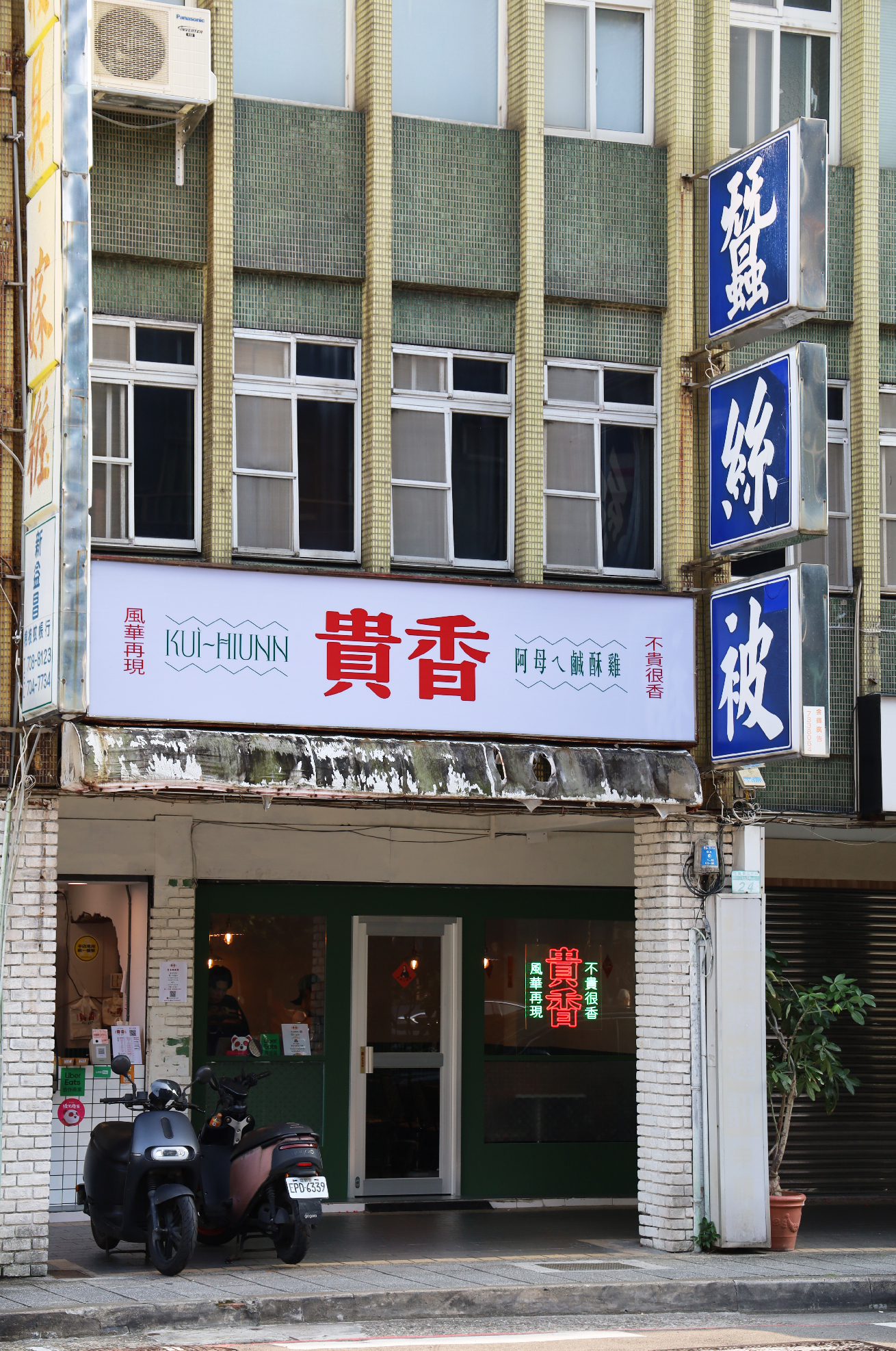
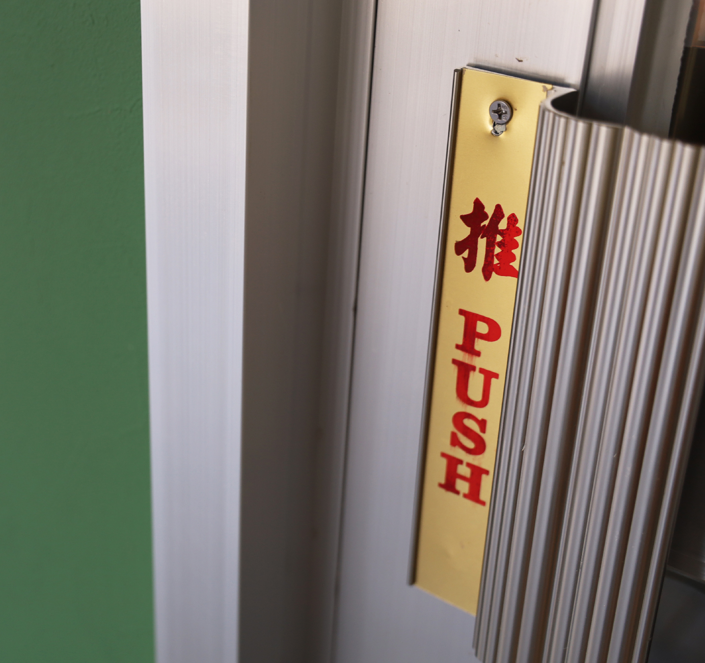
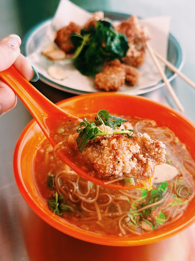
Beyond the logo and color scheme, the entire restaurant environment, from its interior design to tableware selection, is a homage to 1980s Taiwan. Elements such as retro tile patterns, vintage-style menus, and nostalgic lighting recreate the warmth and charm of classic local eateries, immersing customers in a dining experience that is both old-school and fashionable.
Through this visual identity, KUI-HIUNN 貴香鹹酥雞 successfully bridges the past and present, offering not just a meal but a multisensory journey through time, flavor, and culture.
除了標誌與色彩設計,品牌的 店內空間與餐具選擇 亦精心打造,向 1980 年代台灣 的懷舊氛圍致敬。復古磁磚紋樣、懷舊風格菜單,以及充滿復古情懷的燈飾,皆營造出溫馨親切的用餐體驗,讓顧客仿若走進舊時台灣街頭的經典小吃店,在復古與潮流交織的氛圍中,感受獨特的味覺與視覺享受。
透過這套視覺識別設計,貴香鹹酥雞 KUI-HIUNN 成功地串聯過去與現在,為顧客帶來的不僅是一頓美味的餐點,更是一場穿越時空的風味與文化之旅。
Carrefour Foundation Annual Report 2023 家樂福文教基金會 2023 年報
2024

𒊹︎︎︎ Editorial Concept & Design
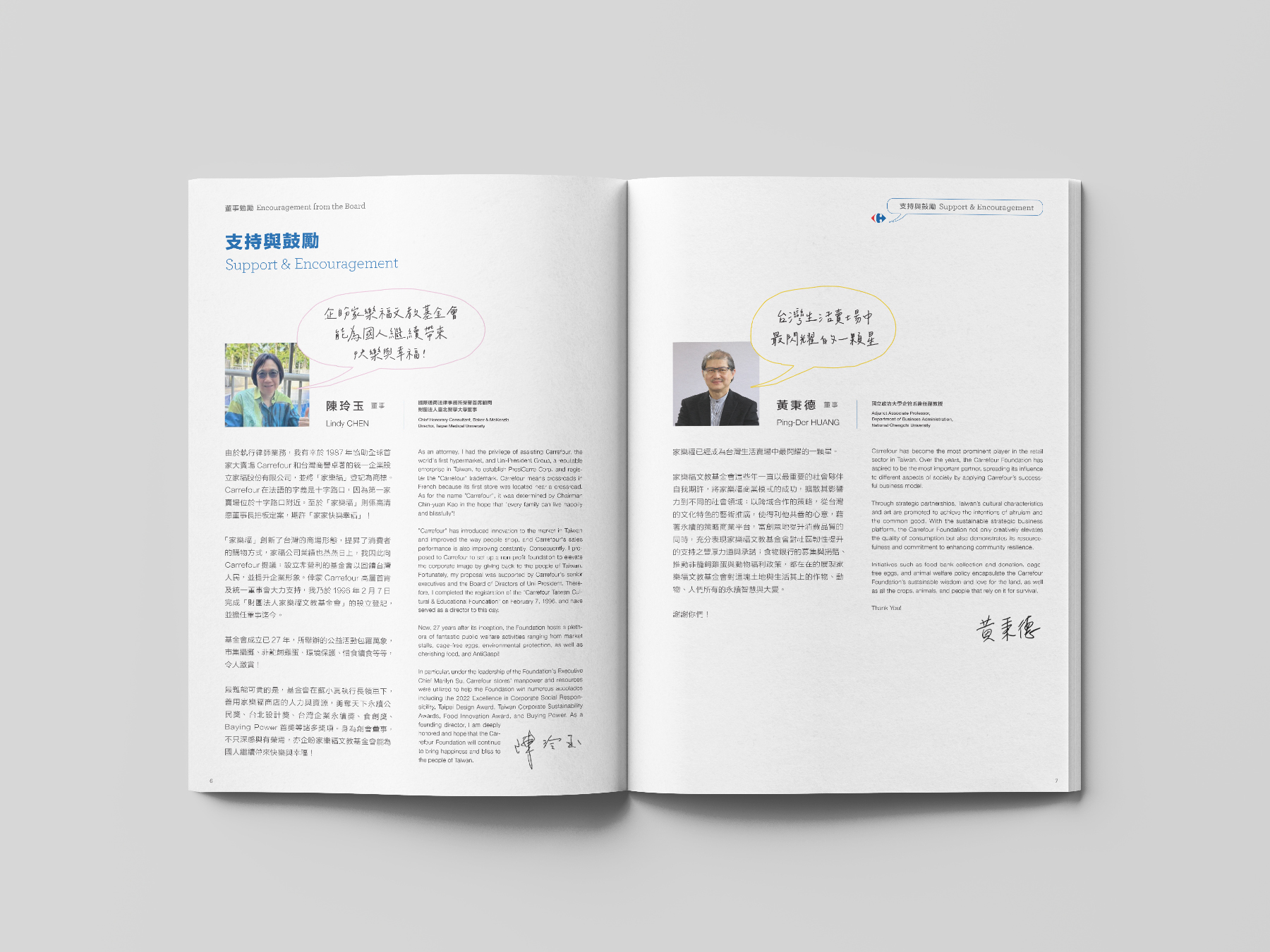
For the Carrefour Foundation Annual Report 2023 (Taiwan), we designed the publication around the theme of "Dialogue," visually represented through various speech bubble designs. These speech bubbles connect the entire report, symbolizing the continuous communication and interaction between the company, its customers, and society.
在 台灣家樂福基金會2023年報設計中,我們以「對話」為主題,透過各式各樣的對話框設計貫穿整本報告,象徵公司、顧客與社會之間不斷的溝通與互動。


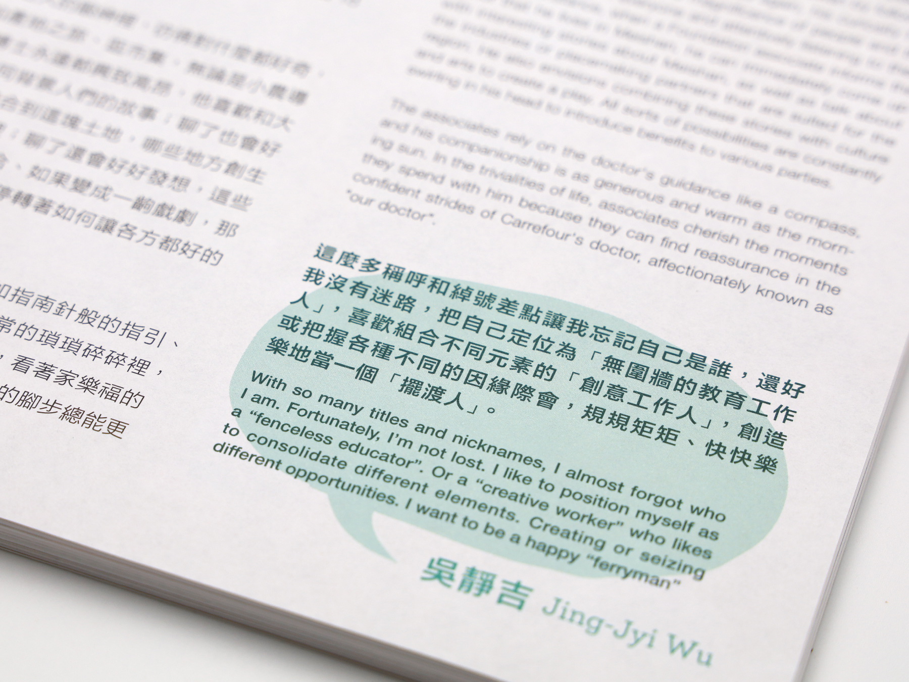


The report is divided into eight main chapters, each highlighting a different aspect of the foundation’s contributions to the community, from environmental initiatives to social responsibility programs. The use of speech bubbles reinforces the idea of ongoing dialogue and collaboration, making the content not only informative but also engaging. This creative approach celebrates the Carrefour Foundation’s efforts while showcasing its commitment to fostering meaningful connections and positive societal impact.
報告共分為八個章節,每個章節都著重於基金會在不同領域中的社會貢獻,涵蓋從文化藝術到社會責任等多方面的倡議與行動。對話框的設計強調了這種持續的溝通與合作,不僅讓內容更具資訊性,同時也增添了互動感。這種創意設計不僅展現了家樂福基金會的努力,也突顯了它對促進有意義的連結與社會正向影響的承諾。
報告共分為八個章節,每個章節都著重於基金會在不同領域中的社會貢獻,涵蓋從文化藝術到社會責任等多方面的倡議與行動。對話框的設計強調了這種持續的溝通與合作,不僅讓內容更具資訊性,同時也增添了互動感。這種創意設計不僅展現了家樂福基金會的努力,也突顯了它對促進有意義的連結與社會正向影響的承諾。




DRAGON HORN
2021
𒊹︎︎︎ Visual Identity
𒊹︎︎︎ Retail
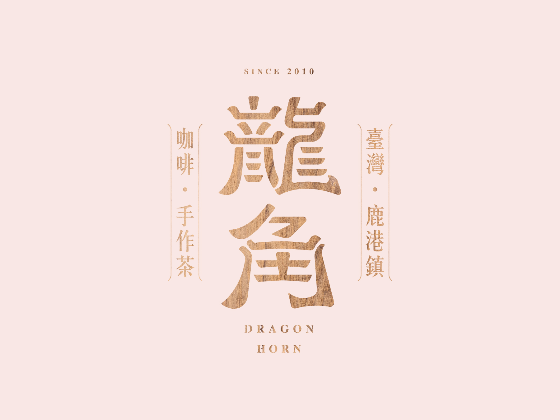
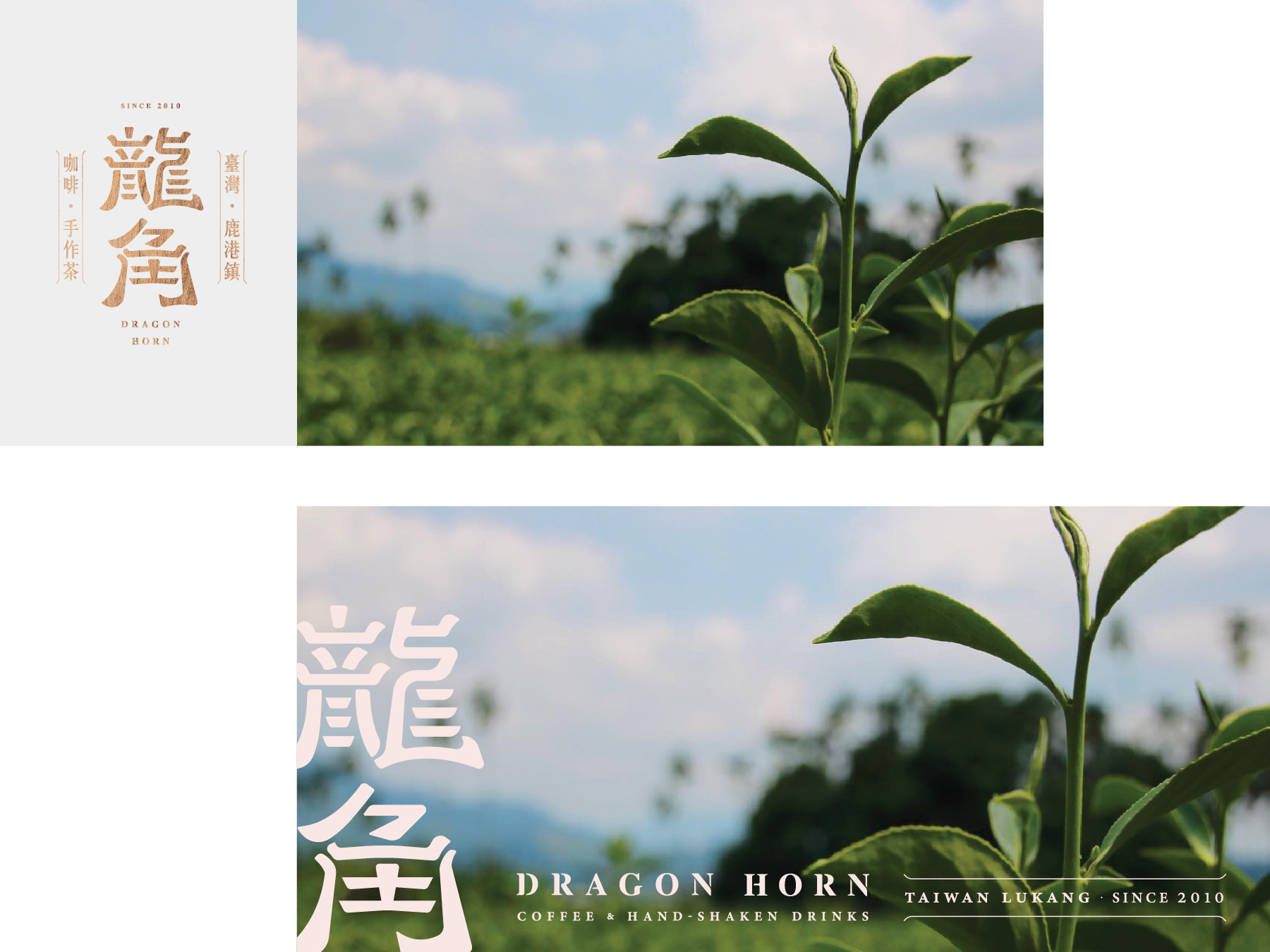
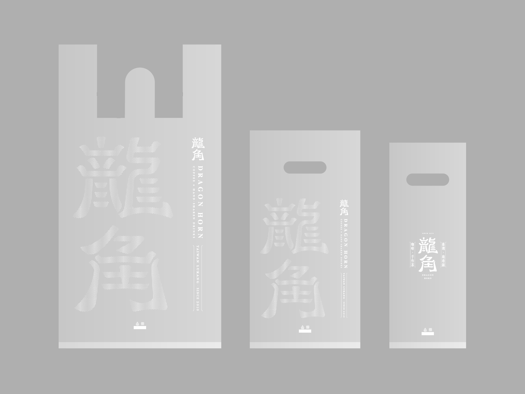
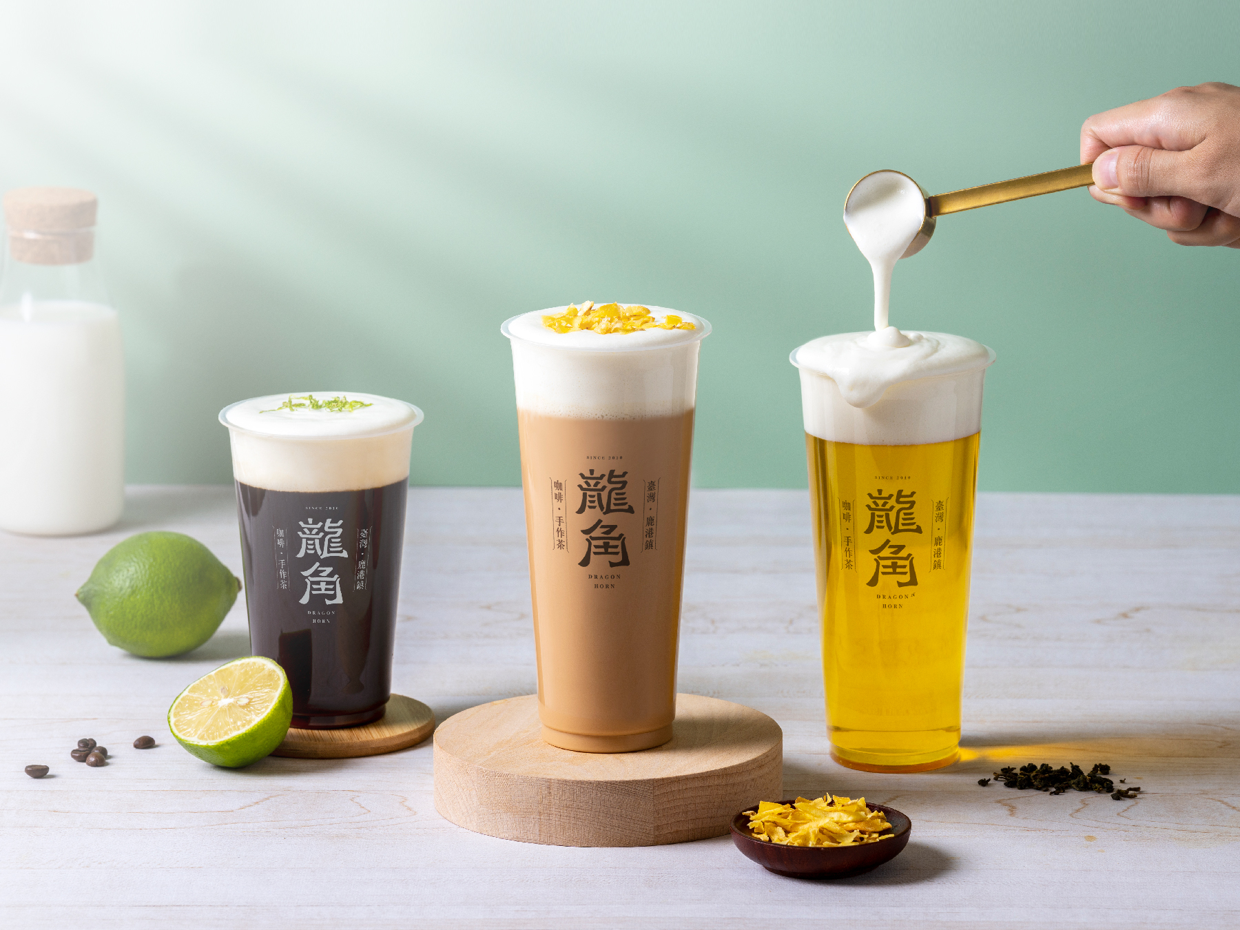
Drawing upon the shop's origin in Lukang and the cultural significance of Chinese temples, we utilized wood sculpture as the primary design element to create a logo that is both unique and memorable. The warm, earthy tones of the woodwork are complemented by the bold, modern typography, creating a balance between tradition and innovation. The end result is a visually striking logo that captures the essence of this beloved bubble tea shop and its roots in Taiwanese culture.
借鑒了店鋪源於鹿港的起源和中國寺廟的文化意義,我們運用木雕作為主要的設計元素,創造出一個獨特而難忘的商標。木工作品的溫暖、自然的色調與大膽、現代的字體相輔相成,實現了傳統和創新之間的平衡。最終呈現的是一個視覺上引人注目的商標,捕捉了這家受人喜愛的珍珠奶茶店的本質和其在台灣文化中的根源。
CONCEPT →



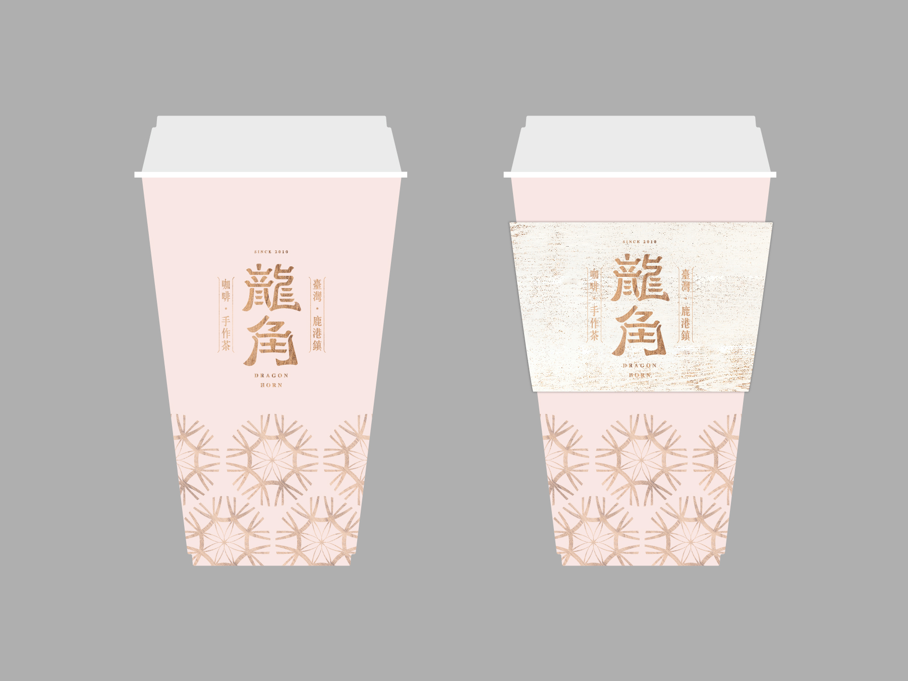
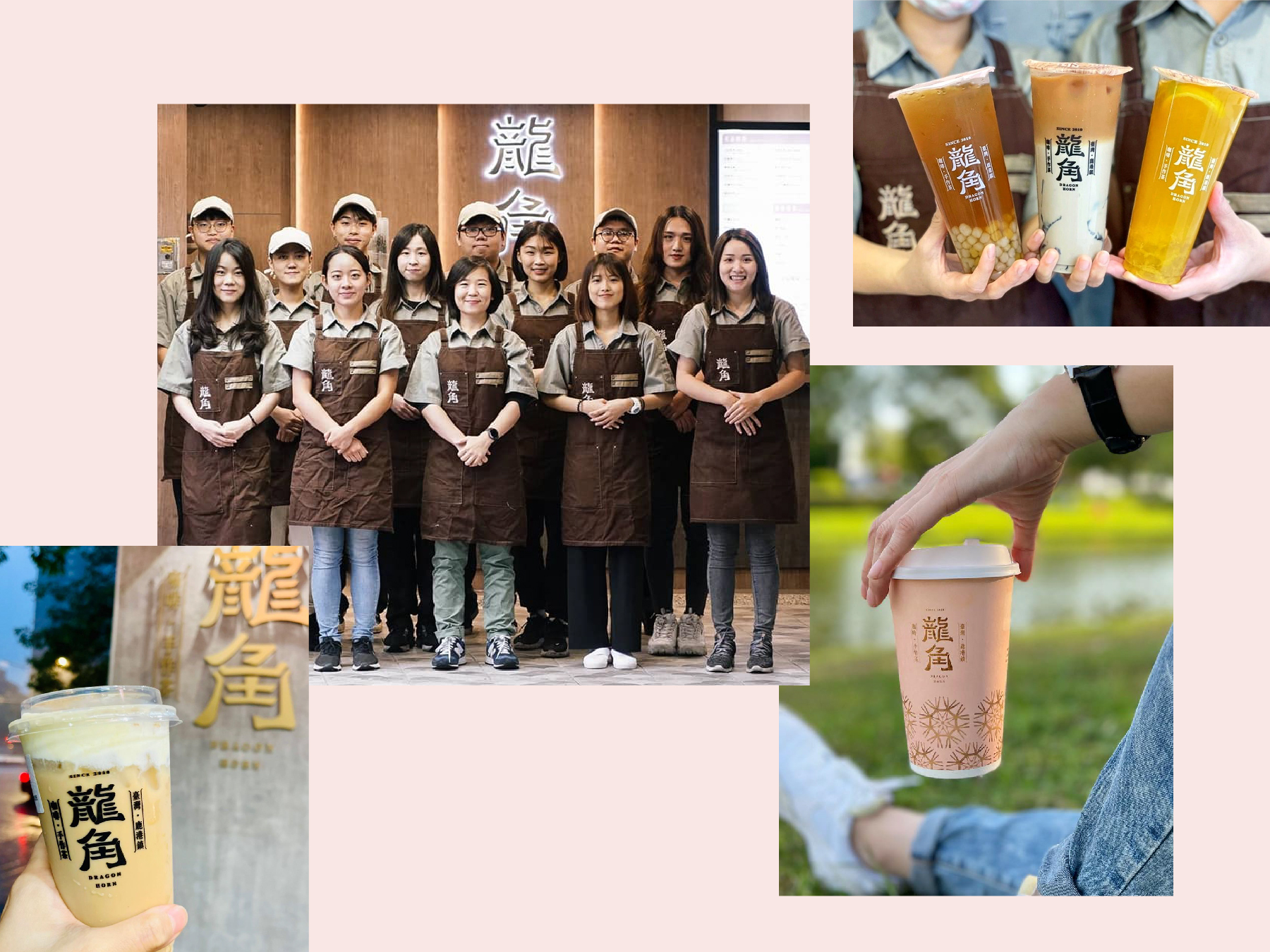
We were also responsible for designing all the marketing materials, including the cups, menu, shop front interior, and other visual elements that create a cohesive brand experience for the customers. Our goal was to create a welcoming atmosphere that incorporates the traditional elements of Lukang and Chinese culture, while also conveying a modern and trendy vibe that appeals to the younger generation.
我們負責設計所有的市場營銷材料,包括杯子、菜單、店鋪內部裝潢和其他視覺元素,為顧客創造出一個統一的品牌體驗。我們的目標是創造一個融入鹿港和中國文化傳統元素的友好氛圍,同時傳達出時尚現代的氛圍,吸引年輕一代的喜愛。
我們負責設計所有的市場營銷材料,包括杯子、菜單、店鋪內部裝潢和其他視覺元素,為顧客創造出一個統一的品牌體驗。我們的目標是創造一個融入鹿港和中國文化傳統元素的友好氛圍,同時傳達出時尚現代的氛圍,吸引年輕一代的喜愛。




EV OASIS
2021


𒊹︎︎︎ Visual Identity
𒊹︎︎︎ Integrated Design
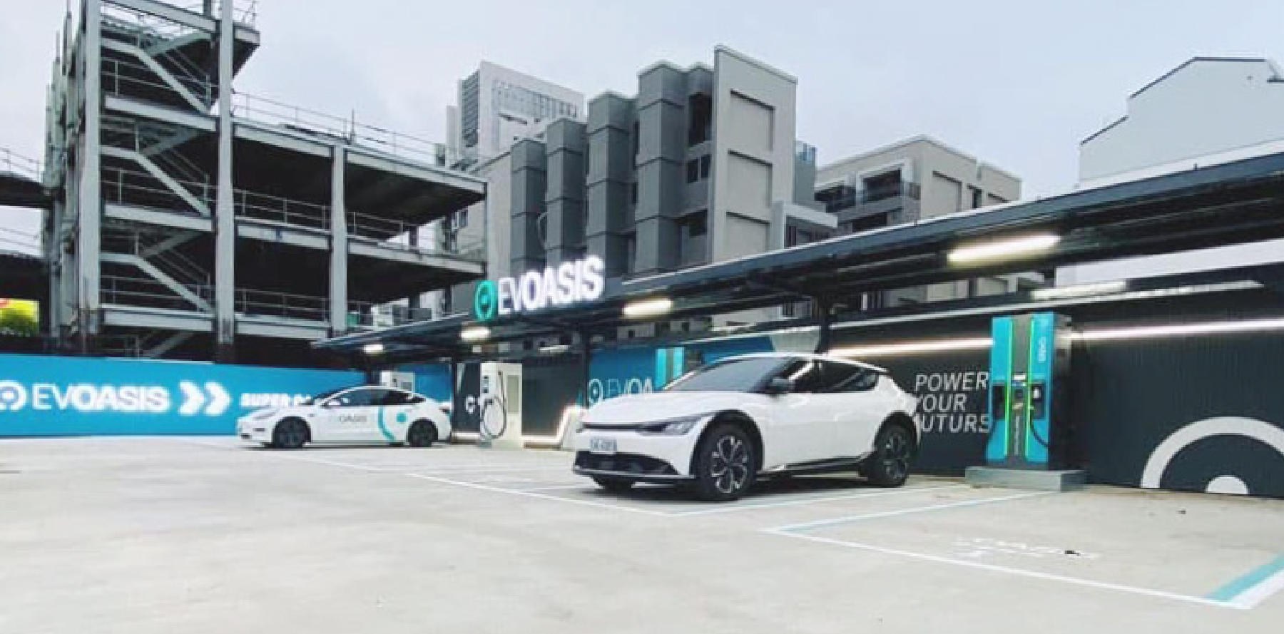
EV OASIS is an EV charging service provider with over 200 charging stations located throughout Taiwan. The main concept of the brand image is to create a futuristic design that seamlessly integrates with all car brands, regardless of their specific design elements.
The logo features a minimalist design with a sleek, simple font and an electric lake-blue-green color that represents the futuristic and eco-friendly nature of the brand. The circular shape of the logo symbolizes the charging slot as well as the infinite possibilities of EV technology and clean energy - to calls out the goal of the brand - provides an oasis of electricity for EV drivers.
The visual identity of EV OASIS adopts clean lines and modern minimalistic elements, creating a friendly and simplistic design across various user interfaces. This effectively highlights the brand's commitment to providing convenient, user-friendly, and sustainable electric vehicle charging solutions.
With its branding and marketing resources, as well as its charging pole and station designs, EV OASIS has become a trendsetter in the electric vehicle industry, making it one of the most well-known and beloved charging service providers in Taiwan.
EV OASIS 是一家在台灣設有超過200個充電站的電動車充電服務提供者。我們為品牌定義富未來感的形象, 標誌採用極簡設計,搭配流暢簡單的字體和湖藍綠色,代表品牌的未來主義和環保特性。標誌的圓形形狀象徵充電插槽以及電動車技術和清潔能源的無限可能性,突顯了品牌的目標 - 為電動車司機提供電力的綠洲。
EV OASIS 的視覺識別採用乾淨的線條和現代極簡主義元素,在各個使用者介面皆打造一個親和簡約的設計,有效凸顯品牌致力於提供便捷、友善易用,且可持續的電動車充電解決方案。
品牌和營銷資源以及充電樁和站內設計都在電動車界帶起風潮,使得 EV OASIS 成為台灣最知名和受人喜愛的充電服務提供商之一。

︎︎︎photos are provided by clients


︎︎︎site locations photos are provided by clients
FORMOSA GREEN
2021

𒊹︎︎︎ Branding
𒊹︎︎︎ Packaging
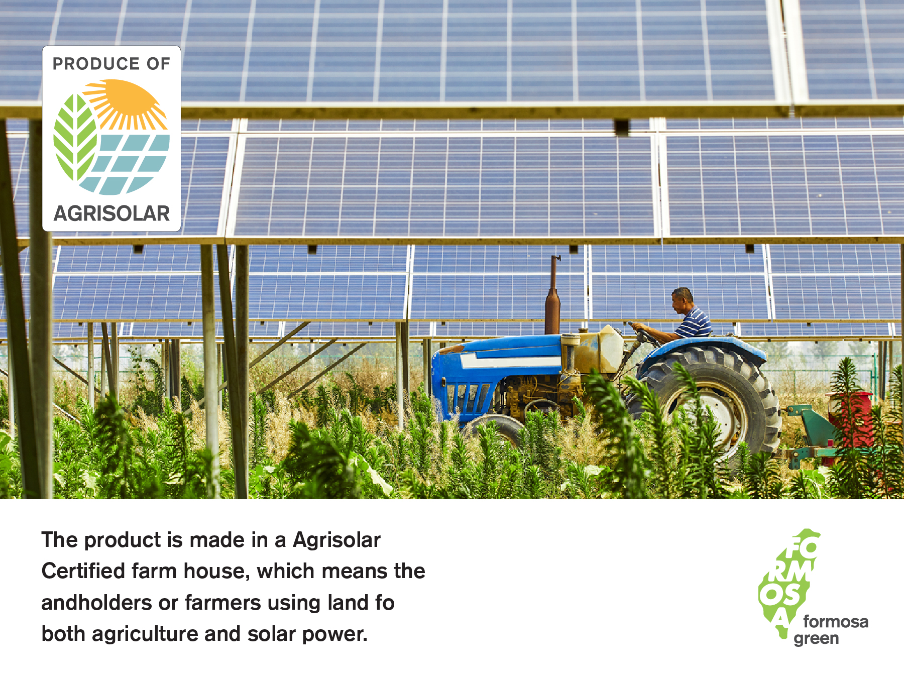
"FORMOSA GREEN" is a Taiwanese company committed to producing agricultural products in a sustainable and environmentally friendly manner. As one of Taiwan's leading green energy providers, FORMOSA promotes "Agri-solar" in Taiwan, aiming to reduce carbon footprint and promote renewable energy.
For the design, we chose to incorporate the shape of Taiwan's map and the characters "臺灣" (Taiwan) to represent the company's pride and vision. This simple yet powerful logo communicates the company's mission.
「FORMOSA GREEN」是一家致力於以可持續和環保方式生產農產品的台灣公司。作為台灣最具代表性的綠電業者,在台灣 FORMOSA 這片土地推廣「農電共生 Agri-solar」,致力減少碳足跡並推廣可再生能源是他們的使命。因此設計我們選擇大擔地用臺灣二字和地圖中臺灣的形狀,作為商標的主體。簡潔有力地溝通業者的驕傲和願景。

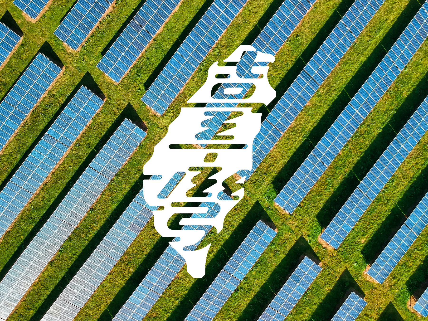

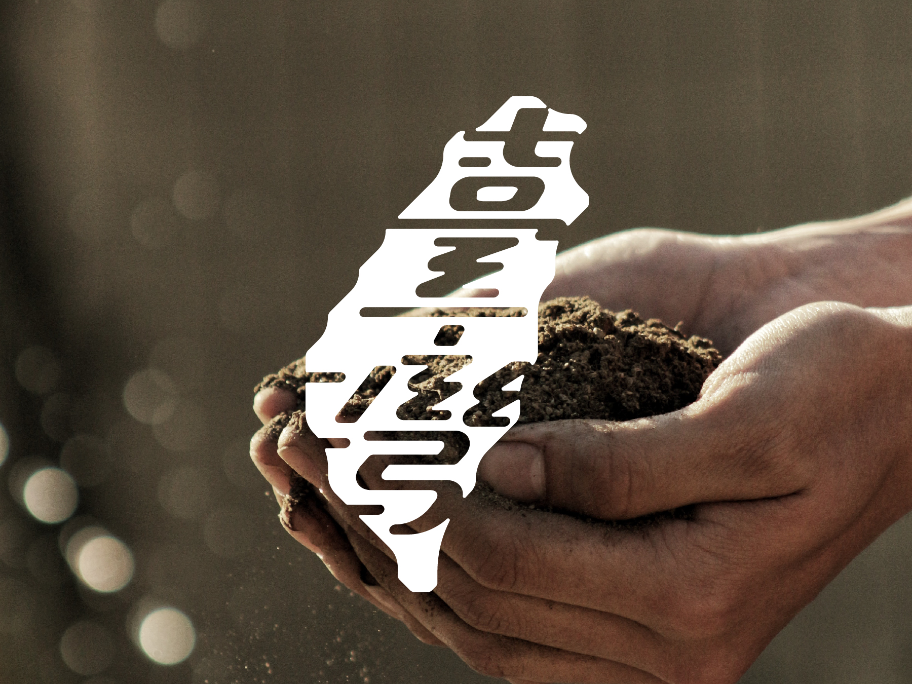
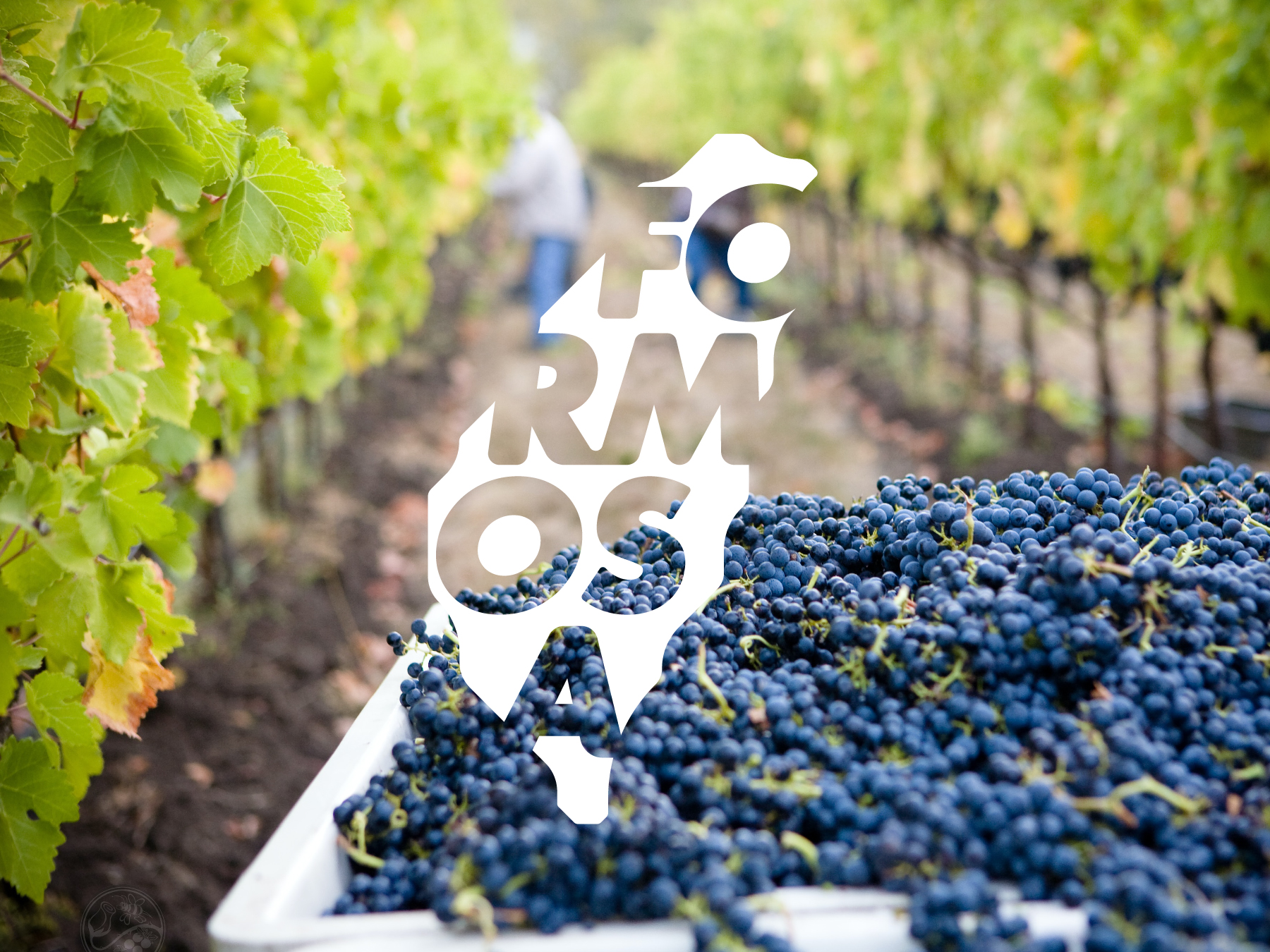

FORMOSA GREEN's solar farms allow them to produce the best products driven solely by renewable energy, ensuring the highest standards of quality while prioritizing environmental protection. They also prioritize the use of natural fertilizers and pesticides, avoiding harmful chemicals that could harm the environment and consumers.
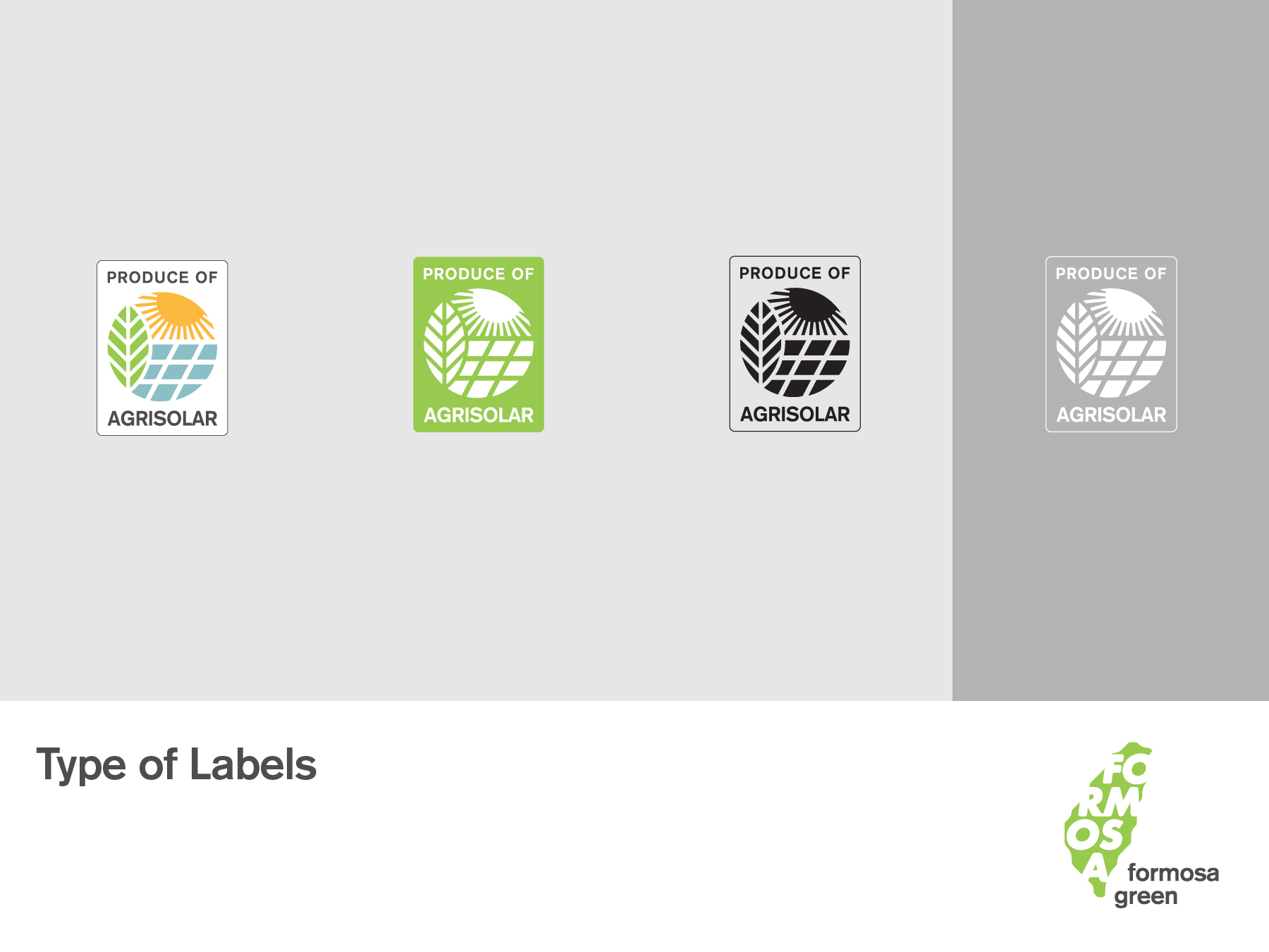
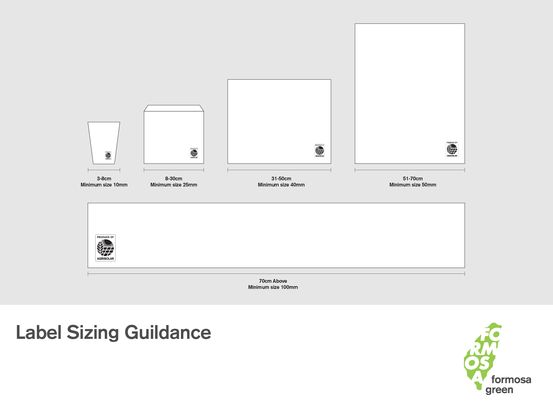
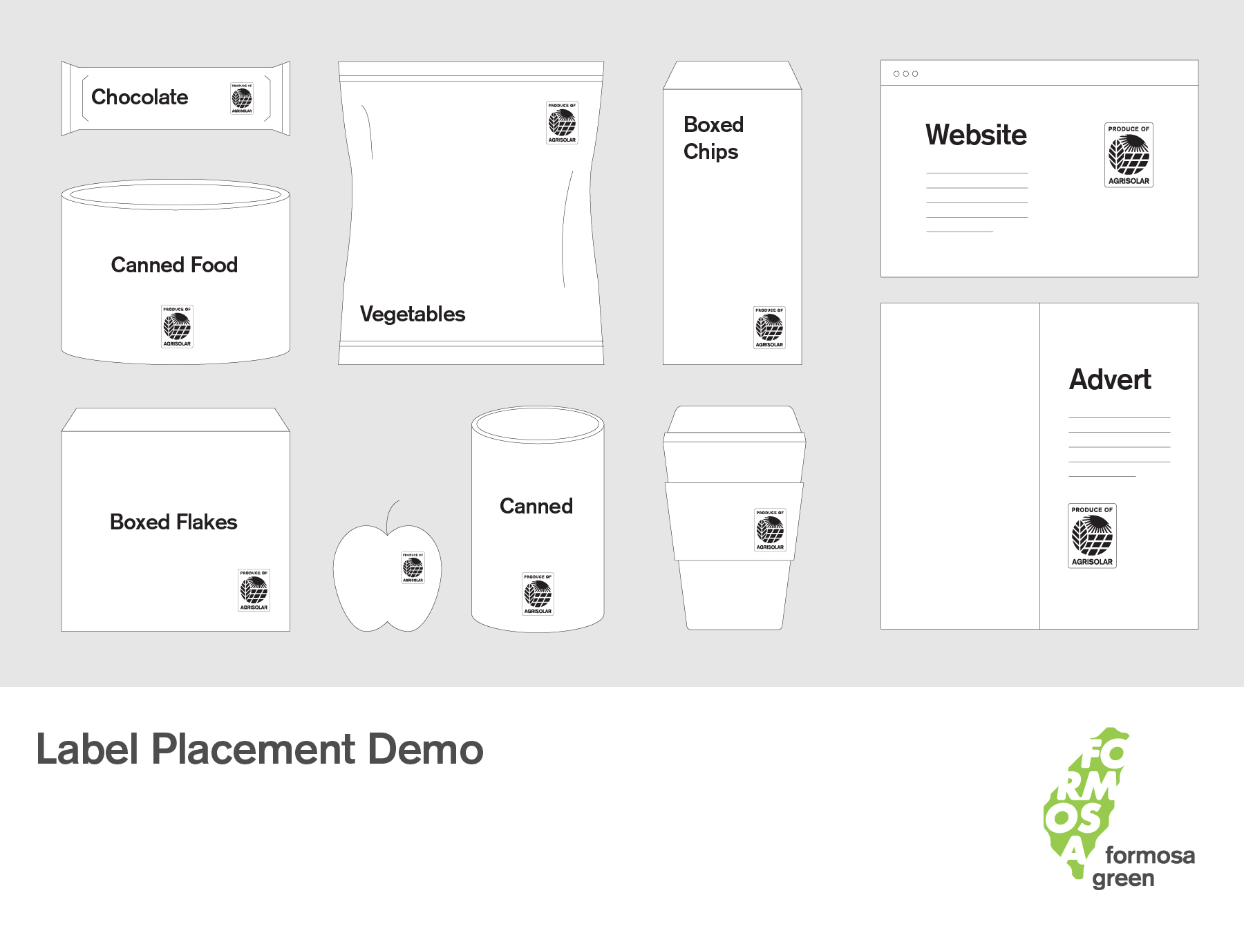
We also designed the "AgriSolar label," which sets the standard for production under the concept of "Agri-solar."
FORMOSA GREEN的太陽能農場使他們能夠生產僅由可再生能源驅動的最佳產品,確保他們的農產品在品質上達到最高標準,同時注重環境保護。此外,他們優先使用天然肥料和農藥,避免有害化學物質對環境和消費者造成傷害。
我們更為業者設計 「AgriSolar 標章」,為「農電共生」下生產的概念立下標準。

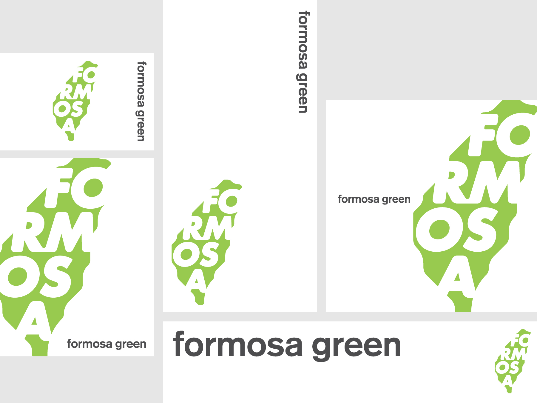
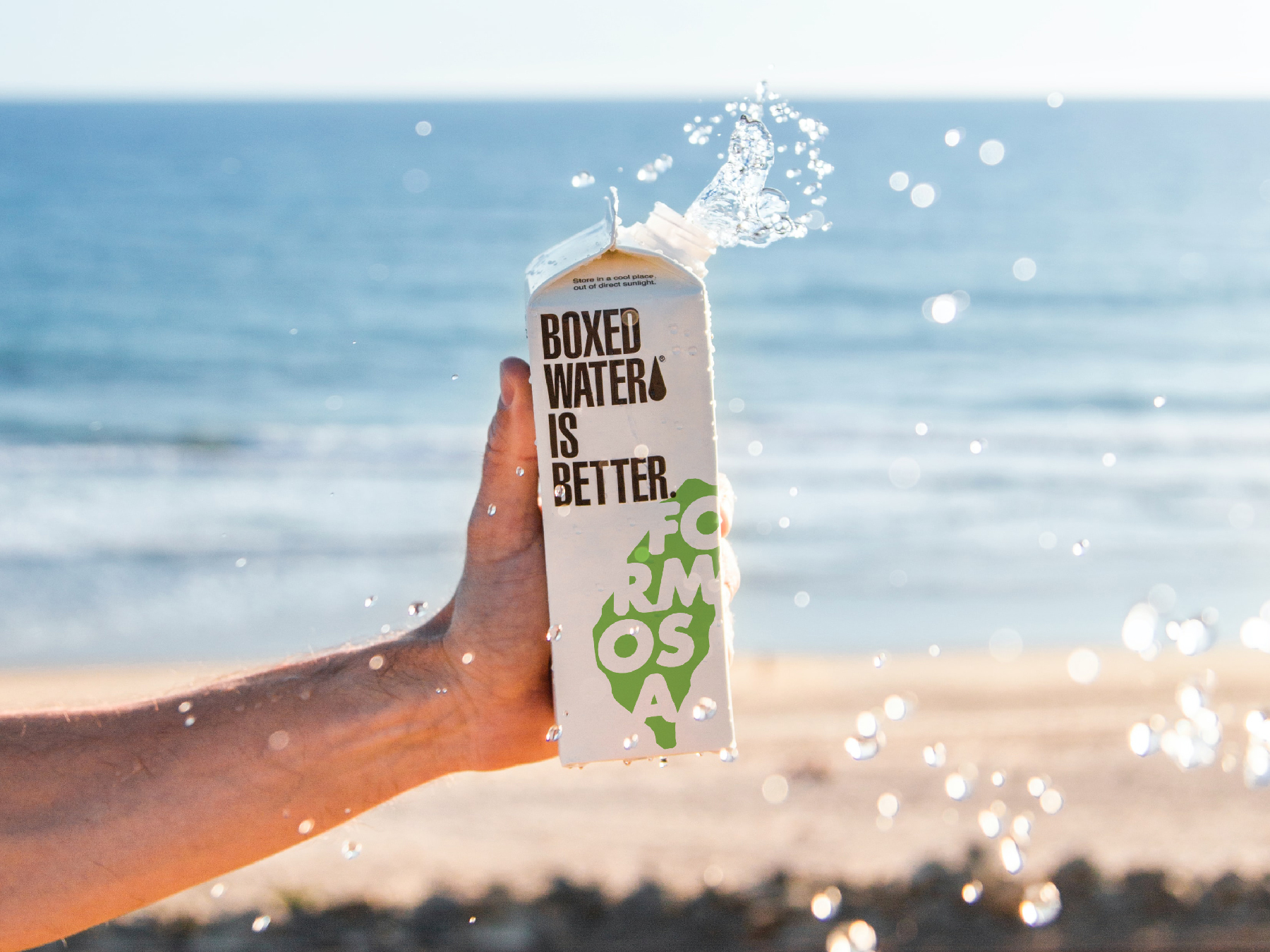
Conceptual design. Photo by Boxed Water Is Better on Unsplash




Linshan Farmers Select 林山農選
2021
𒊹︎︎︎ Brand building
𒊹︎︎︎ Integrated project
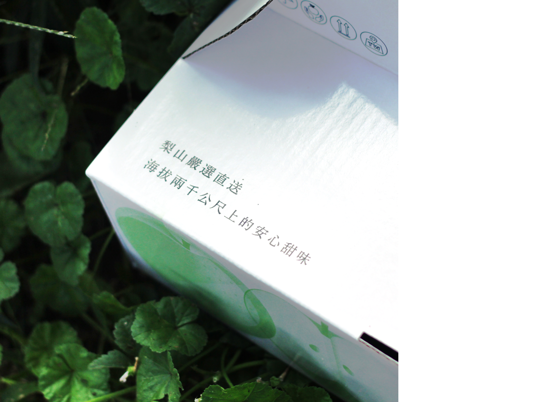
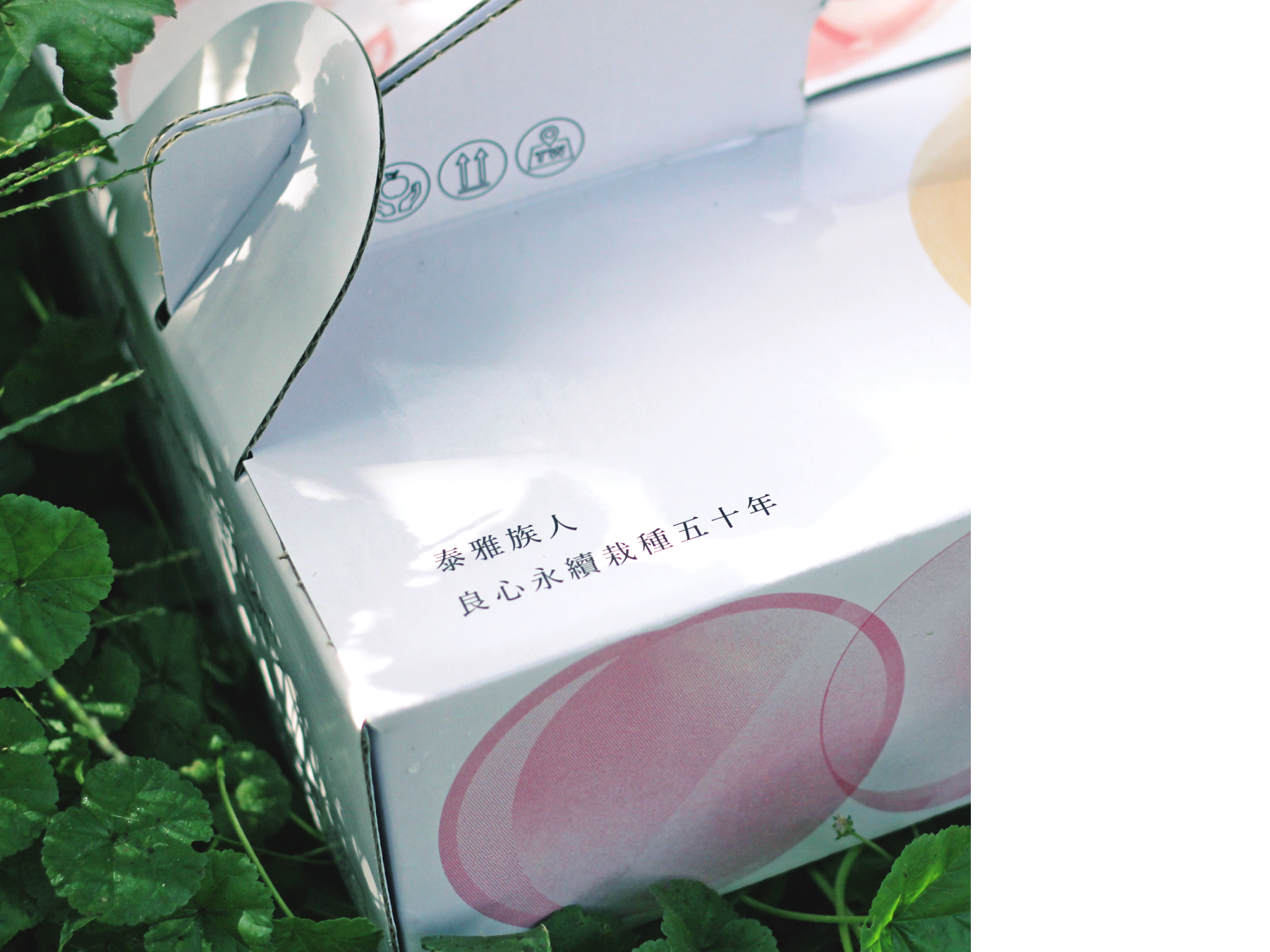
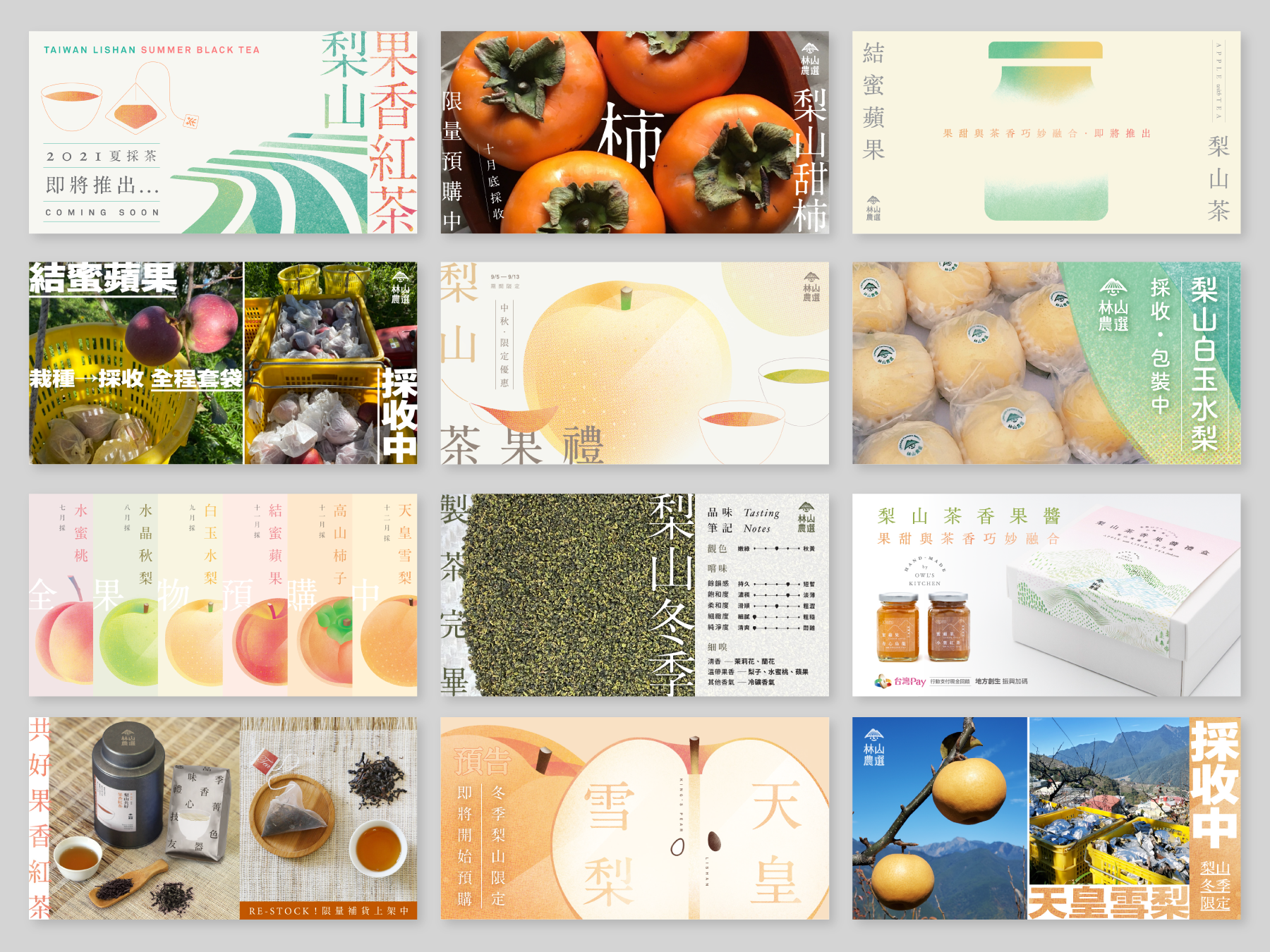
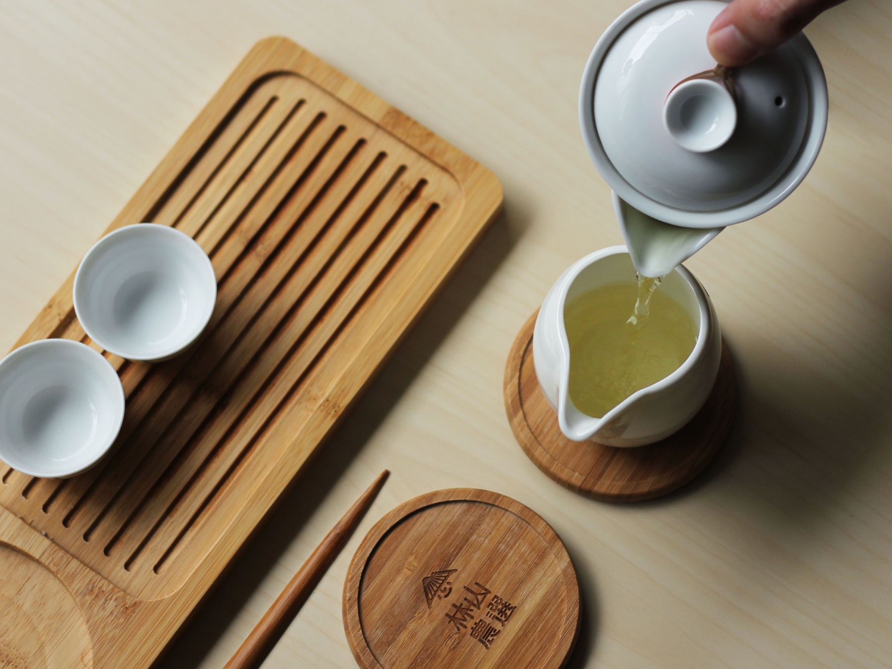
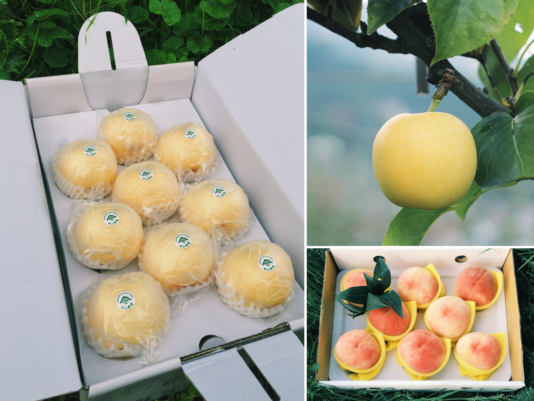
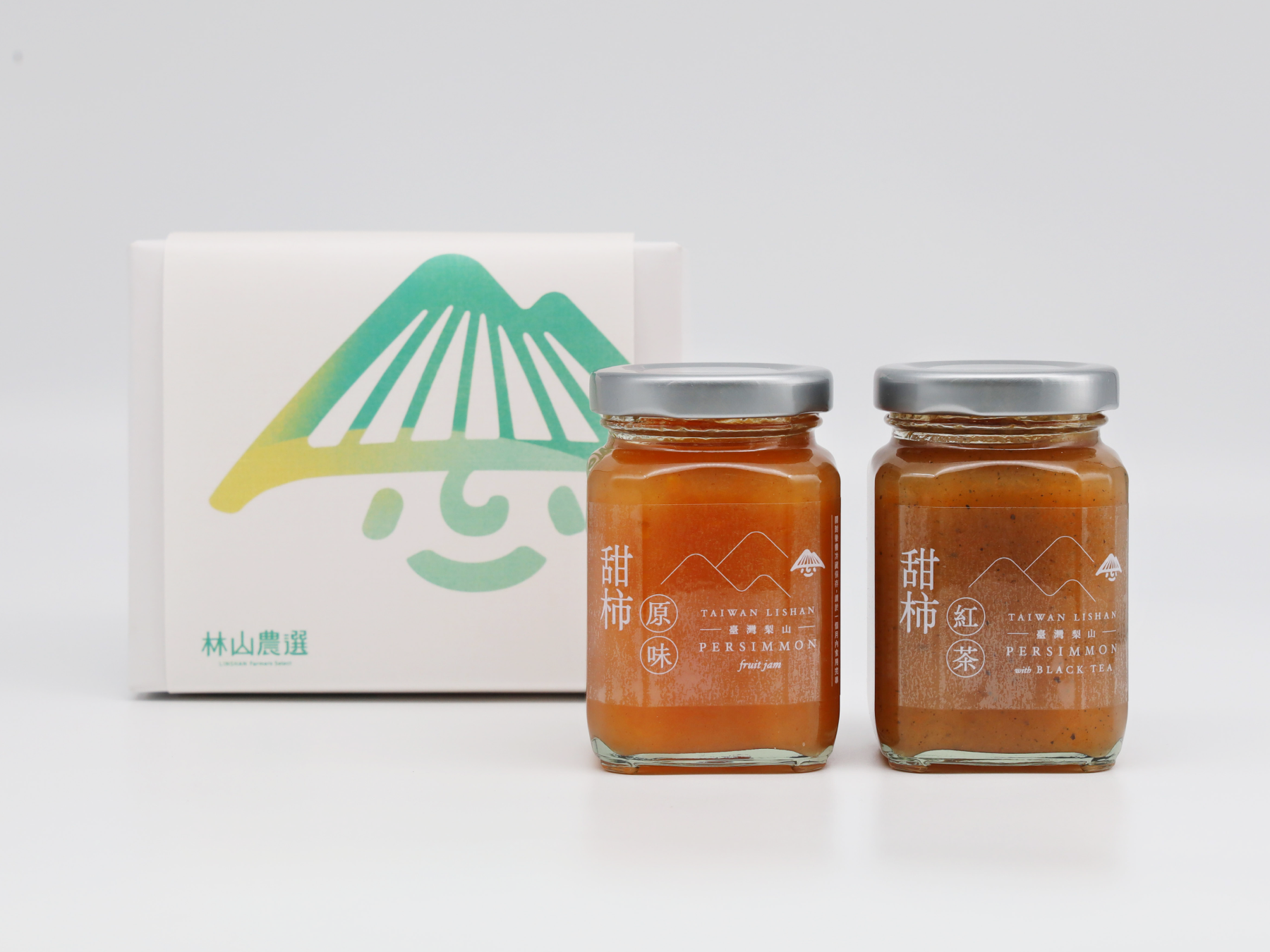
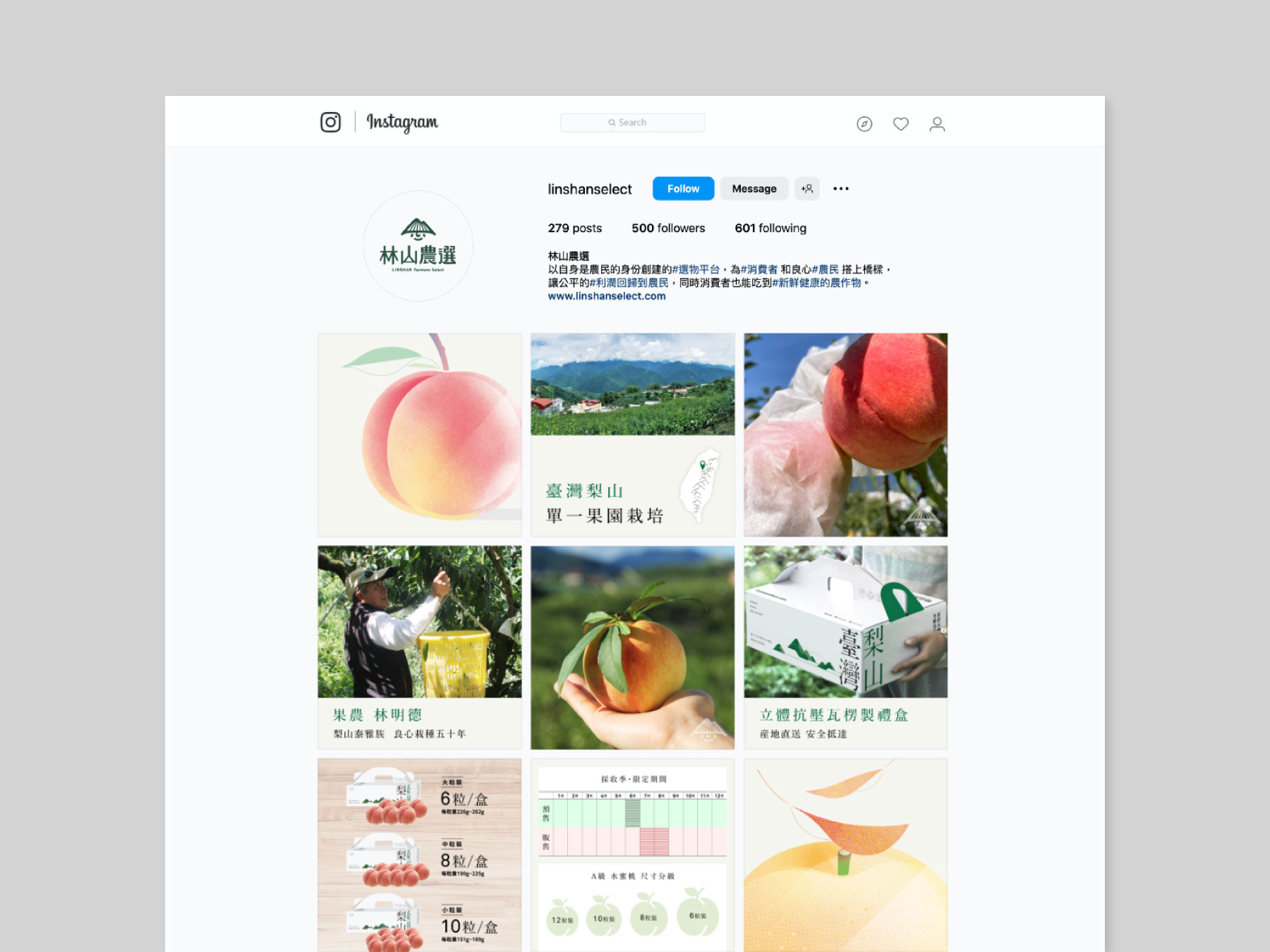
To share with you a project that is close to our company's heart - the creation of the entire visual identity, packaging, and marketing materials for Linshan Farmers Select. As a co-founder of this brand, We are proud to be part of a company that focuses on providing high mountain farm products in Taiwan, while caring for the farmers and creating a fair trade system for both the consumers and producers.
榮幸與大家分享一個與我們公司密切相關的項目 - 為林山農選打造整個視覺形象、包裝和市場推廣材料。作為該品牌的共同創辦人,我們以公司專注於提供台灣高山農產品、關心農民並為消費者和生產者創建公平貿易體系感到自豪。


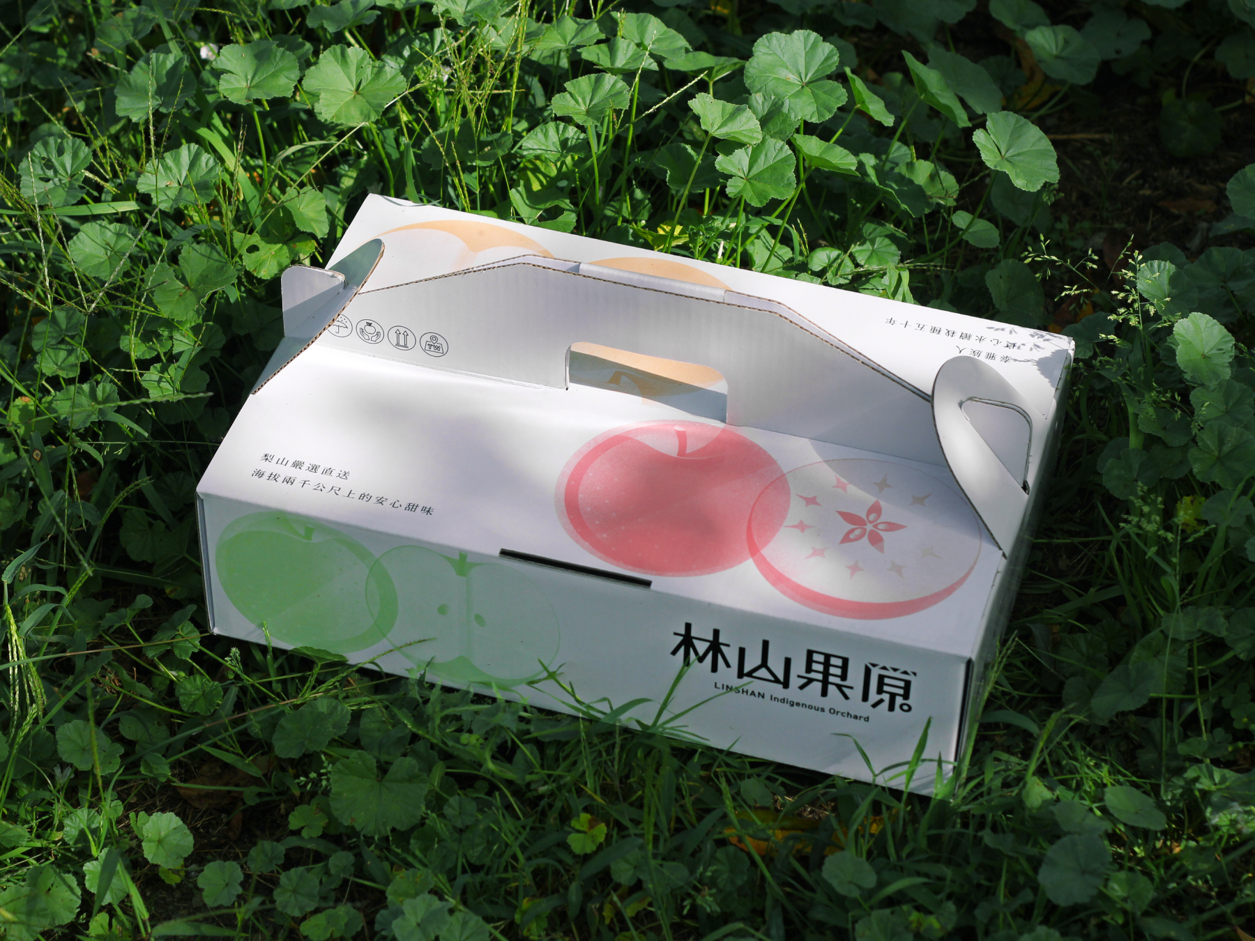
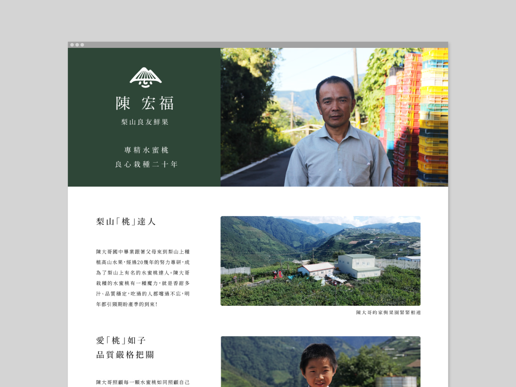
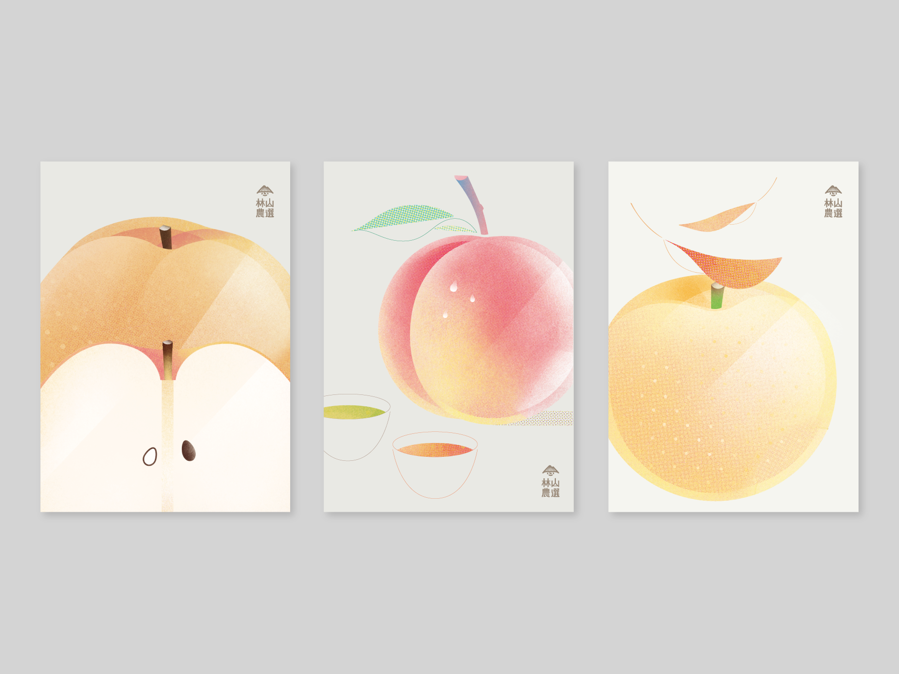
Our mission is to build bridges between the consumer and the producer, and this is reflected in the visual identity and packaging design that we created. By showcasing the beauty of the natural landscape where the products are grown, as well as the care and hard work that goes into producing them throughout the brand, we hope to inspire a greater appreciation for the farmers and their products. It has been a rewarding experience to be part of a brand that not only creates high-quality products but also promotes ethical and sustainable practices.
我們的使命是在消費者與生產者之間建立橋樑,這在我們所創造的視覺形象和包裝設計中得以體現。通過展示產品生產履歷資訊以及關注農友的生活和工作狀態,進一步提升消費者對農民和作物的實質價值。不僅能鼓勵農友創造高品質產品,而且向消費者推廣共好和可持續實踐的品牌理念。對我們來說是一個充滿經驗和回報的項目。
我們的使命是在消費者與生產者之間建立橋樑,這在我們所創造的視覺形象和包裝設計中得以體現。通過展示產品生產履歷資訊以及關注農友的生活和工作狀態,進一步提升消費者對農民和作物的實質價值。不僅能鼓勵農友創造高品質產品,而且向消費者推廣共好和可持續實踐的品牌理念。對我們來說是一個充滿經驗和回報的項目。



Cities Co-op Programme Press Conference 基北北桃城市合作平臺
2023

𒊹︎︎︎ Key Visual Design
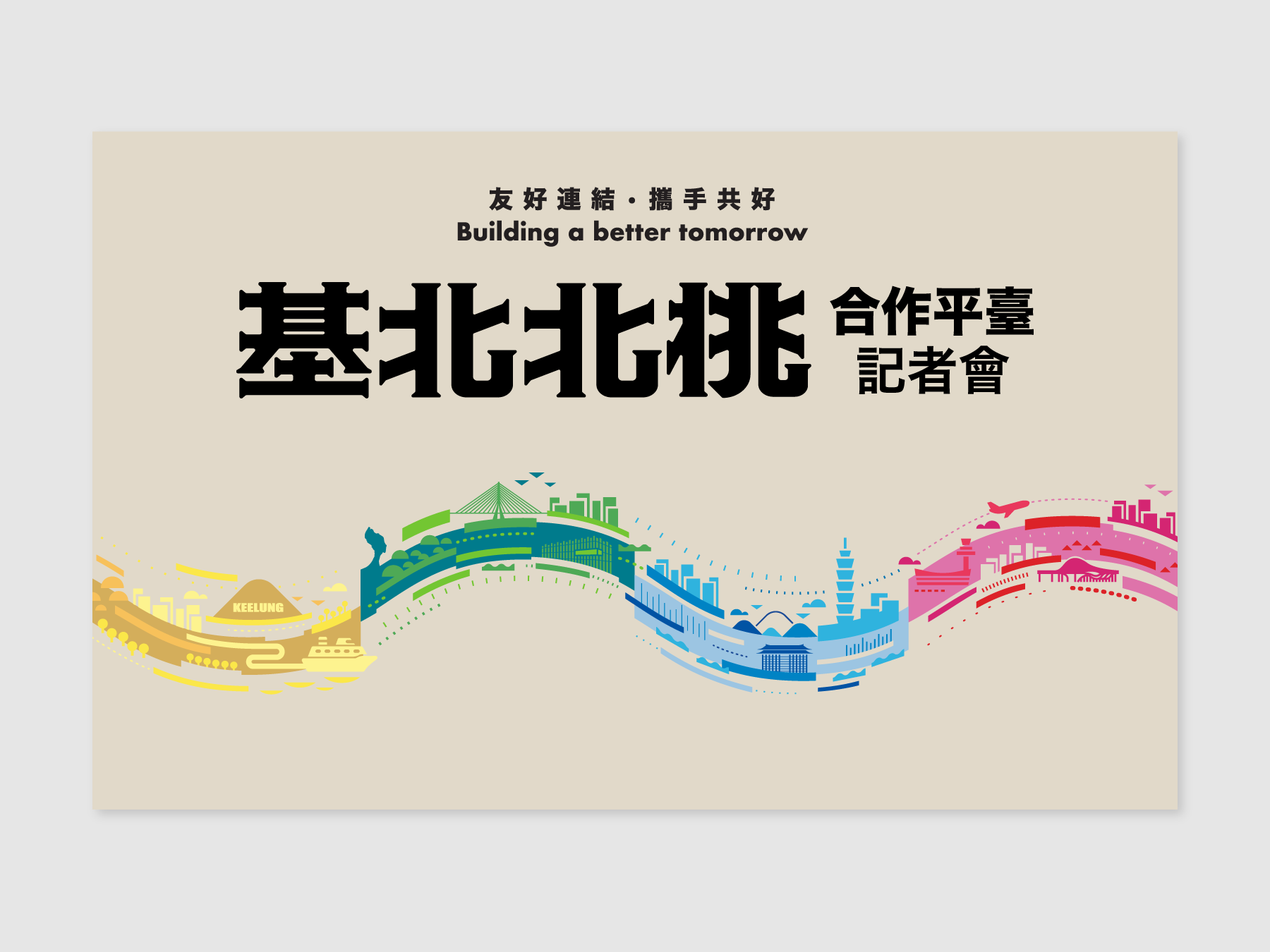
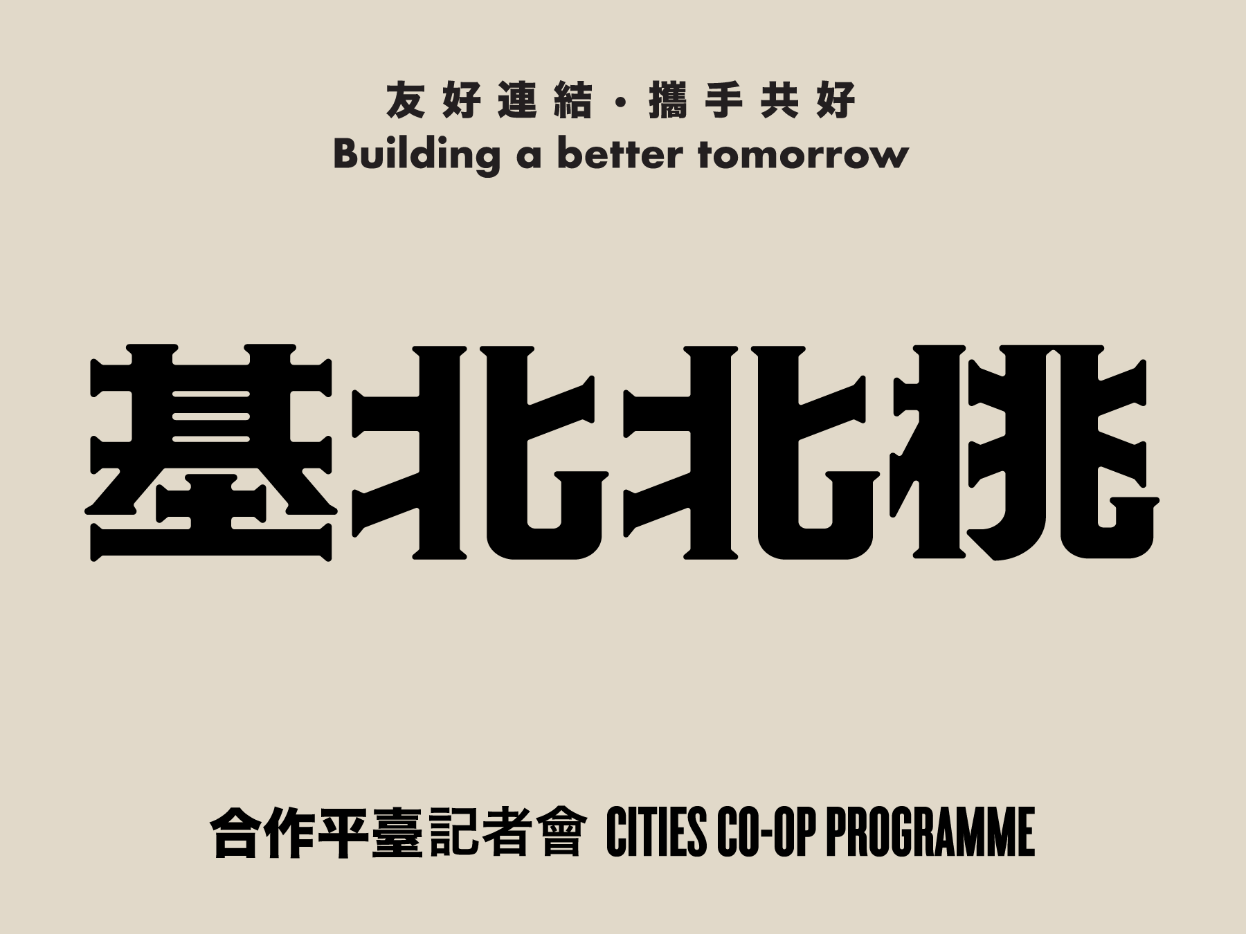
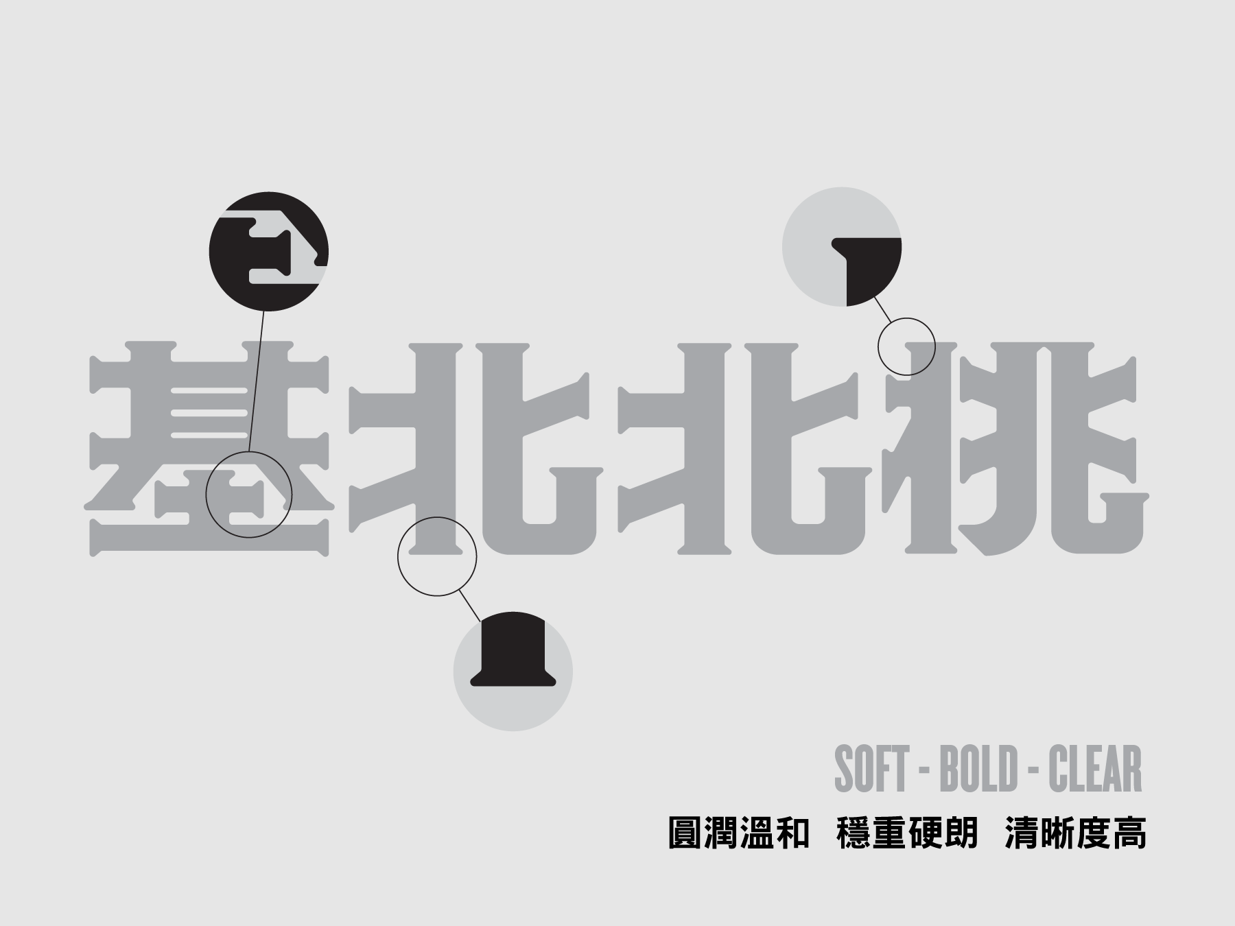
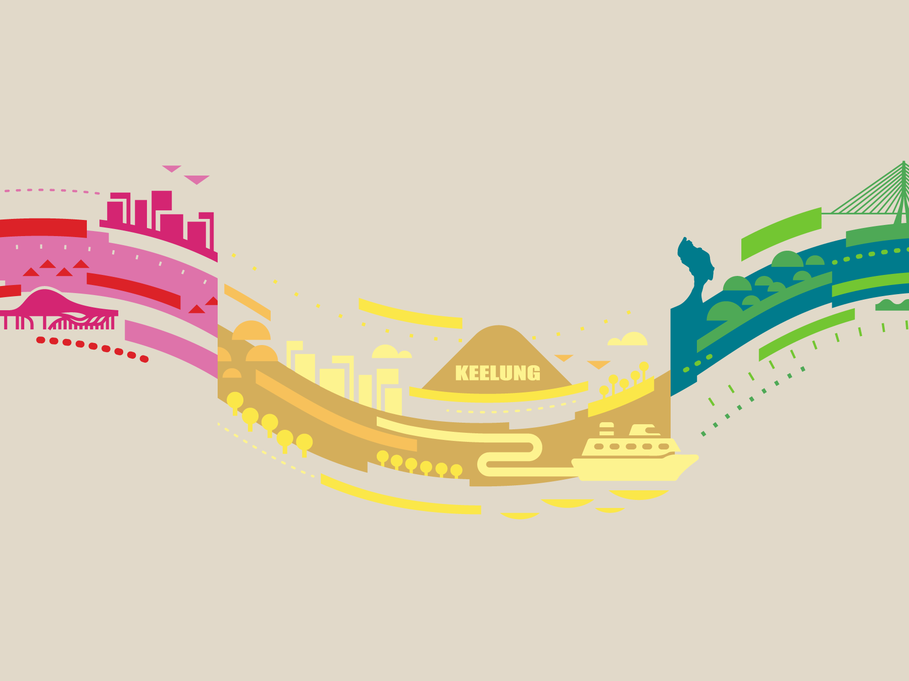
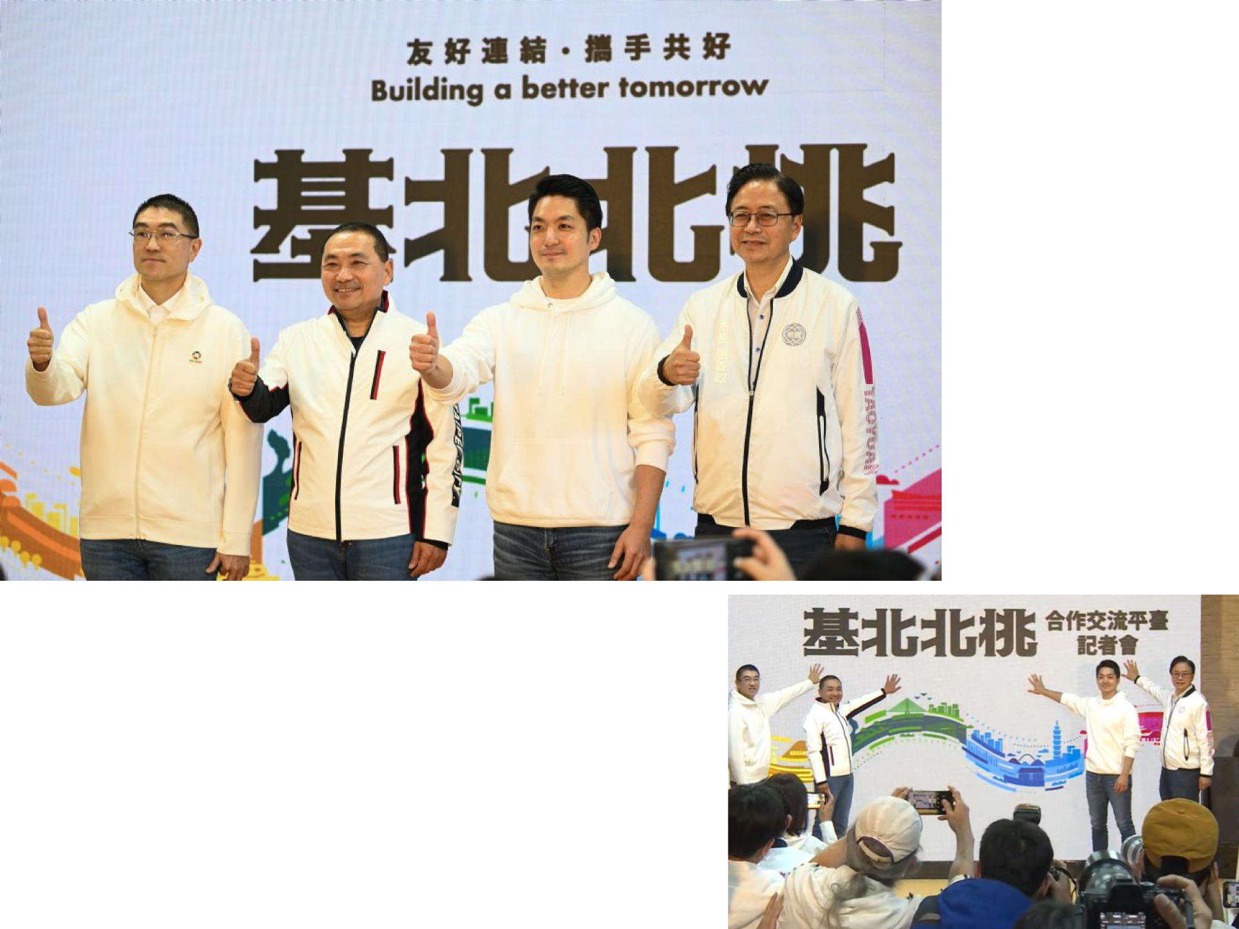
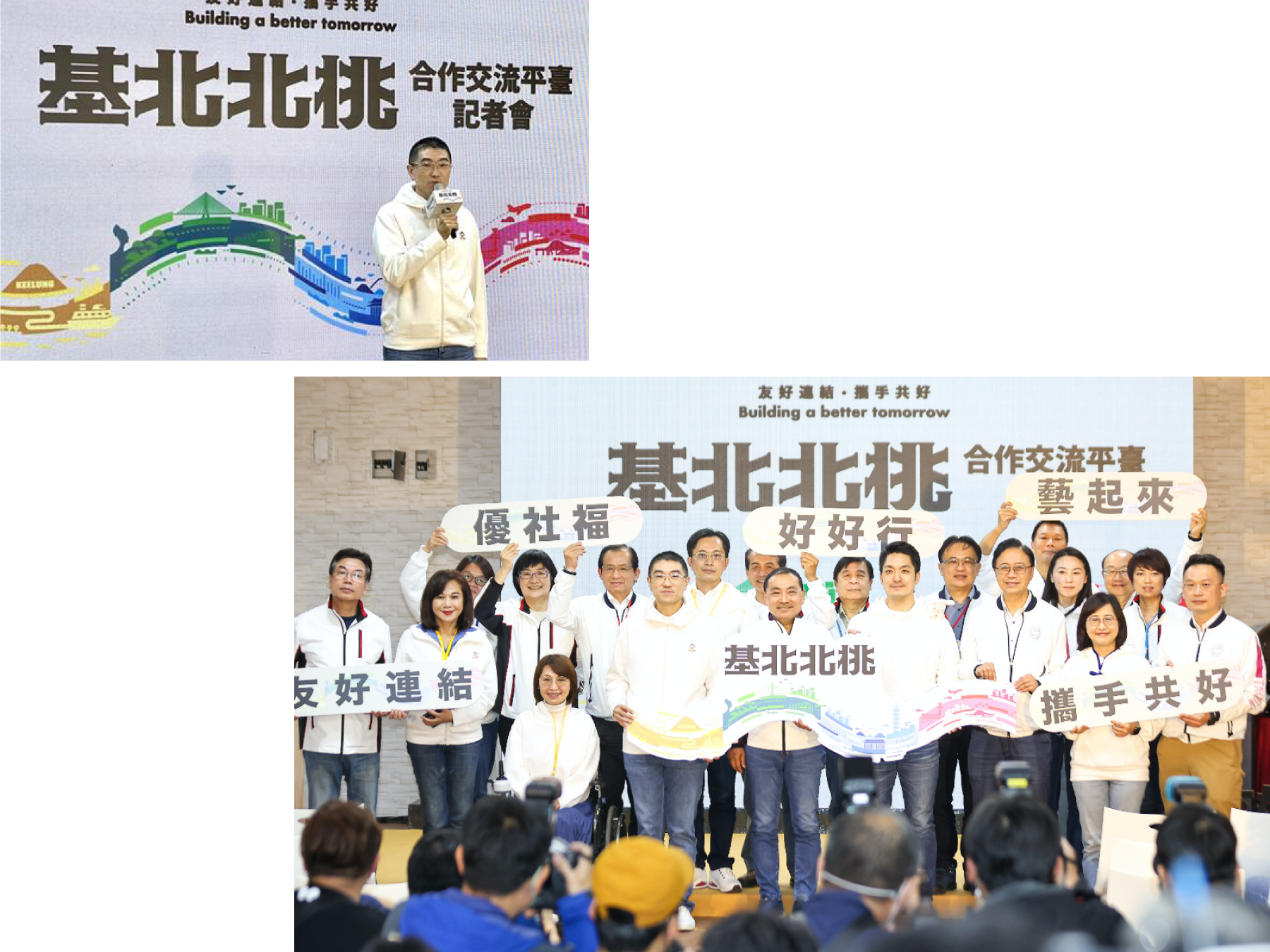
Commissioned by the New Taipei City Government - the key visual design for the press conferences of the cities co-op programme. The programme aims to announce how Taipei, New Taipei City, Keelung, and Taoyuan are working together to create a better experience for their citizens.
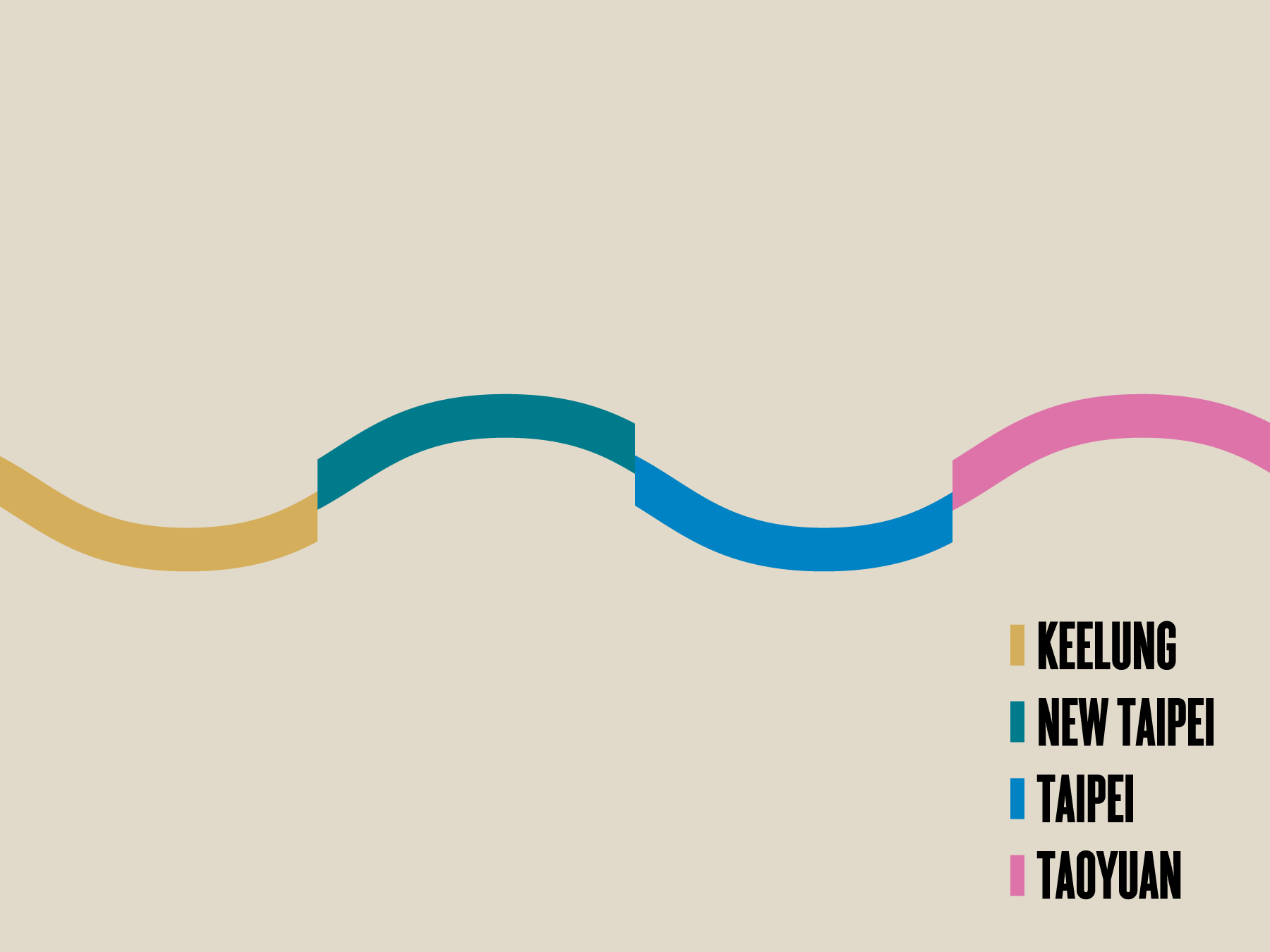
The design uses the colors of the four cities' logos and a wave-like design to connect the four places. I also incorporated illustrations of iconic structures and sites in each city, creating a cohesive visual that extends in an infinite loop. This design highlights the infinite possibilities that can be achieved when these cities work together. It was an honor to create a design that reflects the cooperative spirit and shared vision of these cities, and I hope it inspires more collaboration and unity in the future.
受新北市政府委託,為城市市政合作計畫的新聞發布會設計的主視覺。該計畫旨在宣布台北、新北市、基隆和桃園合作共同為市民創造更好的生活體驗。
設計運用了四個城市標誌的顏色和波浪狀的設計,將這四地連接。在視覺的每段落加入了城市代表性的建築和景點插圖,創造出連貫的視覺效果,宛如無限循環。這個設計凸顯了這些城市合作時可以實現的無限可能性。
能夠為這些城市創造一個反映合作精神和共同願景的設計,我感到非常榮幸,並希望它能帶領我們到更團結的未來。




︎︎︎Press release images
Future Dining Table Project 飛雀餐桌計劃
2020


𒊹︎︎︎ Branding
𒊹︎︎︎ Packaging
𒊹︎︎︎ Editorial
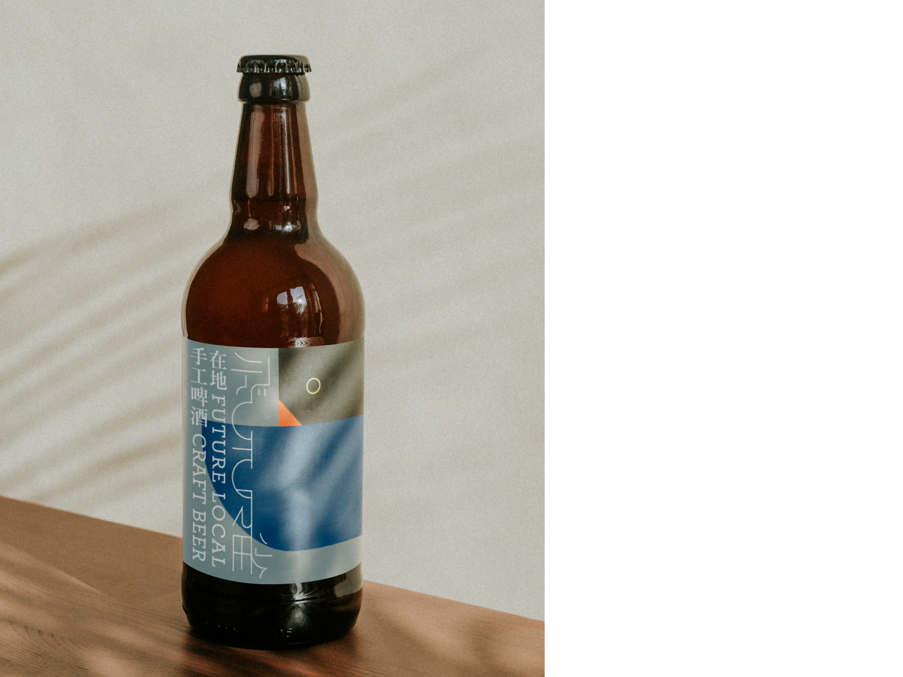
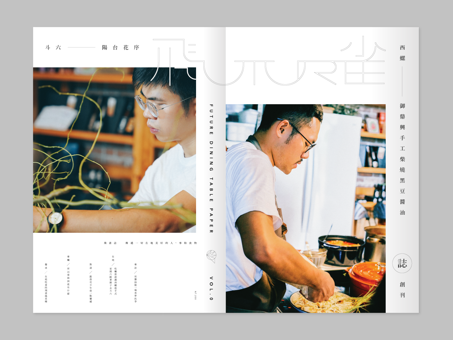
the Visual Identity Design for the Future Dining Table Project, a unique event that links the culture of food in Yunlin, Taiwan. This project curates events such as exhibitions, talks, dining experiences, and local tours.
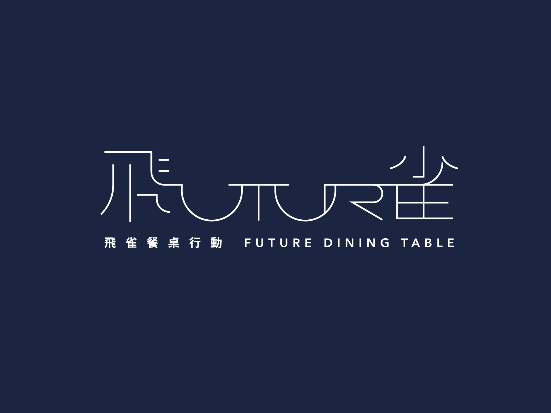
The logo design for the project combines a dining table with the words "FUTURE" and "飛雀" to create a forward-looking design that symbolizes the project's mission.
飛雀餐桌計畫 FUTURE DINING TABLE 是一個連接雲林美食文化的獨特活動。該計畫策劃了展覽、講座、用餐體驗和當地導覽等活動。
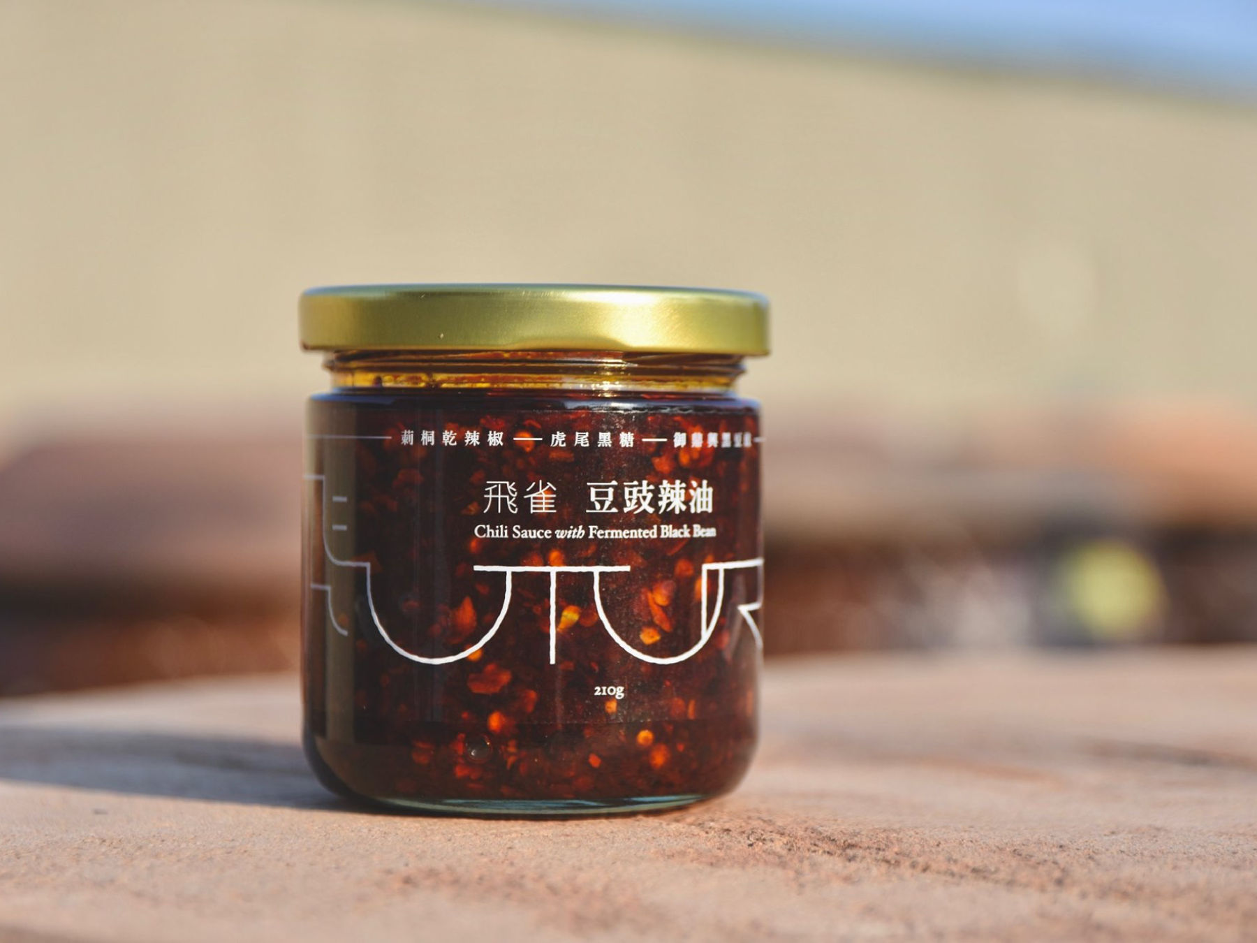
我們受邀為該計畫建立視覺形象。標誌設計將餐桌「FUTURE (未來)」和「飛雀」這兩個詞結合在一起,創造了一個前瞻性的設計,象徵著該計畫的使命。我們的團隊還為當地食材醬料、本地精釀啤酒和其他產品設計了包裝,以增強活動的整體視覺識別。

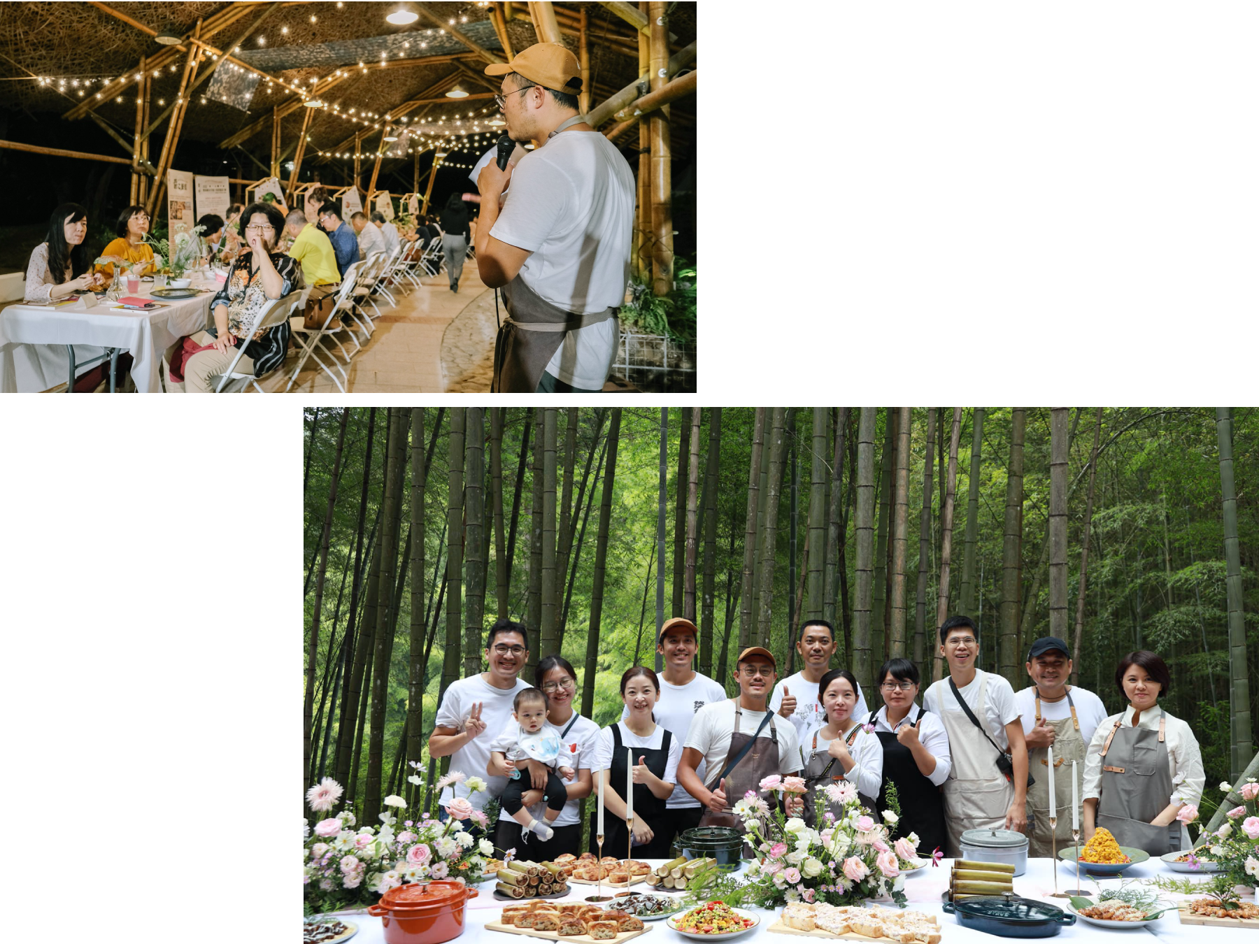
︎︎︎ Event Photos are provided by clients. 以上活動照片由客戶提供。
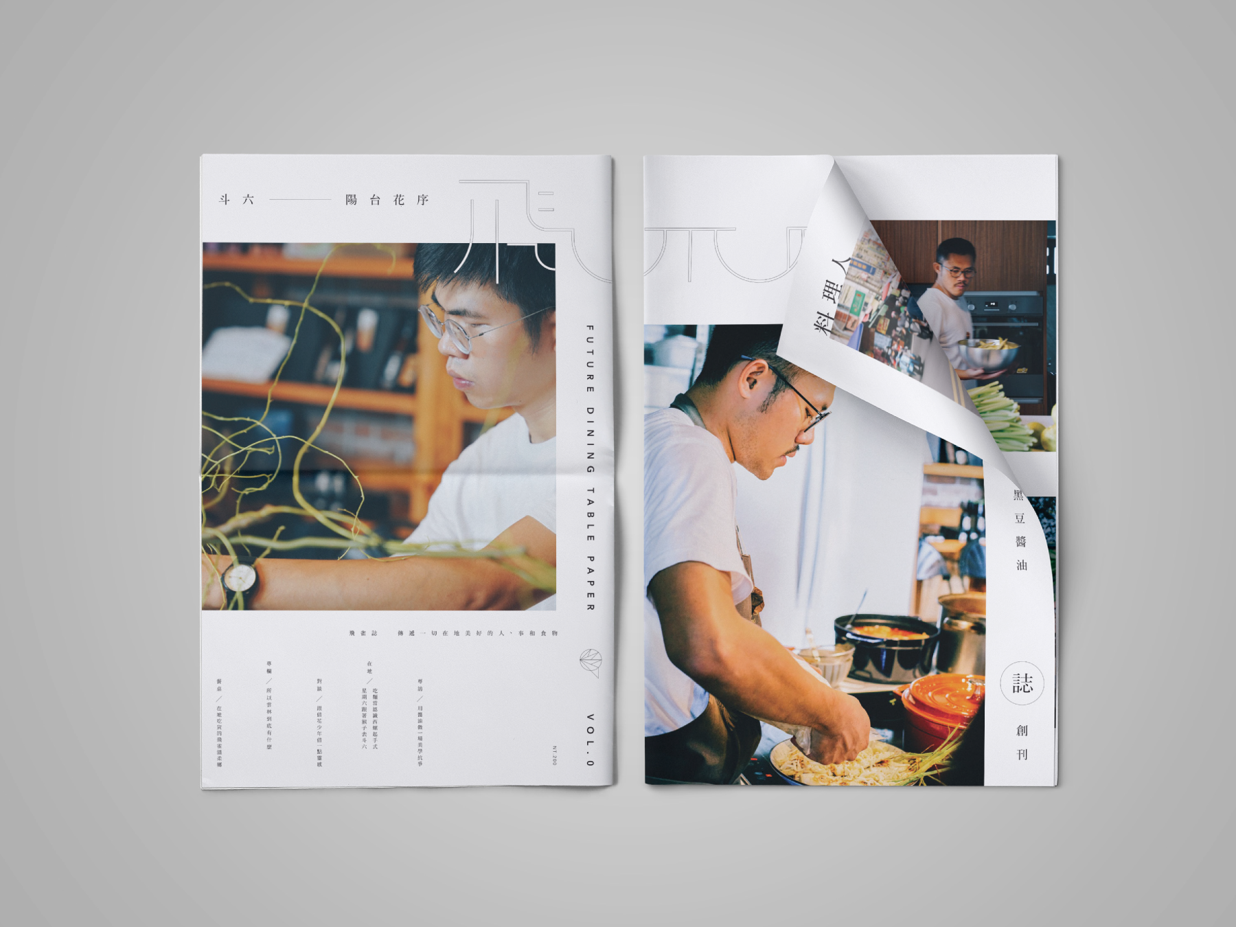
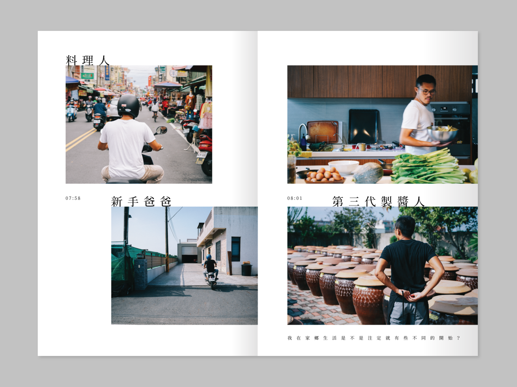
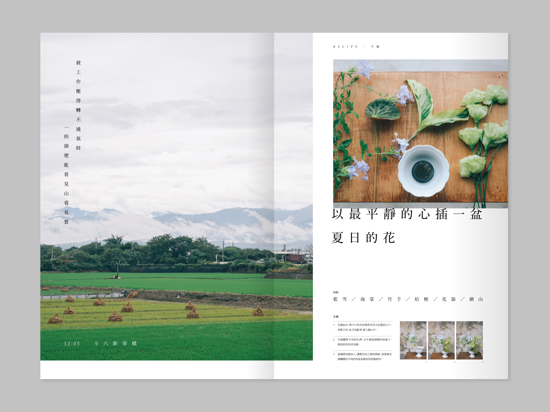
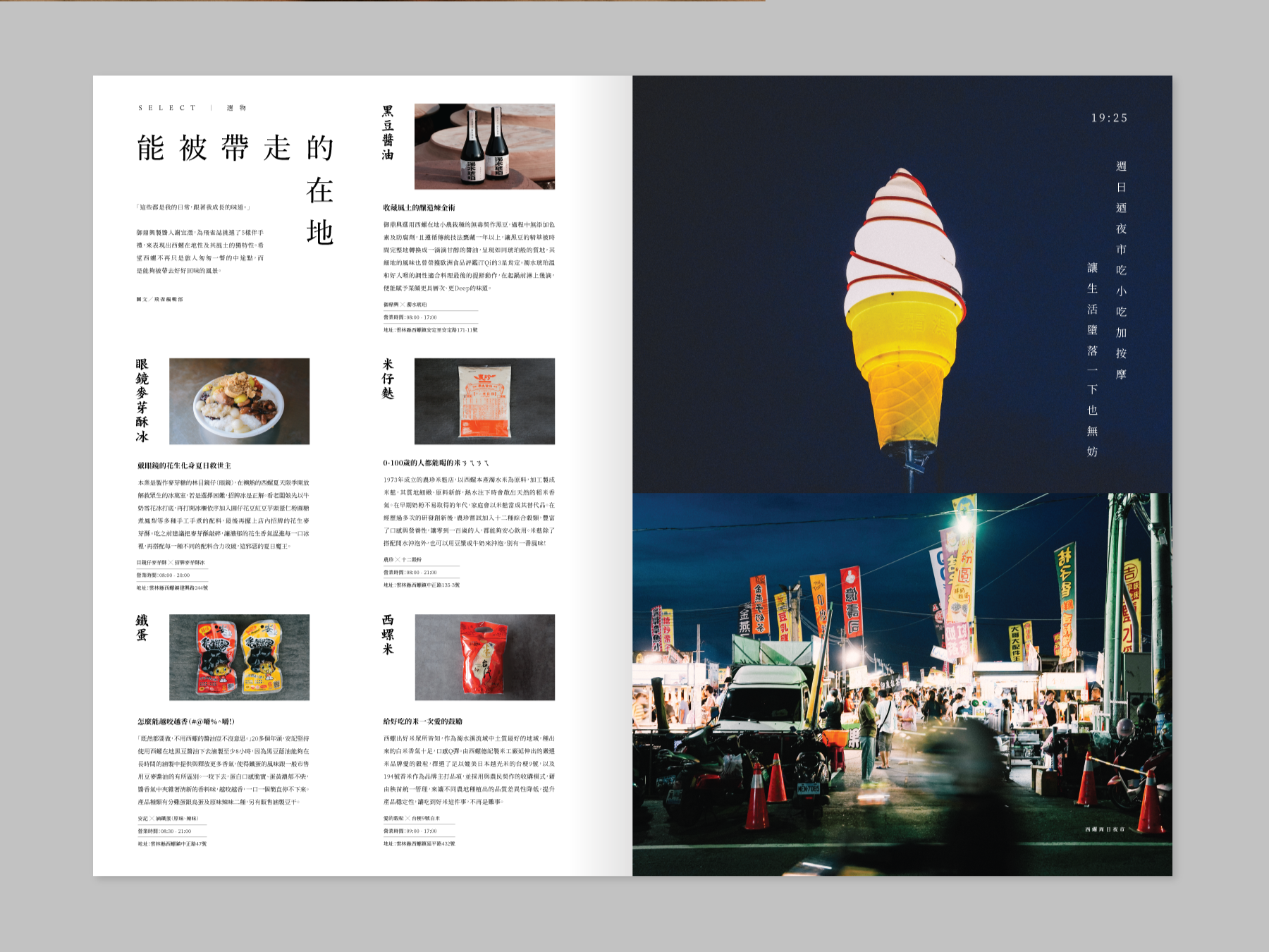
Our team also worked on the packaging design for local ingredient sauces, local craft beer, and other products to enhance the event's overall visual identity. Additionally, we curated a bi-monthly issued magazine that featured two representatives in each issue from Yunlin, who dedicated their careers to local traditional industries.
Through the magazine, the project showcased their way of life and interviewed them to echo the Future Dining Table Project's core value. Our team also designed the whole magazine for the project. I am proud to have worked on this unique and innovative project that combines design, food culture, and local traditions to bring people together.
此外,團隊策劃了一份雙月刊雜誌,每期雜誌都介紹了兩位專注於本地傳統產業的雲林代表。通過雜誌,該計畫展示了他們的生活方式,並對他們進行了訪談,以呼應未來餐桌計畫的核心價值觀。
我們的團隊以大開本、報紙形式為雜誌進行設計、利用大面積的圖文內容創造平穩卻充滿新鮮感的閱讀體驗。這個獨特而創新的計畫結合地方創生,將設計、飲食文化和本地傳統融合在一起,讓人們走到一起。



The Raw Sauce 祼醬
2020
𒊹︎︎︎ Packaging
𒊹︎︎︎ Typography
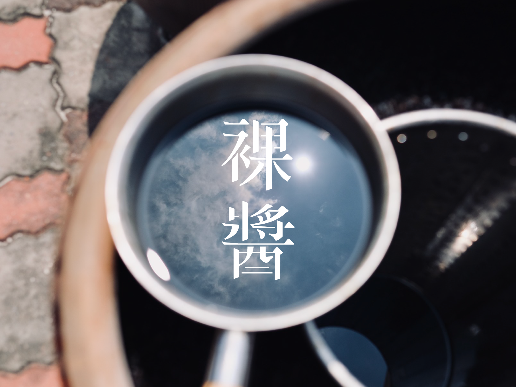
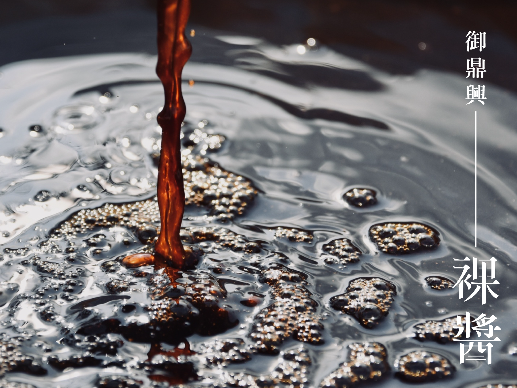
The packaging design for the "Raw Sauce" was commissioned by Yu-ding-xin Soy Sauce Factory, a leading traditional soy sauce manufacturer in Yunlin, Taiwan. This premium soy sauce boasts several unique features, including a three-year aged dry pot oil, a nitrogen content of 2.35, and an annual production schedule.
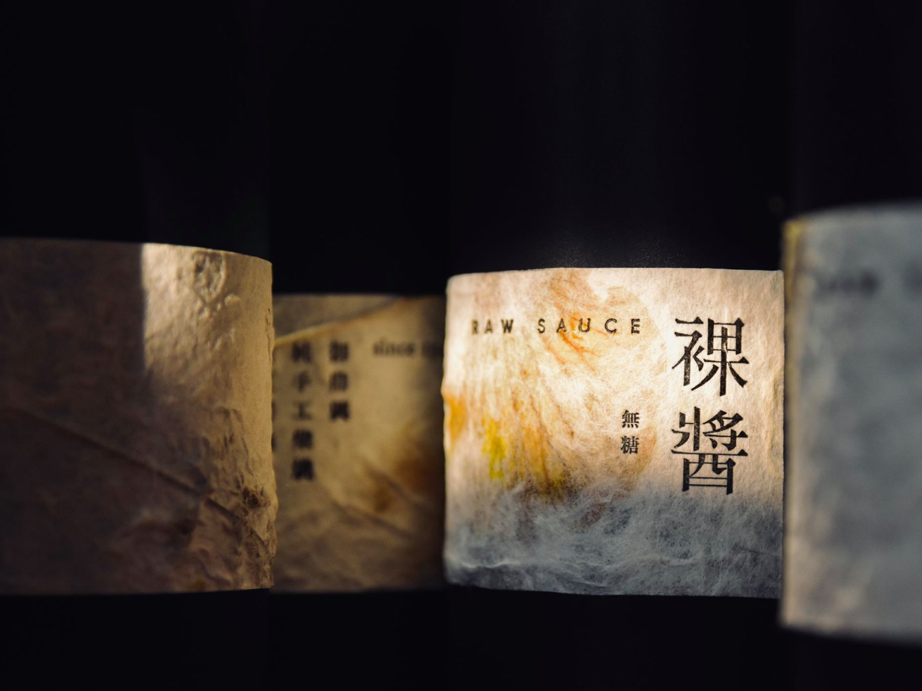
To reflect the brand's commitment to quality and tradition, we opted for a minimalist design approach for the packaging. We chose a handcrafted paper label to evoke a sense of luxury and paired it with a stamped design technique for a more authentic, artisanal feel. The label design focuses on highlighting the brand name and product features in a clean, sophisticated manner.
御鼎興是台灣具代表性的傳統醬油製造商。而「祼醬」這款高級醬油因未經熬煮,所以釀造時間拉長至3年,且為乾式釀造,產量極少,醬的色澤更為黑褐。
為了體現品牌對品質和傳統的承諾,我們選擇了簡約的設計風格來設計包裝。我們選用手工紙標籤,以營造兼具奢華感及手工訂製感,並結合印刷技術,使整體設計更具手工感。同時我們使用高級紅酒的概念去製作外包裝,為此價值不菲的醬油提升珍藏價值!


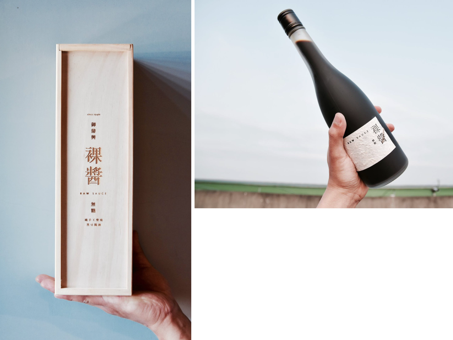


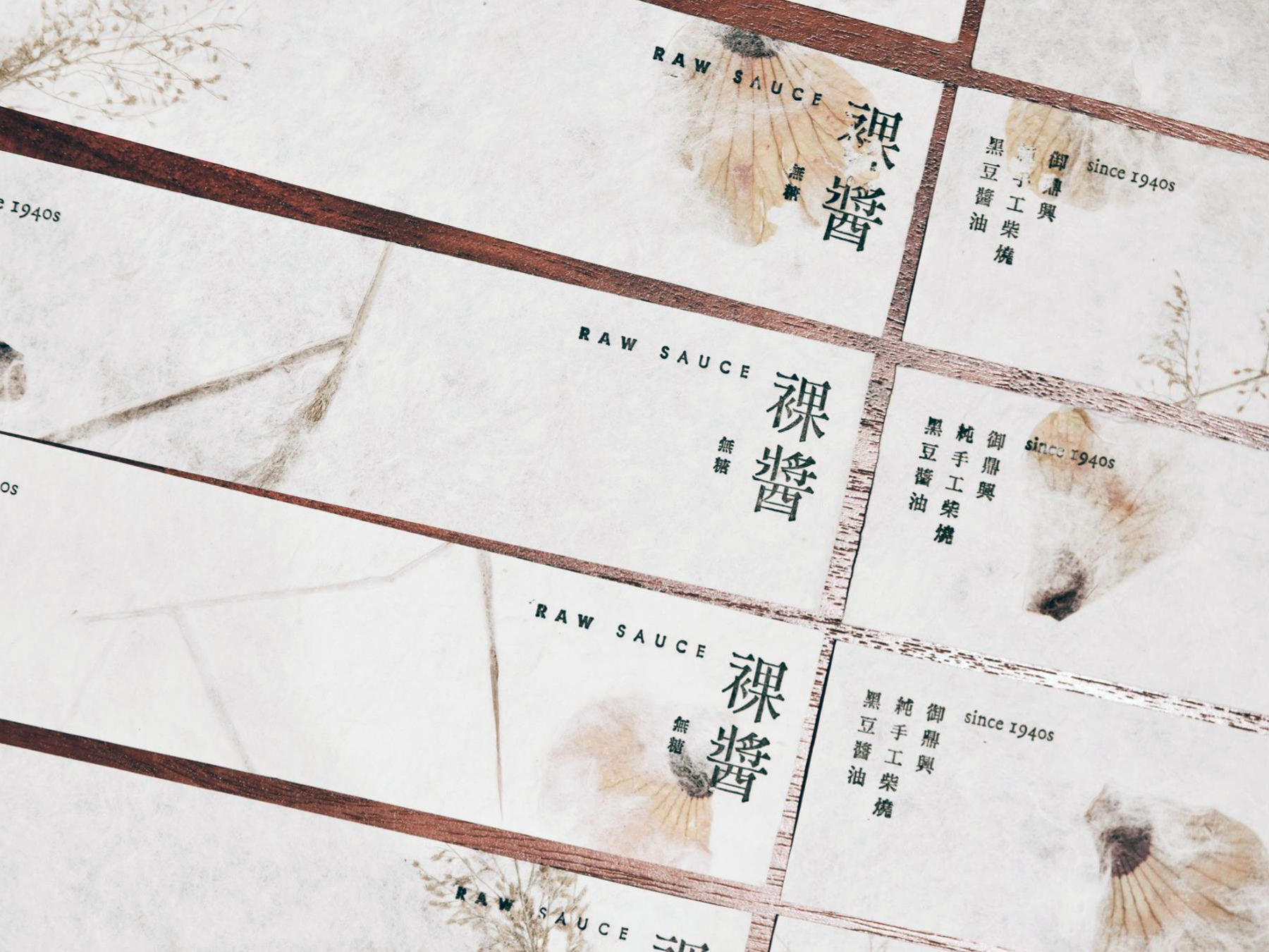
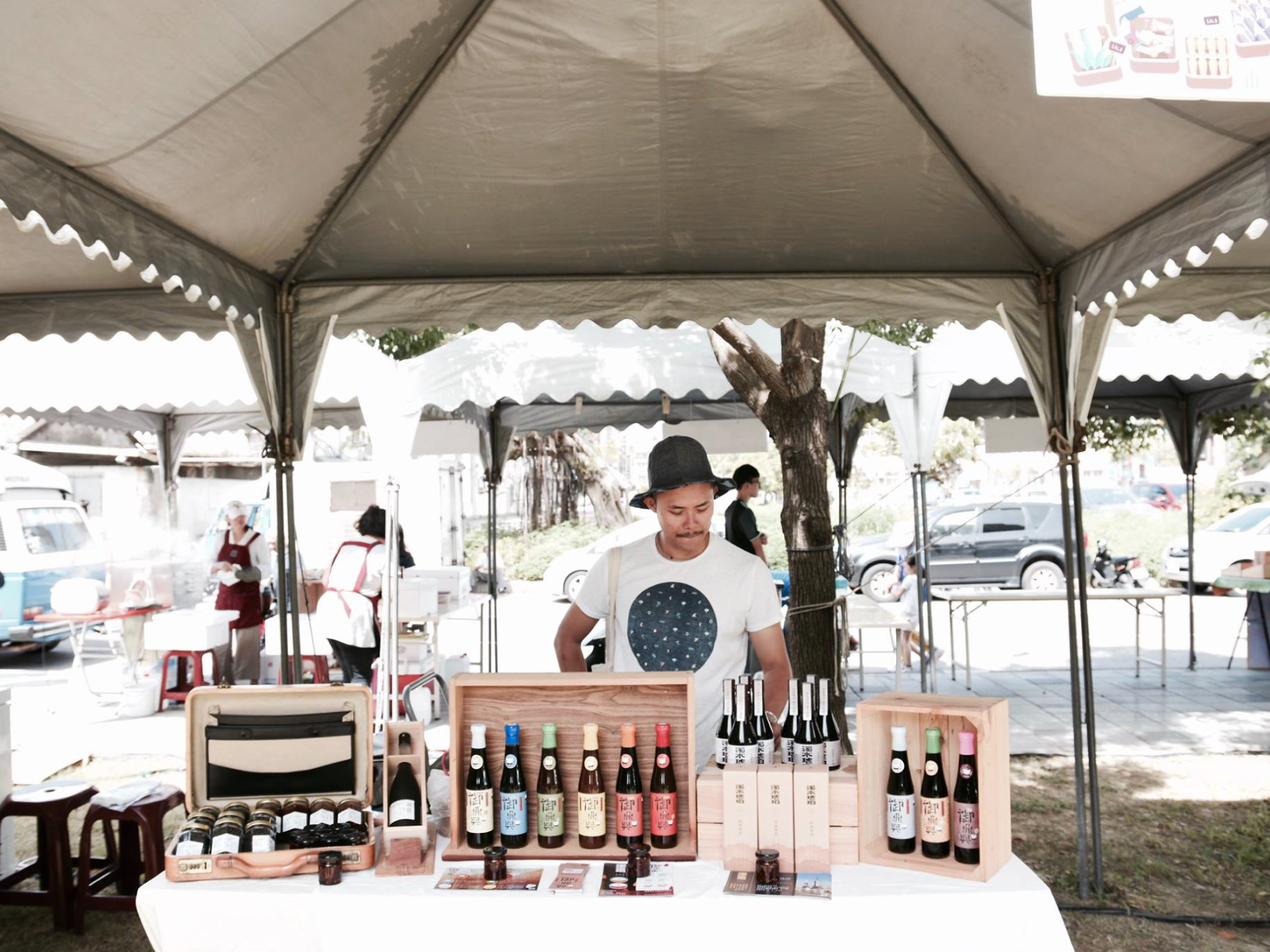
Overall, our design for the Raw Sauce successfully reflects the brand's values and product features while conveying a sense of sophistication and luxury to potential customers. The combination of high-quality materials and careful design considerations makes this packaging design stand out on shelves and attract customers looking for a premium soy sauce product.
︎︎︎ALL PHOTOS ARE PROVIDED BY THE CLIENTS 所有照片由客戶提供
︎︎︎ALL PHOTOS ARE PROVIDED BY THE CLIENTS 所有照片由客戶提供
New Taipei City Music & Art Festival 2024 生音藝術節
2024

𒊹︎︎︎ Event Visual Identity
𒊹︎︎︎ Integrated Design
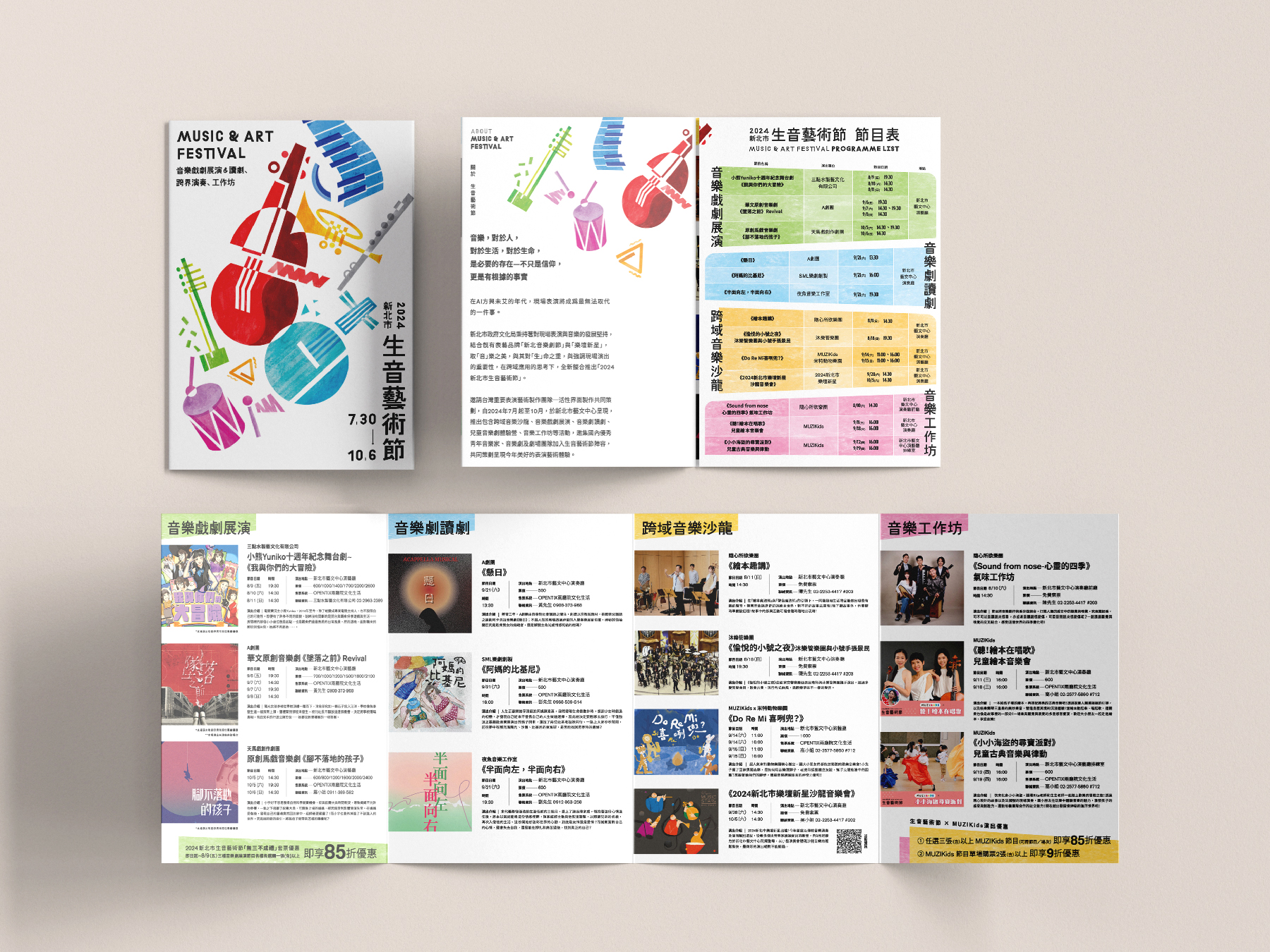
For the NTC 2024 Music & Art Festival visual campaign, we crafted a vibrant and dynamic visual identity that captures the festival’s spirit of creativity, diversity, and joy. Spanning from July to October, the festival integrates the well-established New Taipei Musical Festival and Rising Stars in Music, featuring cross-disciplinary music salons, theatrical performances, and children's musical theater workshops.
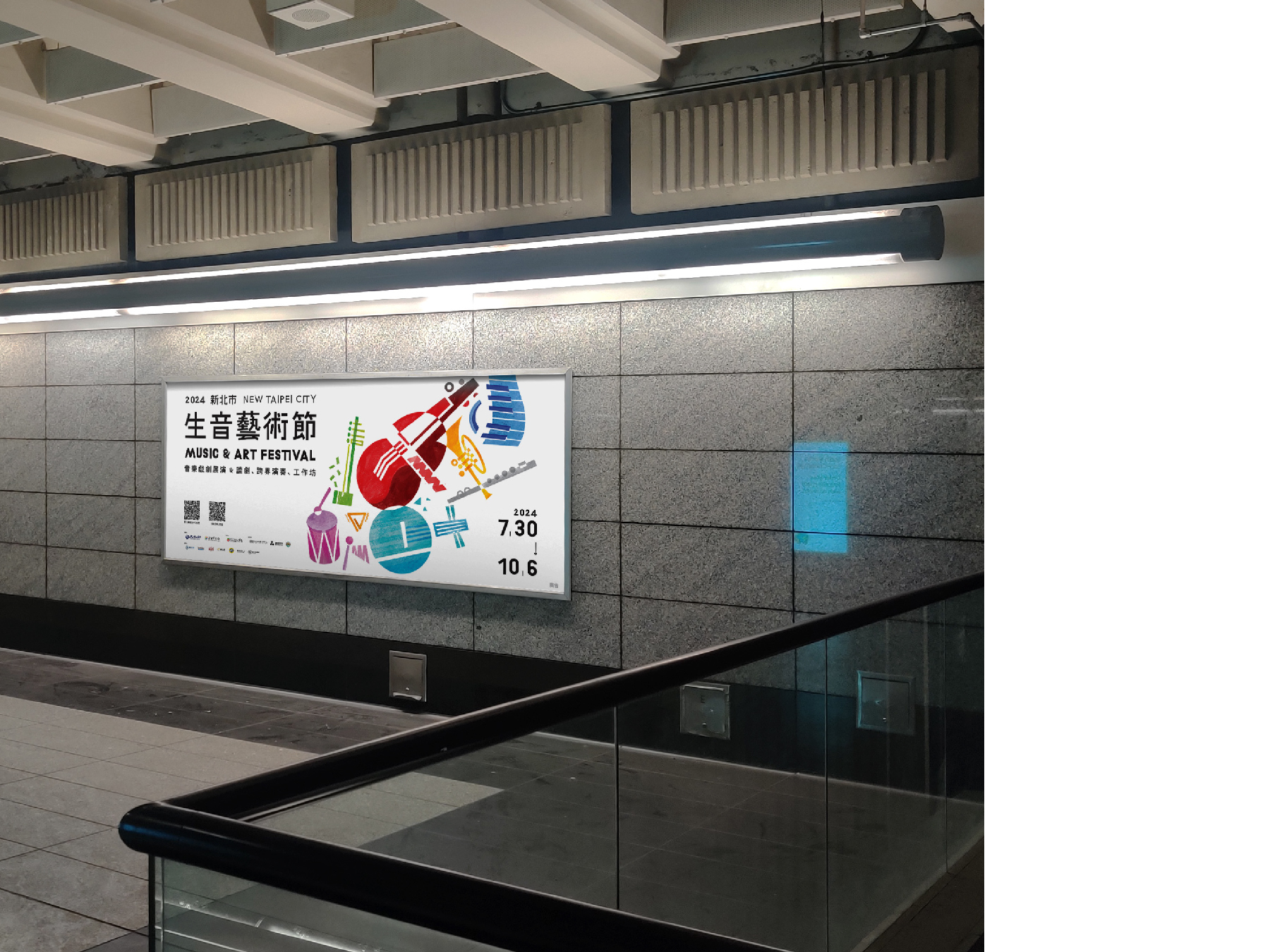
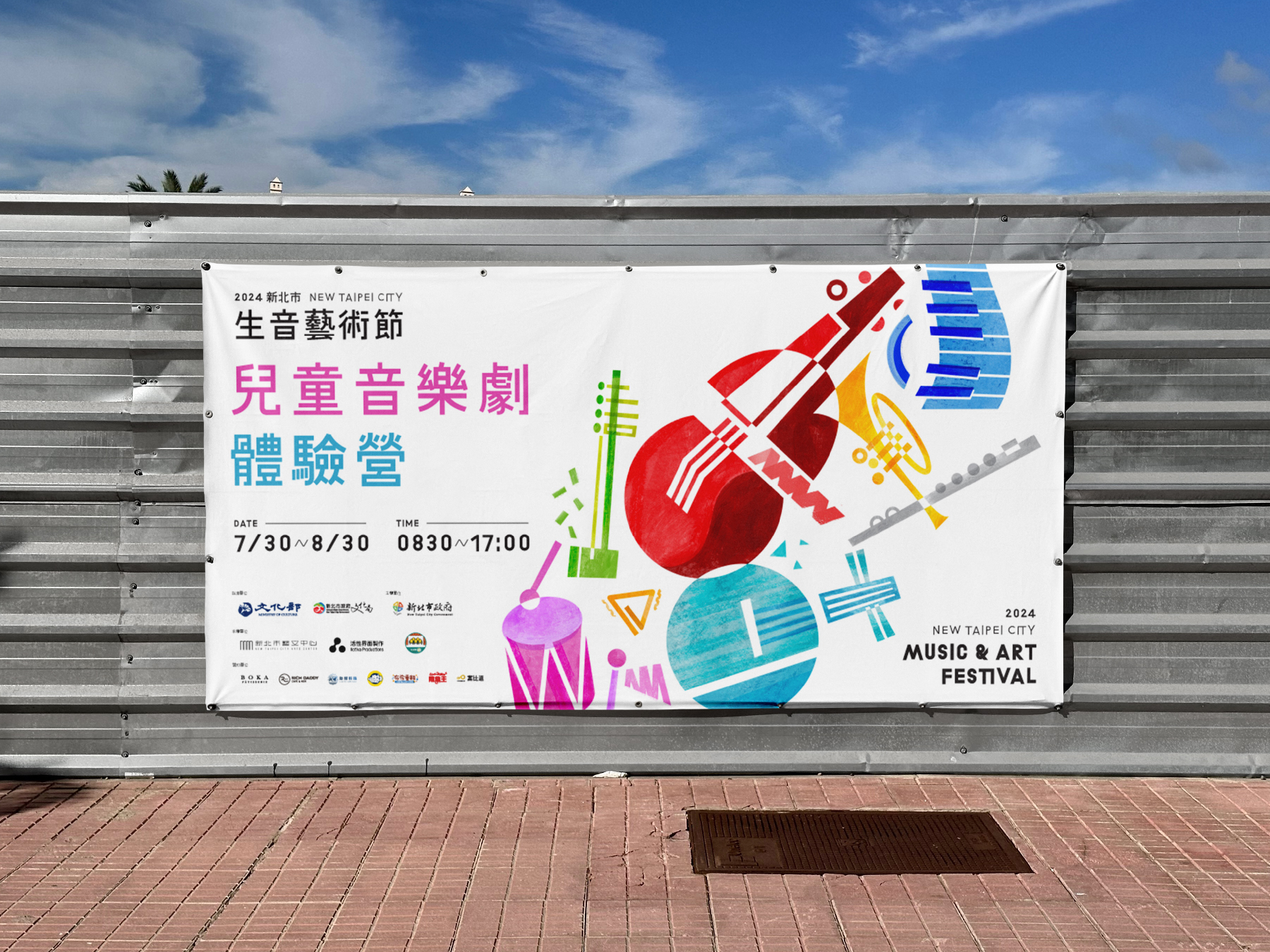
Our design concept revolves around geometric representations of musical instruments, symbolizing the harmony between different art forms. By incorporating bold colors and playful compositions, we aimed to reflect the festival’s energetic and inclusive atmosphere, inviting audiences of all ages to immerse themselves in a world where music and art come alive. The result is a visually engaging campaign that not only enhances the festival’s identity but also amplifies its mission to celebrate artistic expression and community engagement.
新北市 2024 生音藝術節 視覺設計以充滿活力與動感的視覺語言,展現藝術節的多元、創意與歡樂氛圍。今年藝術節自 7 月至 10 月舉行,結合 新北音樂劇節 與 樂壇新星 兩大品牌,活動內容涵蓋跨領域音樂沙龍、音樂戲劇展演、兒童音樂劇體驗營等,邀請國內優秀的青年音樂家與音樂劇團隊共同策劃,帶來豐富精彩的音樂藝術體驗。
我們的設計概念以 幾何化的樂器圖像 為核心,象徵不同藝術形式的交融與對話。透過 鮮明的色彩運用與活潑的構圖,營造出熱情洋溢且充滿感染力的視覺效果,吸引各年齡層的觀眾參與其中。整體視覺不僅塑造了藝術節獨特的品牌形象,更強化了活動「讓音樂與藝術融入生活、連結社群」的核心精神。
我們的設計概念以 幾何化的樂器圖像 為核心,象徵不同藝術形式的交融與對話。透過 鮮明的色彩運用與活潑的構圖,營造出熱情洋溢且充滿感染力的視覺效果,吸引各年齡層的觀眾參與其中。整體視覺不僅塑造了藝術節獨特的品牌形象,更強化了活動「讓音樂與藝術融入生活、連結社群」的核心精神。
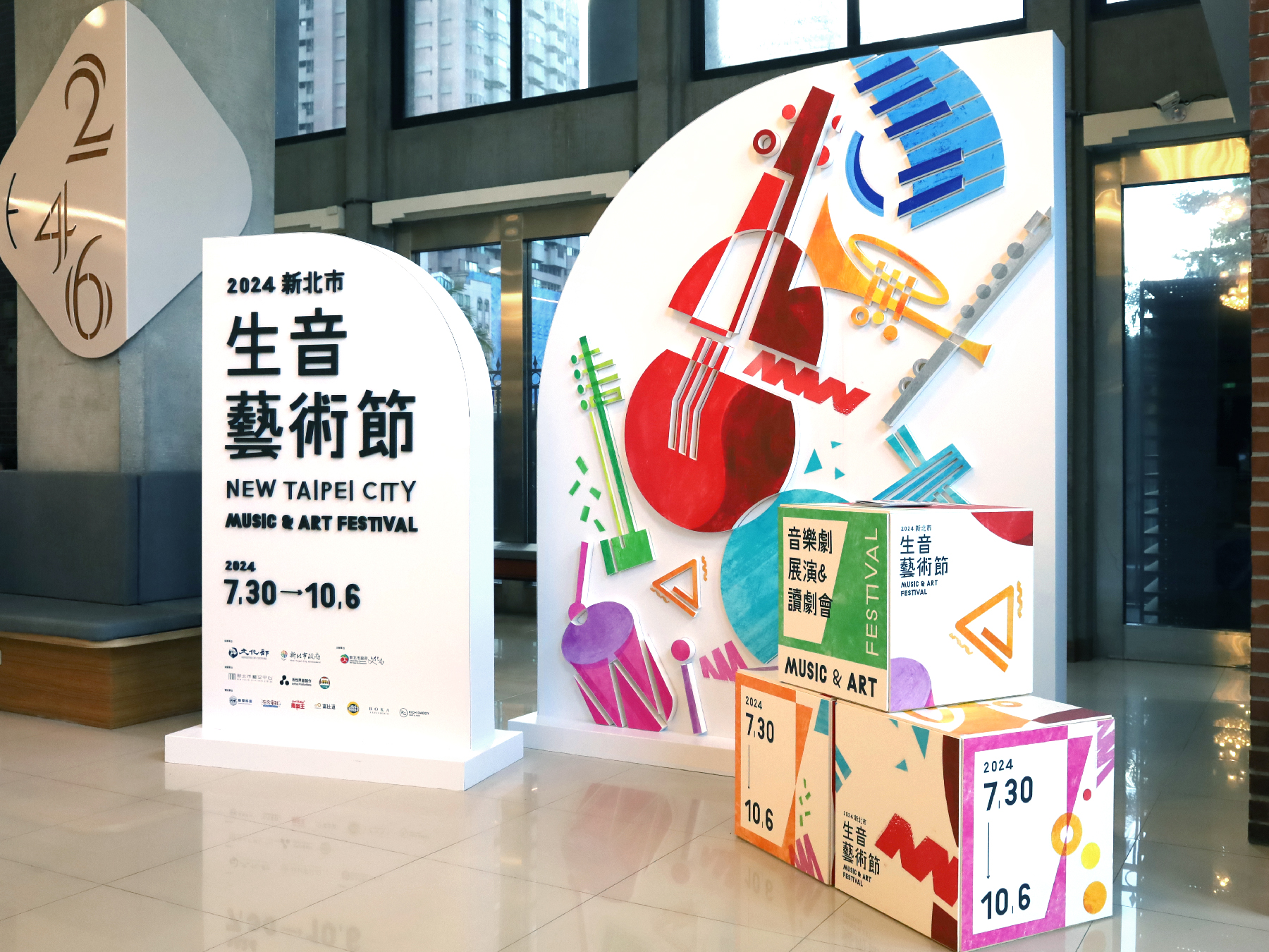
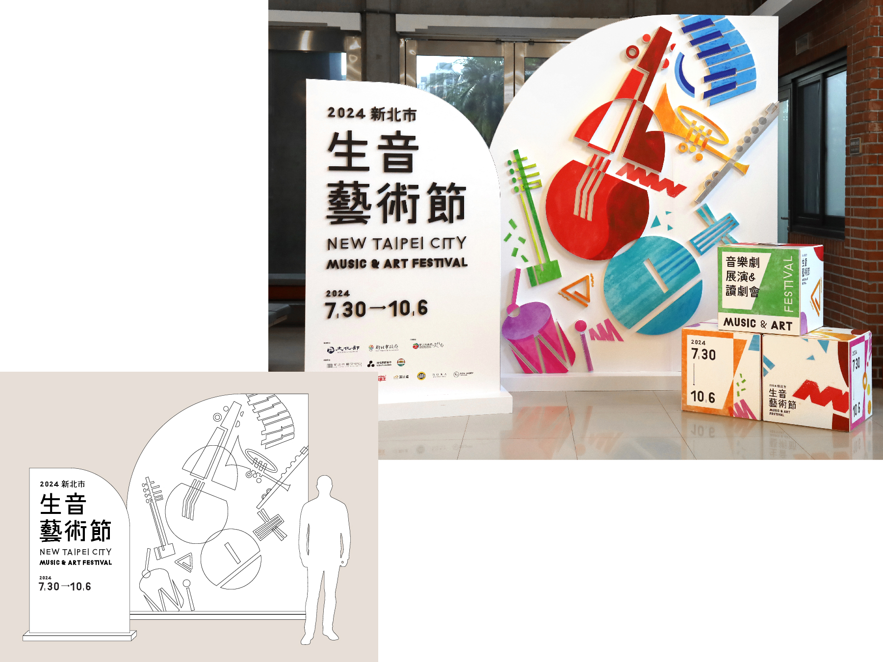
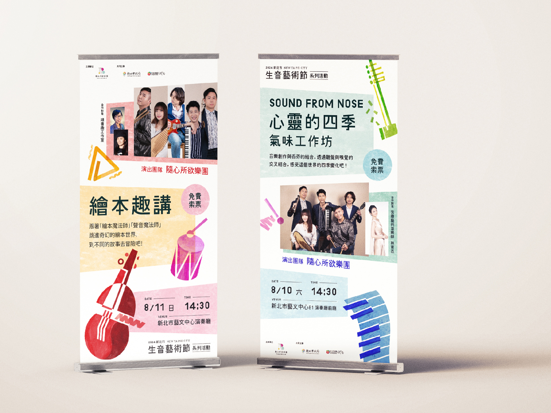
In addition, we prioritize sustainability in physical applications. All POP displays are made from eco-friendly D-Board, ensuring a visually striking yet environmentally responsible design. Instead of printing individual program leaflets for each performance, we have adopted a digital version, reducing paper waste while providing audiences with easy access to event information.
此外,我們在 實體應用 上也特別重視 環保永續 的理念。所有 POP 設計皆採用 環保材質 D-Board,確保設計兼具美觀與環境友善。節目手冊部分,則以 數位化 取代傳統紙本,減少印刷品的浪費,讓觀眾透過電子版本輕鬆獲取節目資訊。
此外,我們在 實體應用 上也特別重視 環保永續 的理念。所有 POP 設計皆採用 環保材質 D-Board,確保設計兼具美觀與環境友善。節目手冊部分,則以 數位化 取代傳統紙本,減少印刷品的浪費,讓觀眾透過電子版本輕鬆獲取節目資訊。
MOVE TO ZERO 藝文永續行動
2021

𒊹︎︎︎ Key Visual Design
The visual identity for “MOVE TO ZERO 藝文永續行動” is rooted in the concept of transformation—moving from awareness to action toward sustainability in the arts and culture sector. Inspired by the core theme of “0,” the design reinterprets the number zero as a symbol of cyclical renewal and regenerative momentum. This circular motif not only reflects the idea of a continuous, evolving process but also echoes the vision of achieving net-zero emissions through unified action.
-
「MOVE TO ZERO 藝文永續行動」的主視覺設計以「轉化」為核心概念,象徵藝文界從意識到實踐、邁向永續的具體行動。設計靈感源自「0」這個符號,將其轉化為象徵循環與再生動能的圖騰,代表著不斷推進、持續演進的永續旅程,同時呼應淨零排放的願景。
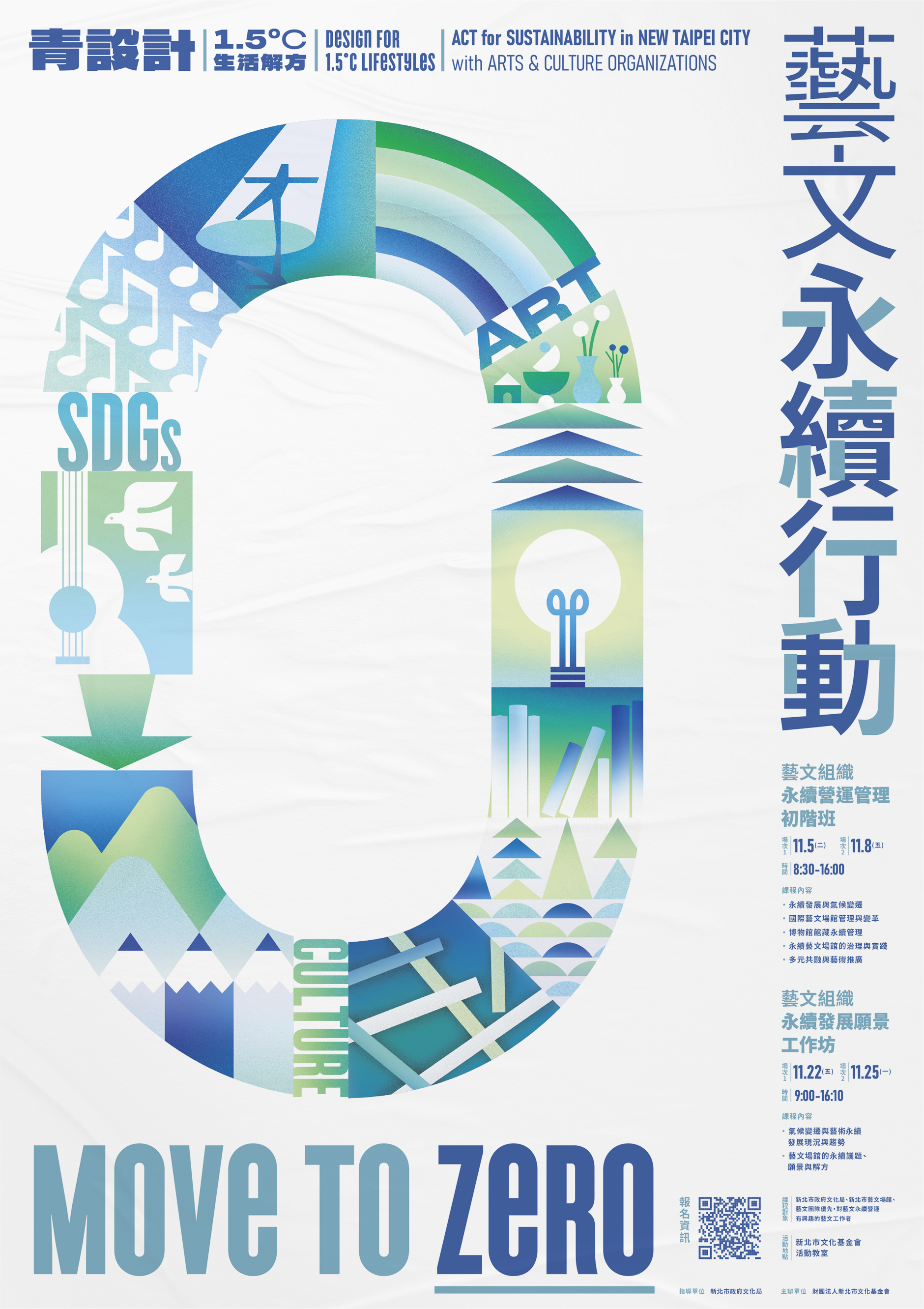
To reflect the essence of both environmental consciousness and artistic expression, the key visual integrates organic, directional shapes & arrows and subtle references to art and cultural forms within the cycle itself. Shades of green and blue are chosen as the primary palette, evoking the natural world and projecting a sense of calm, clarity, and future-forward thinking. These colors also reinforce the campaign’s message of ecological responsibility and collective harmony.
-
為了融合環境意識與藝術文化的視覺語彙,設計以指向箭頭構成圓形結構,並在其中融入與藝文相關的意象,象徵創意與文化在永續進程中的核心角色。整體配色以綠色與藍色為主軸,傳遞自然、生態與清新的感受,直接呼應行動的理念。

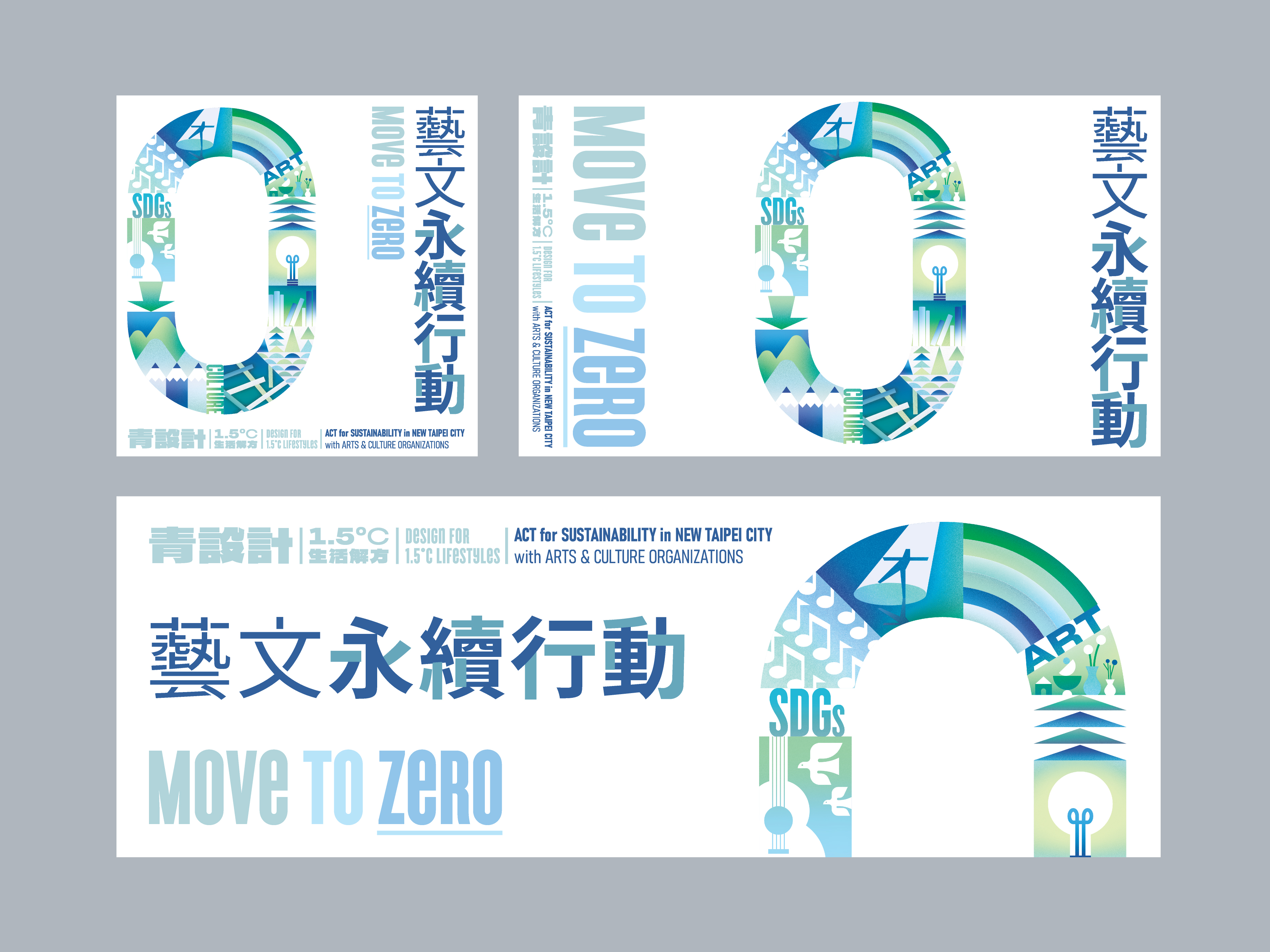


This design serves not just as a visual anchor for the event but also as a communicative tool—helping participants quickly grasp the campaign’s vision of fusing sustainable practices with art and culture. Through simplicity and symbolism, “MOVE TO ZERO” positions itself as both a call to action and a hopeful gesture toward a greener, more resilient creative landscape.
-
協助參與者迅速理解活動訴求與永續目標。透過簡潔而充滿意義的符號設計,「MOVE TO ZERO」成為一項集結藝文力量、邁向永續未來的行動倡議。
Winsun 2024 Contemporary Art Autumn Auction Catalog 衛山 2024 秋季拍賣會圖錄
2024

𒊹︎︎︎ Catalogue Design
The Winsun 2024 Contemporary Art Autumn Auction Catalog is designed with a neat and minimalistic approach, ensuring that each art piece takes center stage with optimal clarity and visibility. Our goal is to create a refined visual experience that enhances appreciation for the artworks while maintaining a sophisticated and timeless aesthetic.
衛山 2024 秋季拍賣會圖錄 設計主要考量其功能性,確保每件藝術作品都能以最佳的視覺方式展現其獨特魅力,用簡約的畫面呈現精緻且具有永恆美感的視覺體驗,讓藏家能夠更加專注於藝術本身。
衛山 2024 秋季拍賣會圖錄 設計主要考量其功能性,確保每件藝術作品都能以最佳的視覺方式展現其獨特魅力,用簡約的畫面呈現精緻且具有永恆美感的視覺體驗,讓藏家能夠更加專注於藝術本身。


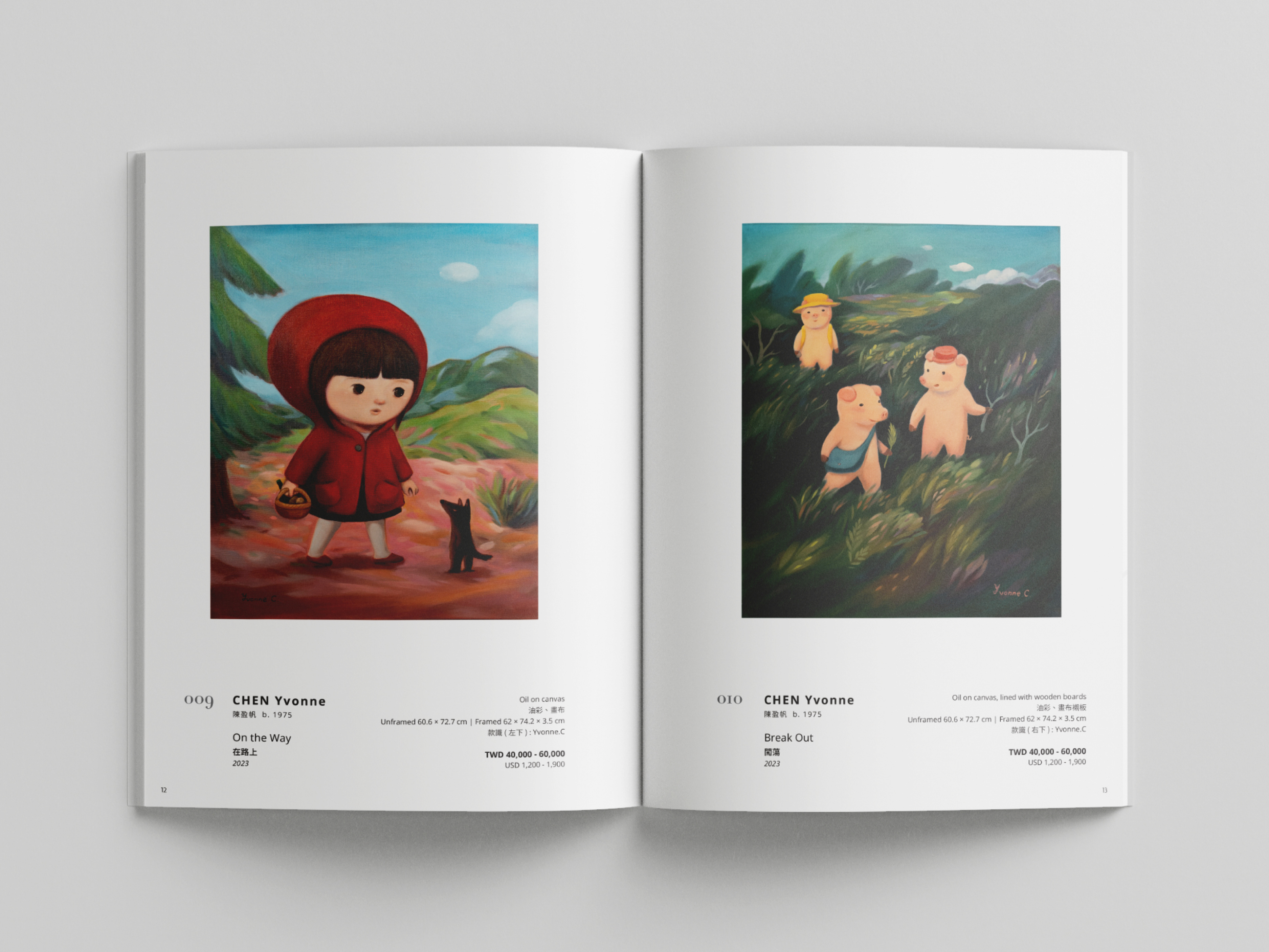


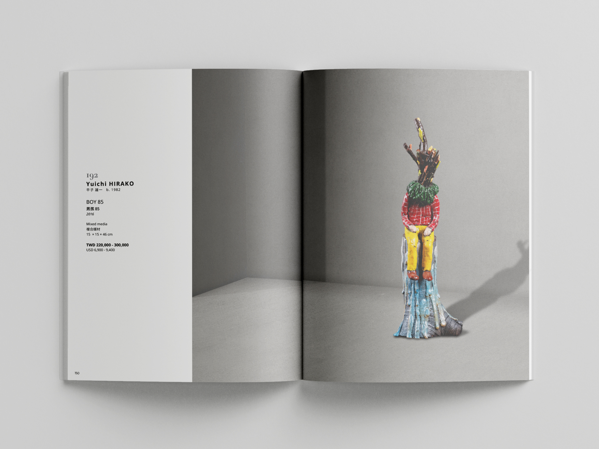
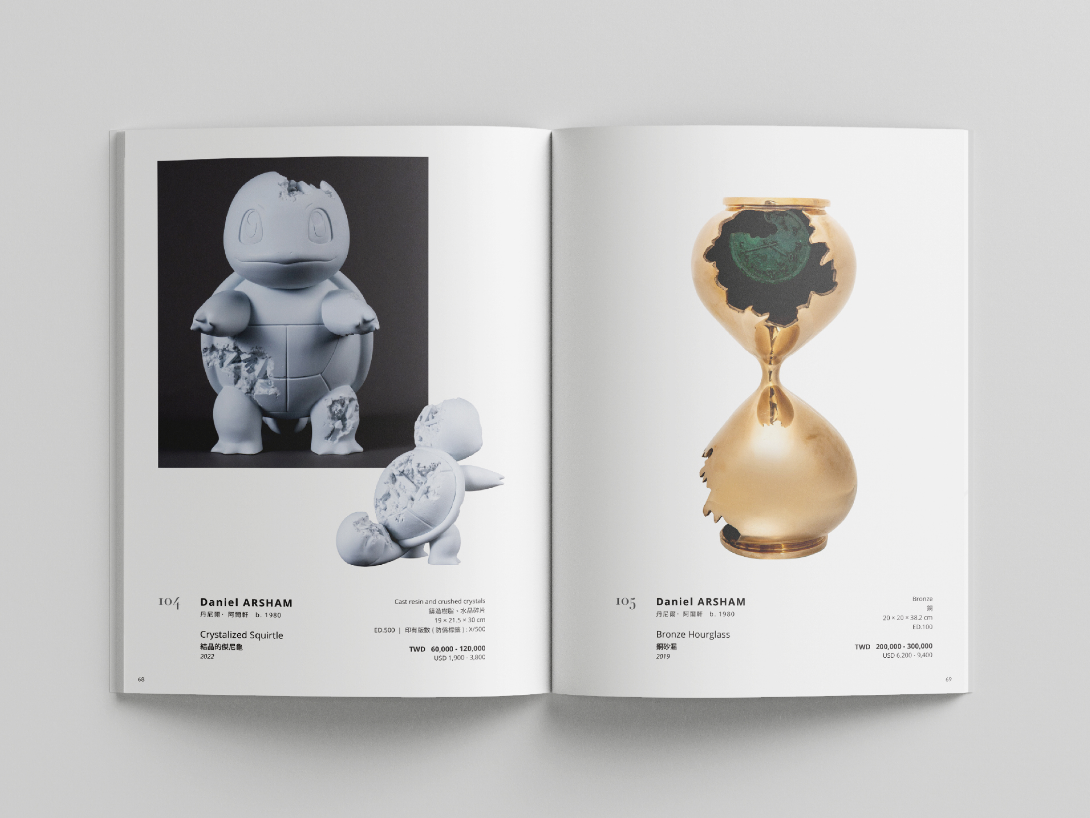
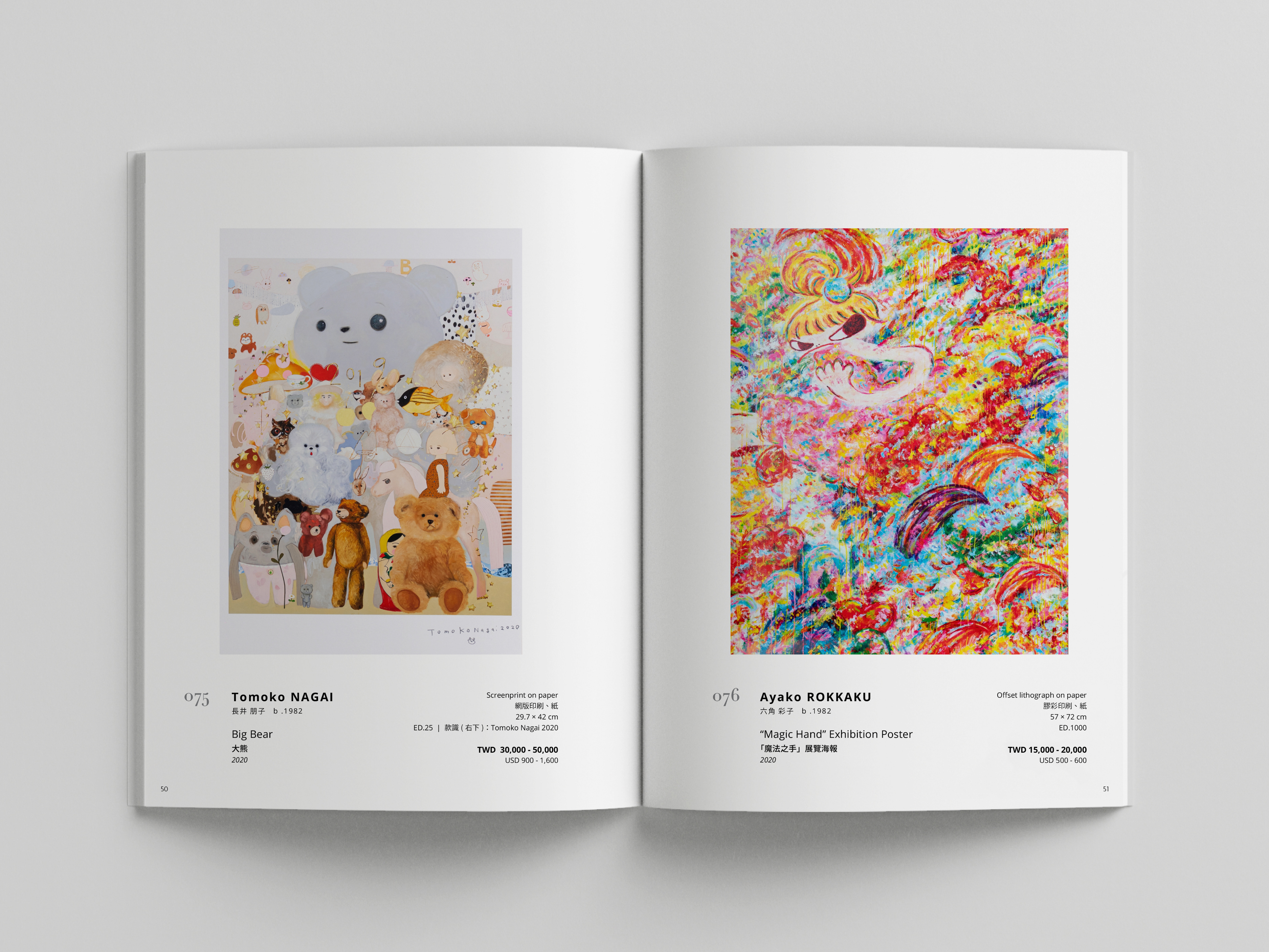


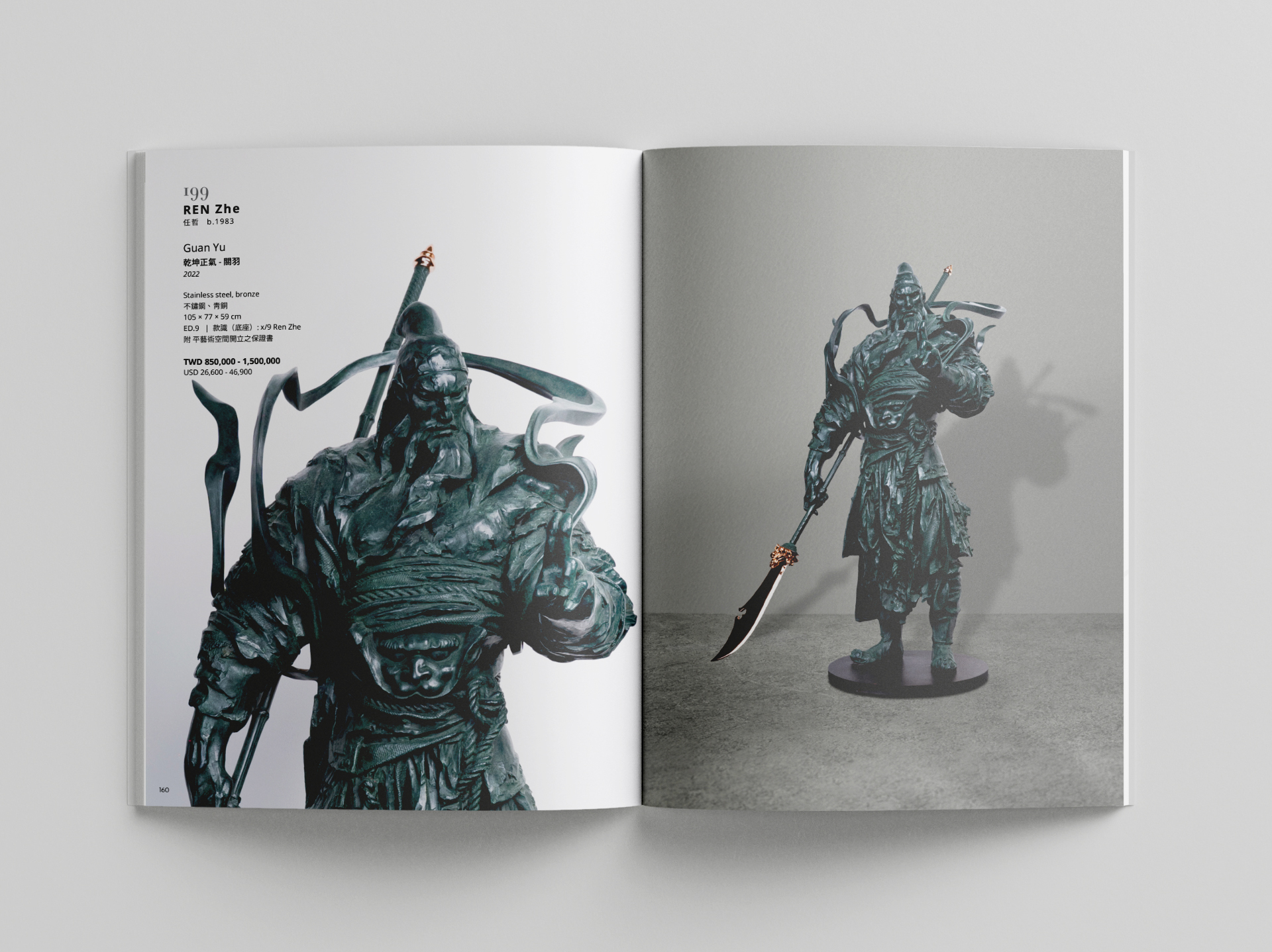
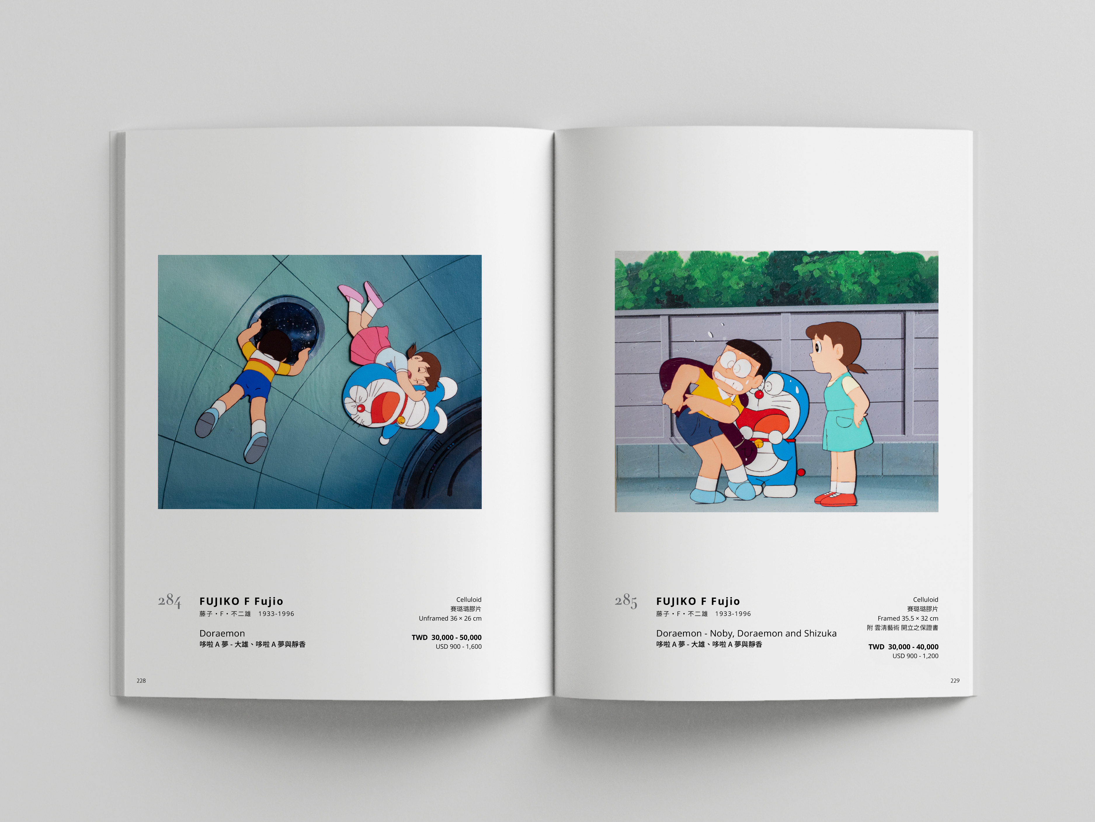

The layout prioritizes legibility and accessibility, presenting detailed auction information in a structured and elegant manner, making it easy for buyers of all ages to engage with the content. A balance of white space, carefully selected typography, and a clean yet multi-functional grid system allows for a seamless reading experience while complementing the contemporary nature of the artworks.
圖錄的版面設計強調清晰易讀與資訊可及性,透過精確的排版與細緻的資訊編排,使不同年齡層的買家都能輕鬆閱讀並掌握拍賣細節。我們運用留白、精挑細選的字體與簡潔多功能的網格系統,確保資訊呈現既專業又易於閱讀,同時也與當代藝術的美學語言相呼應。
-
View the full catalogue
線上圖錄
圖錄的版面設計強調清晰易讀與資訊可及性,透過精確的排版與細緻的資訊編排,使不同年齡層的買家都能輕鬆閱讀並掌握拍賣細節。我們運用留白、精挑細選的字體與簡潔多功能的網格系統,確保資訊呈現既專業又易於閱讀,同時也與當代藝術的美學語言相呼應。
-
View the full catalogue
線上圖錄
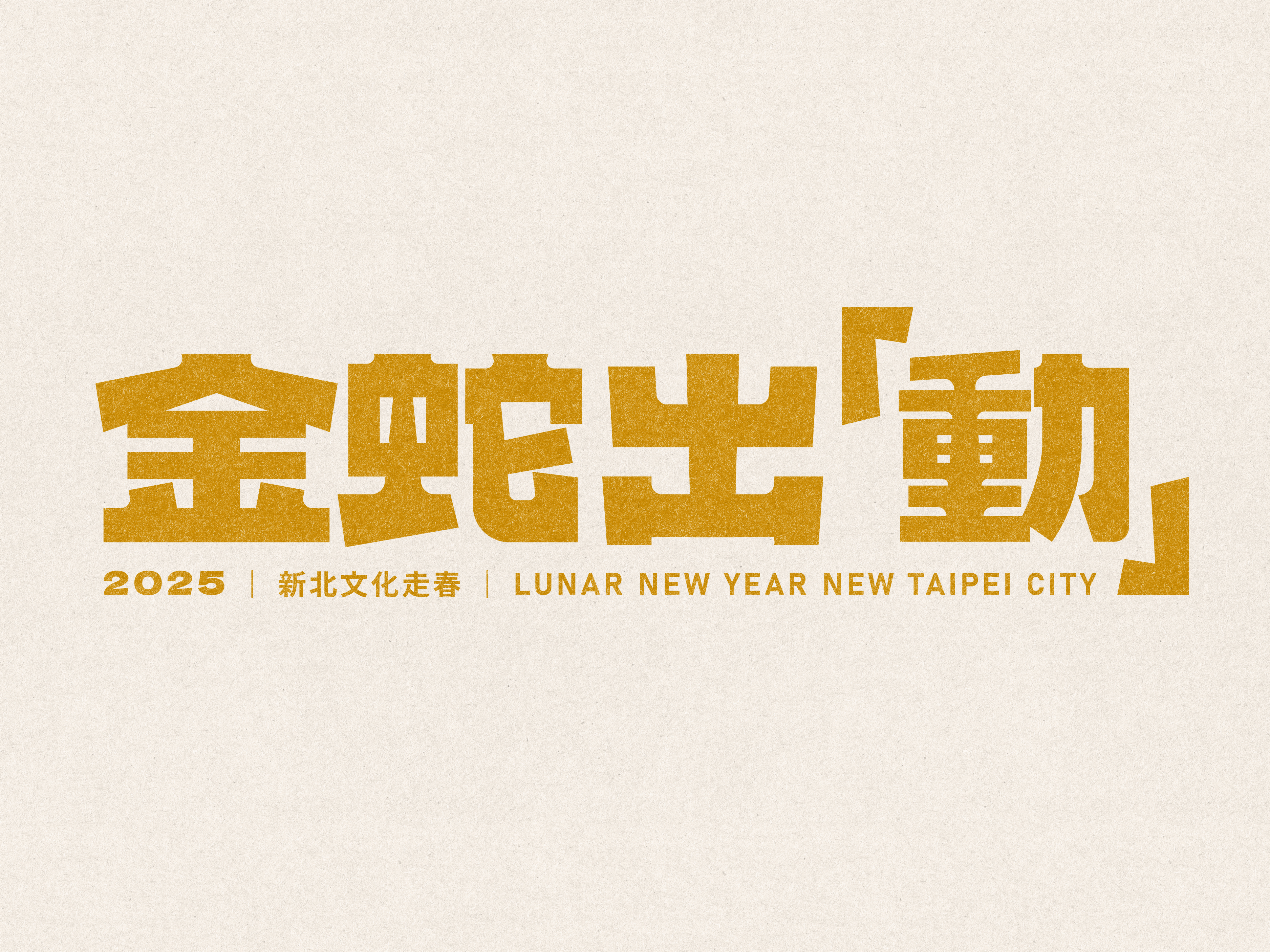
New Taipei City 2025 “Spring Culture Voyage” Key Visual Design
新北市「金蛇出『動』文化走春」主視覺設計
2025
𒊹︎︎︎ Key Visual Design
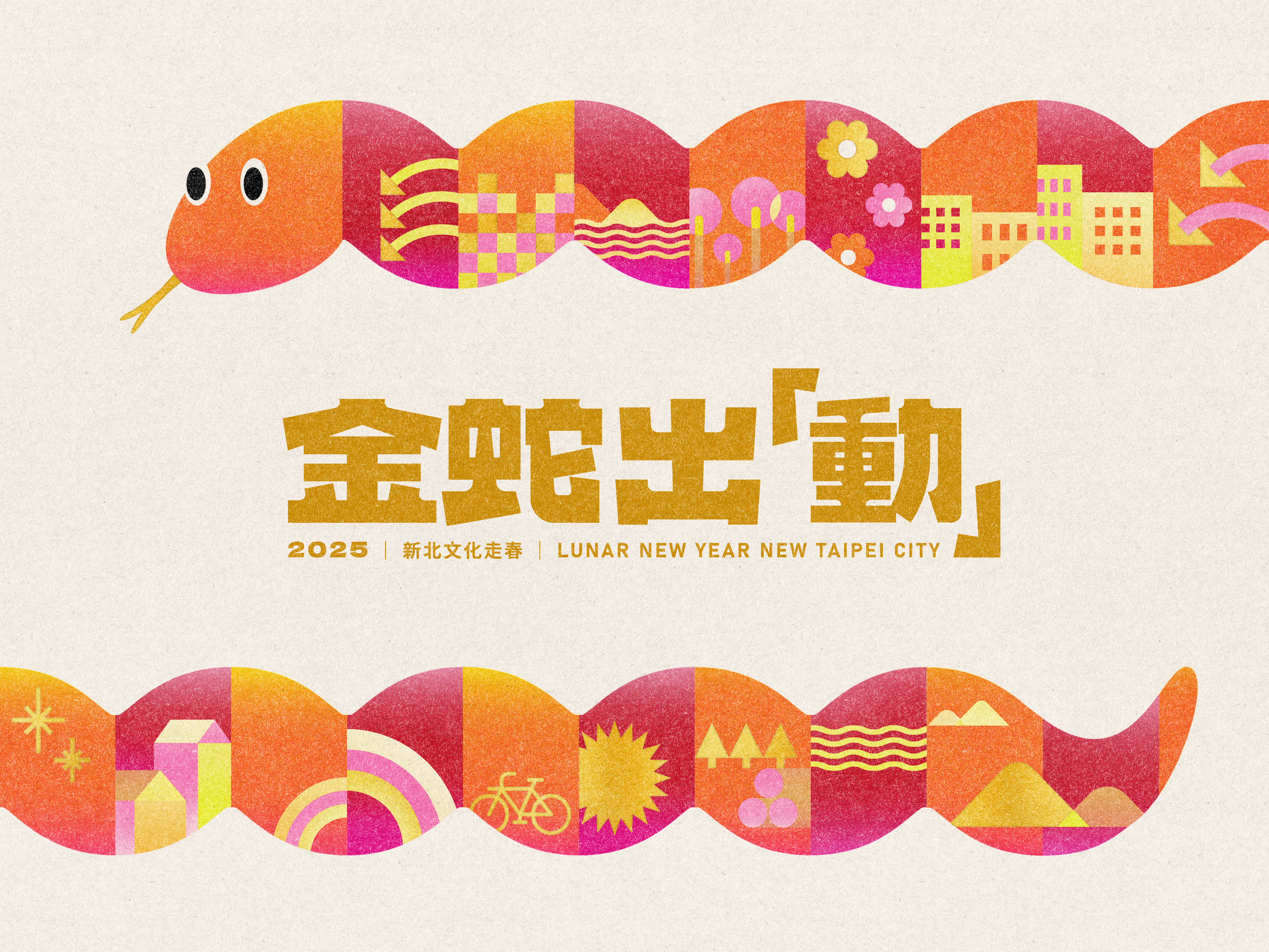
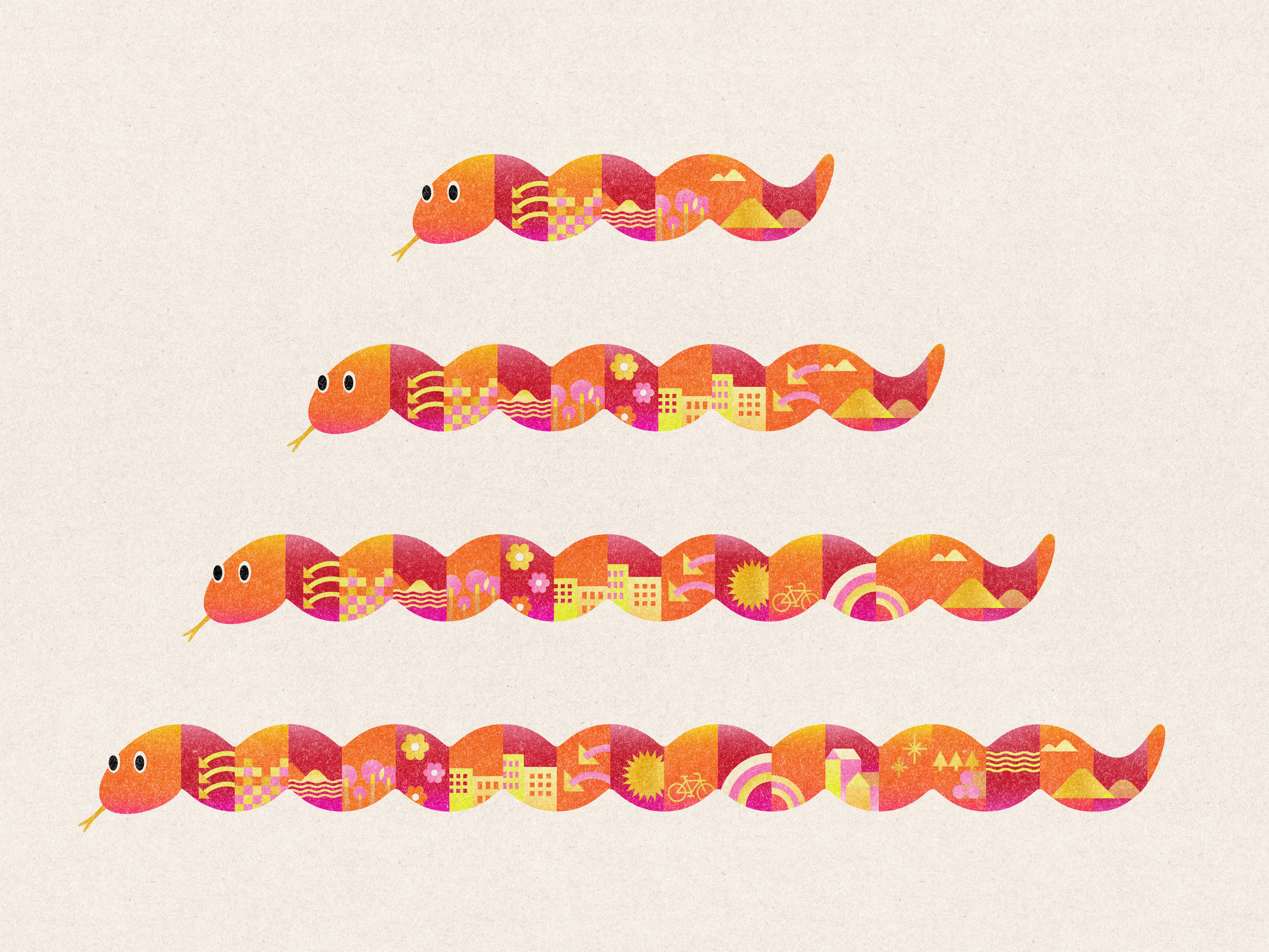
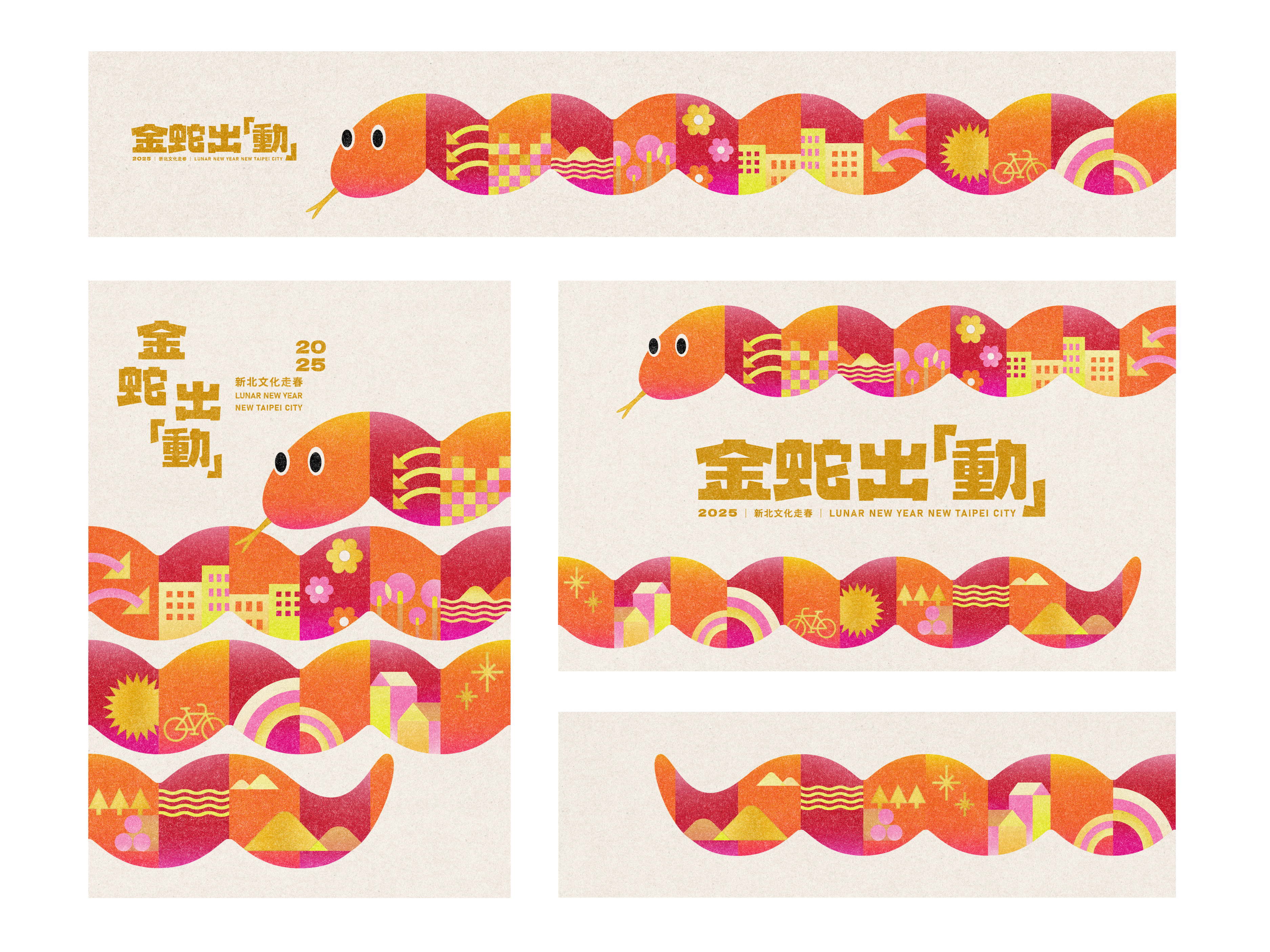
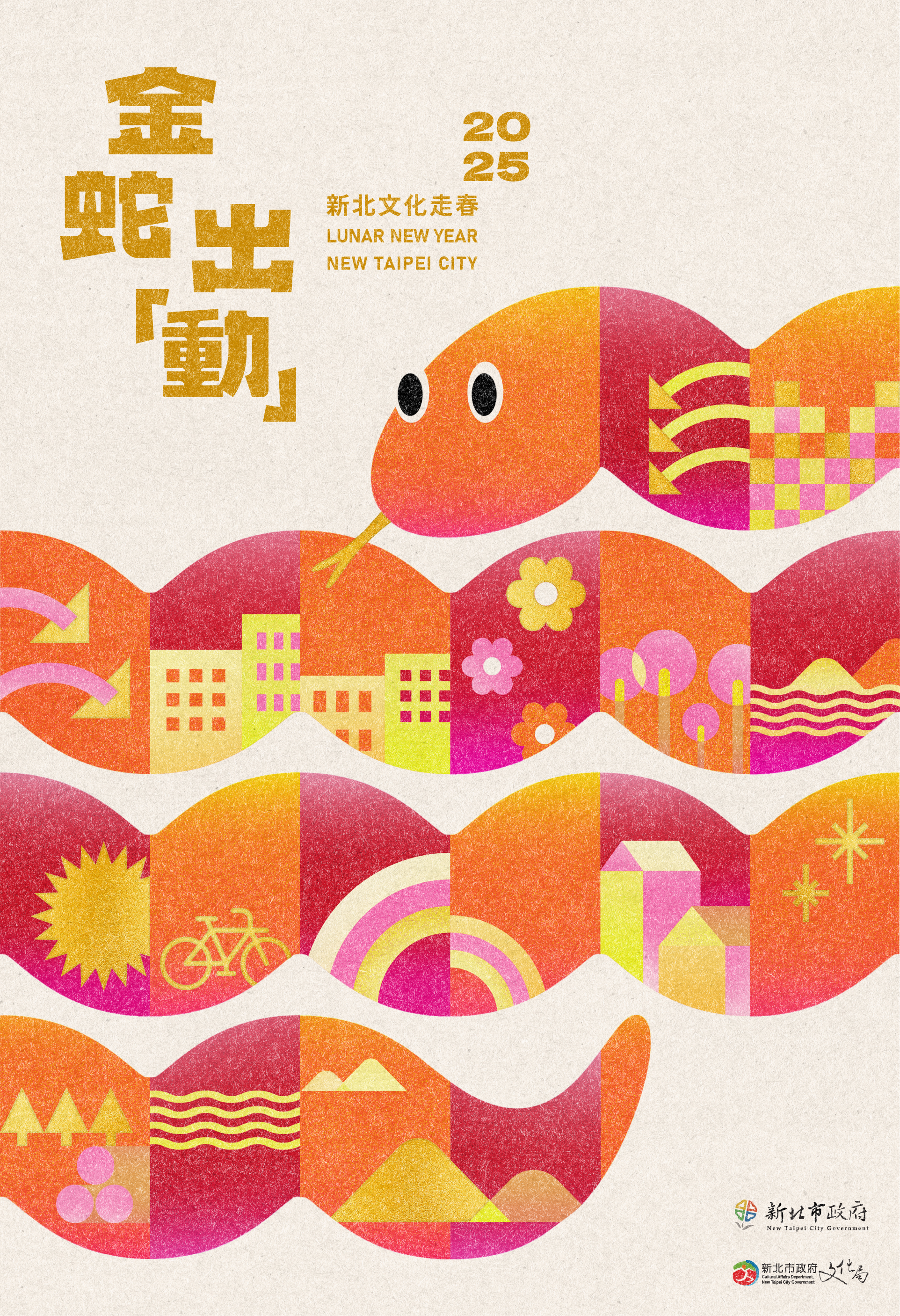
The New Taipei City 2025 “Spring Culture Voyage” Key Visual Design embraces the spirit of the Year of the Snake with a bold yet festive approach. The key visual features a uniquely crafted snake, composed of design elements that represent the essence of New Taipei City. By utilizing the elongated form of the snake, we evoke the dynamic cityscape, weaving through landmarks, museums, and gardens—symbolizing the cultural journey encouraged by the campaign.
新北市 2025「文化走春」主視覺設計 以喜慶的方式呈現蛇年精神。主視覺以模組式設計打造一條象徵新北市城市精髓的蛇,其蜿蜒延展的形態呼應城市的動態天際線,巧妙地穿梭於城市與園林之間,象徵本次活動所鼓勵的文化探索旅程。
新北市 2025「文化走春」主視覺設計 以喜慶的方式呈現蛇年精神。主視覺以模組式設計打造一條象徵新北市城市精髓的蛇,其蜿蜒延展的形態呼應城市的動態天際線,巧妙地穿梭於城市與園林之間,象徵本次活動所鼓勵的文化探索旅程。
This visual campaign celebrates the Lunar New Year, inviting citizens to explore and experience the rich heritage of New Taipei City. Traditionally, snakes may not be perceived as friendly creatures, but our design challenge was to transform this imagery into something warm, welcoming, and full of festive cheer. Through a combination of flowing forms and vibrant colors, the snake is reimagined as an elegant and approachable symbol of the New Year.
活動以農曆新年為核心,邀請市民深入體驗新北市豐富的文化底蘊。蛇通常給人冷峻或不親切的印象,而我們的設計挑戰在於如何將這個形象轉化為溫暖、友善,且充滿節慶氛圍的象徵。我們透過流暢造型、鮮明色彩與可愛的卡通形象,使這條「金蛇」能說出新北故事,也帶來可親與喜慶的節日氛圍。
活動以農曆新年為核心,邀請市民深入體驗新北市豐富的文化底蘊。蛇通常給人冷峻或不親切的印象,而我們的設計挑戰在於如何將這個形象轉化為溫暖、友善,且充滿節慶氛圍的象徵。我們透過流暢造型、鮮明色彩與可愛的卡通形象,使這條「金蛇」能說出新北故事,也帶來可親與喜慶的節日氛圍。
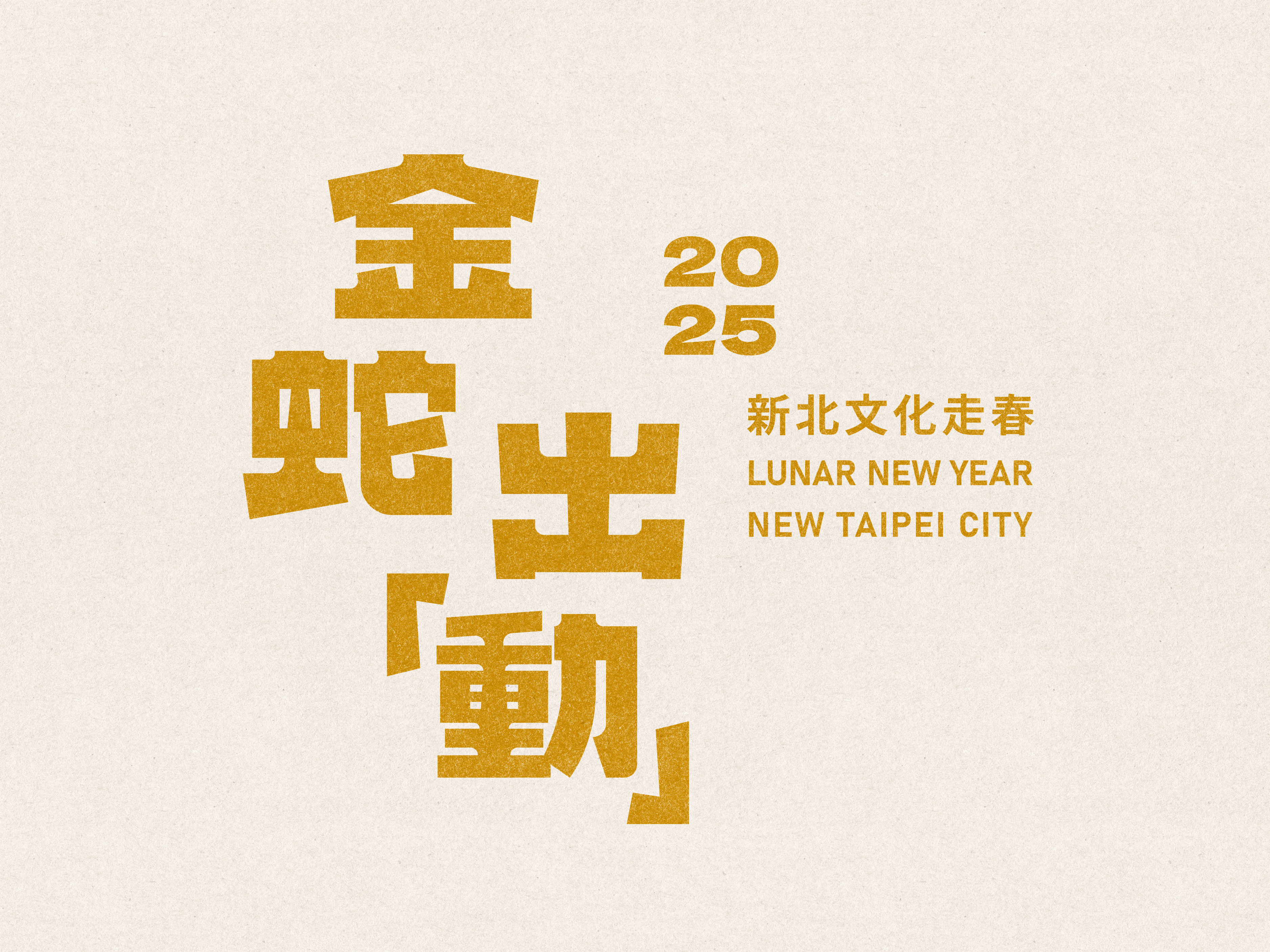
𒊹︎︎︎ Logotype Design

𒊹︎︎︎ Poster Design
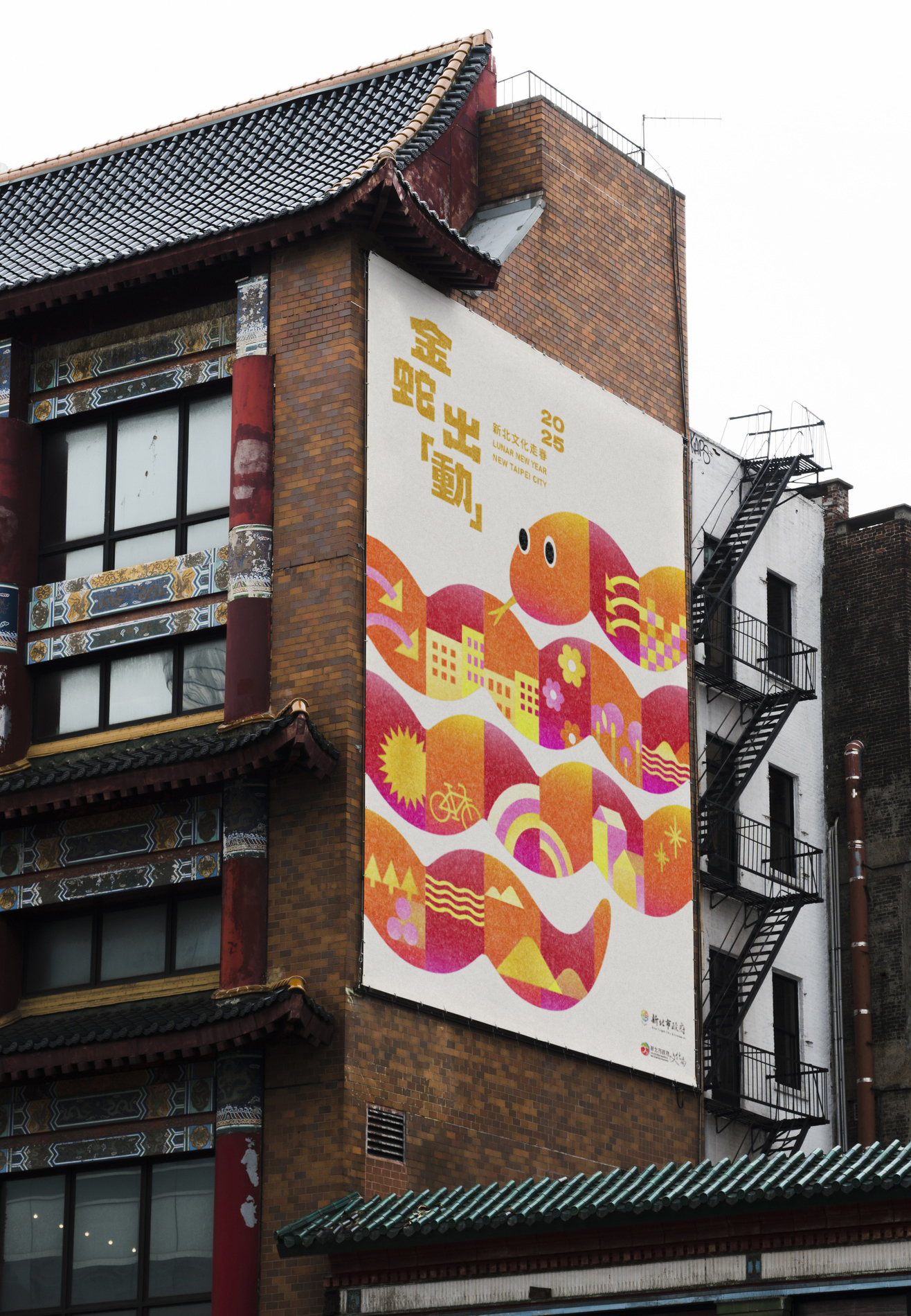
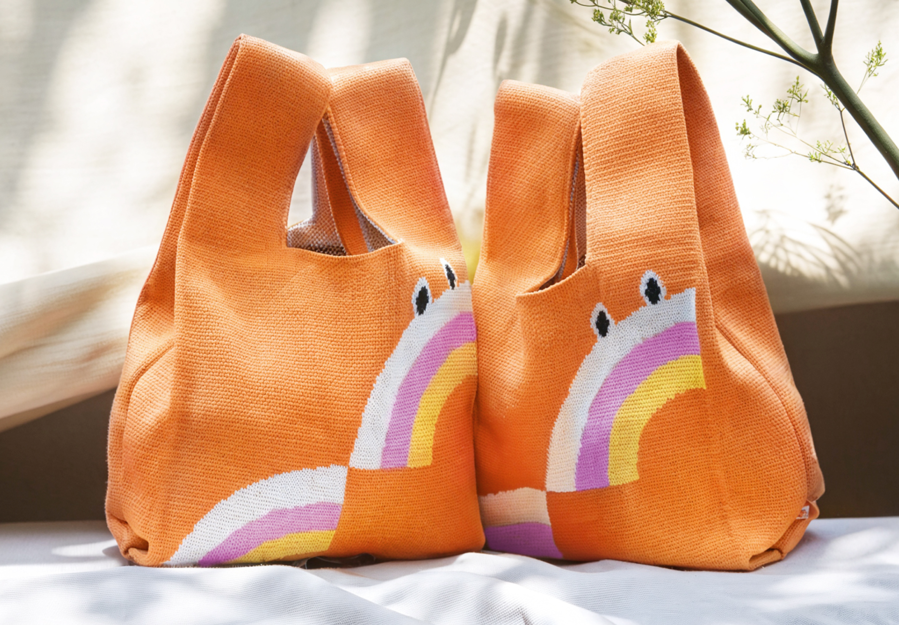
Beyond being a key visual wrapped around the city during the Lunar New Year, the design extends to a range of souvenirs, transforming everyday objects into collectible mementos of the festival. Among the many souvenirs, the most popular design is the shopping bag.
This bag features the Year of the Snake key visual, enhanced with rainbow elements to bring a sense of vibrancy and festive charm. The colorful rainbow symbolizes New Taipei City's cultural diversity and inclusivity, reflecting the city's rich artistic, humanistic, and social vitality. The snake is presented in a stacked, two-layered rainbow form, representing the auspicious meaning of "rising to the next level in the new year." This design not only adds depth and visual richness but also conveys a message of hope, growth, and celebration for the festive season.
這組主視覺以廣告形式在年節期間出現在城市的不同角落,更擴展至多樣化的紀念品設計,讓節慶氛圍更具體呈現於日常生活之中。 在眾多紀念品中,最受歡迎的是織布手提包包!
這款購物袋以主視覺為核心,融入彩虹元素,為整體設計增添活力與吉祥氛圍。 彩虹的繽紛色彩象徵著新北市的文化多樣性與融合性,展現這座城市豐富的藝術、人文與社會活力。蛇的形態以兩層彩虹堆疊的方式呈現,象徵著「新年步步高升」的美好寓意,不僅帶來視覺上的豐富層次感,也傳遞出充滿希望與成長的節慶祝福。
Dynamic City Parkour 城市跑酷
2024

𒊹︎︎︎ Logo type Design
𒊹︎︎︎ Promotional Material Design
In collaboration with the New Taipei City Culture Foundation, We had the opportunity to work on the logo type design for "城市跑酷 Dynamic City Parkour." Rooted in the Foundation's vision of promoting cultural equality, this project aims to break down barriers between urban and rural areas by offering elementary school students across New Taipei City the chance to engage in a city parkour-themed painting activity.
The logo type design captures the essence of this dynamic concept, with bold and lively typography that reflects the adventurous spirit of parkour. Drawing inspiration from the vibrant illustrations by local illustrator, Train 火車, the design incorporates jumps and parkour movements through characters, creating a sense of excitement and movement.
在與新北市文化基金會的合作中,我們有機會為「城市跑酷 Dynamic City Parkour」設計標誌字型。在基金會與主創作、動畫製作者黑碼藝識共同合作的專案中,根植於促進文化平權的願景, 他們期待透過繪畫打破城鄉圍籬,藉由動畫線稿接力創作,共同完成圓頂動畫作品。
標誌字型設計捕捉了這個動態概念的本質,採用了大膽而生動的字體,反映了跑酷的冒險精神。配合插畫家火車 (Train) 的生動筆觸,通過字型的跳躍和動態,營造歡樂動感的氛圍。


Through this project, children are invited to unleash their imagination and explore the colorful cityscape of New Taipei City, transcending boundaries and embarking on an exhilarating urban adventure.
通過這個項目,孩子們被邀請釋放想像力,探索新北市豐富多彩的城市景觀,超越界限,展開一場都市冒險。
計畫總籌 | New Taipei City Culture Foundation 財團法人新北市文化基金會
主創作 動畫製作 | Hey mechanic! 黑碼藝識
插畫設計 | 火車 Train
計畫網站設計|多盒心科技
標準字設計 | 厸彡 Linshan
通過這個項目,孩子們被邀請釋放想像力,探索新北市豐富多彩的城市景觀,超越界限,展開一場都市冒險。
計畫總籌 | New Taipei City Culture Foundation 財團法人新北市文化基金會
主創作 動畫製作 | Hey mechanic! 黑碼藝識
插畫設計 | 火車 Train
計畫網站設計|多盒心科技
標準字設計 | 厸彡 Linshan
