FORMOSA GREEN
2021

𒊹︎︎︎ Branding
𒊹︎︎︎ Packaging
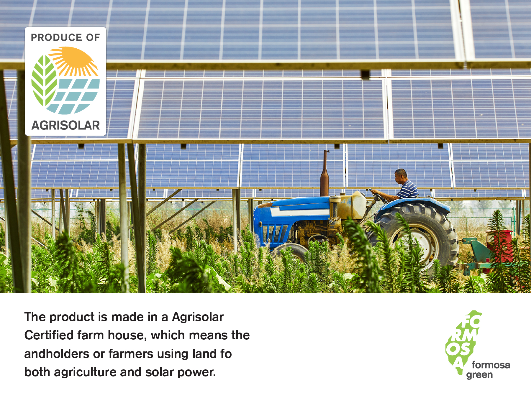
"FORMOSA GREEN" is a Taiwanese company committed to producing agricultural products in a sustainable and environmentally friendly manner. As one of Taiwan's leading green energy providers, FORMOSA promotes "Agri-solar" in Taiwan, aiming to reduce carbon footprint and promote renewable energy.
For the design, we chose to incorporate the shape of Taiwan's map and the characters "臺灣" (Taiwan) to represent the company's pride and vision. This simple yet powerful logo communicates the company's mission.
「FORMOSA GREEN」是一家致力於以可持續和環保方式生產農產品的台灣公司。作為台灣最具代表性的綠電業者,在台灣 FORMOSA 這片土地推廣「農電共生 Agri-solar」,致力減少碳足跡並推廣可再生能源是他們的使命。因此設計我們選擇大擔地用臺灣二字和地圖中臺灣的形狀,作為商標的主體。簡潔有力地溝通業者的驕傲和願景。

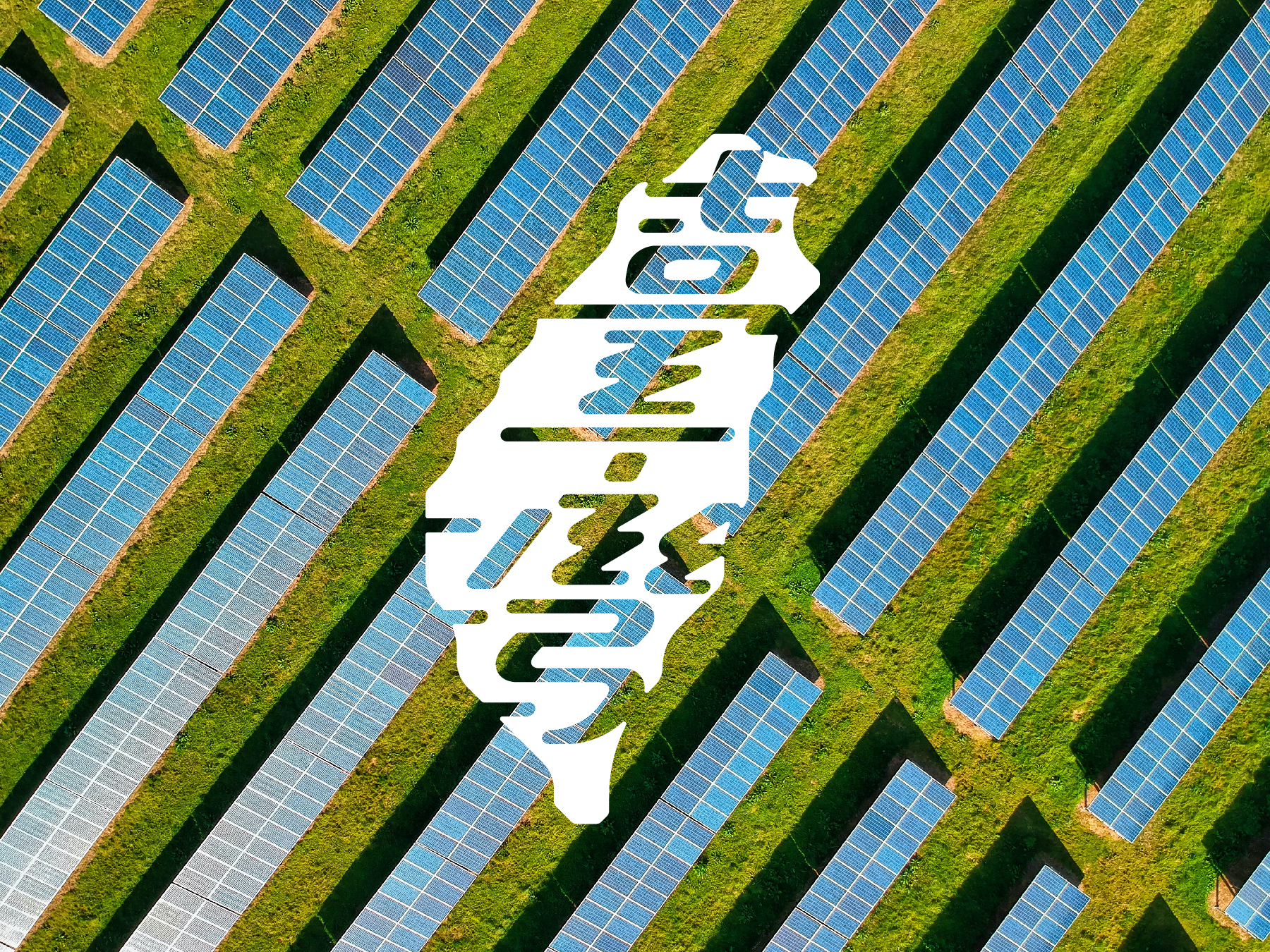

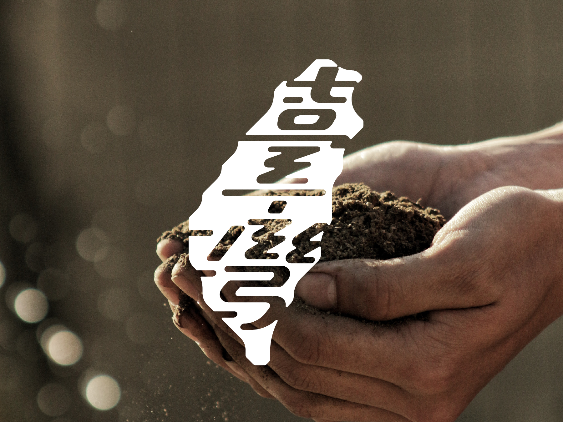
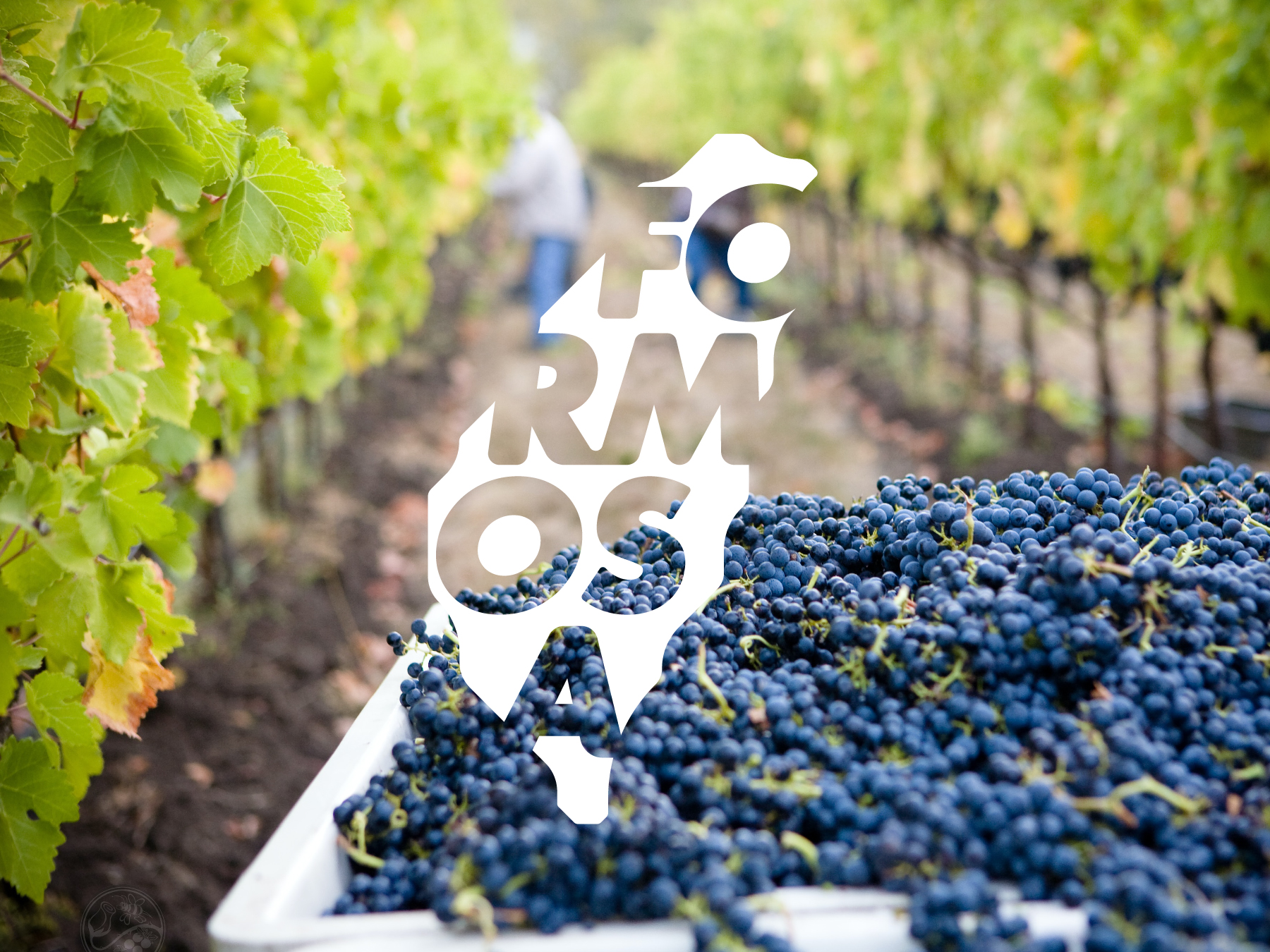

FORMOSA GREEN's solar farms allow them to produce the best products driven solely by renewable energy, ensuring the highest standards of quality while prioritizing environmental protection. They also prioritize the use of natural fertilizers and pesticides, avoiding harmful chemicals that could harm the environment and consumers.
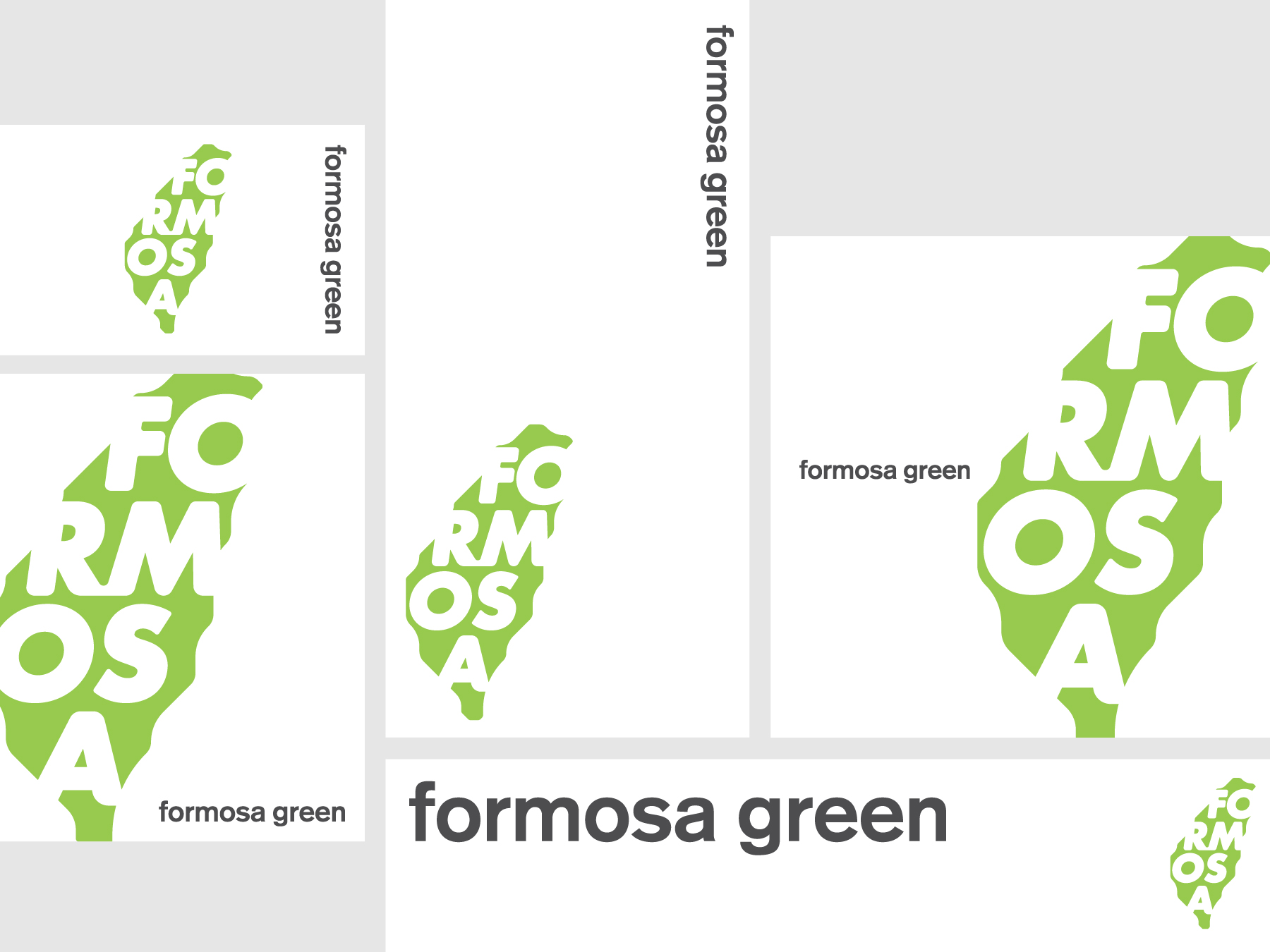
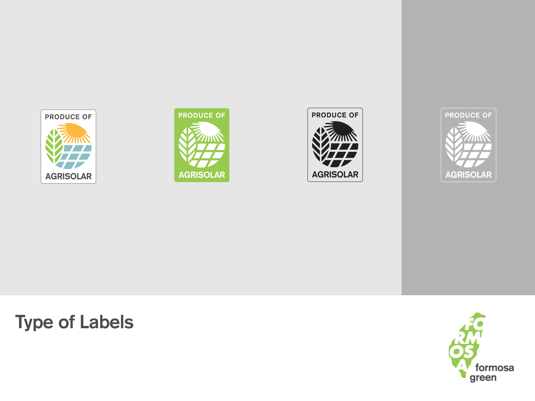
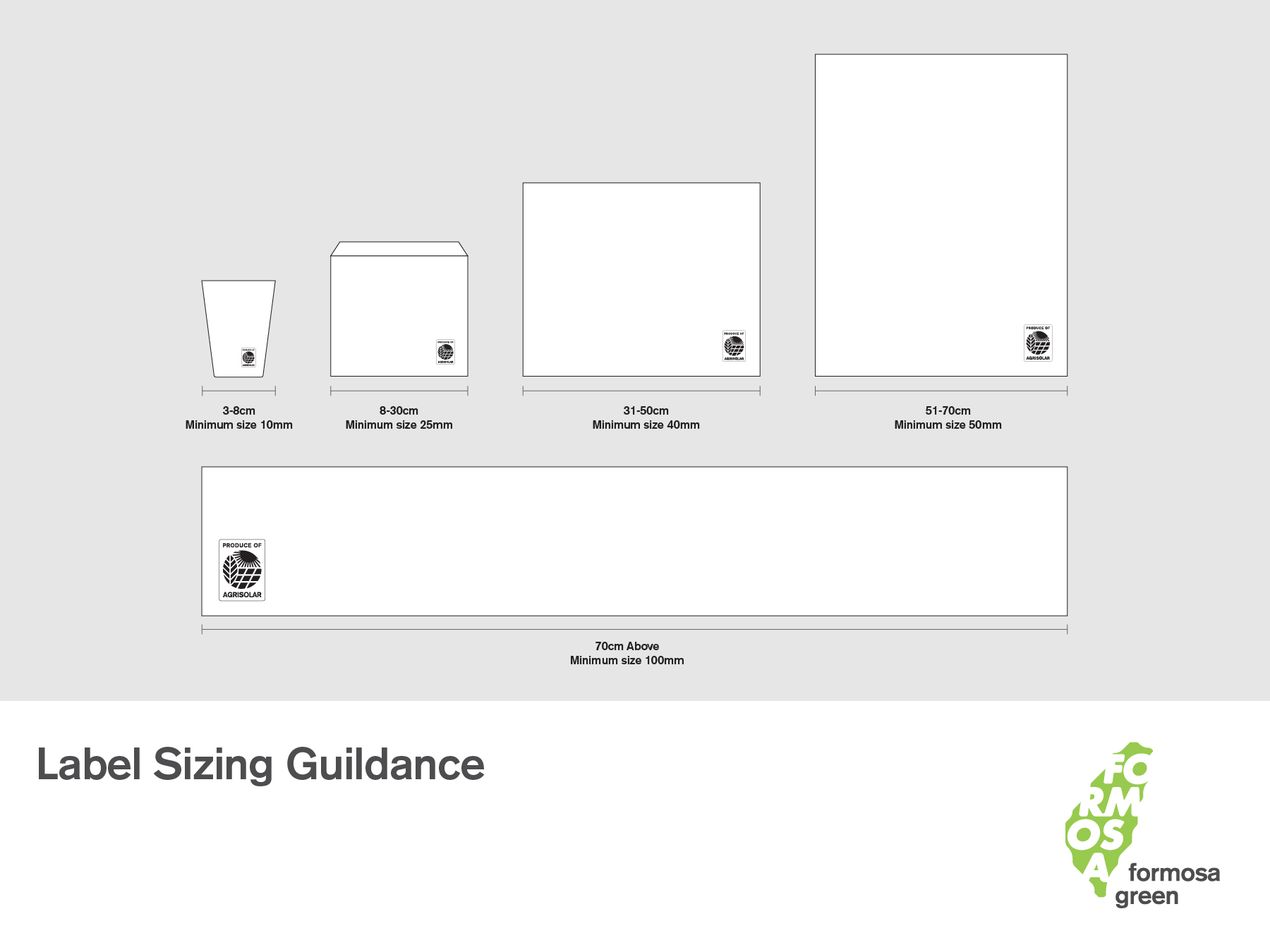
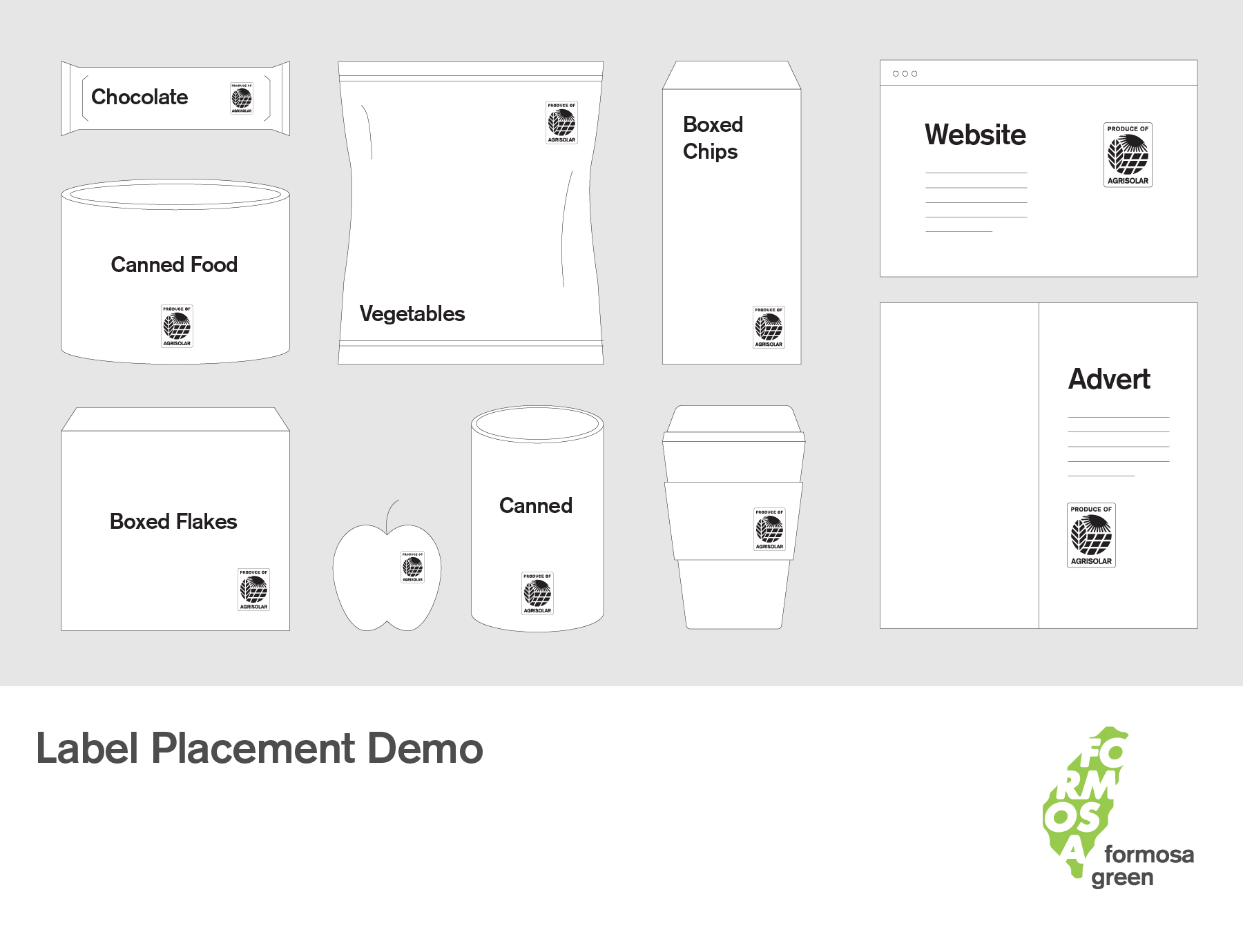
We also designed the "AgriSolar label," which sets the standard for production under the concept of "Agri-solar."
FORMOSA GREEN的太陽能農場使他們能夠生產僅由可再生能源驅動的最佳產品,確保他們的農產品在品質上達到最高標準,同時注重環境保護。此外,他們優先使用天然肥料和農藥,避免有害化學物質對環境和消費者造成傷害。
我們更為業者設計 「AgriSolar 標章」,為「農電共生」下生產的概念立下標準。

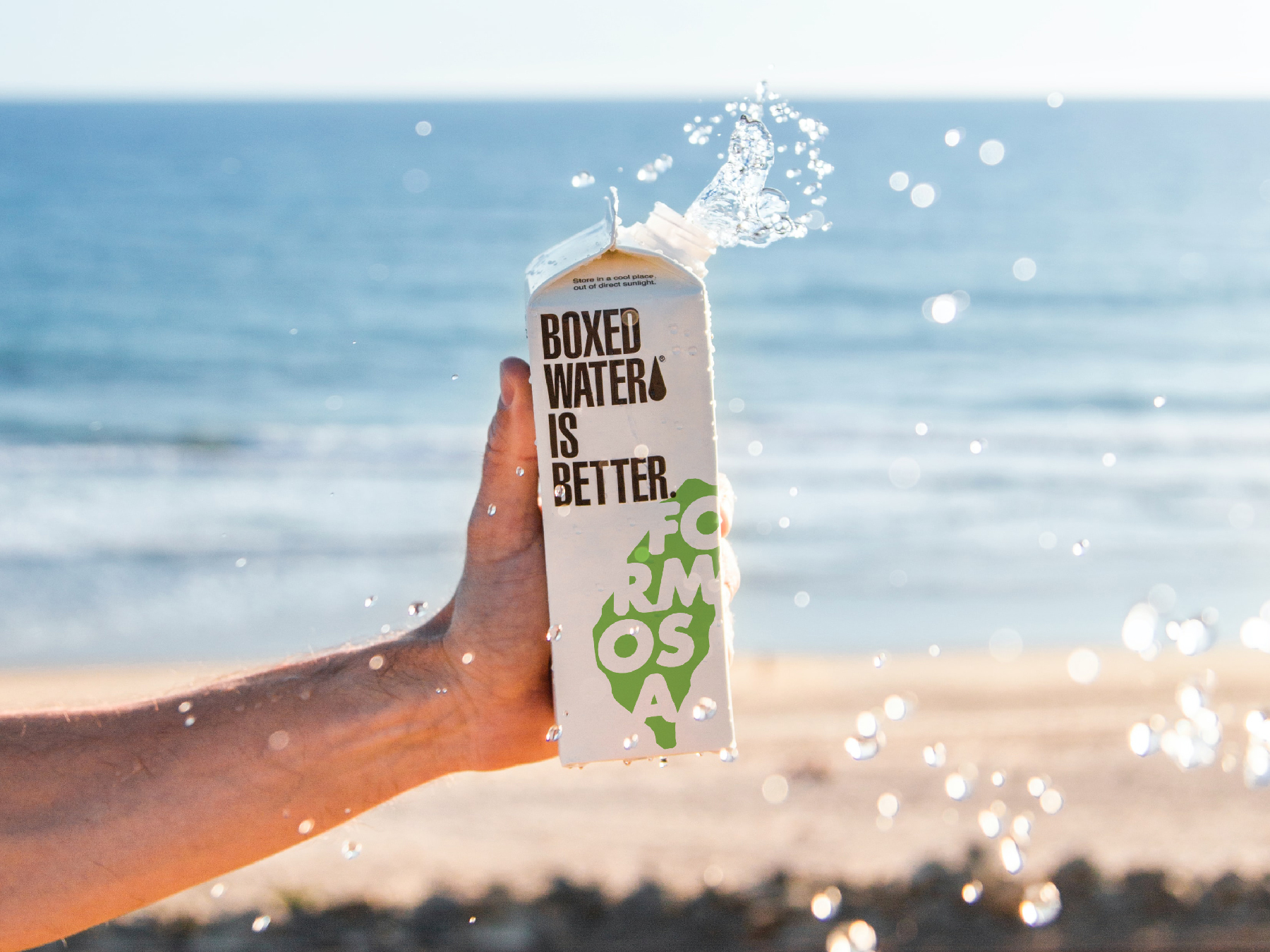
Conceptual design. Photo by Boxed Water Is Better on Unsplash


Linshan Farmers Select 林山農選
2021
𒊹︎︎︎ Brand building
𒊹︎︎︎ Integrated project
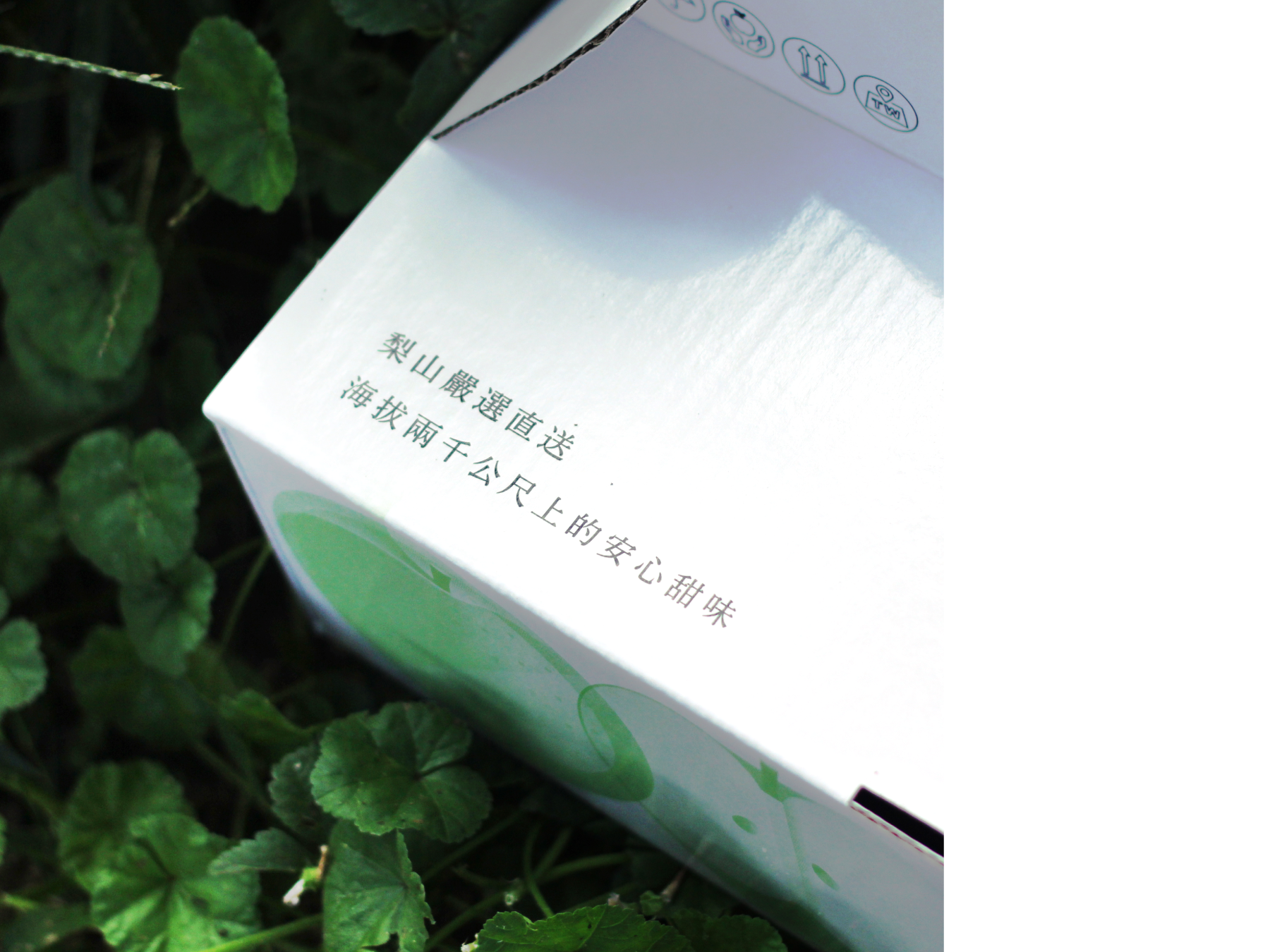
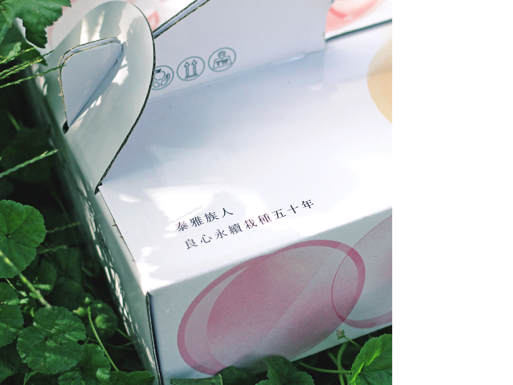
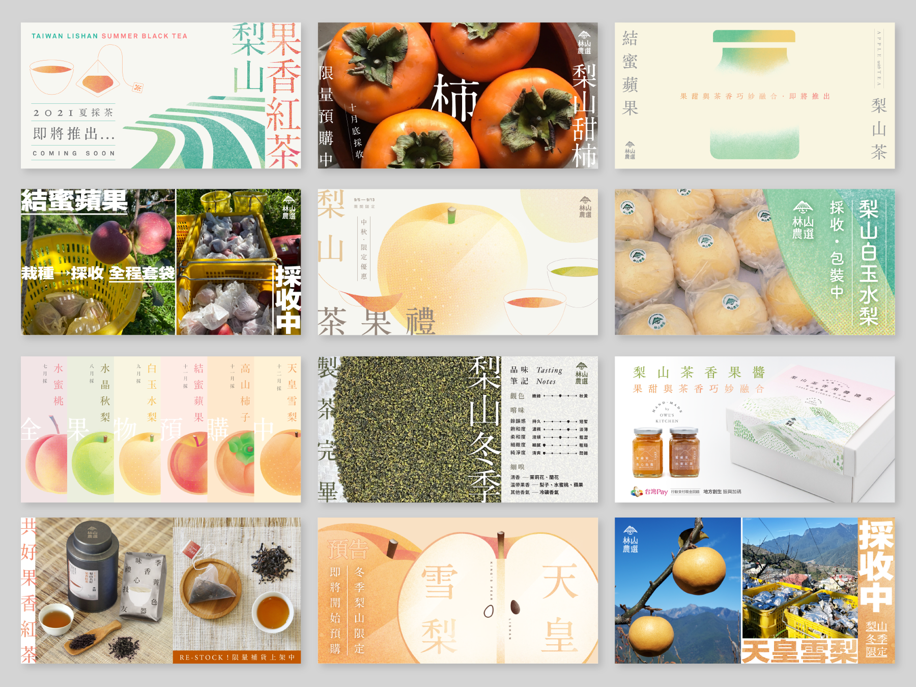
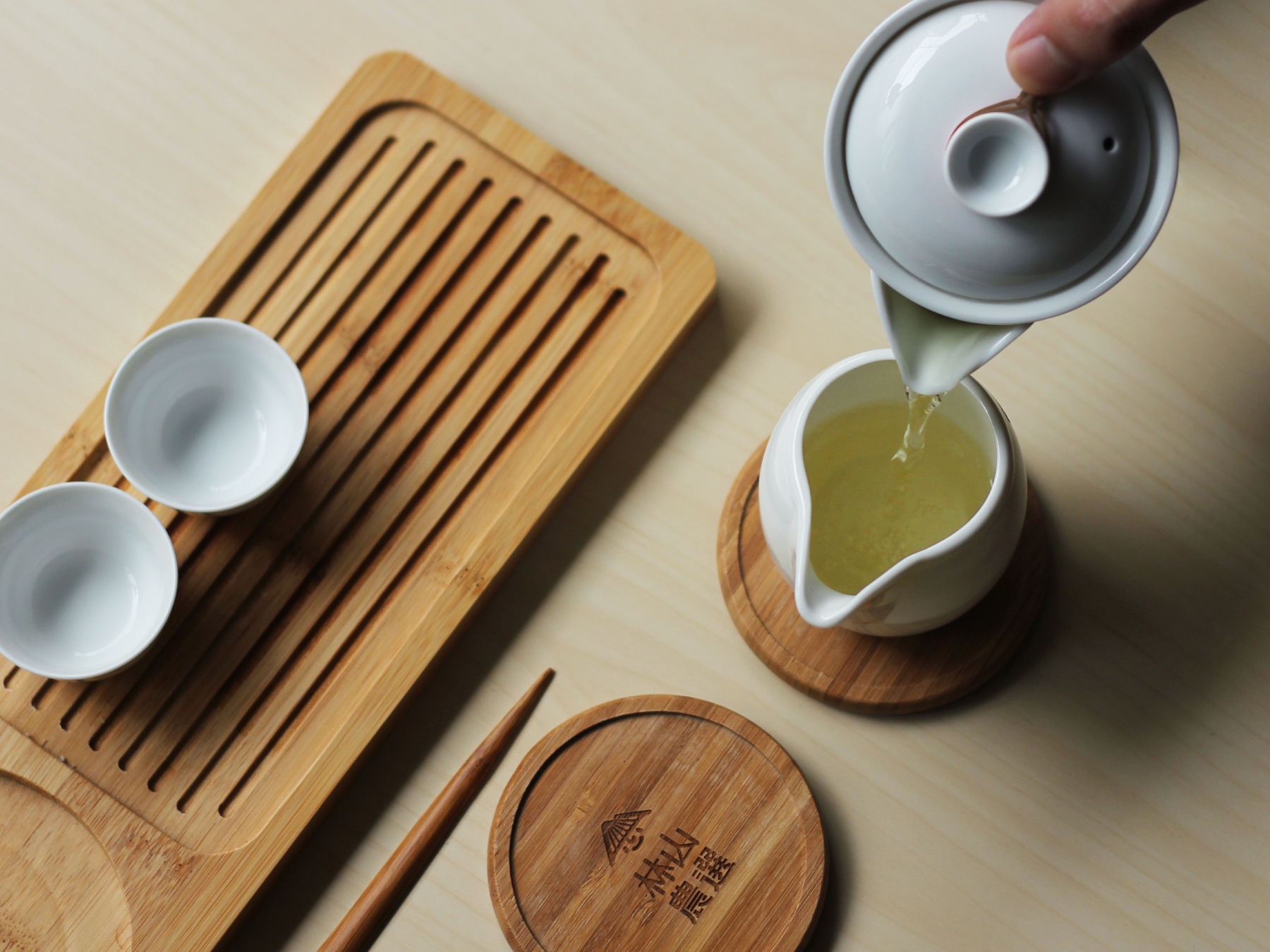
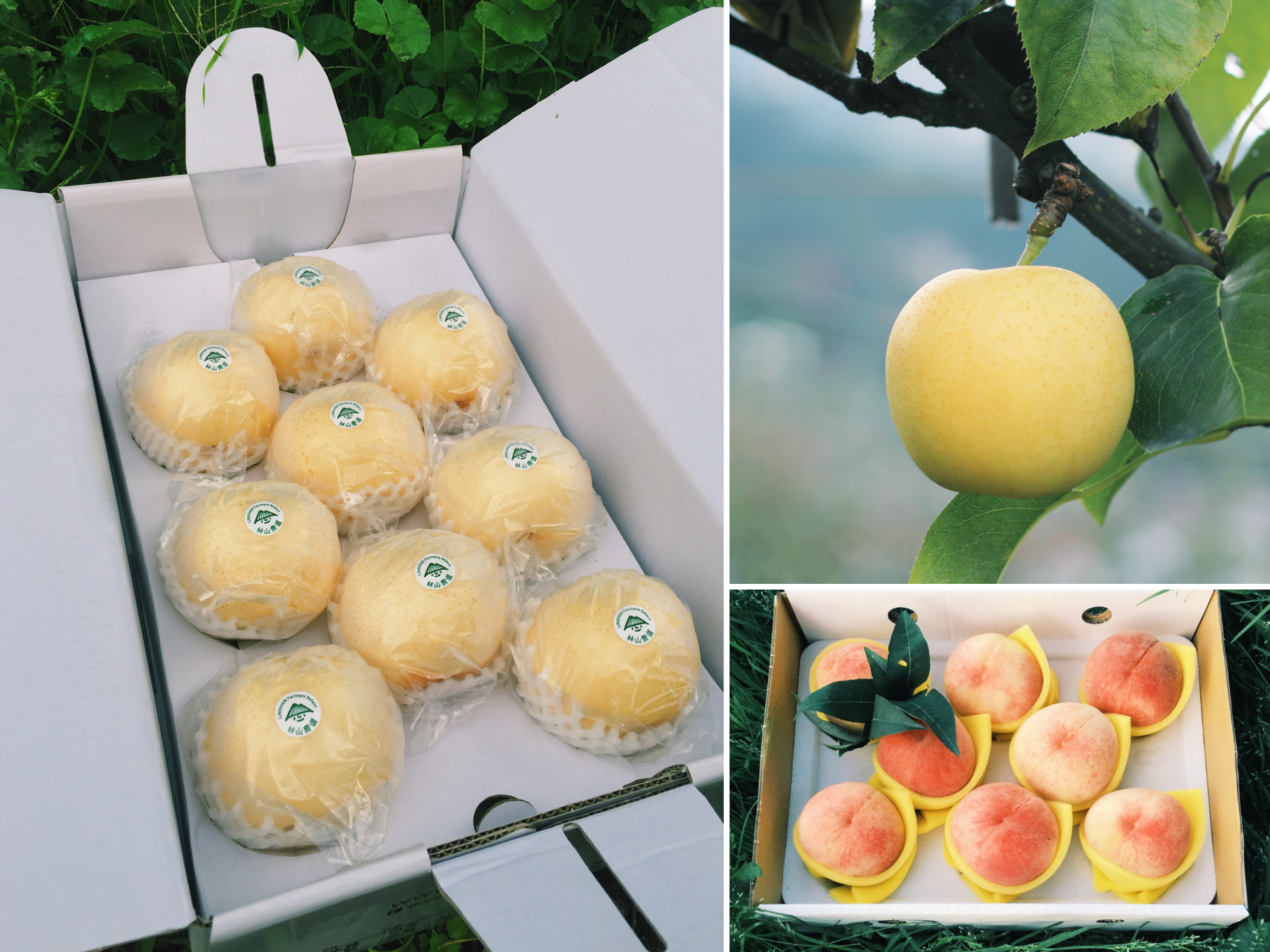
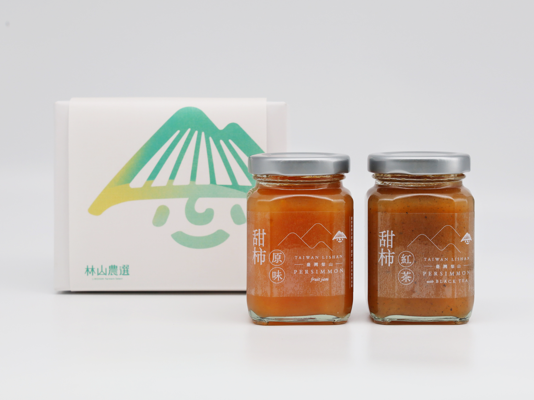
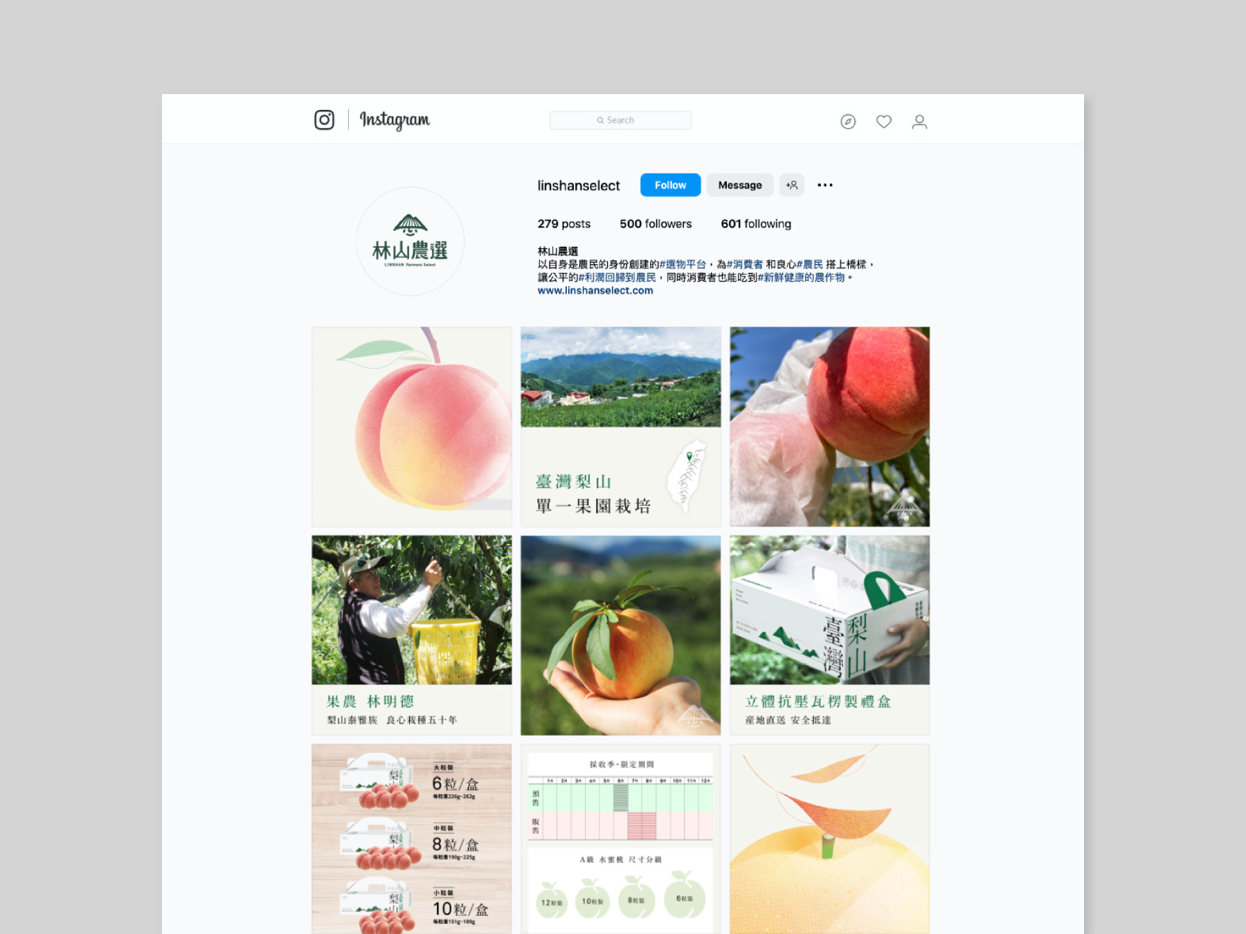
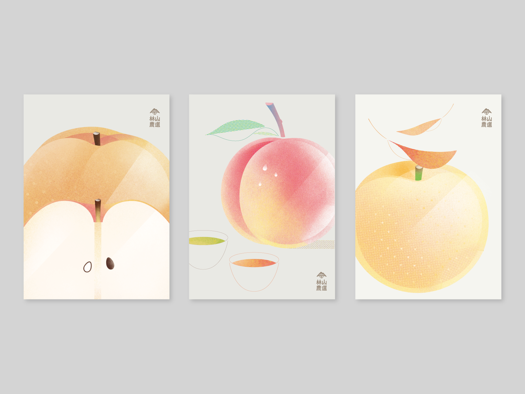
To share with you a project that is close to our company's heart - the creation of the entire visual identity, packaging, and marketing materials for Linshan Farmers Select. As a co-founder of this brand, We are proud to be part of a company that focuses on providing high mountain farm products in Taiwan, while caring for the farmers and creating a fair trade system for both the consumers and producers.
榮幸與大家分享一個與我們公司密切相關的項目 - 為林山農選打造整個視覺形象、包裝和市場推廣材料。作為該品牌的共同創辦人,我們以公司專注於提供台灣高山農產品、關心農民並為消費者和生產者創建公平貿易體系感到自豪。


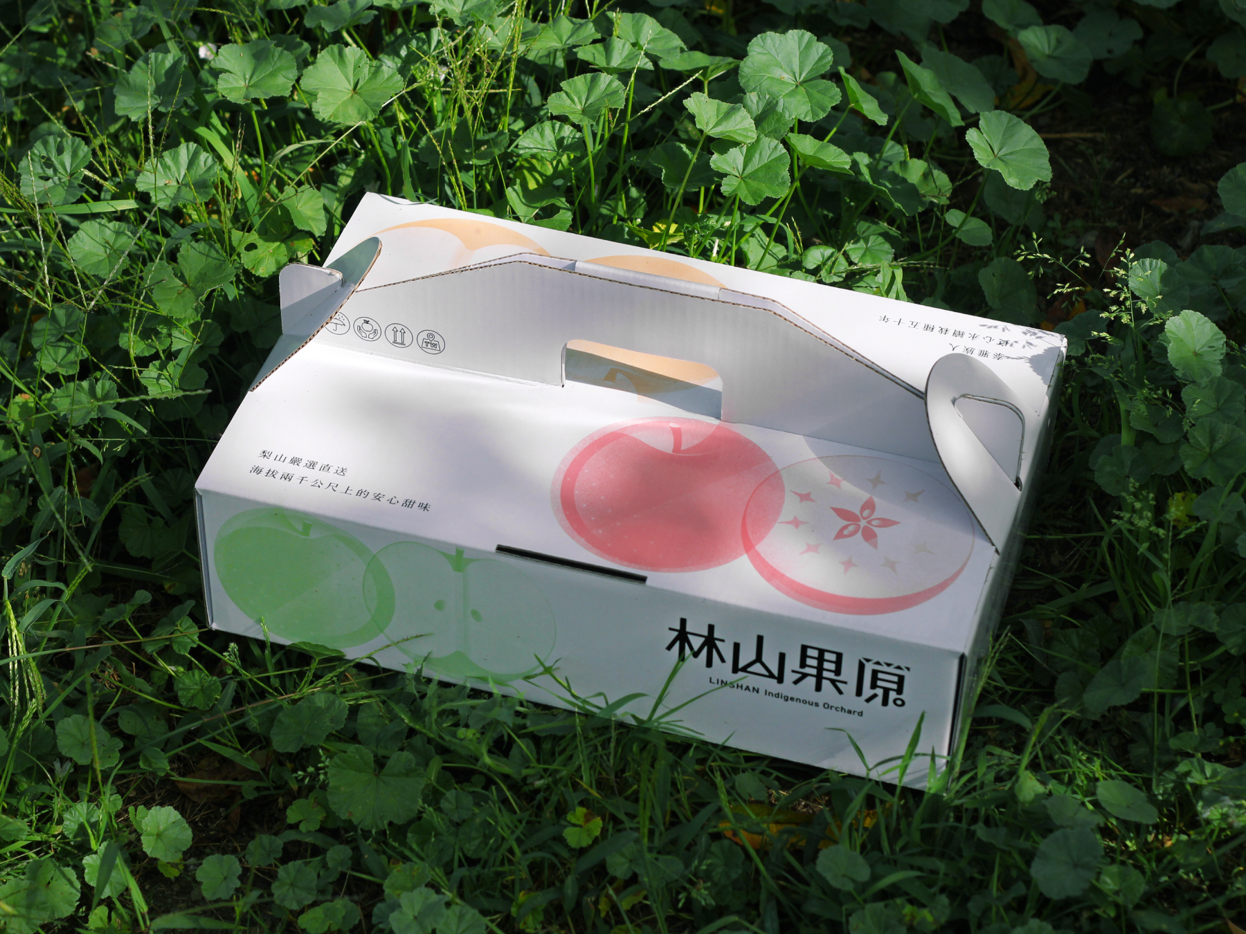
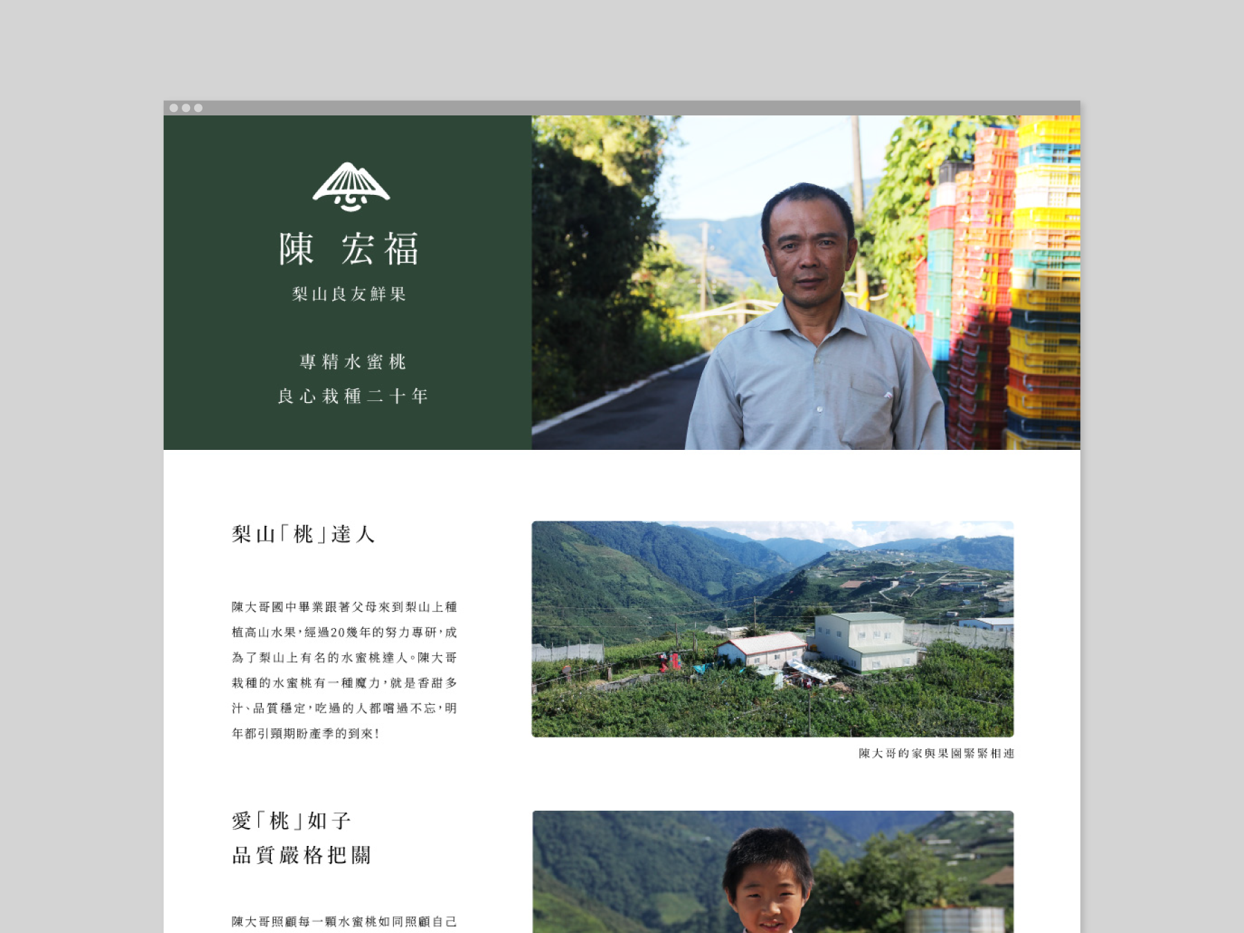
Our mission is to build bridges between the consumer and the producer, and this is reflected in the visual identity and packaging design that we created. By showcasing the beauty of the natural landscape where the products are grown, as well as the care and hard work that goes into producing them throughout the brand, we hope to inspire a greater appreciation for the farmers and their products. It has been a rewarding experience to be part of a brand that not only creates high-quality products but also promotes ethical and sustainable practices.
我們的使命是在消費者與生產者之間建立橋樑,這在我們所創造的視覺形象和包裝設計中得以體現。通過展示產品生產履歷資訊以及關注農友的生活和工作狀態,進一步提升消費者對農民和作物的實質價值。不僅能鼓勵農友創造高品質產品,而且向消費者推廣共好和可持續實踐的品牌理念。對我們來說是一個充滿經驗和回報的項目。
我們的使命是在消費者與生產者之間建立橋樑,這在我們所創造的視覺形象和包裝設計中得以體現。通過展示產品生產履歷資訊以及關注農友的生活和工作狀態,進一步提升消費者對農民和作物的實質價值。不僅能鼓勵農友創造高品質產品,而且向消費者推廣共好和可持續實踐的品牌理念。對我們來說是一個充滿經驗和回報的項目。


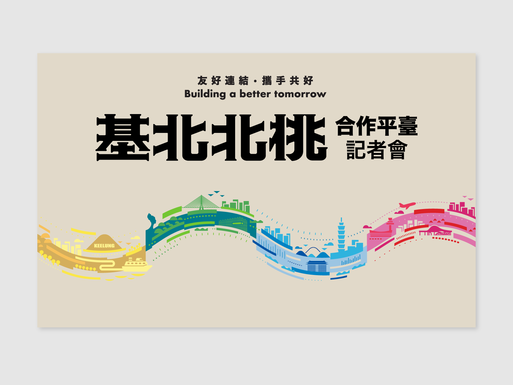
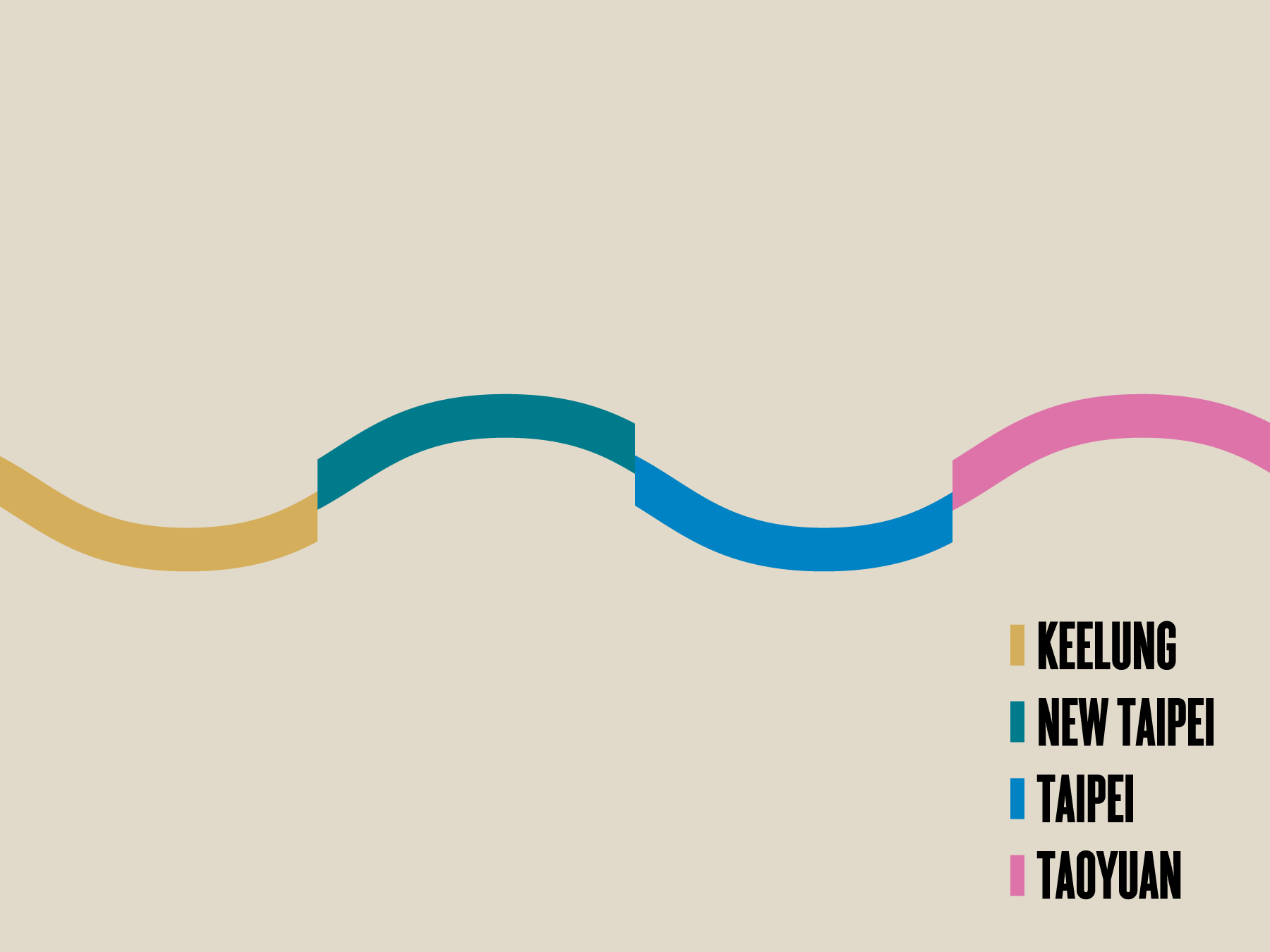
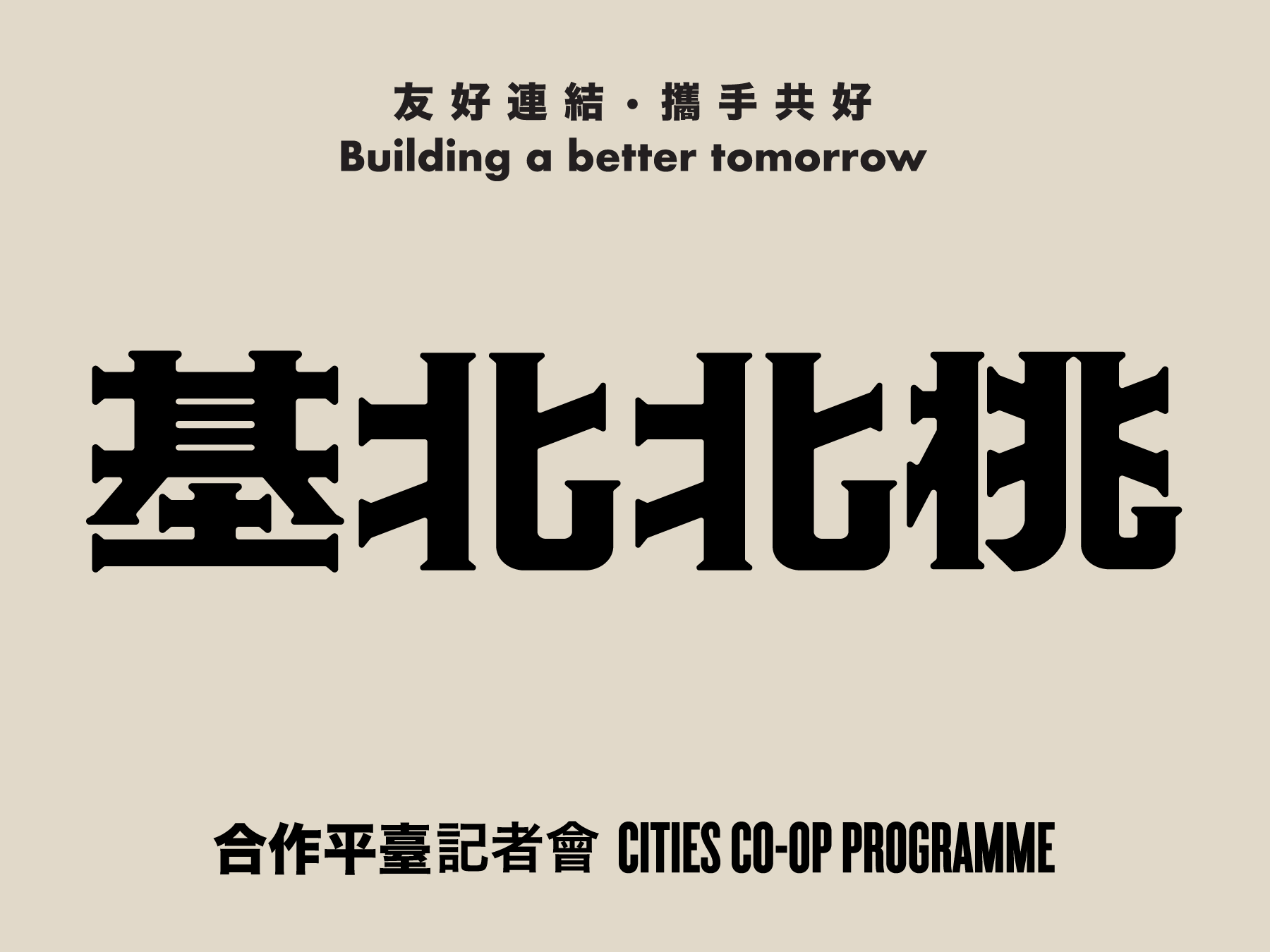
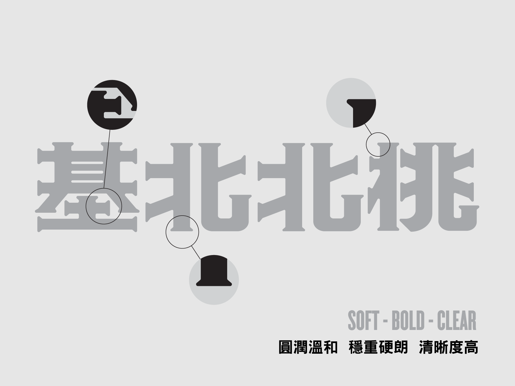
Cities Co-op Programme Press Conference 基北北桃城市合作平臺
2023

𒊹︎︎︎ Key Visual Design
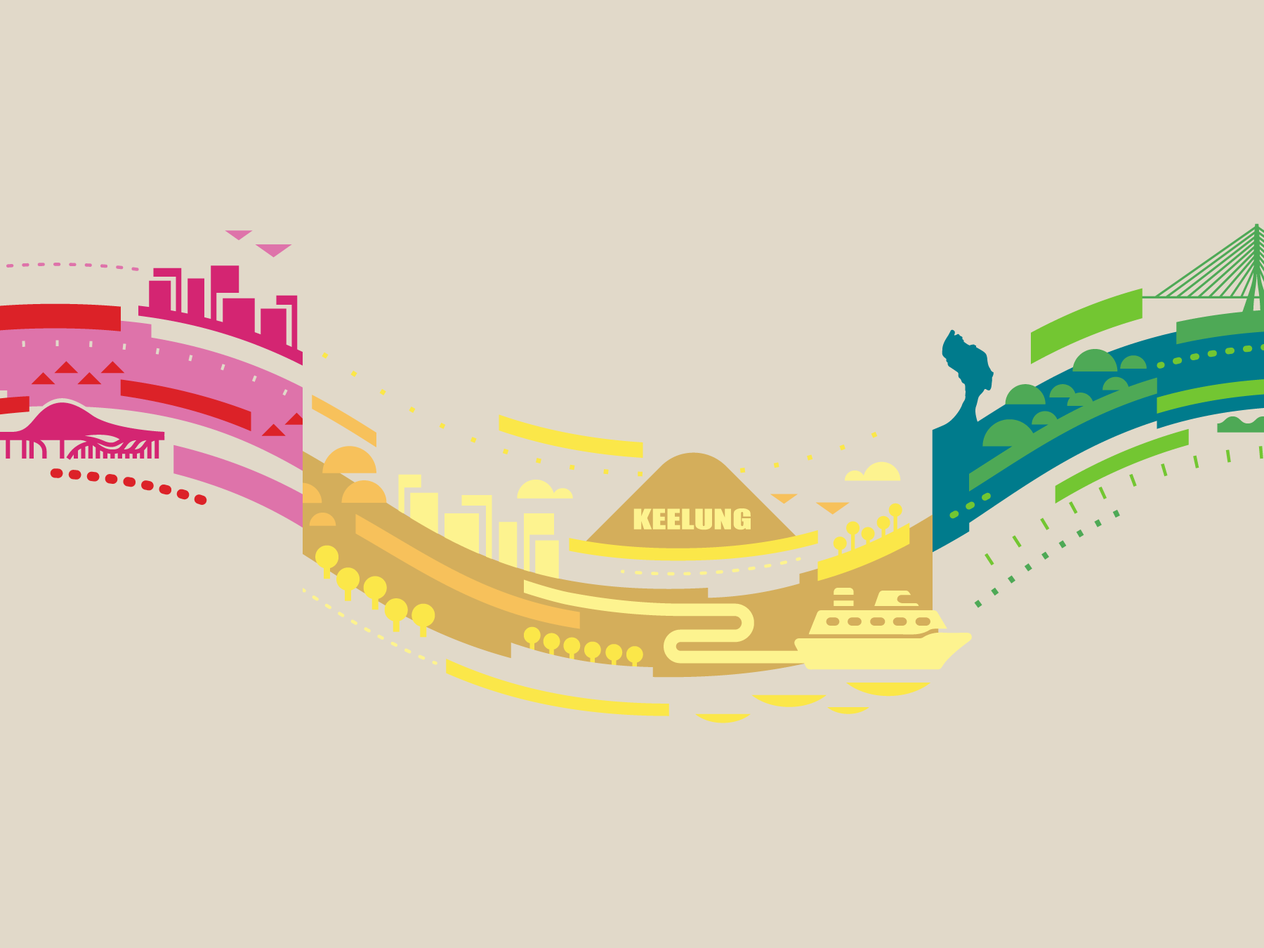
Commissioned by the New Taipei City Government - the key visual design for the press conferences of the cities co-op programme. The programme aims to announce how Taipei, New Taipei City, Keelung, and Taoyuan are working together to create a better experience for their citizens.
The design uses the colors of the four cities' logos and a wave-like design to connect the four places. I also incorporated illustrations of iconic structures and sites in each city, creating a cohesive visual that extends in an infinite loop. This design highlights the infinite possibilities that can be achieved when these cities work together. It was an honor to create a design that reflects the cooperative spirit and shared vision of these cities, and I hope it inspires more collaboration and unity in the future.
受新北市政府委託,為城市市政合作計畫的新聞發布會設計的主視覺。該計畫旨在宣布台北、新北市、基隆和桃園合作共同為市民創造更好的生活體驗。
設計運用了四個城市標誌的顏色和波浪狀的設計,將這四地連接。在視覺的每段落加入了城市代表性的建築和景點插圖,創造出連貫的視覺效果,宛如無限循環。這個設計凸顯了這些城市合作時可以實現的無限可能性。
能夠為這些城市創造一個反映合作精神和共同願景的設計,我感到非常榮幸,並希望它能帶領我們到更團結的未來。


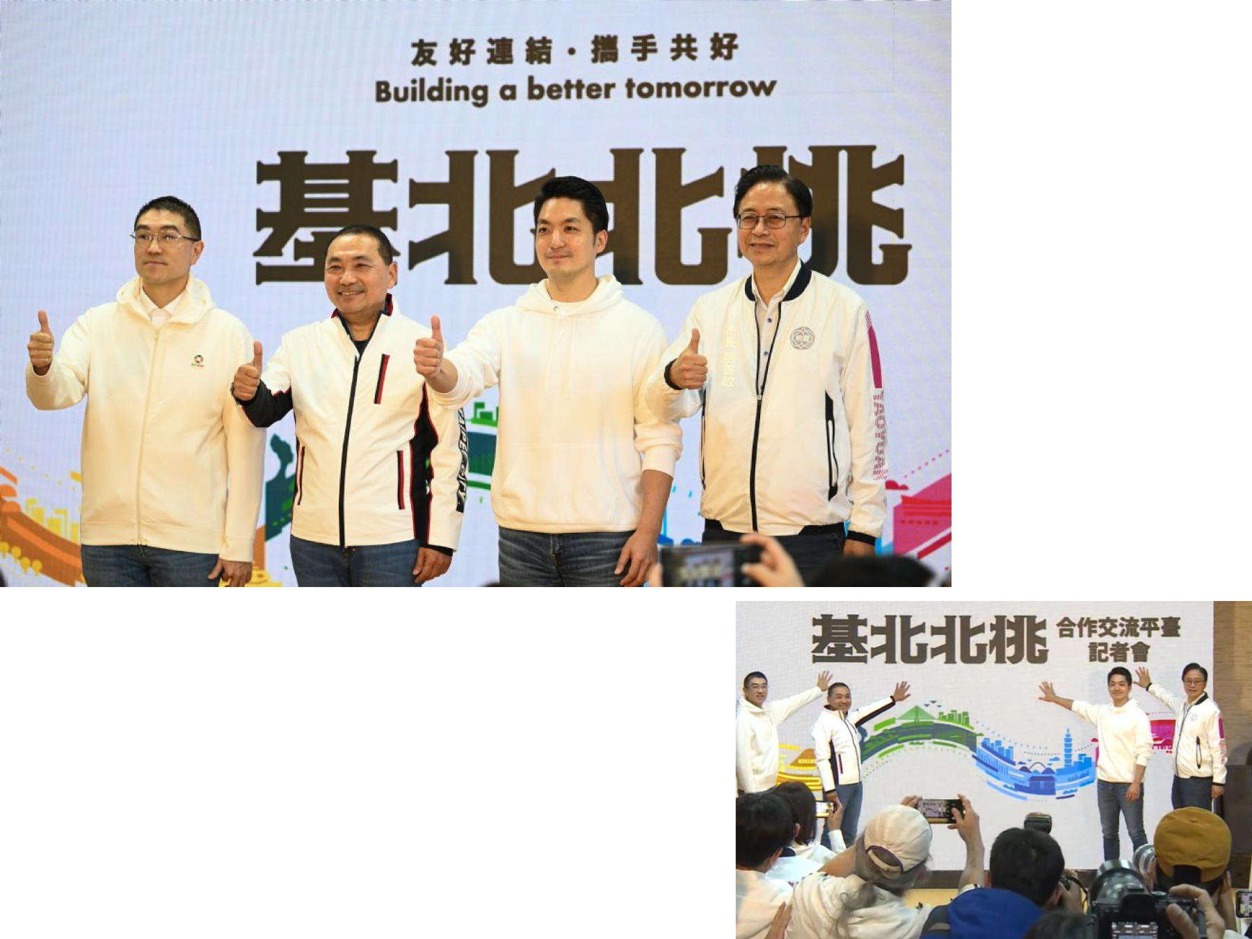
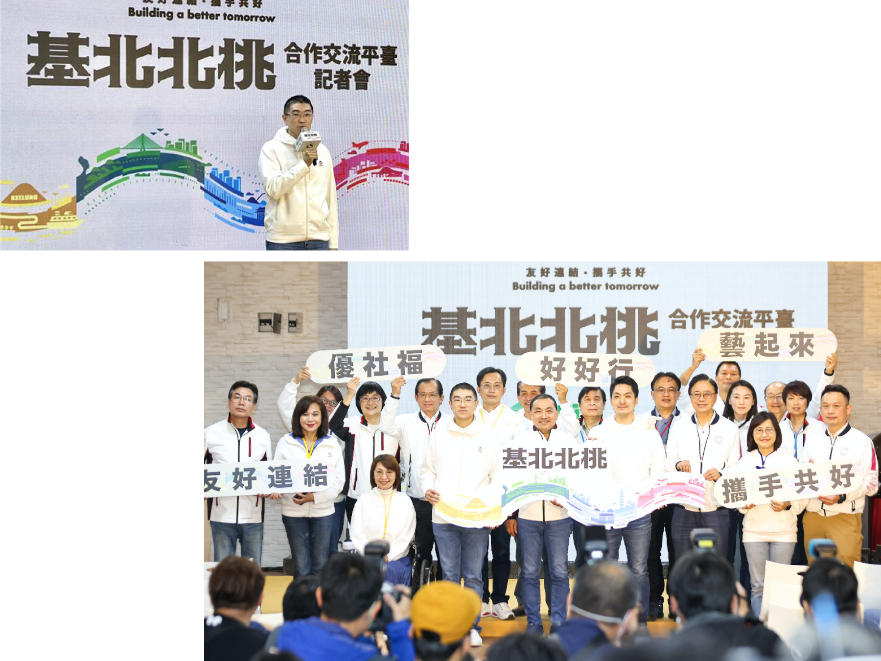
︎︎︎Press release images
Future Dining Table Project 飛雀餐桌計劃
2020


𒊹︎︎︎ Branding
𒊹︎︎︎ Packaging
𒊹︎︎︎ Editorial
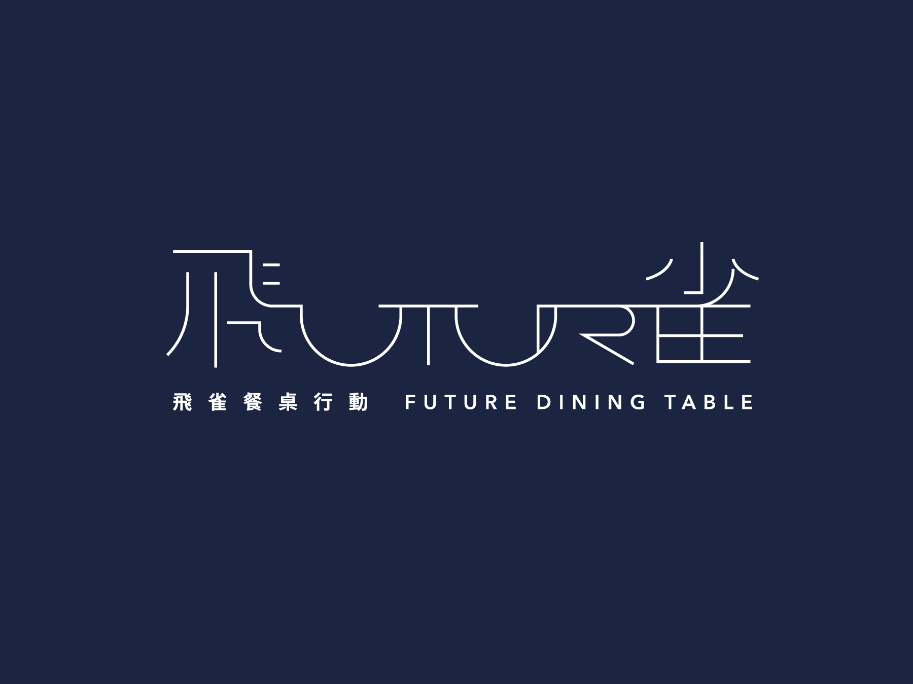
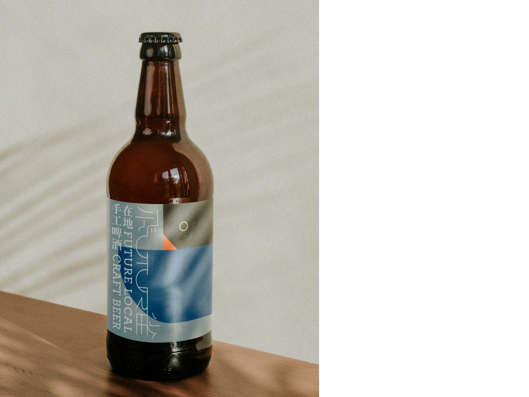
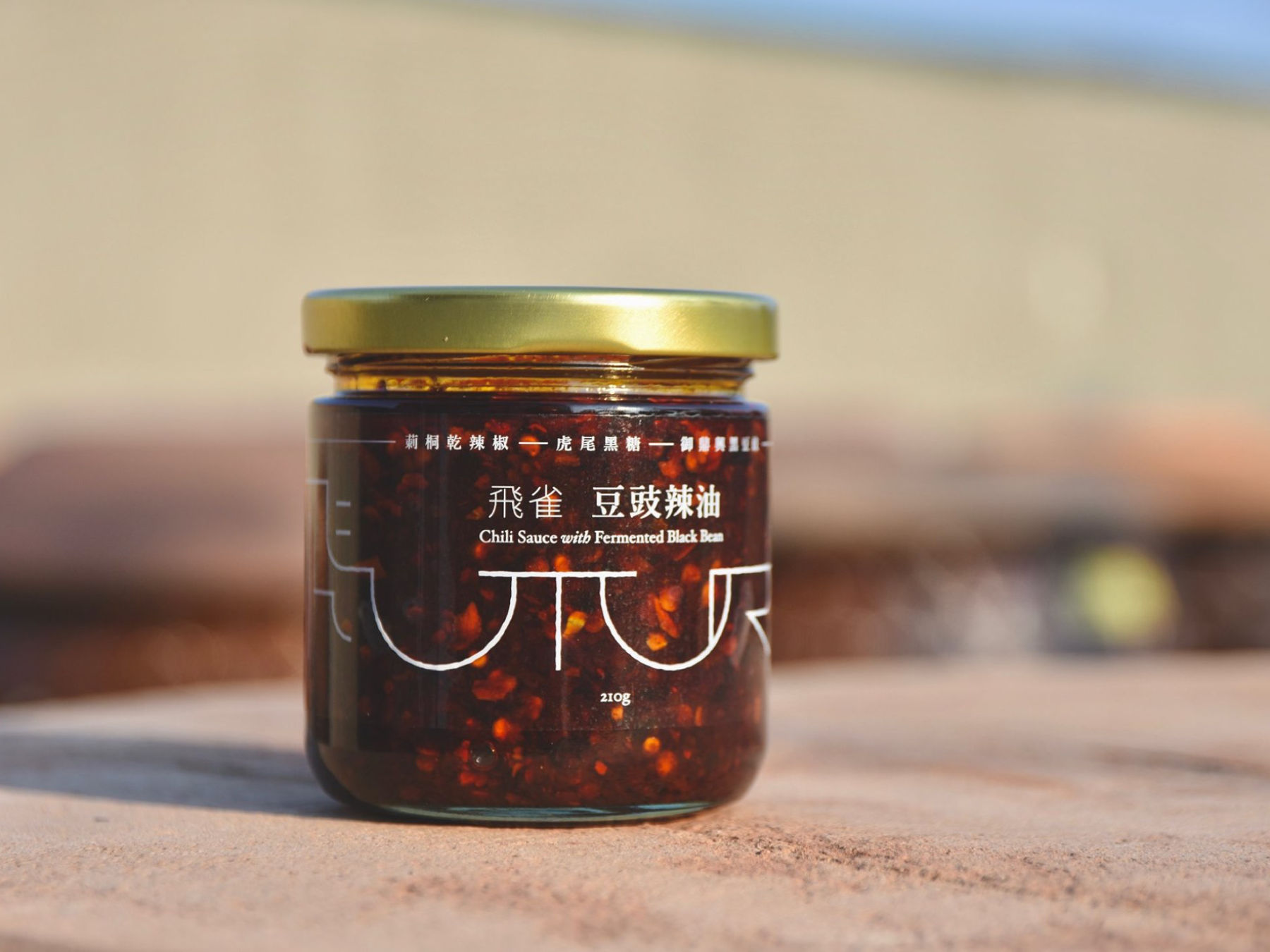
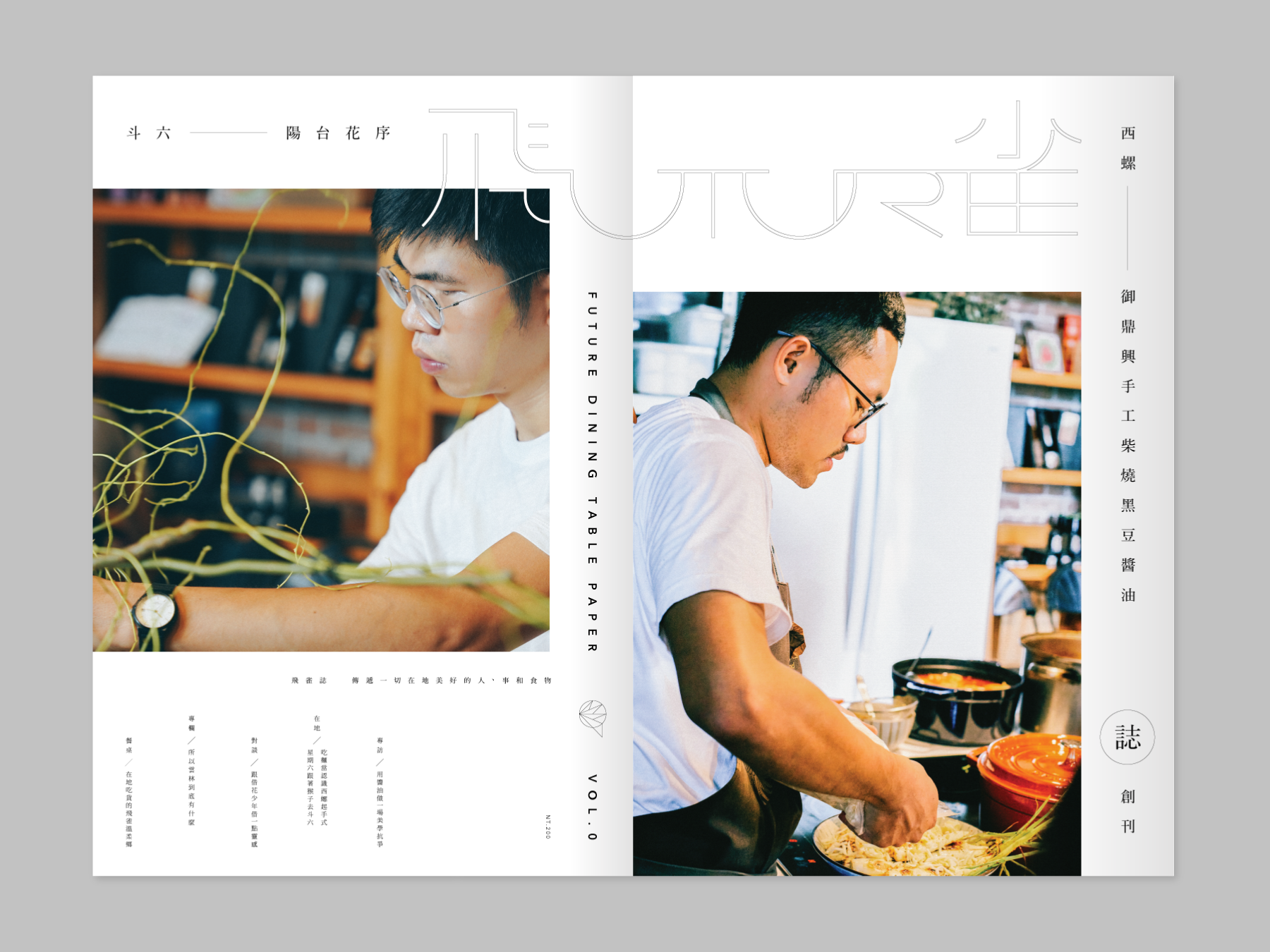
the Visual Identity Design for the Future Dining Table Project, a unique event that links the culture of food in Yunlin, Taiwan. This project curates events such as exhibitions, talks, dining experiences, and local tours.
The logo design for the project combines a dining table with the words "FUTURE" and "飛雀" to create a forward-looking design that symbolizes the project's mission.
飛雀餐桌計畫 FUTURE DINING TABLE 是一個連接雲林美食文化的獨特活動。該計畫策劃了展覽、講座、用餐體驗和當地導覽等活動。
我們受邀為該計畫建立視覺形象。標誌設計將餐桌「FUTURE (未來)」和「飛雀」這兩個詞結合在一起,創造了一個前瞻性的設計,象徵著該計畫的使命。我們的團隊還為當地食材醬料、本地精釀啤酒和其他產品設計了包裝,以增強活動的整體視覺識別。

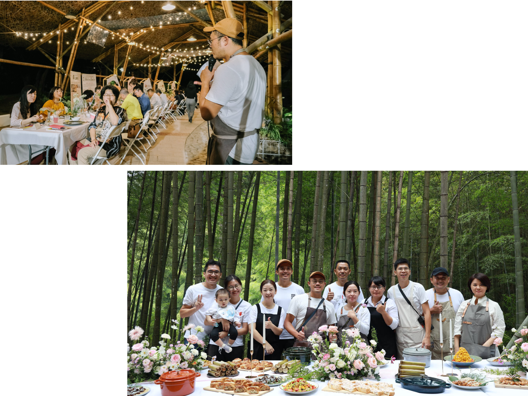
︎︎︎ Event Photos are provided by clients. 以上活動照片由客戶提供。
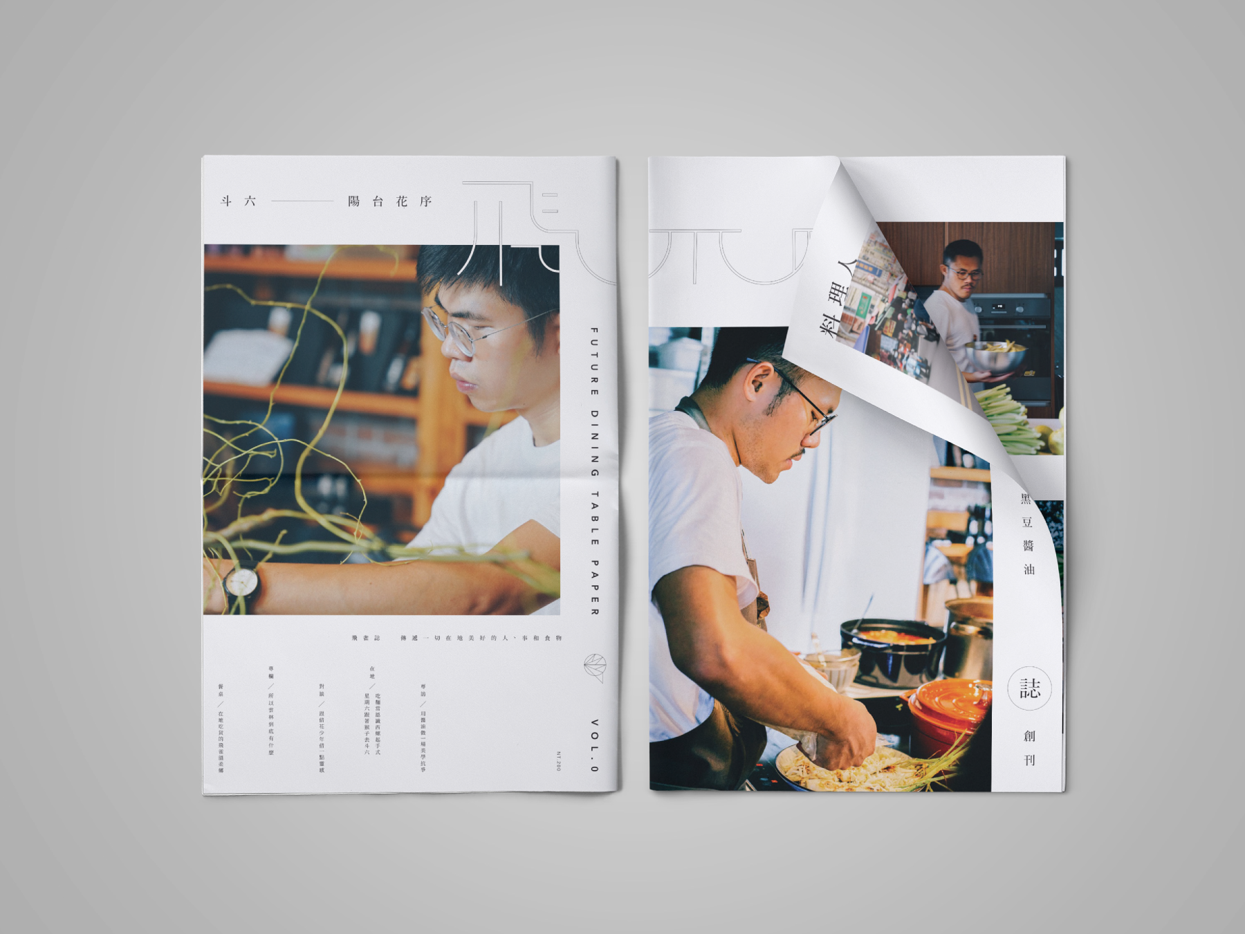
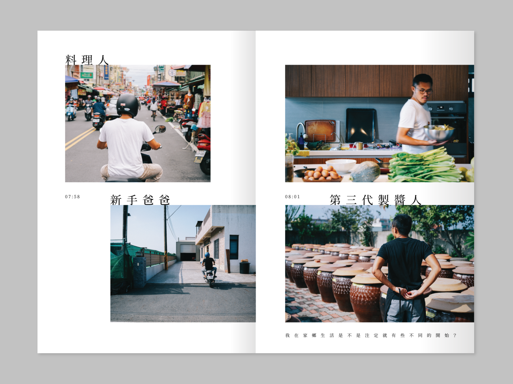
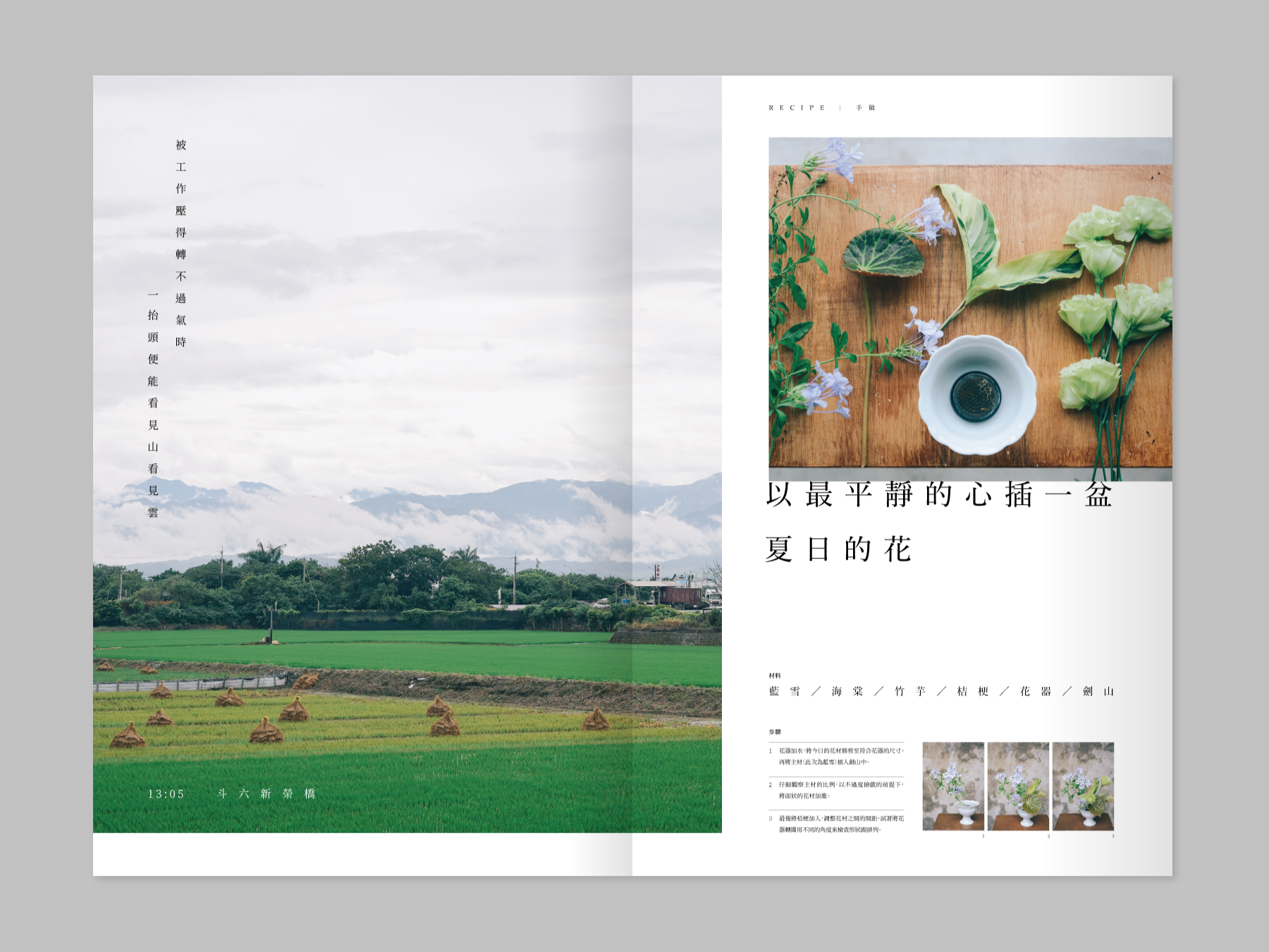
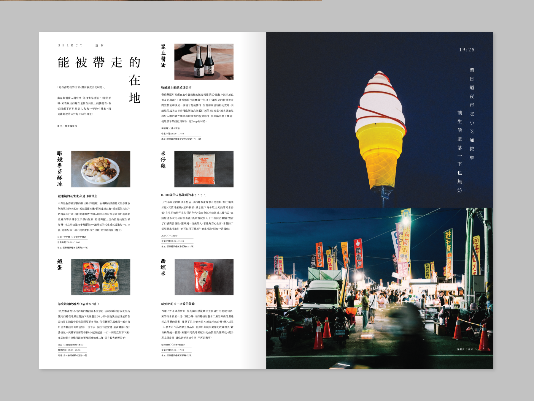
Our team also worked on the packaging design for local ingredient sauces, local craft beer, and other products to enhance the event's overall visual identity. Additionally, we curated a bi-monthly issued magazine that featured two representatives in each issue from Yunlin, who dedicated their careers to local traditional industries.
Through the magazine, the project showcased their way of life and interviewed them to echo the Future Dining Table Project's core value. Our team also designed the whole magazine for the project. I am proud to have worked on this unique and innovative project that combines design, food culture, and local traditions to bring people together.
此外,團隊策劃了一份雙月刊雜誌,每期雜誌都介紹了兩位專注於本地傳統產業的雲林代表。通過雜誌,該計畫展示了他們的生活方式,並對他們進行了訪談,以呼應未來餐桌計畫的核心價值觀。
我們的團隊以大開本、報紙形式為雜誌進行設計、利用大面積的圖文內容創造平穩卻充滿新鮮感的閱讀體驗。這個獨特而創新的計畫結合地方創生,將設計、飲食文化和本地傳統融合在一起,讓人們走到一起。


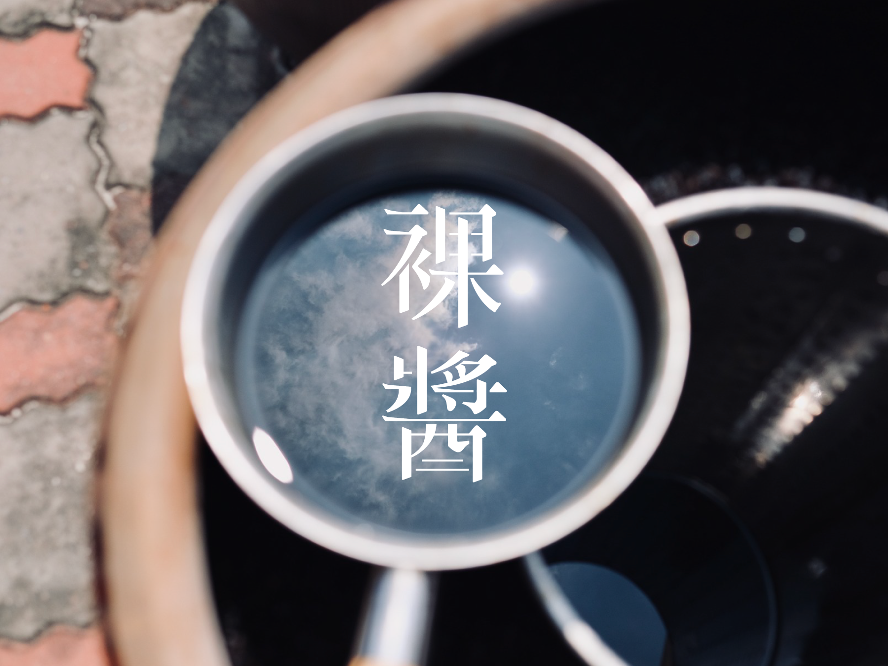
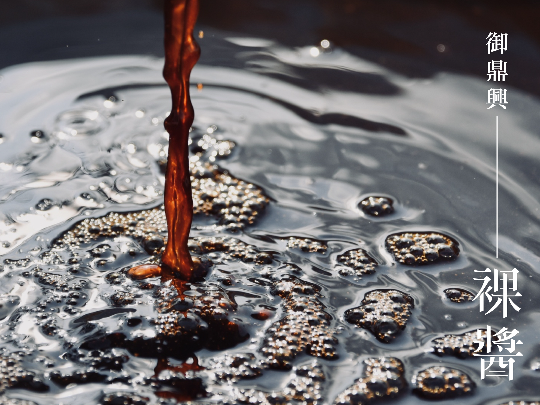
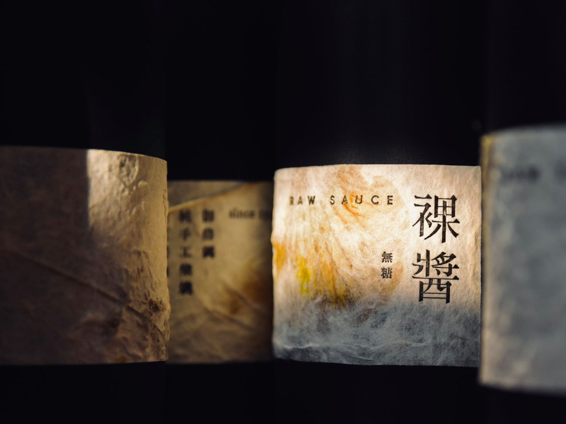
The Raw Sauce 祼醬
2020
𒊹︎︎︎ Packaging
𒊹︎︎︎ Typography
The packaging design for the "Raw Sauce" was commissioned by Yu-ding-xin Soy Sauce Factory, a leading traditional soy sauce manufacturer in Yunlin, Taiwan. This premium soy sauce boasts several unique features, including a three-year aged dry pot oil, a nitrogen content of 2.35, and an annual production schedule.
To reflect the brand's commitment to quality and tradition, we opted for a minimalist design approach for the packaging. We chose a handcrafted paper label to evoke a sense of luxury and paired it with a stamped design technique for a more authentic, artisanal feel. The label design focuses on highlighting the brand name and product features in a clean, sophisticated manner.
御鼎興是台灣具代表性的傳統醬油製造商。而「祼醬」這款高級醬油因未經熬煮,所以釀造時間拉長至3年,且為乾式釀造,產量極少,醬的色澤更為黑褐。
為了體現品牌對品質和傳統的承諾,我們選擇了簡約的設計風格來設計包裝。我們選用手工紙標籤,以營造兼具奢華感及手工訂製感,並結合印刷技術,使整體設計更具手工感。同時我們使用高級紅酒的概念去製作外包裝,為此價值不菲的醬油提升珍藏價值!


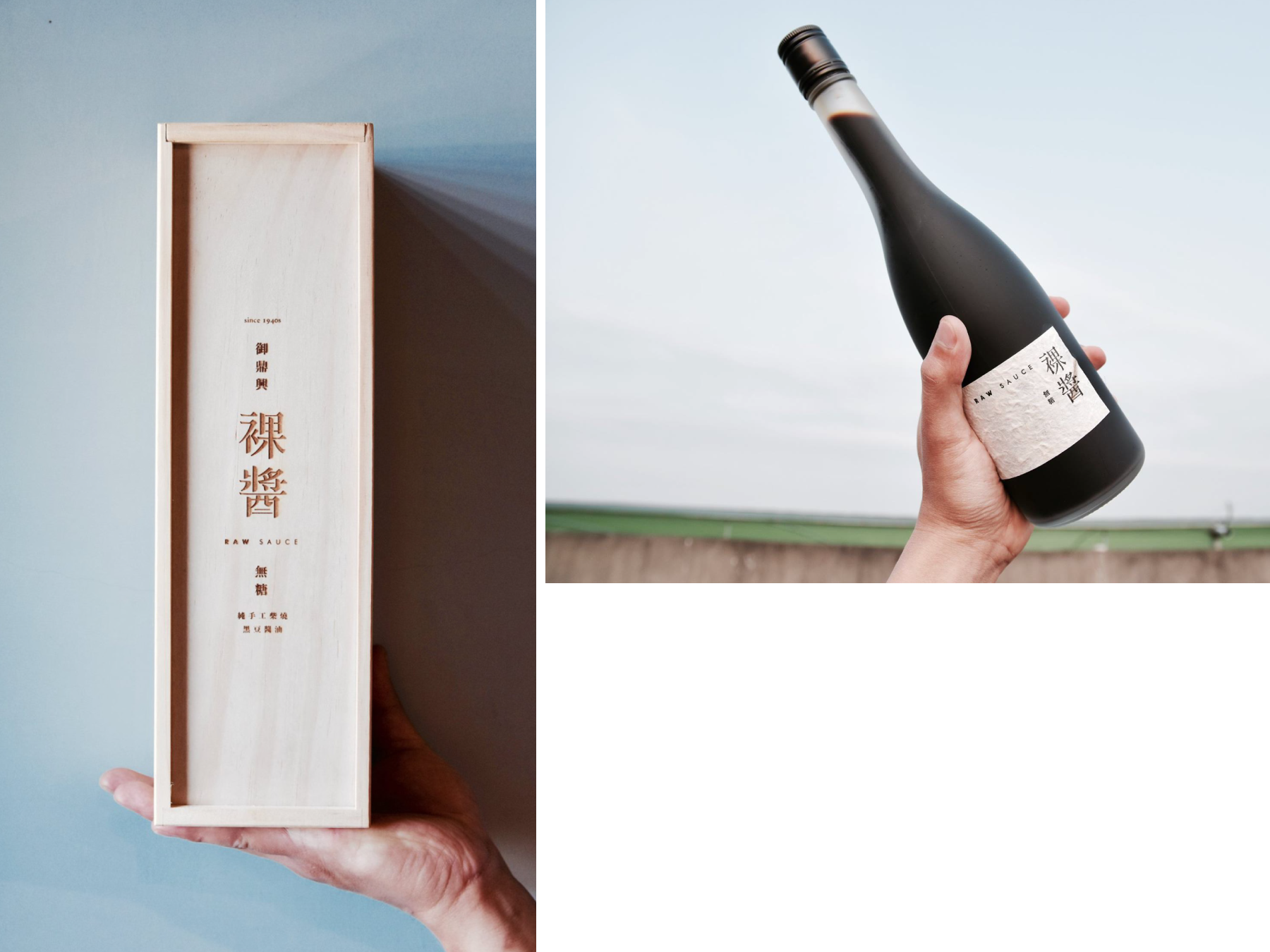


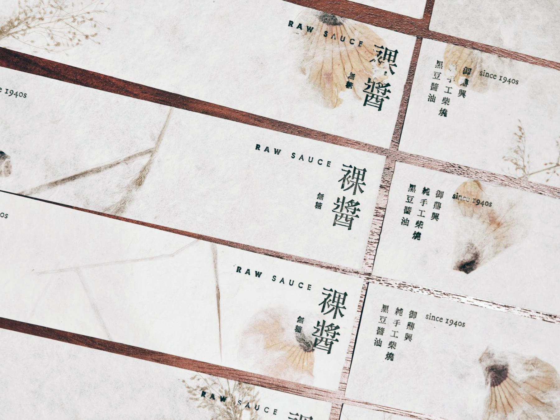
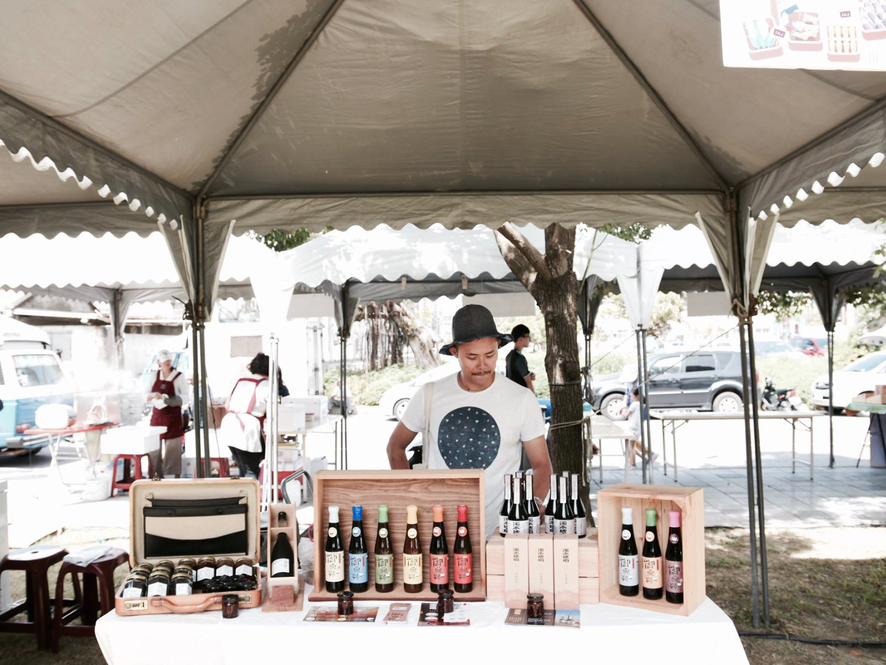
Overall, our design for the Raw Sauce successfully reflects the brand's values and product features while conveying a sense of sophistication and luxury to potential customers. The combination of high-quality materials and careful design considerations makes this packaging design stand out on shelves and attract customers looking for a premium soy sauce product.
︎︎︎ALL PHOTOS ARE PROVIDED BY THE CLIENTS 所有照片由客戶提供
︎︎︎ALL PHOTOS ARE PROVIDED BY THE CLIENTS 所有照片由客戶提供
2024 © Linshan design & consultancy co ltd
厸彡行銷顧問有限公司