LITE-ON 光寶科技
2020

𒊹︎︎︎ Packaging
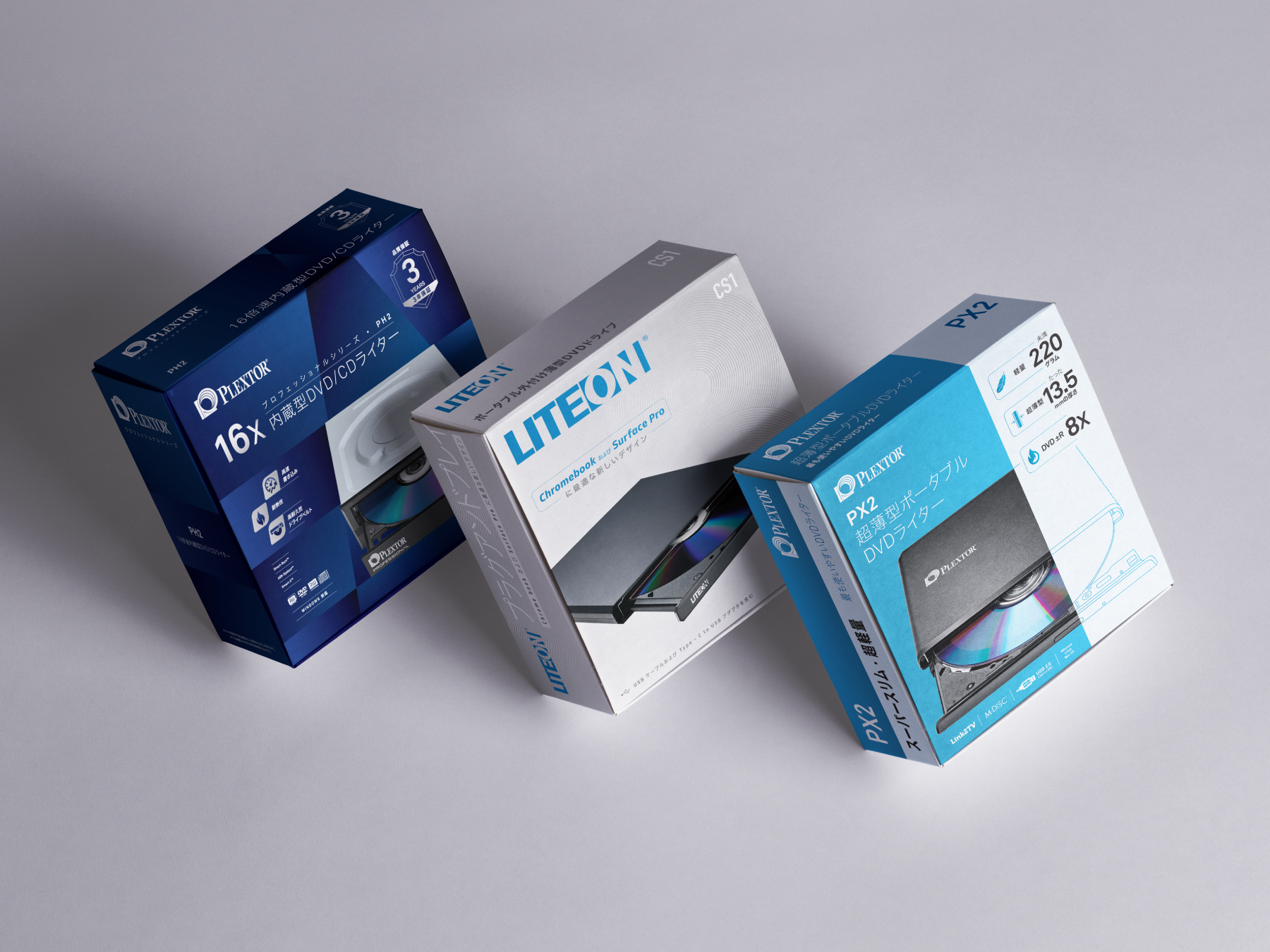
We had the opportunity to work on the packaging design project for LITE-ON and exclusively for the Japanese market. The design approach was to keep it simple yet elegant. The packaging design reflects the product features and its capabilities. The product's name is displayed prominently in bold typography, making it easier for customers to identify it.
The packaging's chic design features the product's image, making it stand out on the shelf. The design concept was to create a packaging that would appeal to a wide range of customers, keeping in mind the Japanese market's preferences. The design's clean and straightforward approach was well-received and helped increase the product's sales.
為LITE-ON 光寶科技公司設計針對日本市場的包裝設計項目。主要要求為需在包裝設計反映產品的特點和功能。產品名必須易讀清晰,讓顧客更容易識別。
考慮到日本市場的喜好,包裝大膽用色強烈的設計,有效在貨架更為顯眼,創造一個能夠吸引廣大顧客的包裝。設計直接提高產品的銷售率,得到了良好的評價。


